


|
|
|
|
by Editor Lourens Durand
Edited and published by Yvette Depaepe, the 14th of Februari 2025

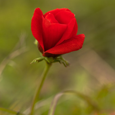
'Everything is red' by Evgeniy Popov
Colour is only one of the elements used to create a great photograph, but many successful photographers (and artists) will argue that it is by far the most important, creating the emotional and psychological foundation upon which a successful image is built. In fact, Goethe recognised the psychological impact of colour on the mood of an image as early as 1840 in his Theory of Colour. He wrote, among other things, that "people experience great pleasure in colours", especially yellow, red-yellow and yellow-red, which evoke quick, lively and aspirational feelings.On the other hand, blue, red-blue and blue-red were associated with a "restless, sensitive and anxious expression".
Today this has become a generally accepted set of associations and is universally used by artists and photographers:
- White = Innocence, purity, natural, peace
- Red = Passion, love, anger, danger
- Green = Natural, fertile, earthy, harmony, life, growth
- Blue = Sadness, coolness, calm, cold
- Orange = Joy, enthusiasm, energy, autumn
- Brown = Dependable, confident, stability, comfort
- Yellow = Hope, happiness, friendly, brightness
- Purple: = Royal, melancholy, pride, magic, luxury, mysterious
- Violet = Drama, authority, strength
- Pink = Airy, feminine, compassionate
- Black = Power, deadliness, evil, elegance. dramatic
Both Newton and Goethe (centuries apart) developed colour wheels, with red, blue and yellow being the primary colours, not a lot different from the modern colour wheel.
 Newton's colour wheel on the left, Goethe's on the right
https://annrichmanart.com/blog/goethes-color-theory

Modern Colour Wheel
Interestingly, the colours on the blue side of the wheel tend to recede into the background, while the reds seem to approach the viewer, which can be a useful compositional tool.
Goethe also associated the use of complementary colours, such as red and a touch of green, to balance each other and create a complex mix of emotions, which is an important part of colour theory today. Using three adjacent colours on the wheel in different proportions can also enhance mood.
These concepts propounded by Goethe still hold true today, and when used creatively, recognising these relationships between colours and their balance can have a powerful effect on the emotions expressed in the final work.Fine-tuning tools such as colour contrast, harmony of tones, saturation, desaturation, lightness and darkness, along with composition, all have an effect on the mood and dramatic interpretation of the photograph, adding to the story, even if it is just a touch of colour in an otherwise monochromatic image.
Try them all, whether in the studio, in the field or even in post-production, and see for yourself how colour affects the final product.

'After Harvest 2' by Jian Xu

'Cheese Farm' by Fernando PIçarra

'Donegal stories...' by Krzysztof Browko

untitled by HJ Yang

'Bee-eater' by Amro

'Persian girl' by Moein Hasheminasab

'purple hour' by Judith Kuhn

'Fine Art – Valeria and flowers' by Gila Koller

'Balance stem' by Jian Xu

'Whispers of Fall' by Sharon Levy

'Summer mood' by UstinaGreen

*?* by Ramiz Sahin

'Duc Hoa 2' by Clas Gustafson PRO

'Downtown Dubai' by Mrinal Nath

'Autumn Colors' by Grigore Roibu

'Beauty in the branches' by Barbara Fletcher

'Field View' by NanZ

'Bees at work' by Emanuel Papamanolis

'A True Lady' by Daniel Springgay

'Red Dot' by Karen Kolbeck

'Red Beans' by John-Mei Zhong

'caddo Lake' by Ti Wang

'Steampunk tea' (with a hot air balloon) by Dina Belenko

'La Rotonde' by Isabelle DUPONT

'CarMechanics' by Marcel Egger

'Competitor' by HuongHoang

'Sunflower' by Anna Qu
 | Write |
 | Lourens Durand CREW |
 | Gila Koller PRO Thank you Lourens & Yvette for choosing one of my pictures for this
interesting article, it is a great honored. |
 | Montserrat Alviani PRO A great article. Thanks and congratulations to the authors of the images. |
| Lourens Durand CREW Thank you. |
 | Molly Fu (APA) PRO Lovely colour and collections, thanks to Loren’s and Yvette for this excellent article! |
| Lourens Durand CREW Thank you.
|
 | Carlos Hernandez Martinez PRO Genial articulo! |
| Lourens Durand CREW Gracias |
 | John-Mei Zhong PRO Many thanks, Lourens & Yvette, for choosing one of my photos, extremely honored. |
 | Antonyus Bunjamin (Abe) PRO Many Thanks to Lourens & Yvette for great this inspiration article! Congratulations to all! |
| Lourens Durand CREW Thank you. |
 | YANGYING PRO Wonderful article and images, thank you! |
| Lourens Durand CREW Thank you. |
 | Gian Corrado DONATI PRO Thank you so much Yvette and Lourens for this interesting article ! Congratulations to all photographers !!! |
| Lourens Durand CREW Thank you. |
 | Eiji Yamamoto PRO Thank you so much for the very interesting article with wonderful and great photo works! |
 | Mrinal Nath PRO Very interesting article with wonderful images dear Lourens. Many thanks Lourens & Yvette for publishing such an inspiring article. Congratulations to all. |
 | Yvette Depaepe CREW Thanks for your appreciation, Mrninal Nath! |
| Lourens Durand CREW Thank you. |
 | Petra Dvorak PRO Very interesting article, thank you! |
| Lourens Durand CREW Thank you. |
 | Miro Susta CREW Well composed collection of beautiful photographs, very well done Lourens |
| Lourens Durand CREW Thank you Miro. |
 | Amro PRO Such a beautiful article. Thank you for sharing your thoughts. |
| Lourens Durand CREW Thank you. |
 | garyholman PRO Very interesting article and Wonderful! images. Congratulations! to All. |
| Lourens Durand CREW Thank you. |
 | Francisco Villalpando PRO Wonderful article and images, congratulations! |
| Lourens Durand CREW Thank you. |
 | Daniel Springgay CREW Great work wonderful mix of subjects and moods well done all - First Class work. |
| Lourens Durand CREW Thank you Daniel. |