


|
|
|
|
by Editor Colin Dixon
Edited and published by Yvette Depaepe, the 20st of January 2023
Colour in photography as we all know is one of the most important elements of our images.
We use specific colours and saturation to grab the eye of the viewer.
We can balance the image using complementary colours or using opposing colours such as Orange and Blue / Green and Red for example.

'Based on a true story' by Arnon Orbach
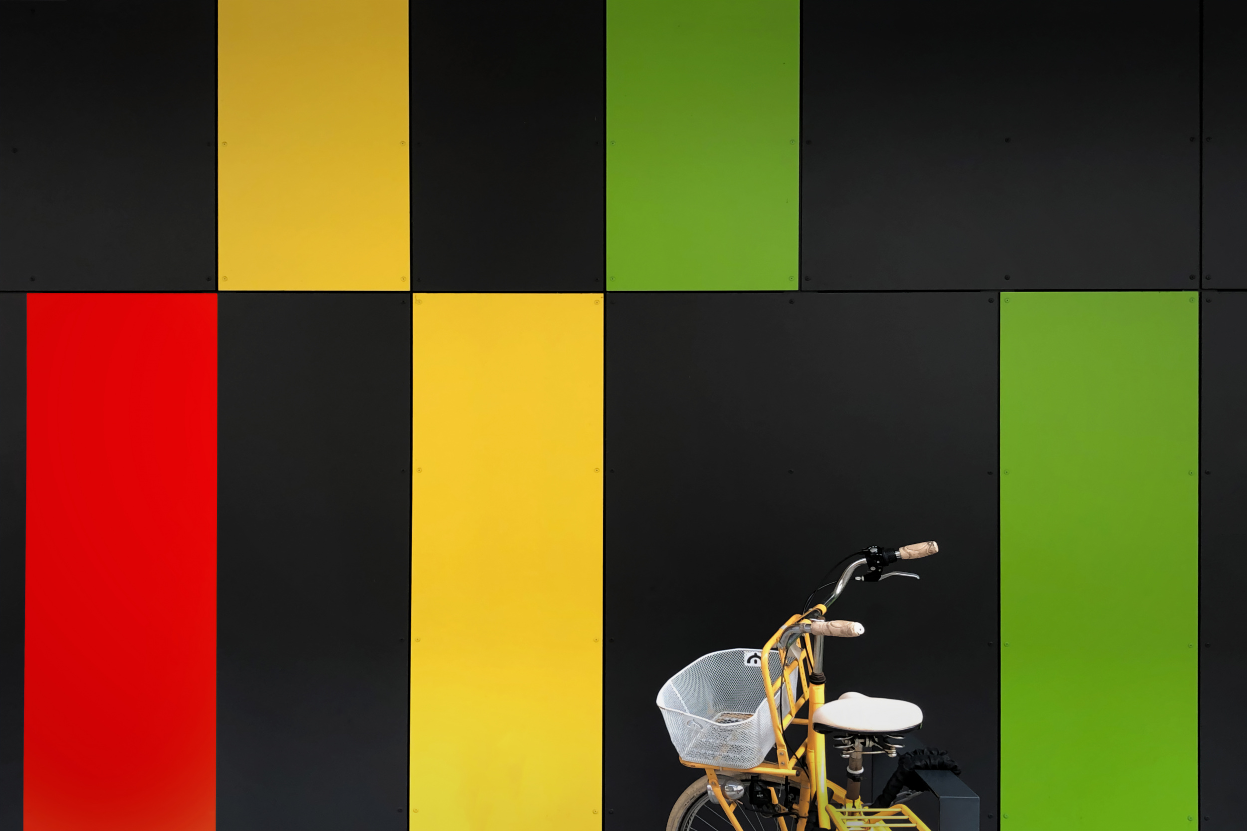
'Yellow bike' by Hans-Wolfgang Hawerkamp
But one of the elements I want to write about is the moods of colour.
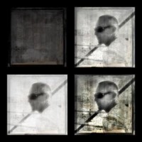
With a dominant colour we can set a mood in our images. We see this a lot in cinematography where the colour balance in the scene determines how they want to make us feel - horror, romance, etc. Here they commonly use Analogous colours, where one colour is dominant and all the other colours in the scene are similar tones of that colour. You can also use Monochromatic Colour images for the same effect using lighter and darker shades of one colour. We of course think of this primarily as Black and White with grey tones but the same effect can be achieved using different shades of any colour..
Evoking a certain mood or emotion through colour is key to the art of photography. To use colour effectively in your photos, it’s important to understand how it impacts mood and perception.
BLUE
With the colour blue, you can influence the mood of your photos by incorporating lighter or darker blues, depending on which of the following moods you are going for.
COLD
ISOLATION
MELANCHOLY
CALM
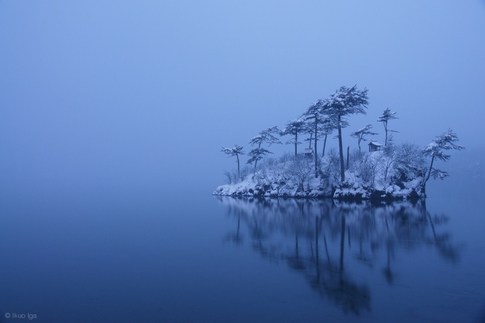
'Snowy Morning' by Ikuo Lga
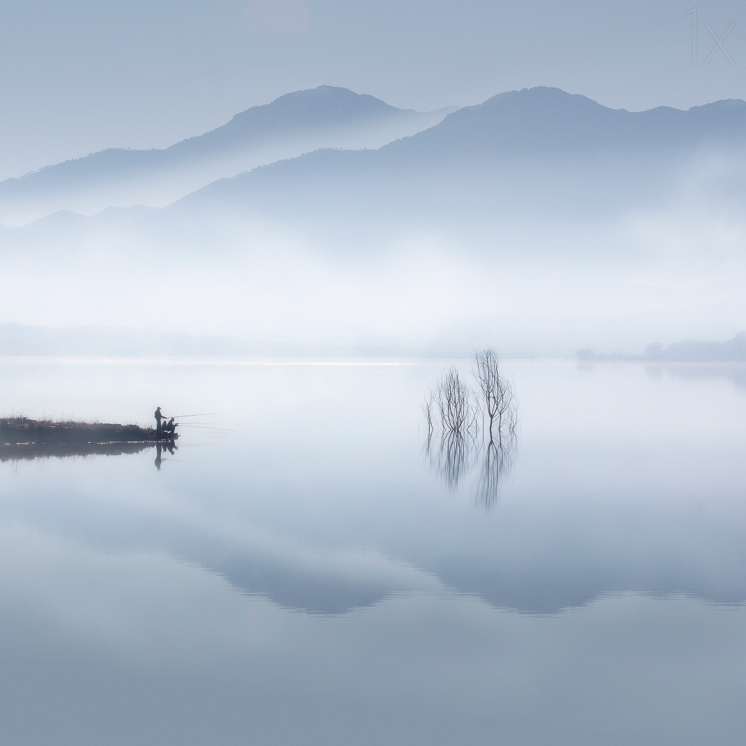
'Blue Silence' by Jose Beut
'Pattern of light and shadow' by Akira.k
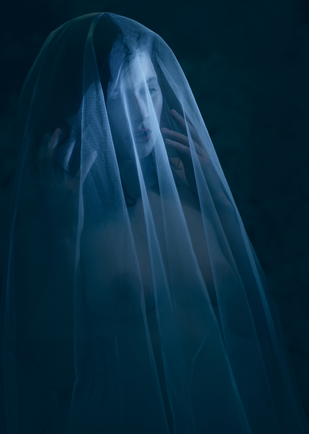
'Behind the Veil' by Colin Dixon
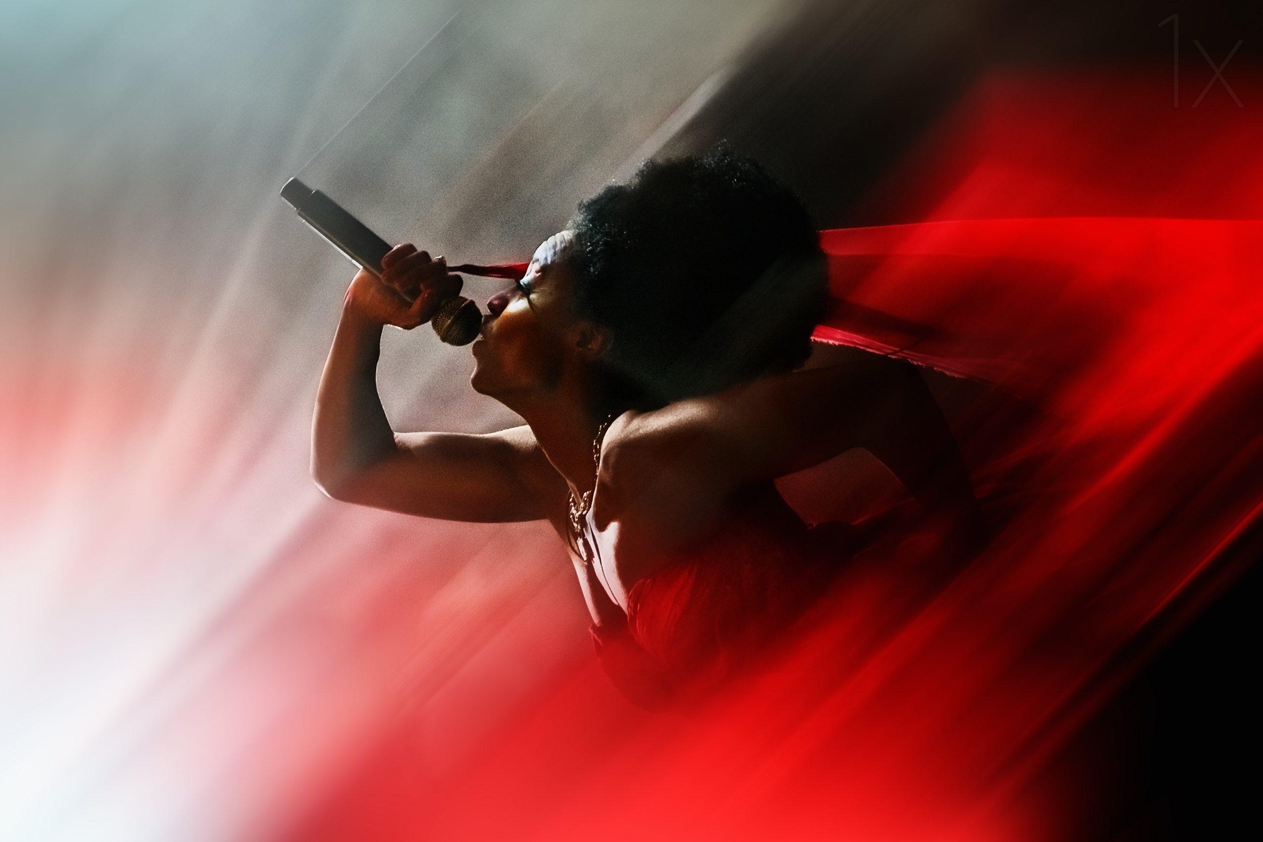
RED
Red is a powerful colour that can bring out a variety of emotions in people depending on how it’s used. Red in an image can bring out:
LOVE
PASSION
DANGER
ANGER
POWER
'Blood like lemonade' by Paulo Abrantes
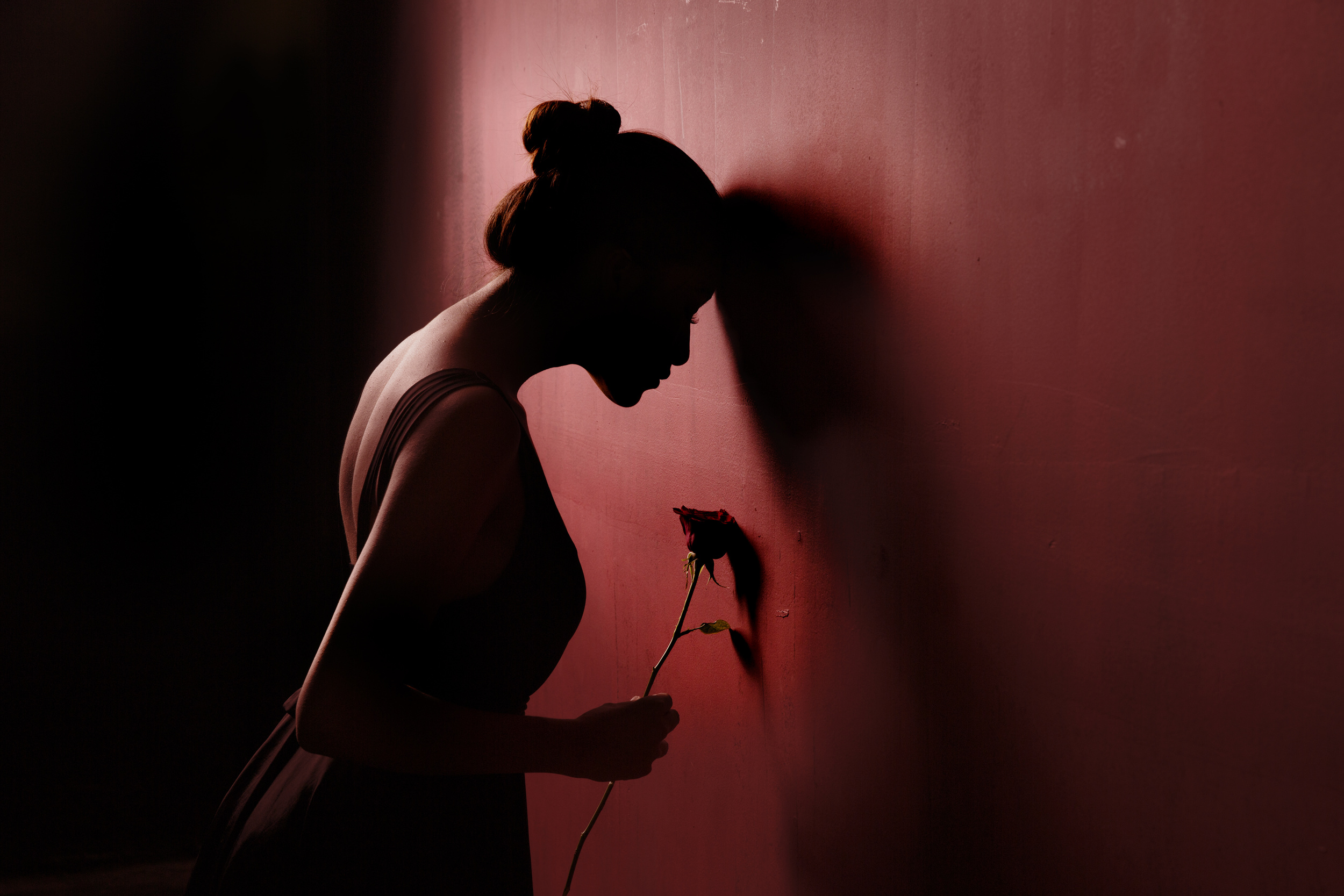
Red Rose 3 by Sebastian Kisworo
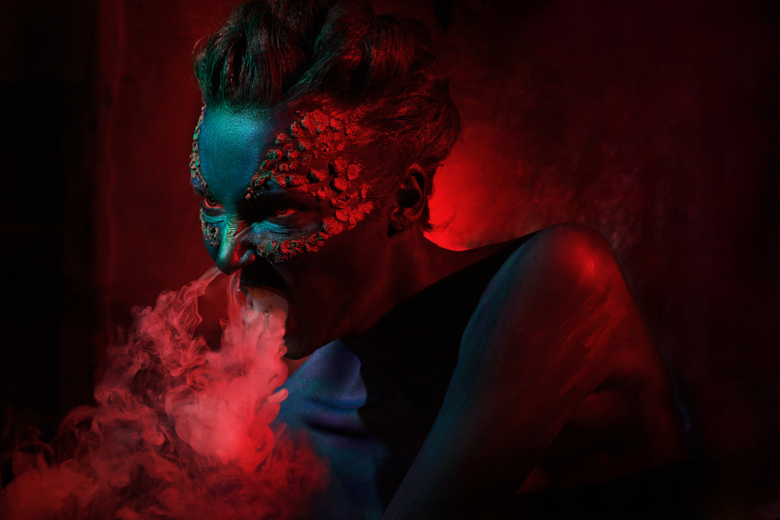
'Dragon' by Ivan Kovelev
ORANGE
Orange can be used to give the feeling of the following:
WARMTH
SOCIABILITY
FRIENDLY
YOUTH

'Once upon a time' by Stefan Miron
'Color Harmony' by Tali Stein
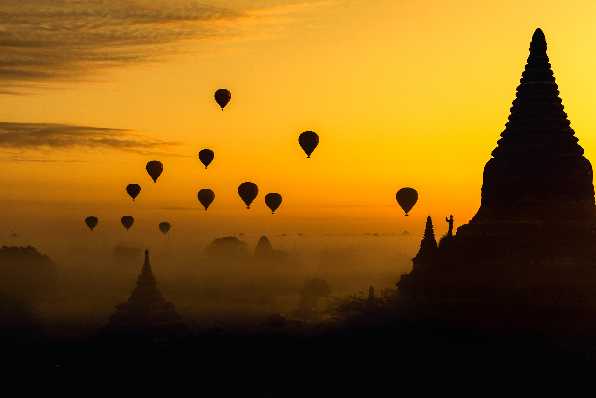
'Balloons' by Witold Ziomek
GREEN
Green is the one cooler colour and can be used to express to following feelings:
NATURE
OMINOUS
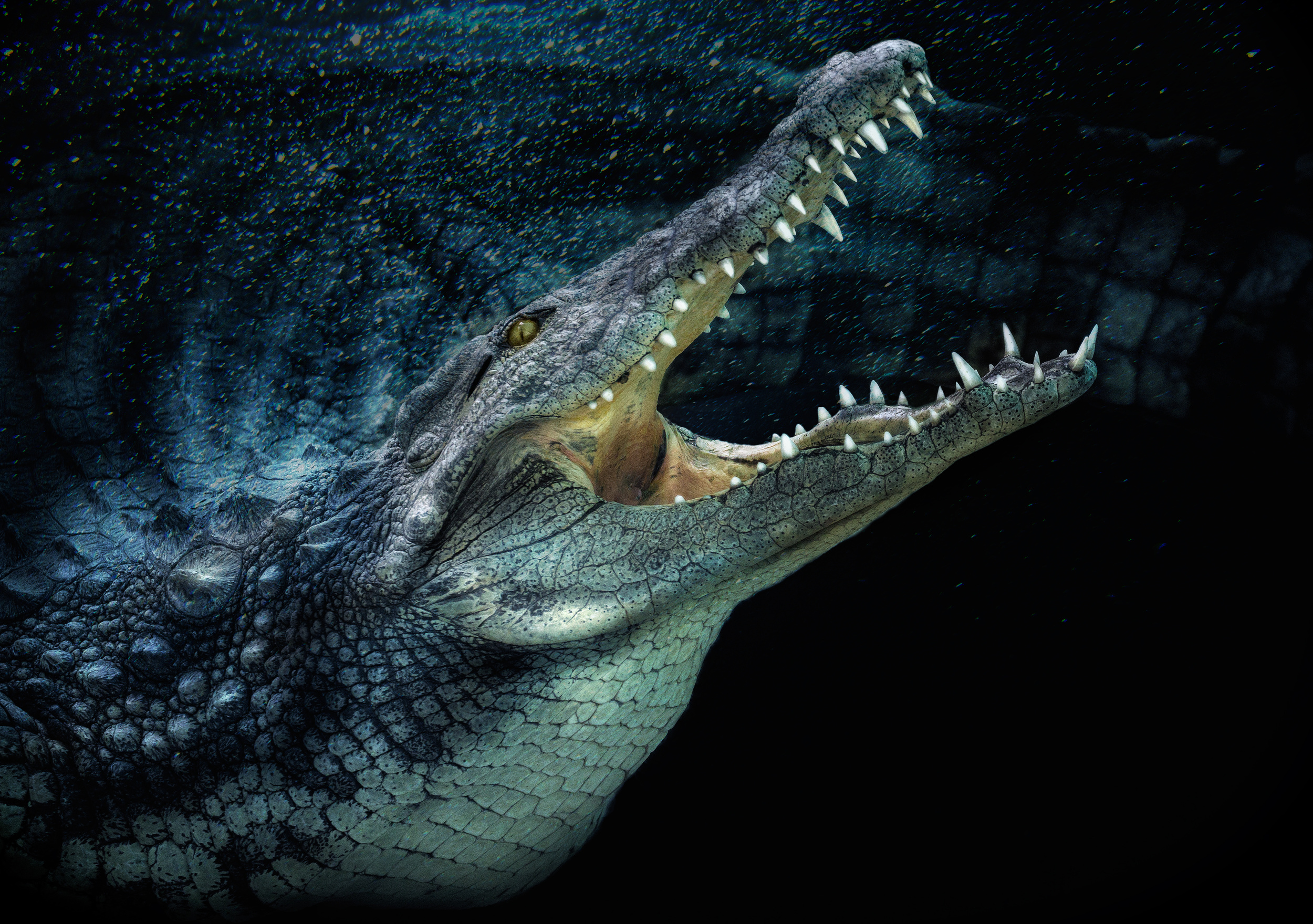
DARKNESS
DANGER
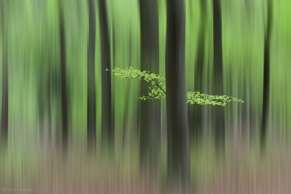
'Spring Morning' by Huib Limberg
n/t by Veselin Atanasov
'Surprise!!!' By Pedro Jarque Krebs
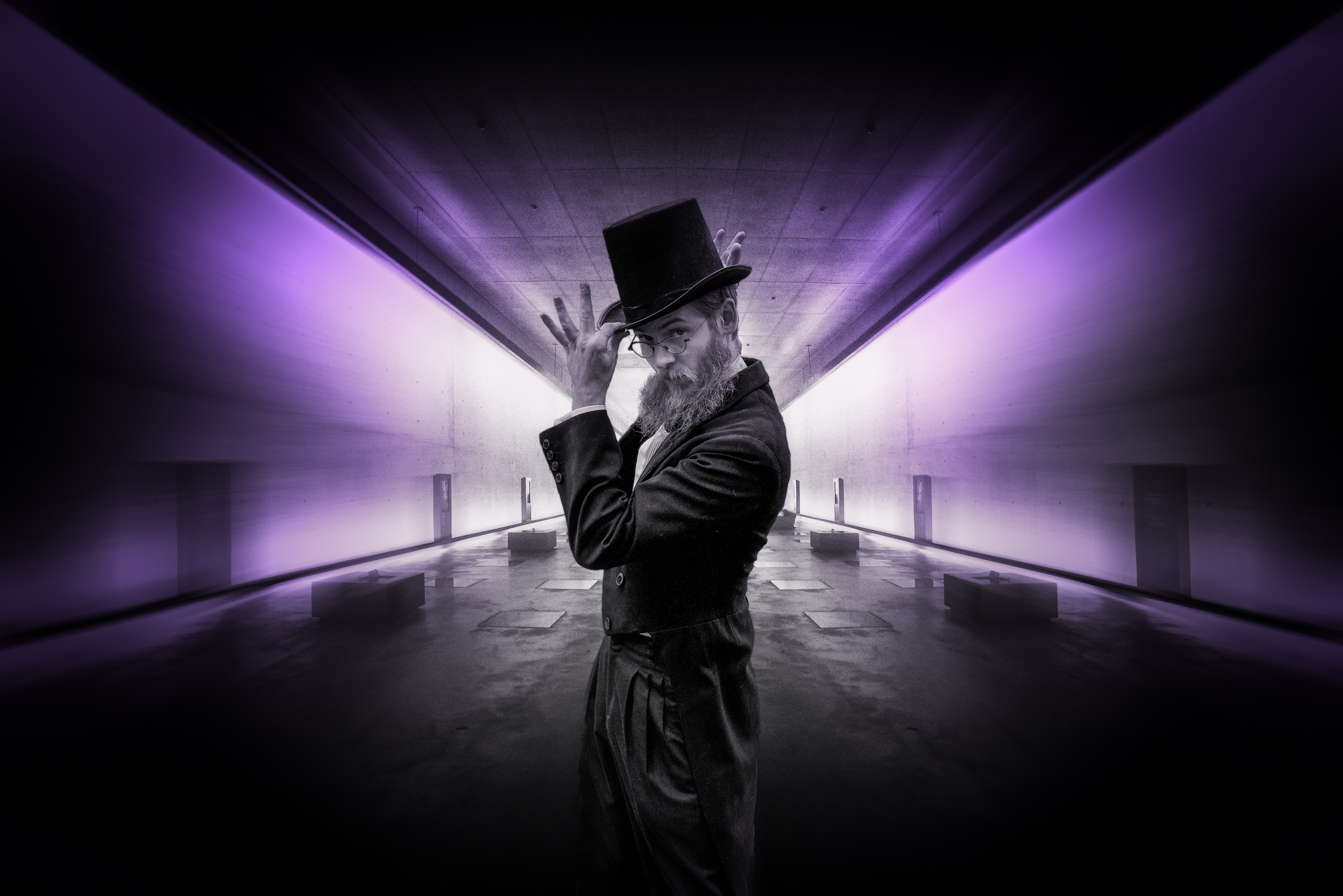
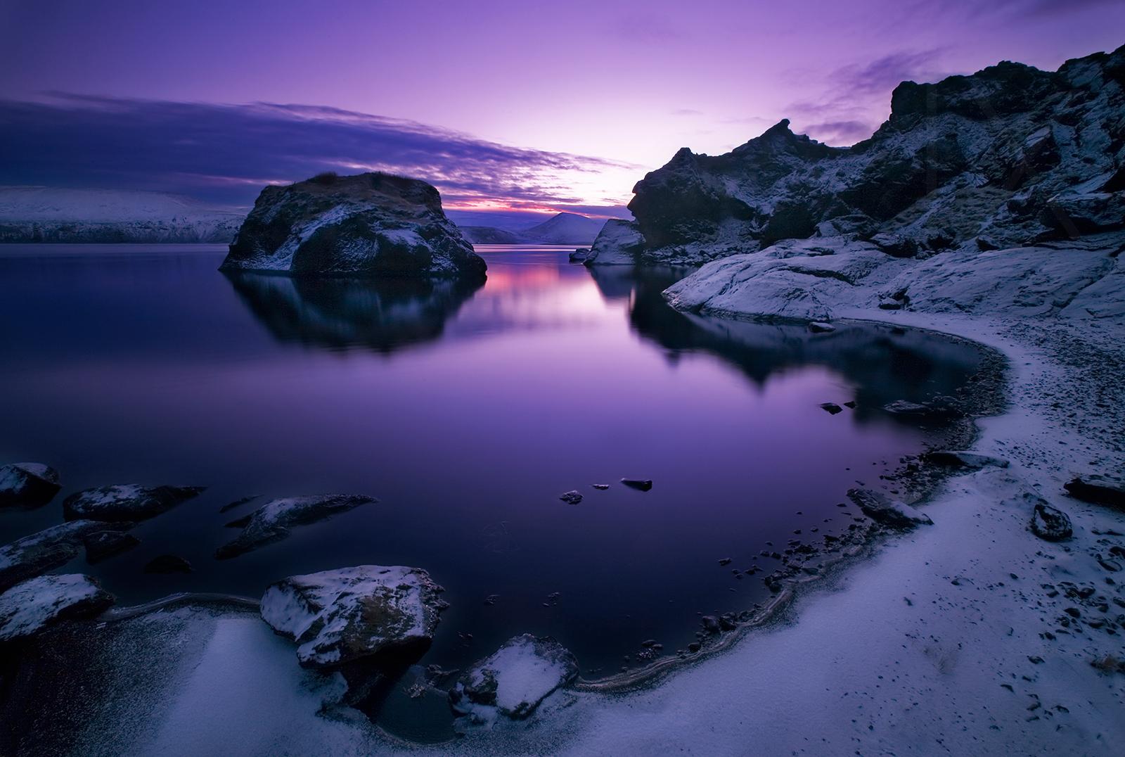
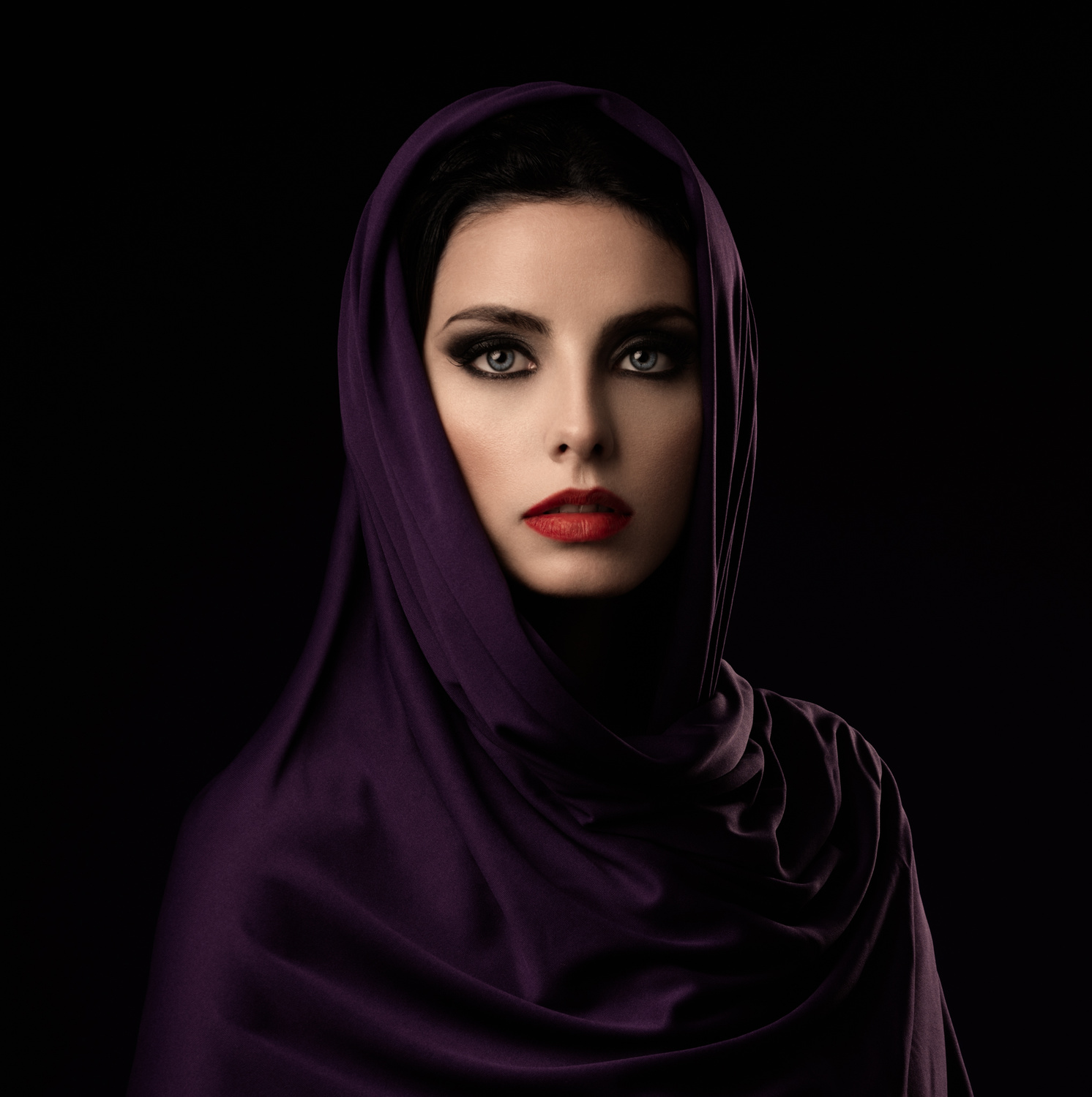
PURPLE
Adding purples and purple tints into your images can inspire a feeling of:
FANTASY
ETHEREAL
MYSTICAL
OMINOUS
'Mystery Room' by Desmet Patrick
'Ortus Solis' by Bragi Ingibergsson
'Purple Veil..!!!' by Alfredo Sanchez
Although colour definitely has a subconscious, as well as a conscious impact on how someone perceives your work, when you are creating a mood for your images through a choice of colour, you are doing it with your own feelings and perspective. Many other people will get different feelings from your work, hence why we love what we do because photography is an art that we create mainly for ourselves.
 | Write |
 | Annie Keizer PRO Very interesting article about colors. And wonderful images. Super👍👍 |
 | Izak Katz PRO Nice and interesting selection of beautiful images .
|
 | Ruth Franke PRO really interesting article and very beautiful artwork |
 | Miro Susta CREW Peter you have chosen very interesting topic for this article. I agree that colours are very important for photography, the warm golden colour of the sunset or the cold blue for a winter photo, nothing can beat that. But colours are also very important for our daily life, our mood and for all of us who live in temperate zones enjoyment of the colours of the seasons........Thank you for the article and for selecting the lovely photos and thank you Yvette for publishing it. |
 | Colin Dixon CREW Thank you Miro and a good point about real life |
 | Michel Romaggi CREW Very interesting article and nice pictures |
 | Iris Wiener PRO Awesome images. Love the explanations.thanks! |
 | Thierry Dufour PRO Wonderful images, splendid article, congrats !!! |
 | Anita Singh PRO Very informative article and lovely images , Thanks Colin and Yvette |
 | Paulo Abrantes PRO Many thanks, and congrats for the narrative. Colors can be the angel and the devil, at the same time, in a picture. Hard subject to discuss, nevertheless, because of the so many possibilities about the presentation and because so often, the color presentation in a picture can be even more abstract than the b&w one. |
| Colin Dixon CREW Totally agree Paulo |
 | Dorte Irene Sattrup Lund-Nielsen Really good article 👍👍👍
|
| Colin Dixon CREW Thank you so much |
 | Wanghan Li PRO Thank you so much for the article! |
| Colin Dixon CREW No problem glad you enjoyed it have a great weekend. |
 | Heike Willers PRO Very interesting article and a great choice of images! Thank ou for sharing! |
| Colin Dixon CREW Thanks Heike yes we are surrounded by fabulous photography here on 1x :) |
 | Arnon Orbach CREW Colors are such an integral part of our life, it is an intriguing subject, thanks a lot dear Colin for your very thoughtful article with the beautiful gallery to demonstrate each color. Thanks for including my photo, much appreciated. Have a good weekend |
| Colin Dixon CREW Thank you Arnon |
 | Inci Koyuncu PRO çok güzel... teşekkürler. :) |
 | Hans-Wolfgang Hawerkamp PRO thanks a lot for this much interesting article Colin and also for the selection of images. Regards Hans-Wolfgang |
| Colin Dixon CREW Thank you Hans. |