


|
|
|
|
by Editor Lourens Durand
Edited and published by Yvette Depaepe, the 4th of November 2022
by Leyla Emektar La_
How often have we applauded a magnificent operatic, theatrical or musical production for the performance of the actors and the preparation of the stage and props, yet have forgotten another most important member of the production - the Stage Lighting Manager?
Of course, it is the SLM’s job to ensure that the performers are visible to the audience and that the props are adequately lit, but the responsibility does not stop here – more importantly, this is where the SLM uses the power of colour to manipulate the mood and the psychological impact of the performance to enthral the audience.
We, as photographers, have the same ability to use colours to inject emotion, atmosphere and meaning into our photographs.
In his book “Theory of Colour” written in 1810, Johann Wolfgang von Goethe was one of the first to realise that colours have a psychological impact on mood and emotion. He devised a crude colour wheel and proposed that each of the colours had specific effects on viewers.
Many writers have since explored this subject and the theory has evolved into a set of commonly accepted colour meanings.
For example:
White = Innocence, purity, natural
Red = Passion, love, anger, danger
Green = Natural, fertile, earthy, harmony
Blue = Sadness, coolness, calm, cold
Orange = Joy, enthusiasm, energy
Brown = Dependable, confident
Yellow = Hope, happiness, friendly, brightness
Purple: = Royal, melancholy, pride
Violet = Drama, authority, strength
Pink = Airy, feminine, compassionate
Black = Power, deadliness, evil, elegance
For even more effectiveness, these colours may be combined in a number of ways to intensify their impact, based on the modern colour wheel:
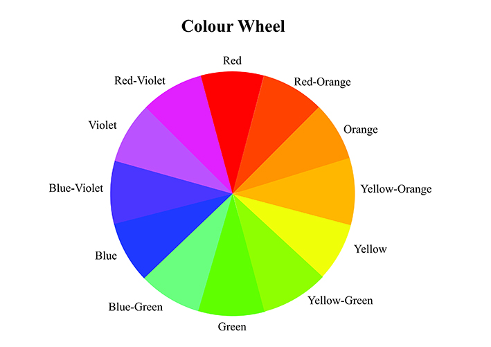
Complementary Colours
The viewers' eyes always look for a bit of a complementary colour to balance the picture, so try to use two colours opposite each other on the colour wheel for balance. Examples are red and green or blue and yellow to balance and to create a complex mix of emotions
Analogous Colours
Use three colours adjacent to each other on the colour wheel to amplify the effect of a mood –try combining red with red-orange and red-violet.
Triadic Colour
Use a combination of three colours 120 degrees apart on the colour wheel for a unique touch, telling a story – for example, combining orange, violet and green for a combination of earthiness, joy and drama
Some other considerations for the use of colours
* The primary colours red, blue and yellow can appear be very loud and a distraction in the background, so try not to use colour too strongly in the background
* Also note that warm colours (like red, orange and yellow) tend to approach the viewer whilst cool colours (blue, green and purple) tend to recede, and this can make or break the effect that is aimed for.
* Remember that often less is more. Subtle combinations can be more effective unless the aim is to be shocking.
* Of course, it is not always possible to arrange colours outside of a studio setup but, if you take the time to look around at your surroundings you may very well find interesting colour variations available, even in landscapes.
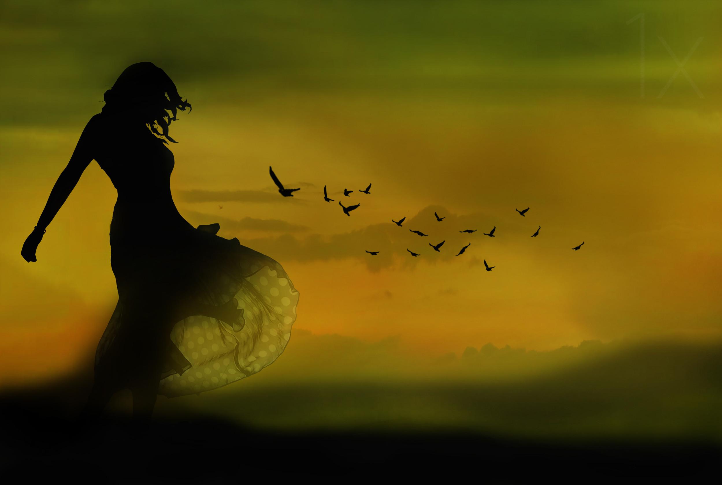
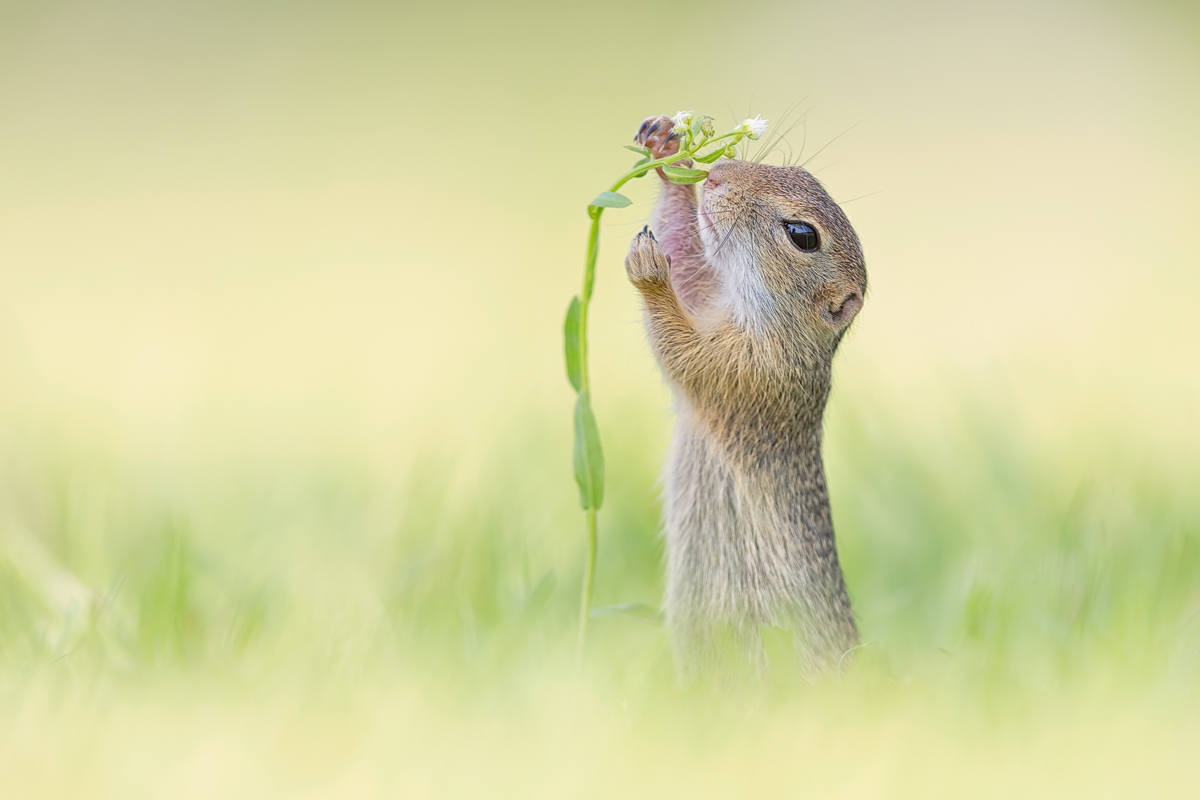
I have attempted to put together a collection of photographs taken by 1X.com photographers demonstrating the impact of colour in photography. Please enjoy!
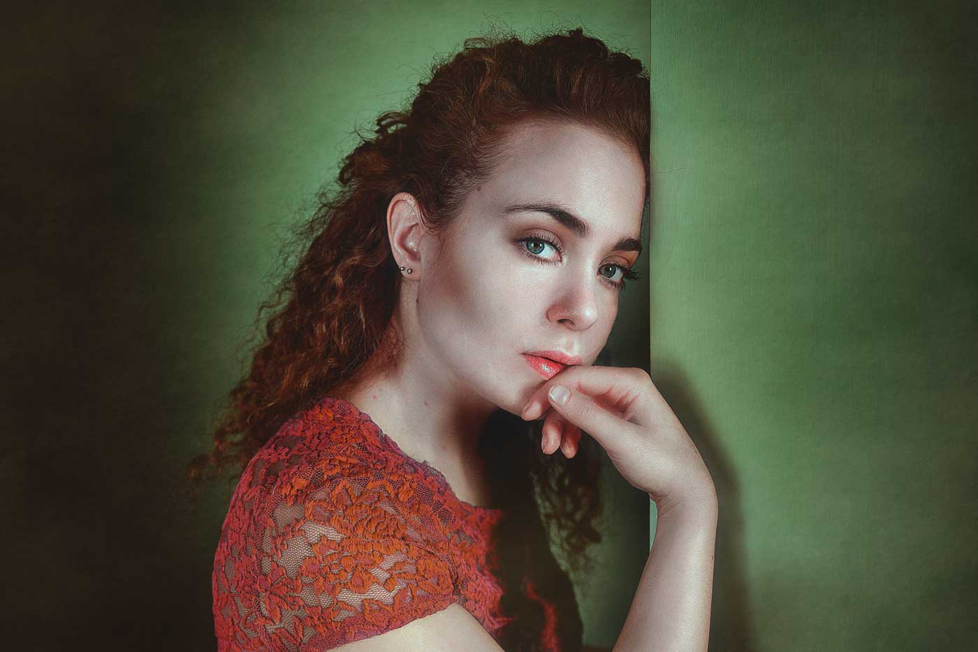
'complementary feelings' by Antonella Renzulli
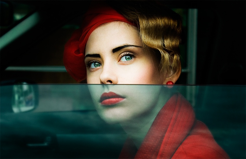
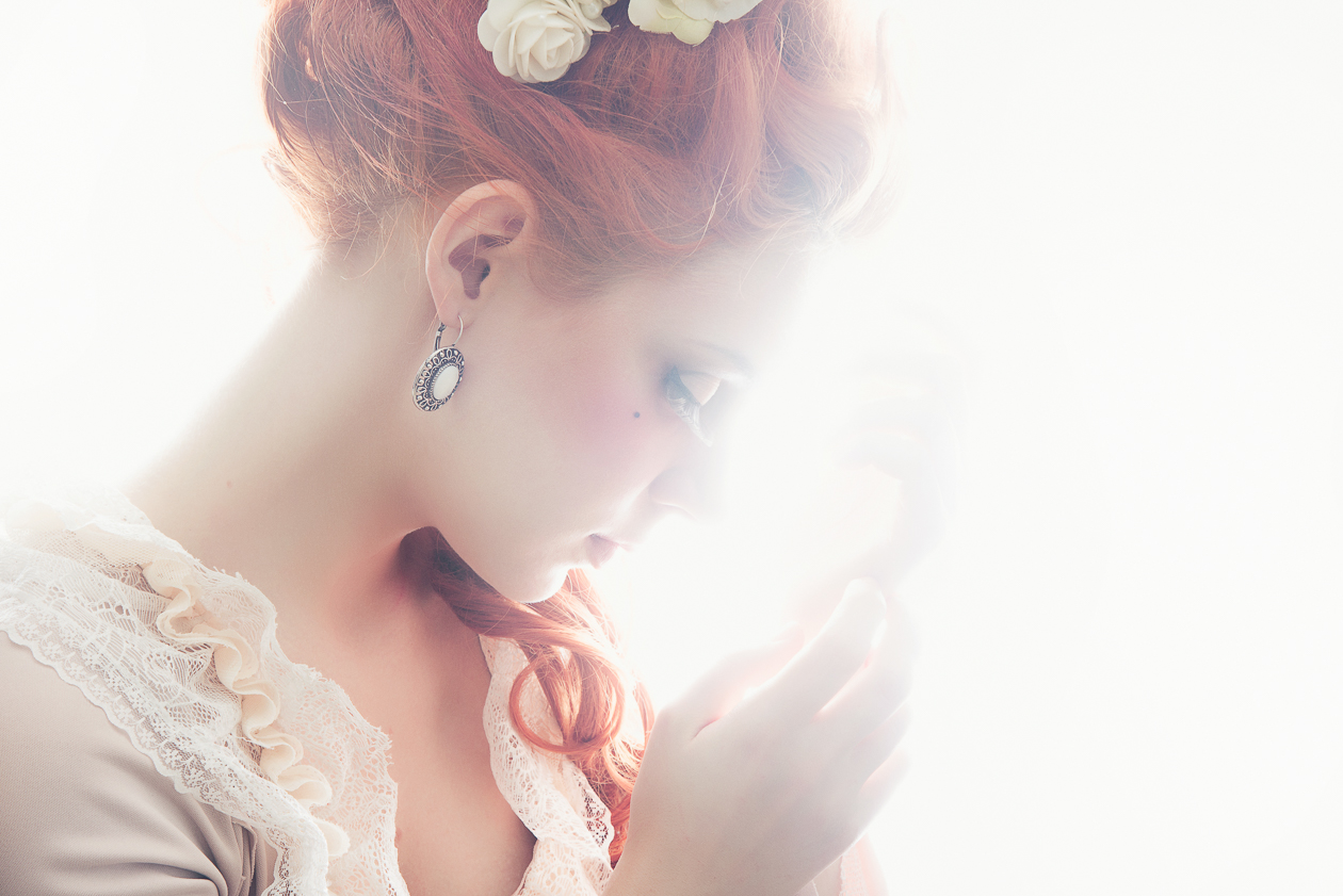
'Sara' by Tomek Dyczewski
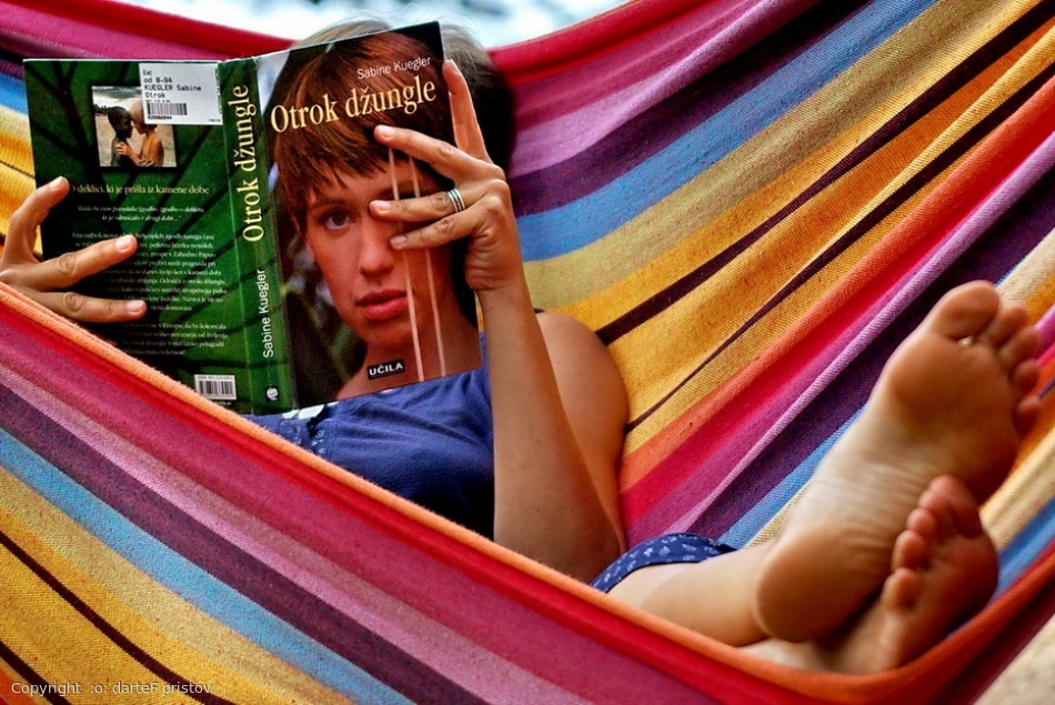
'in book' by :o: darteF pristov
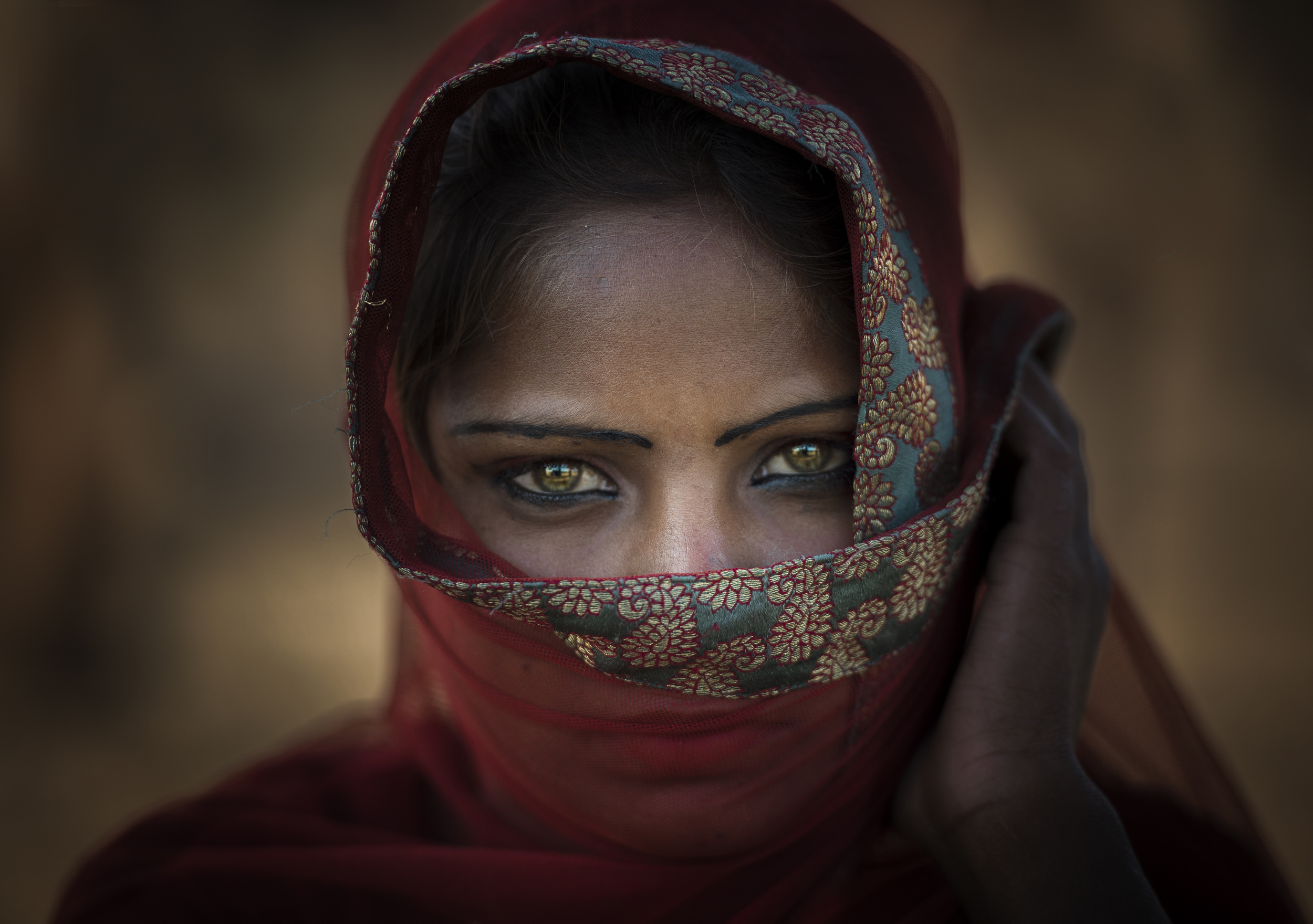
'Captivating Eyes' by Rana Jabeen

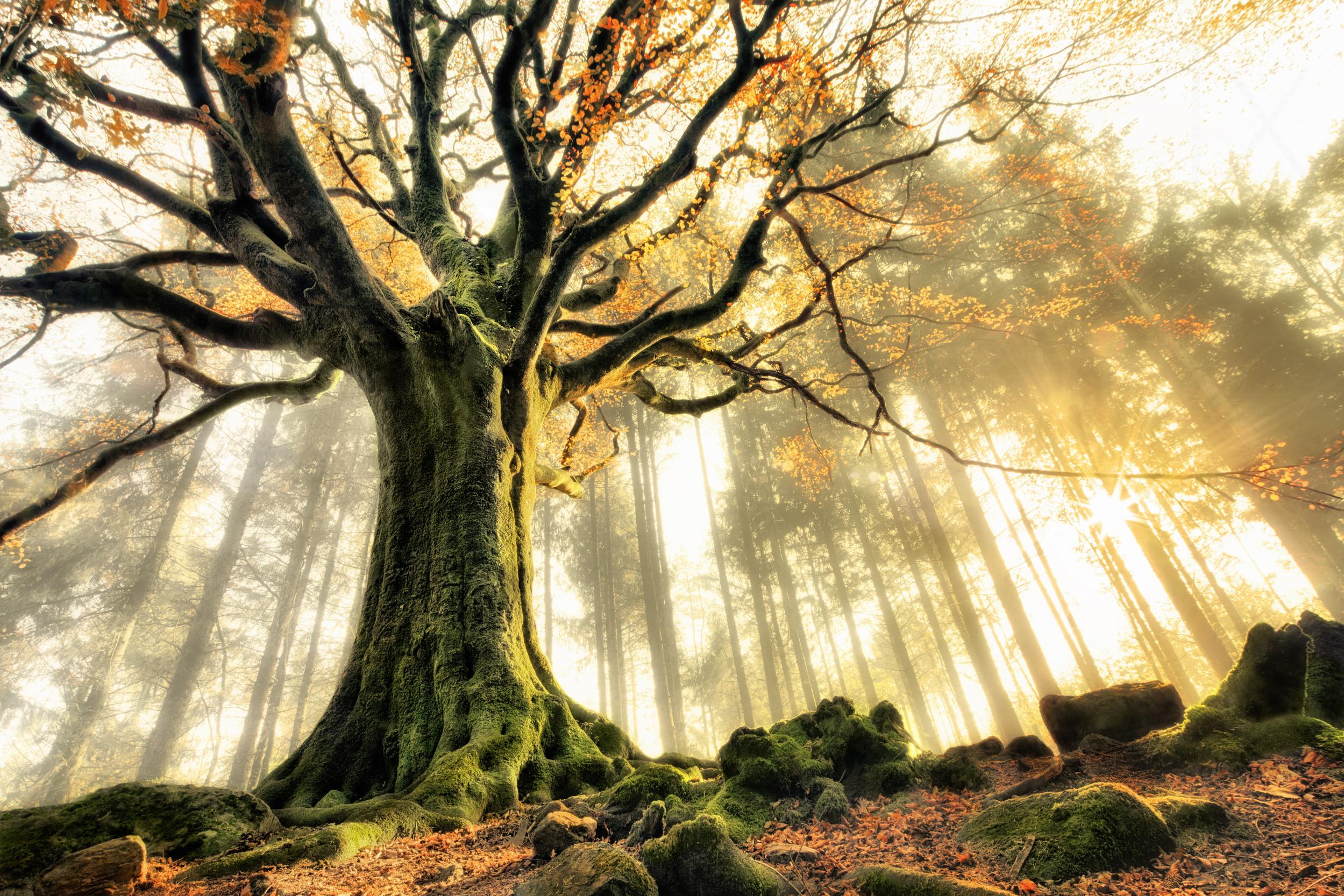
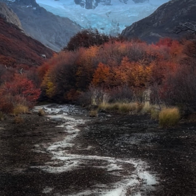
'First Autumn' by Sylwester Szymanski
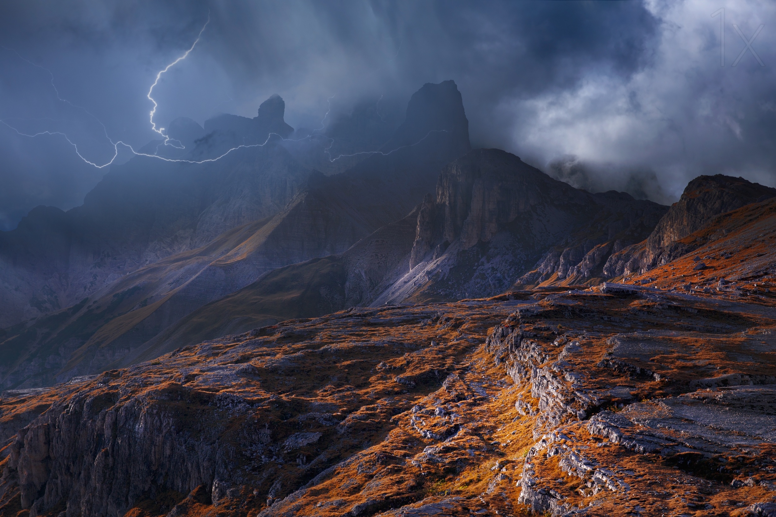
'Bergwetter' by Nicolas Schumacher
'Bohemian' by Ravena July
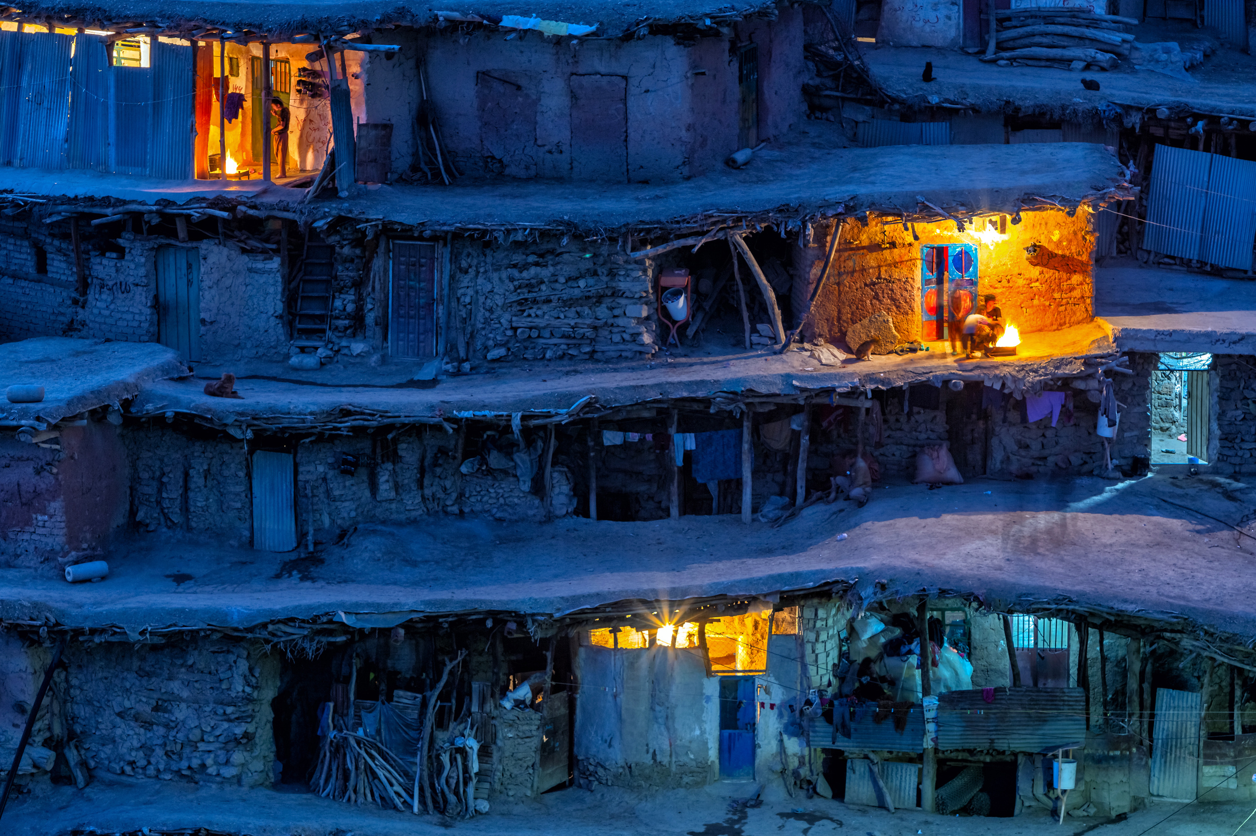
'Around the fire' by Mohammadreza Momeni
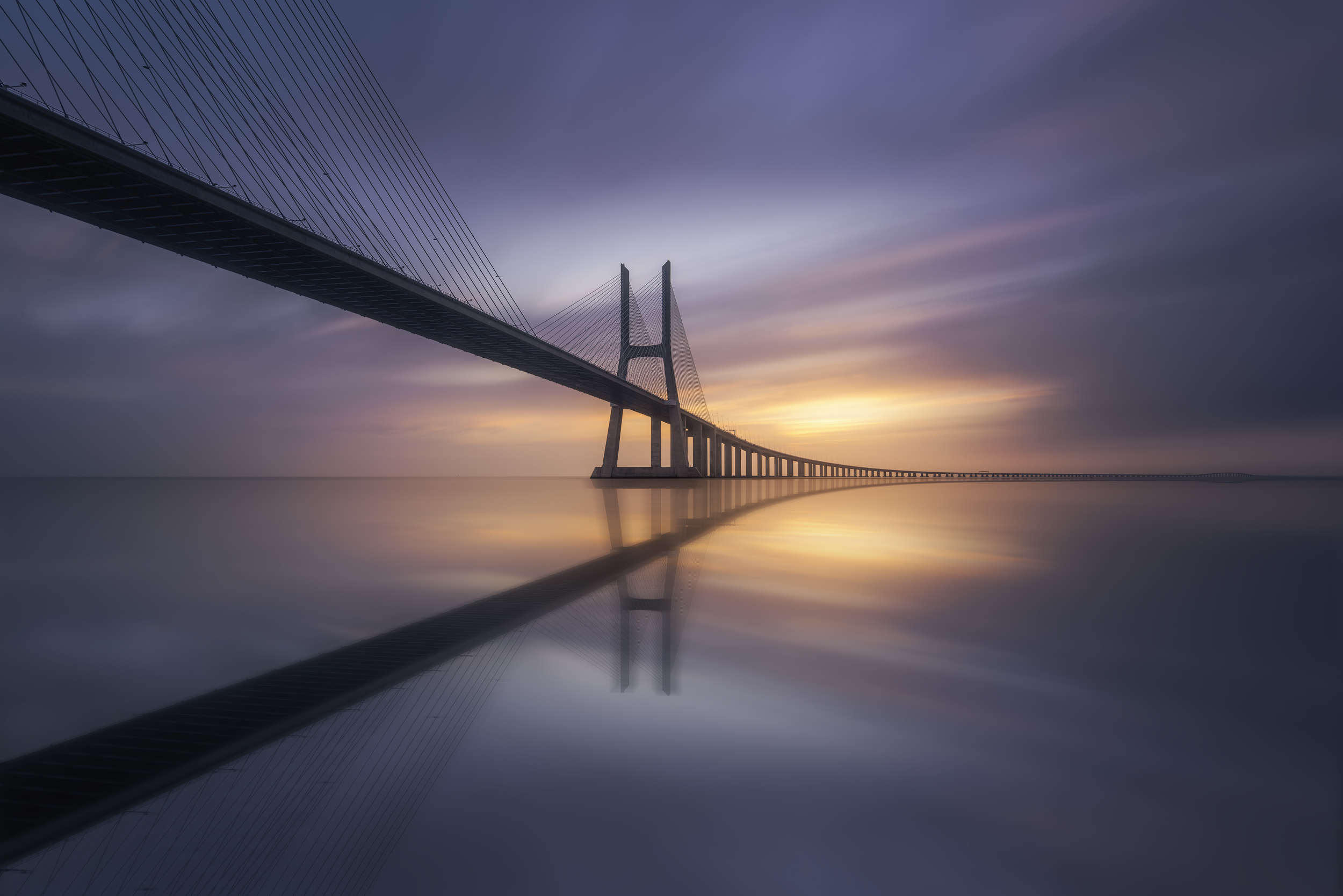
'Sunrise bridge' by Jorge Ruiz Dueso
'Blue hour' by Anton van Dongen
'The power of calm.' by Slawomir Kowalczyk
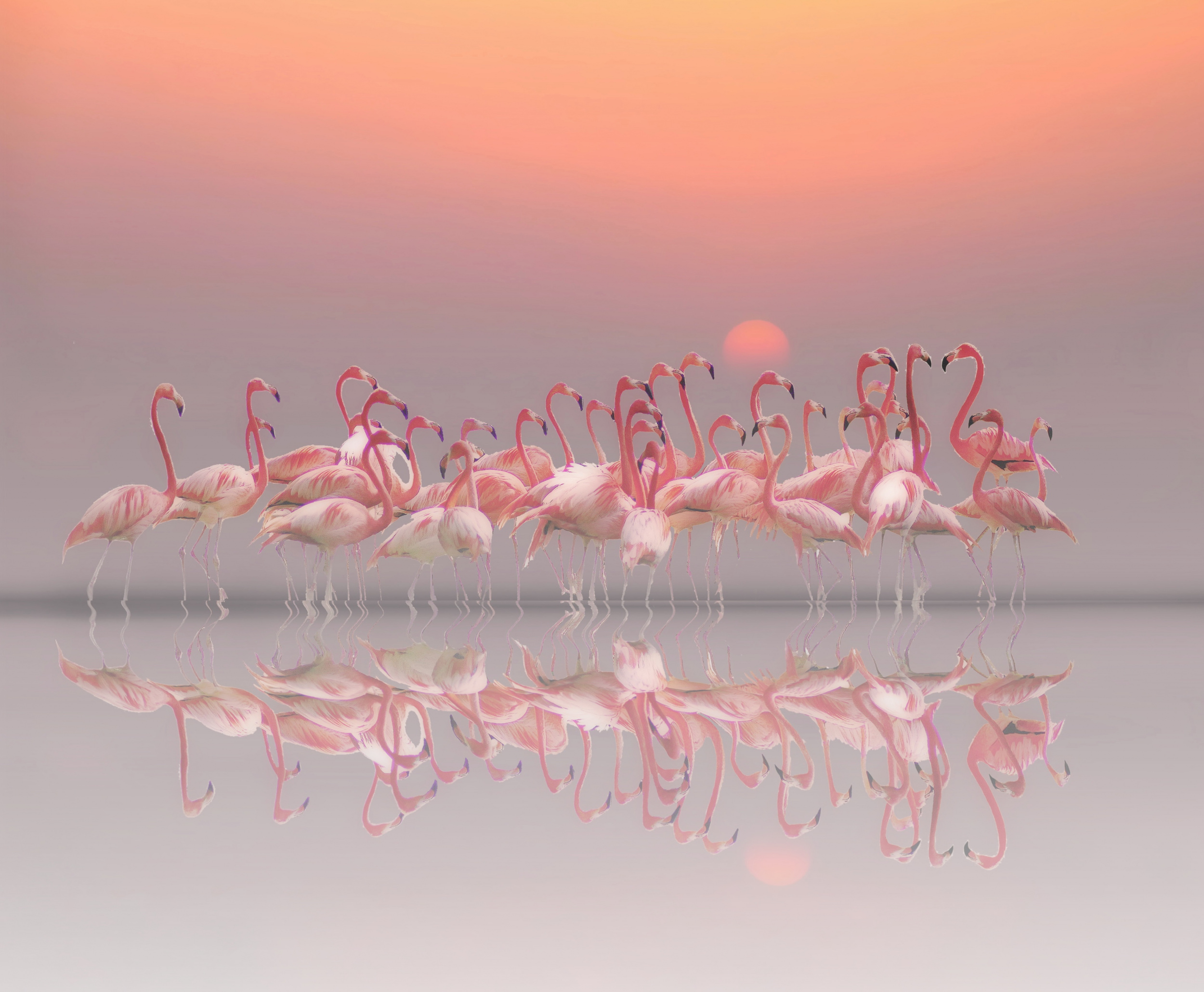
'meeting before sunset' by Anna Cseresnjes
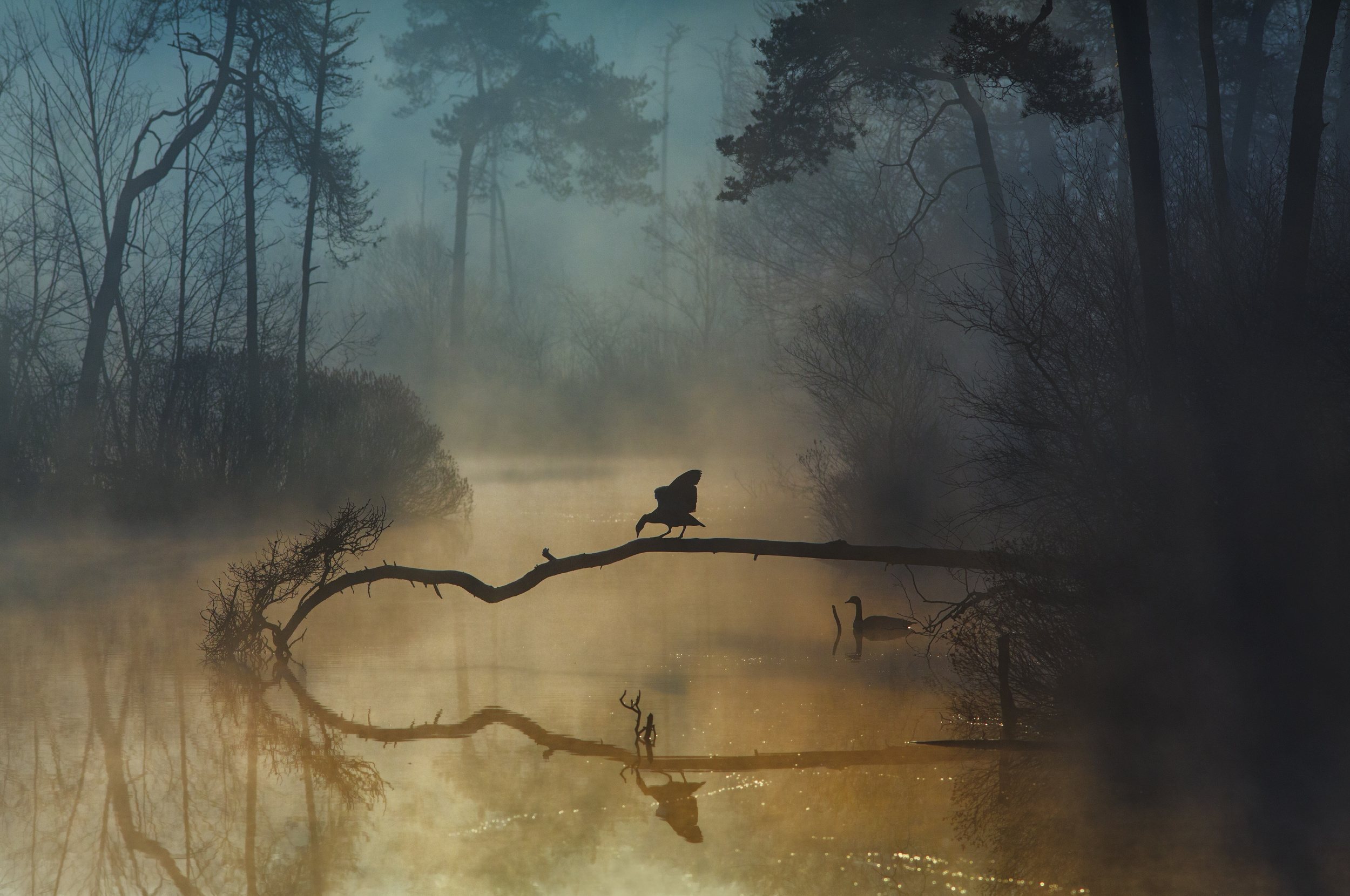
'November' by Christophe Kiciak
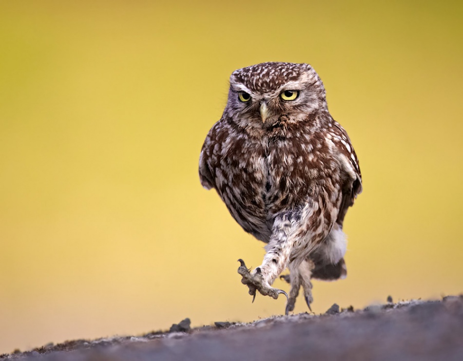
'A Little Owl out for an evening stroll' by Austin Thomas
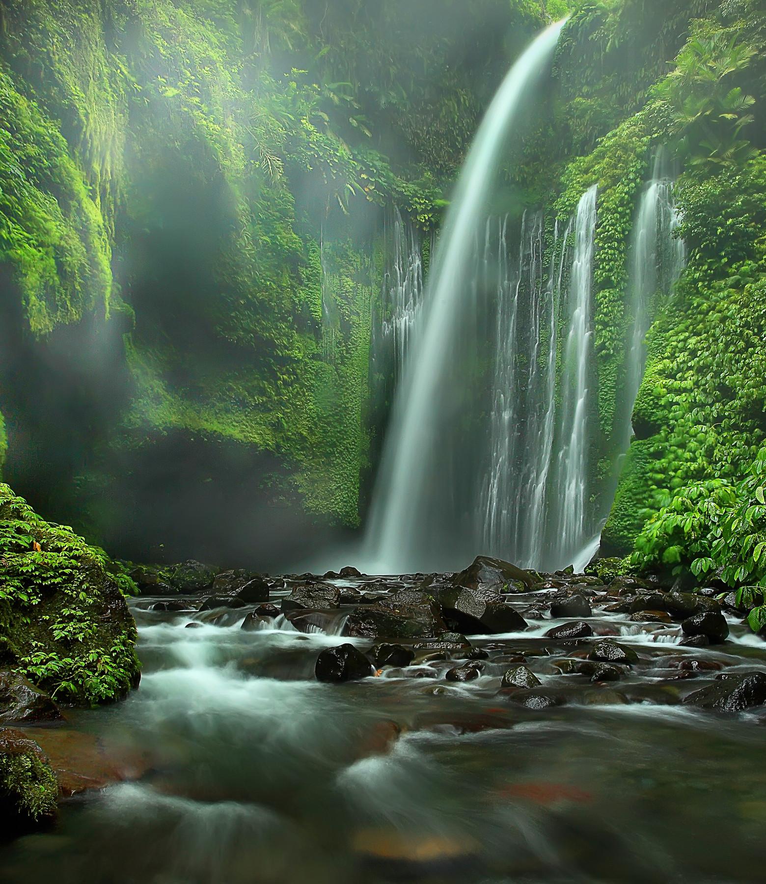
'Tiu Kelep' by Adhi Prayoga
'Gentle Touch' by Henrik Spranz
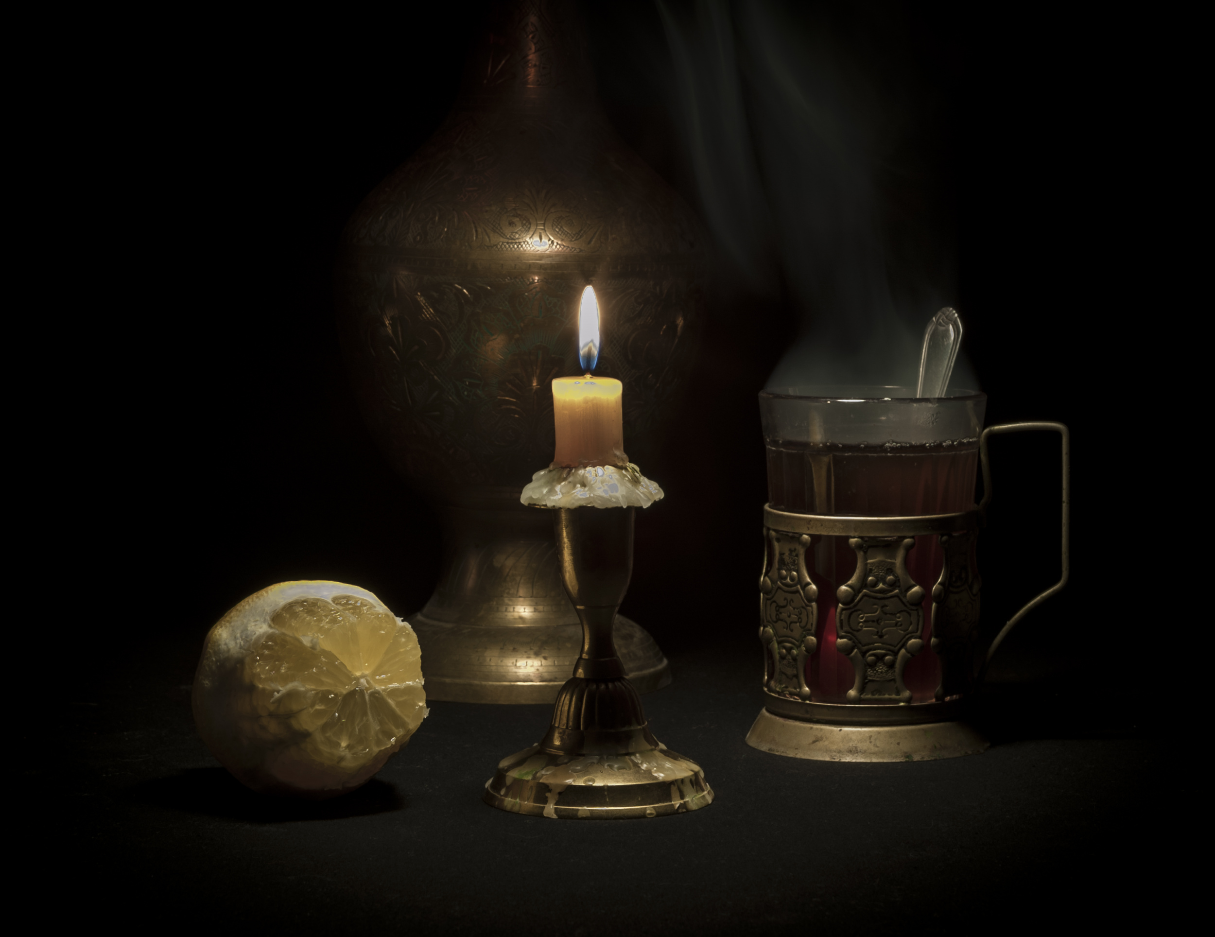
'Still life in dark tones' by Viktor Cherkasov
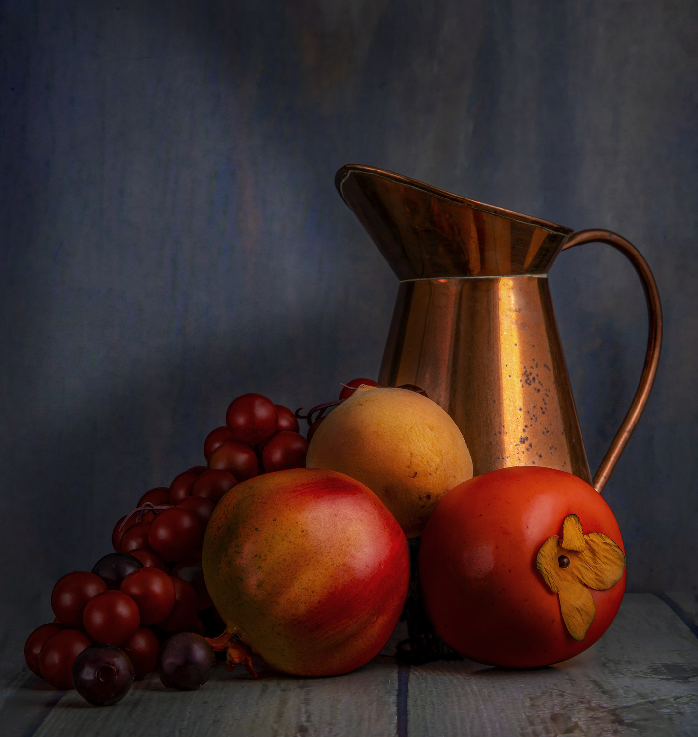
'Still Life with Fruit' by Lourens Durand
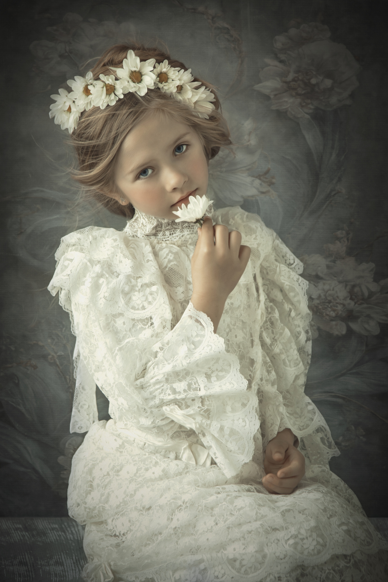
'Little polish girl' by Carola Kayen-Mouthaan
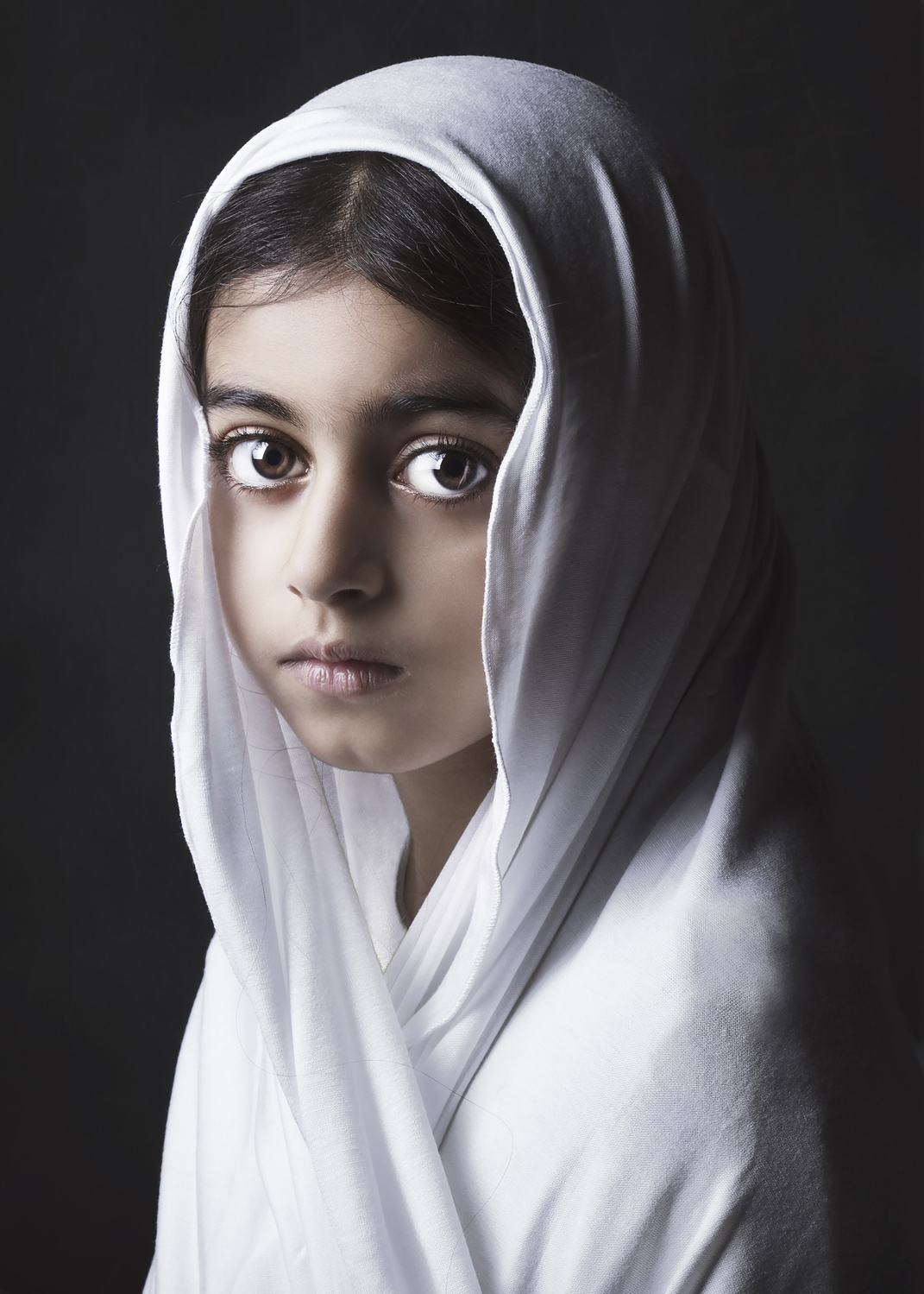
'MALAK' by Fadhel
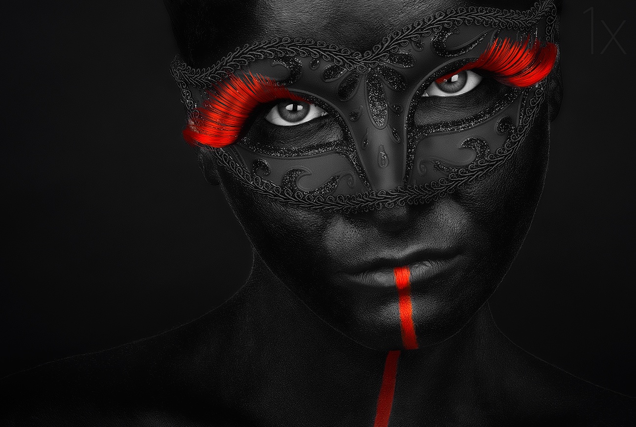
'Dark Passion' by Petko Petkov
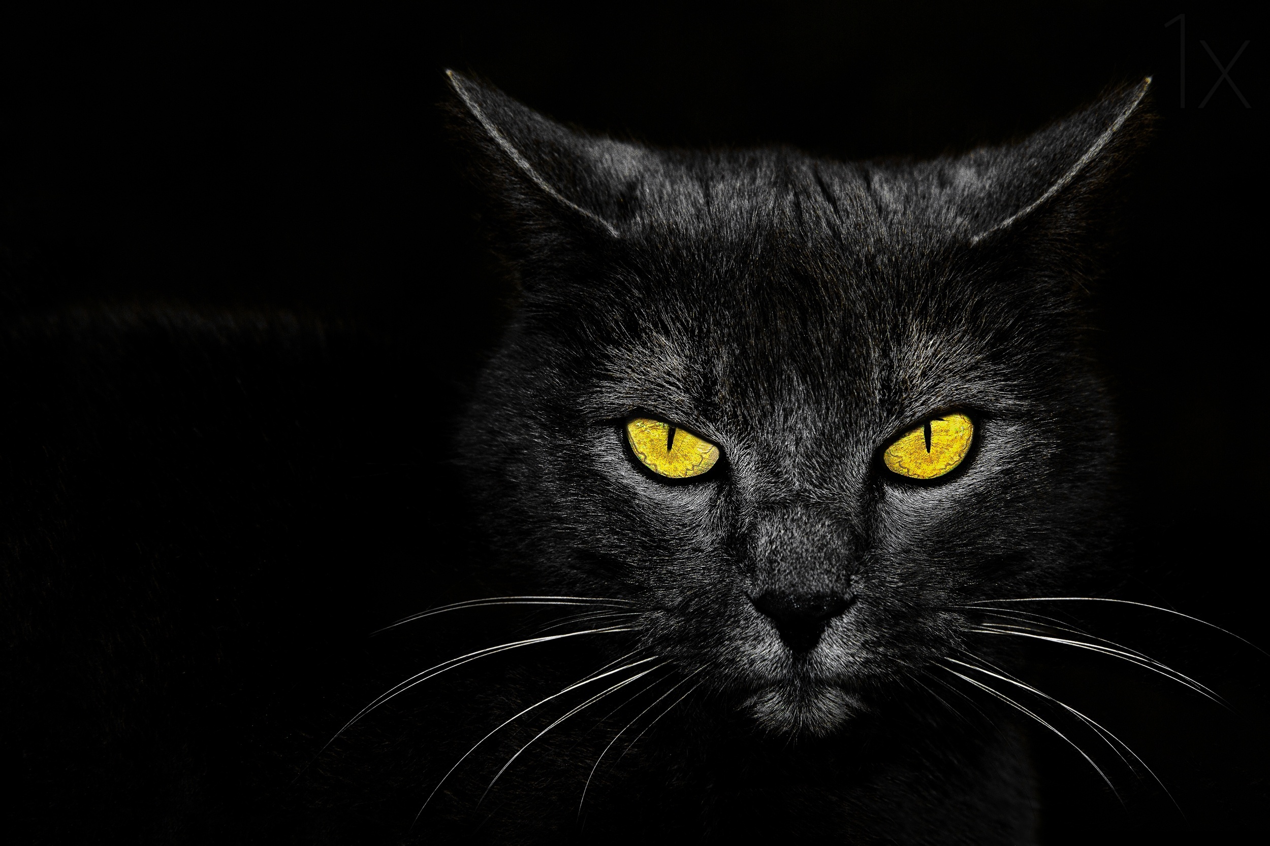
'Black Cat' by Davorin Baloh
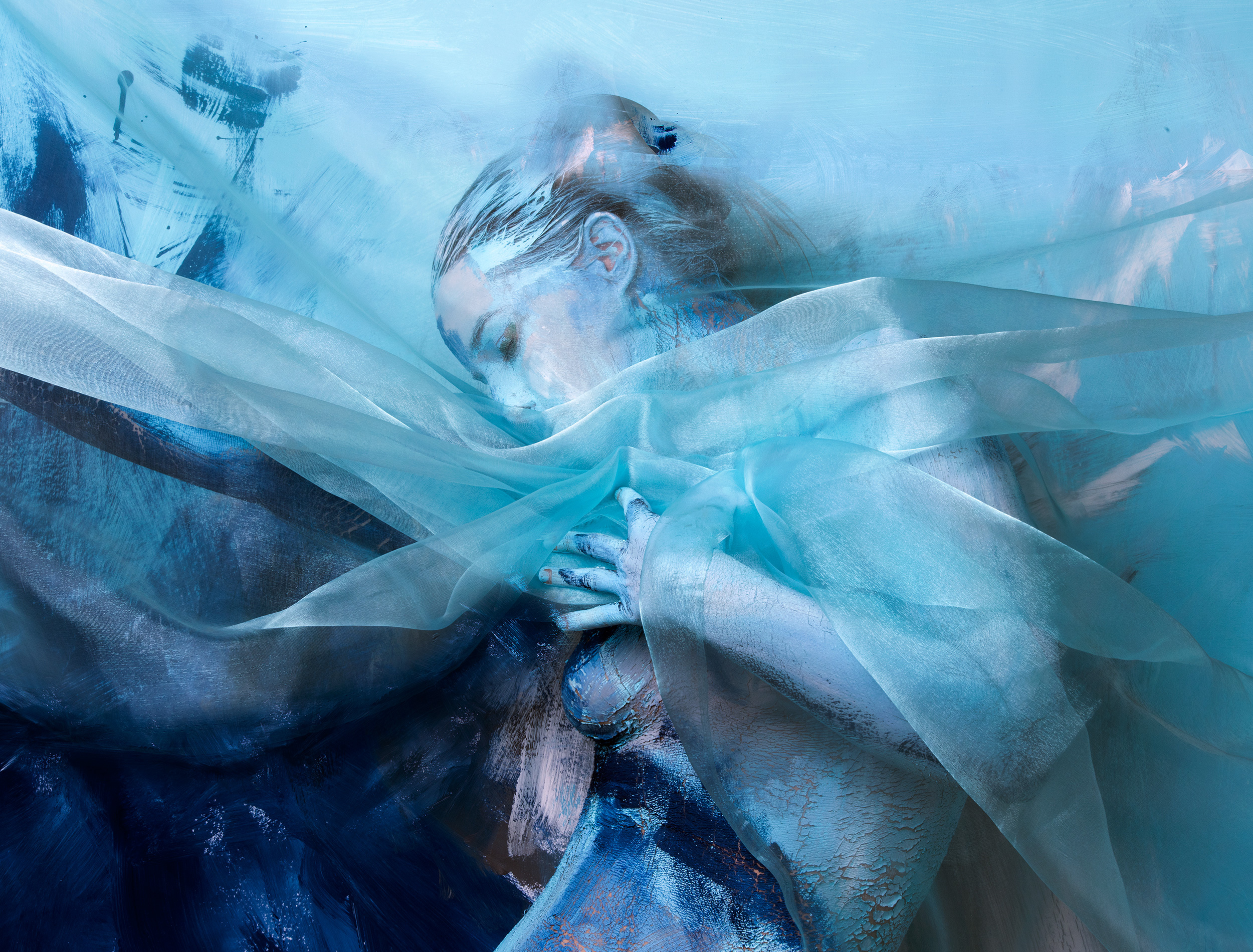
'Dreams' by Edith Hoffmann
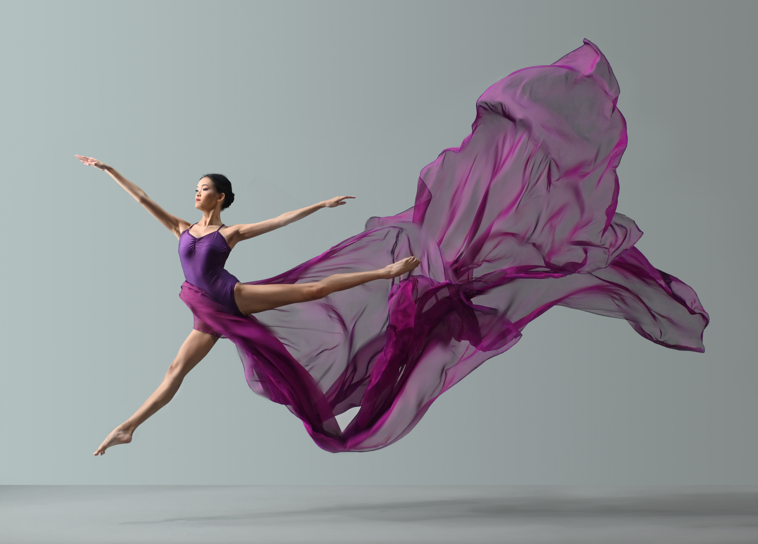
'Purple jump ballerina' by Rawisyah Aditya
'My Days' by Levente Szabo
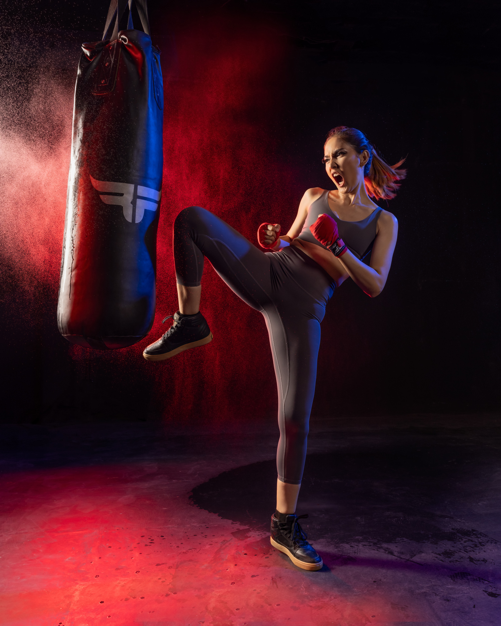
'Indri Boxer' by Lisdyanto Suhardjo
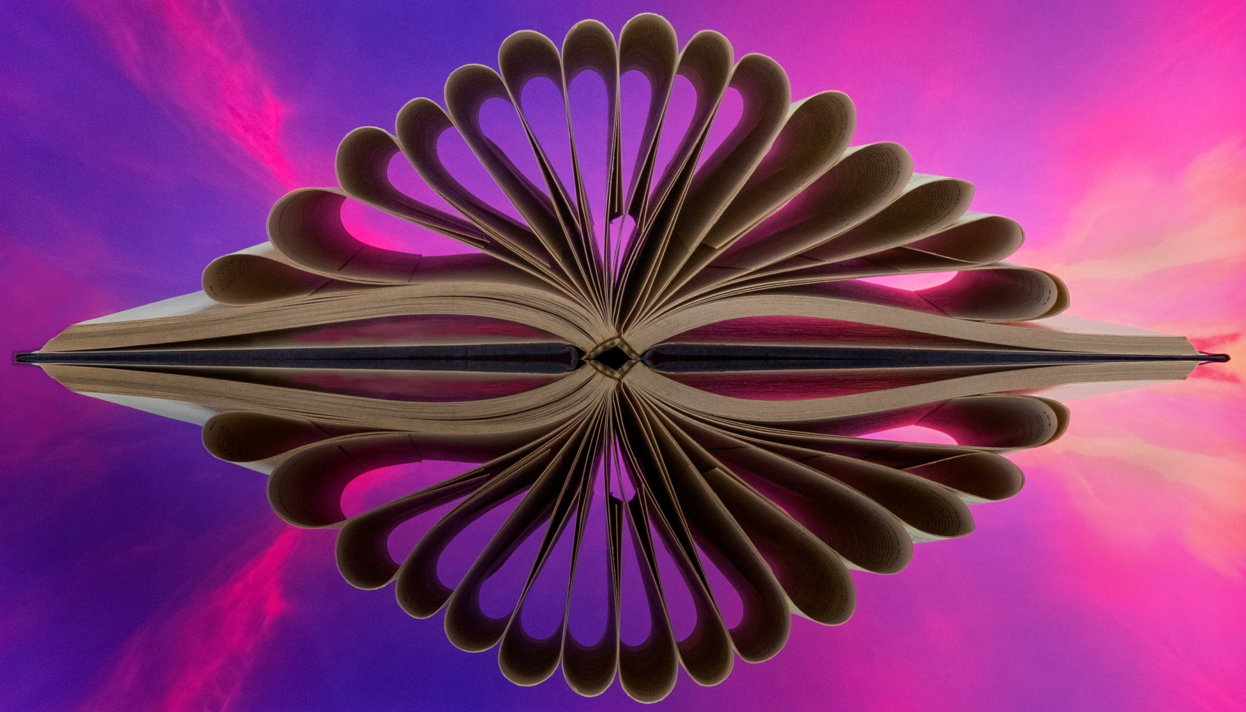
'An Open book for self reflection' by Pang Teng Lin
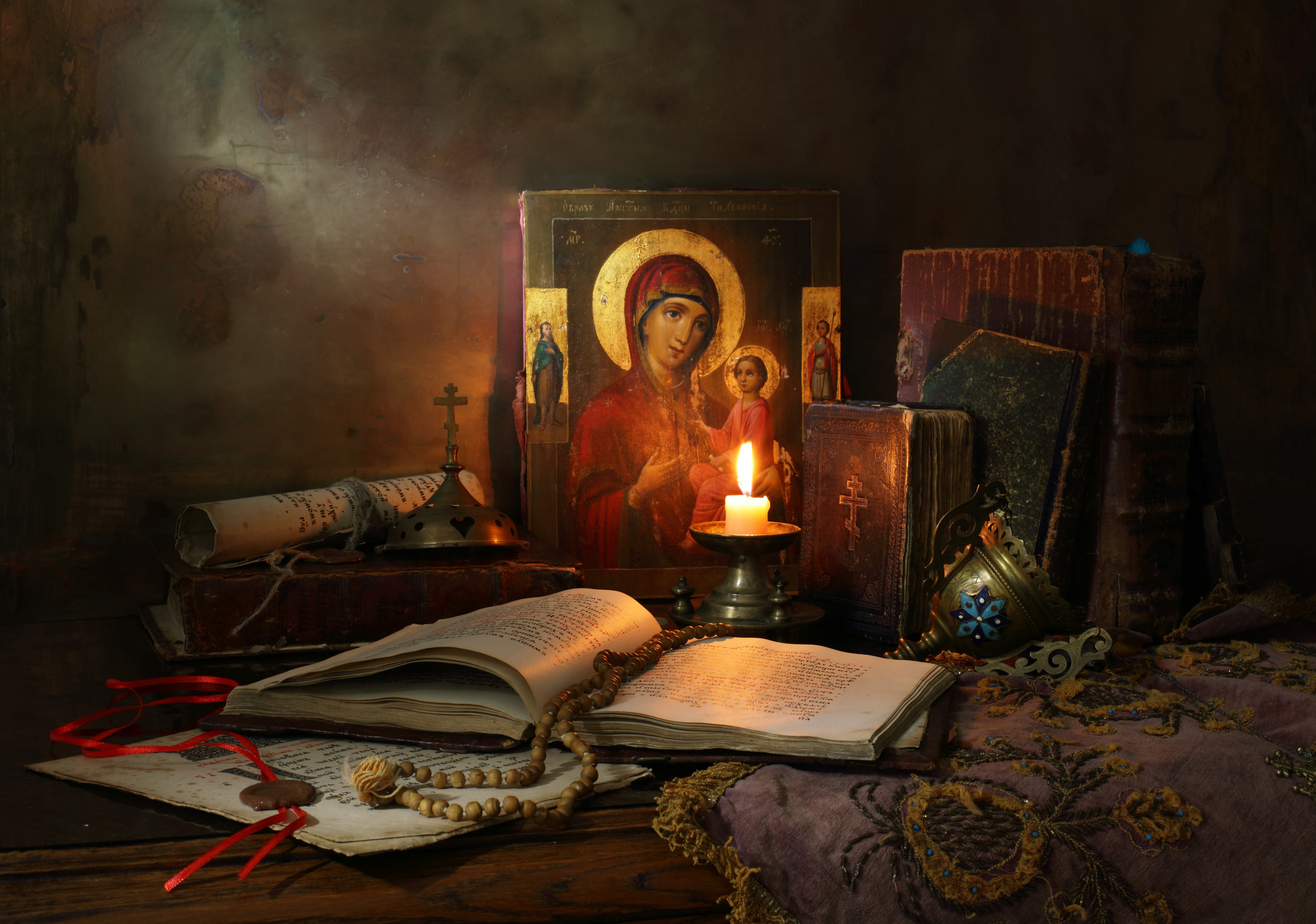
'Still life with icon' by Andrey Morozov
 | Write |
 | Davorin Baloh CREW 🙌🫶🫶❤️ |
 | Lourens Durand CREW Thank you! |
| | Davorin Baloh CREW |
| | Davorin Baloh CREW 🙌🫶🫶❤️ |
 | Marita Beneke Wow makes you think again. Great, simple article with fantastic images. Certainly makes you think out of the box!
|
| Lourens Durand CREW Thank you Marita! |
 | Ludmila Shumilova PRO Very enlightening and inspiring article! and what a magnificent gallery of images to support it! Thank you for these moments of delight. |
| Lourens Durand CREW Thanks Ludmila |
 | Margaret Netherwood I was looking for inspiration and your article has helped, thanks! |
| Lourens Durand CREW Thanks you so much. |
 | Sudip Ray A very informative and intriguing article. And a truly inspiring collection of images. |
| Lourens Durand CREW Thank you Sudip |
 | Michael Echteld PRO Beautiful and inspiring collection of images. |
| Lourens Durand CREW Thank you. |
 | Ruth Franke PRO very interesting report and wonderful picture examples! thanks for that! |
| Lourens Durand CREW Thank you Ruth. |
 | Bing Li PRO Very intrigue article and brilliant illustrating images . well done. |
| Lourens Durand CREW Thanks Bing Li. |
 | Pang Teng Lin PRO A concise write up with beautiful photos and helpful pointers. Congrats to all photographers. Thank you for choosing my image for this article. |
| Lourens Durand CREW Thank you. |
 | Anita Singh PRO Beautiful stunning images, congratulations to all photographers |
| Lourens Durand CREW Thank you
|
 | Wanghan Li PRO Thank you so much for putting a lot of "work" on us. Very helpful with the beautiful collection along with the information at the top. Appreciate your article very much! |
| Lourens Durand CREW Thank you.
|
 | Viktor Cherkasov Thank you Lourens for a well written article. It's nice to see a beautiful selection of works. And special thanks for choosing my still life. Good weekend! |
| Lourens Durand CREW Thank you Viktor. |
 | Rana Jabeen PRO A very well written and informative article Lourens and impressive photos. Thank you for including my image in the article , Congratulations to author and all photographers. |
| Lourens Durand CREW Thank you Rana.
|