




|
|
|
|


by Editor Wicher Bos
Published the 27th of August 2021
I read somewhere about Marc de Montifaud (1845-1912), an art critic and author, describing Olympia, a masterpiece painting inspired by Manet’s work, he said: “Mr. Cézanne merely gives the impression of being a sort of madman, painting in a state of delirium tremens.” Paul Cézanne, or rather all the Impressionists. Over 100 years after that first exhibition Cézanne is still a celebrated artist and his paintings worth millions on the art market.
This article was triggered by noticing some disappointed photographers on various forums. One of the reasons seems to be their style didn’t match the taste (or perhaps expectations) of the forum community. Debates were fierce… As a result, many left… some others tried to educate the community however only very few succeeded doing that… and be accepted…
What could be a cause?

'The uncompromising man...' by Adam Bartončík(Portrait)
Let’s explore the ideas about Artistic Taste and Style.
Taste is the personal preference of the viewer, either natural, spontaneous or educated by knowledge or social group concepts… to belong… to be part of…
Style is personal preference as it shows in creative choices made by the artist; in various ways, choice of subject, choice of color, choice of concept, … Some photos are made with so much style that I can guess its maker… Often you don’t choose a style - it rather finds you… if you look and review your artistic work created over the past years, you’ll see your preferences and so your style.
Taste and Style are in a way complementary to each other and deeply connected to your own artistic believes, convictions, emotions, and so on… - so, with YOU!
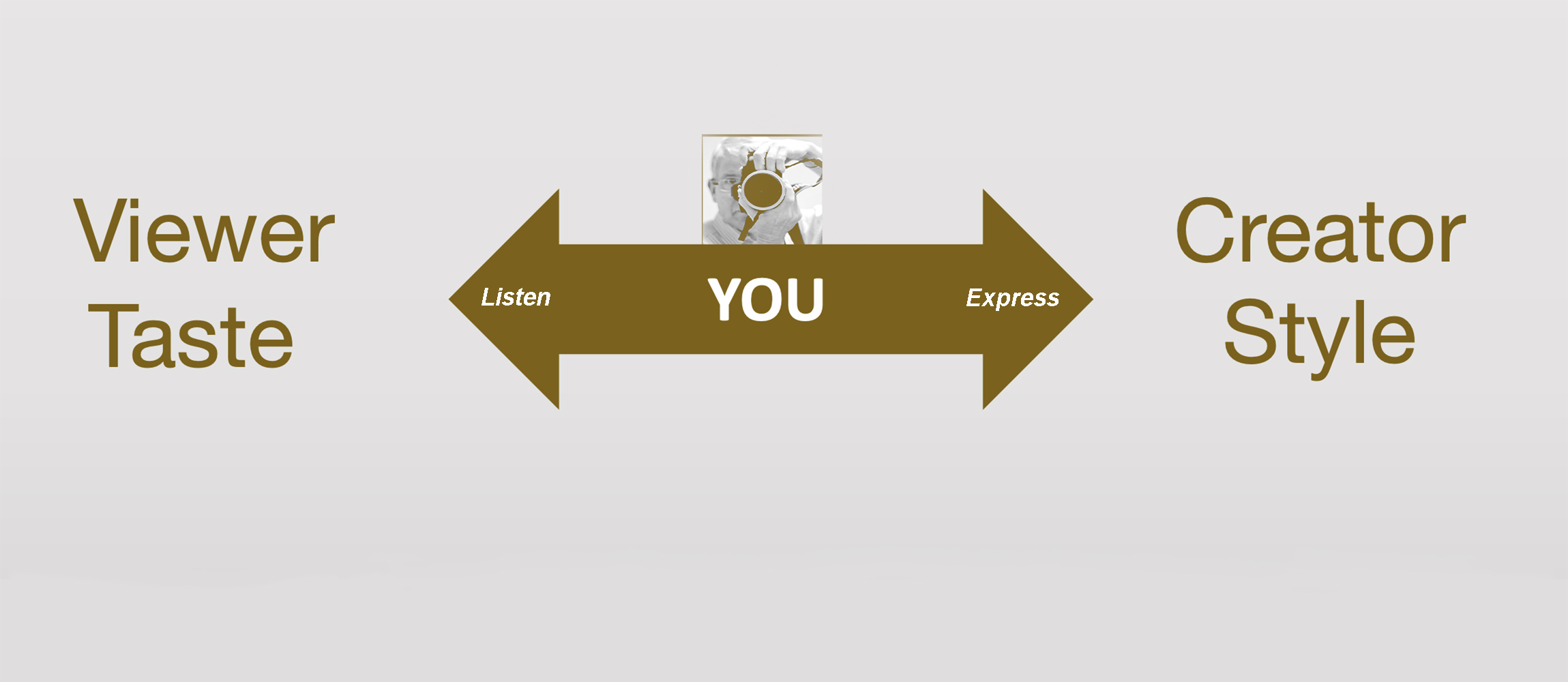
Both, taste and style can change - will change - over time as a result of the people you meet - your social and cultural environment – the given feedback on your work – the studies you undertake, etc…
The (art) critic is just another YOU, often more experienced and/or educated – which makes their advice and judgements a valuable source for learning. However, as the story of Mrs. Marc de Montifaud tells us, they sometimes can be wrong too… or rather have a different preference for style.
For any photographer wanting to learn is the key to progress. At the same time, experience tells us we are poor judges of our own work; we often overestimate our abilities and the quality… this judgment is influenced by cultural factors too… It makes your exposure to critiques and feedback key.
Test it yourself: Go to a photo exposition and hang around a particular photo that you like or dislike, and listen how different viewers see the image, the diversity of why they (dis-)like it, etc. Don’t chose your own photo for this experiment, because you are too emotionally attached and you will start defending the choices you made, and why they are wrong… it will block your learning… Just listen what others see and say…
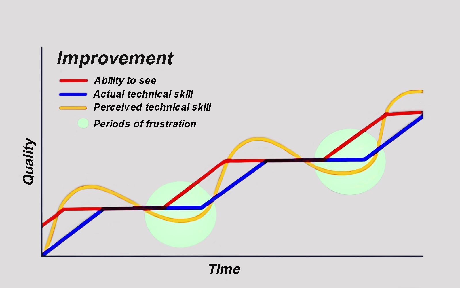
Next step will be to apply this. Sycra Yasin, an artist and art instructor, created an insightful drawing about this process. It shows first you need to train yourself in seeing, then the technical ability to execute your mental vison. Prepare yourself for periods of frustration but push on, you will get there in the end. A moment of recognition at least for myself.
I hope this article will help you to understand viewers, creators, curators and critics… that’s why I personally like the “photographer of the week” articles very much, these articles reveal the artistic style of the featured photographer and some of the aspirations of the YOU-person creating them…
“Interpretation is the revenge of the intellectual upon art.” ~ Susan Sontag
Now for my own taste, let me present a selection of the photo’s I marked as favorite - from the time I joined 1x.com - perhaps it reveals something about me too. I asked myself several time why do I like this image so much? Often, I really wonder, in some cases I admire the skill and creativity of the photographer knowing I might never be able to create such a beauty. To me browsing my favorites works as a mirror and a challenge at the same time.
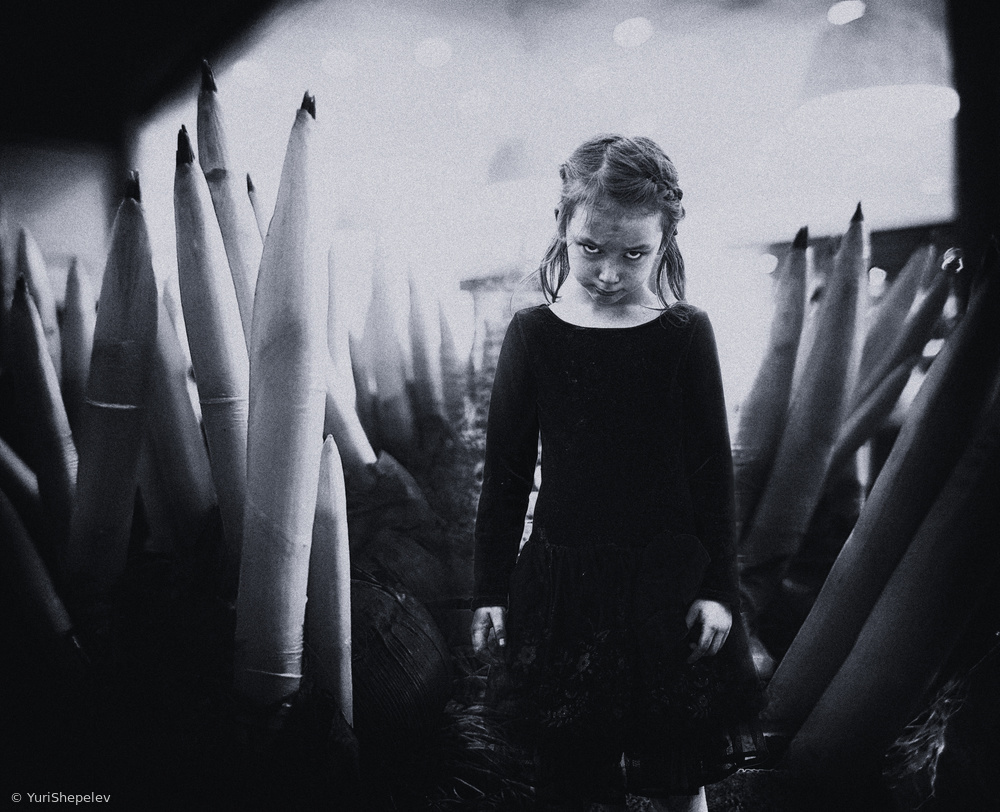
'Grace' by Yuri Shepelev (Conceptual)
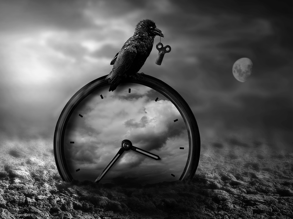
'Night shift' by Ben Goossens (Creative edit)
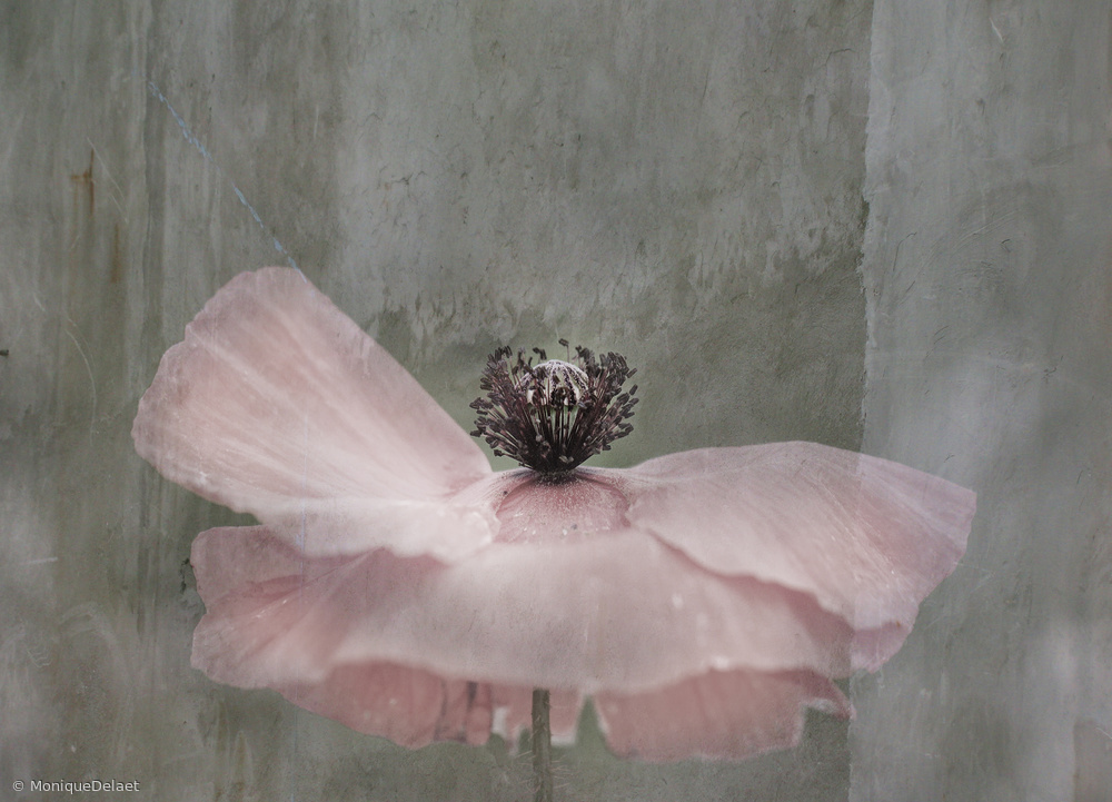
'dancing queen' by Monique Delaet (Conceptual)

'Our Past. Sisters.' by Svetlana Melik-Nubarova (Conceptual)
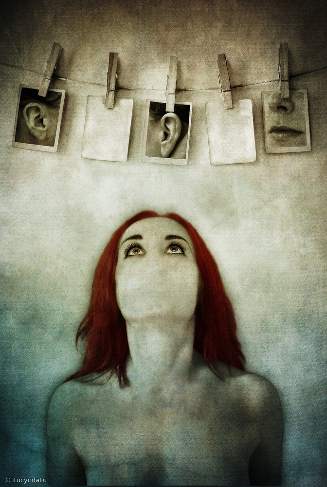
'I'm Looking for myself (part 2) by Lucynda Lu (Creative edit)
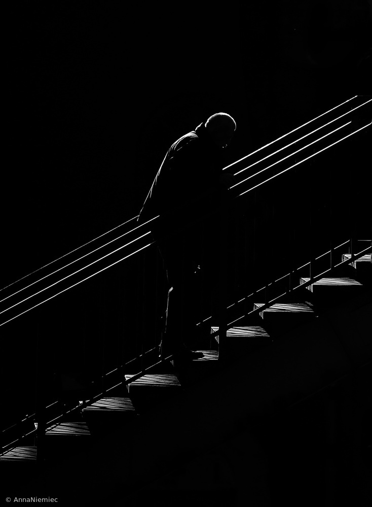
n/t by Anna Niemiec (Abstract)

Black Sorrow' by Mohammad Shefaa (Documentary)
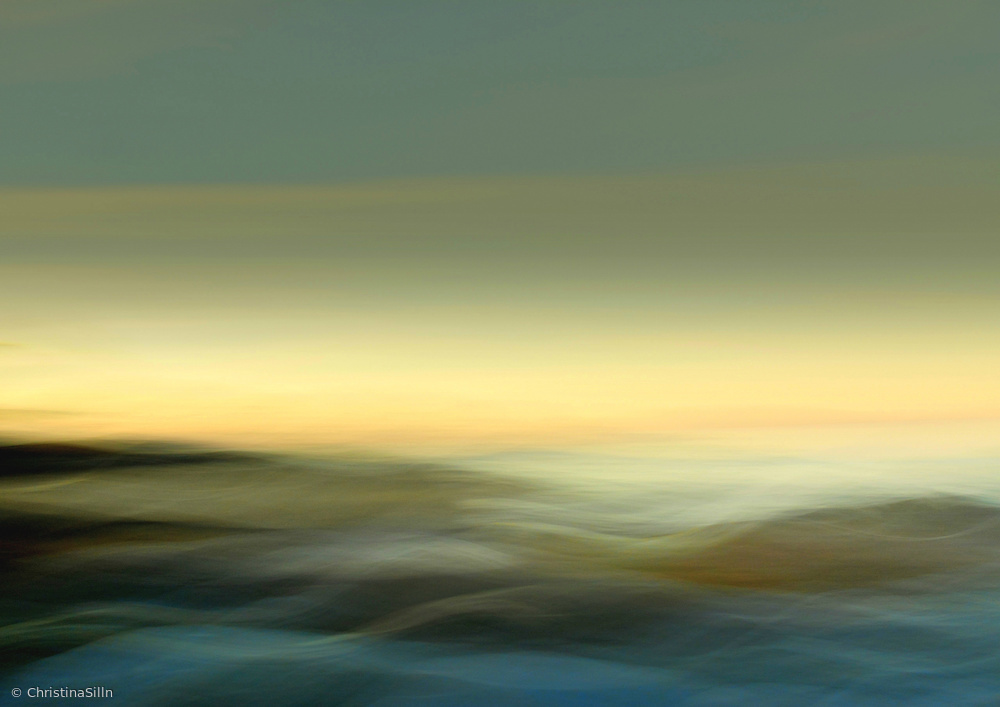
'Shades of morning' by Christina Sillèn (Abstract)
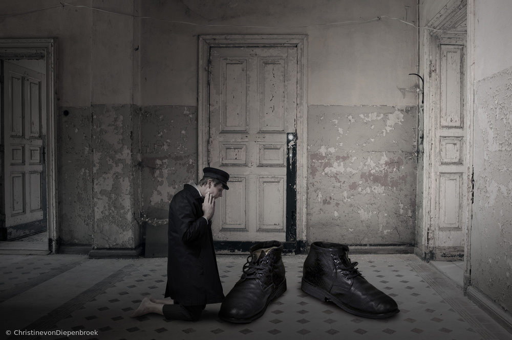
'Oversize II' by Christine von Diepenbroek (Conceptual)
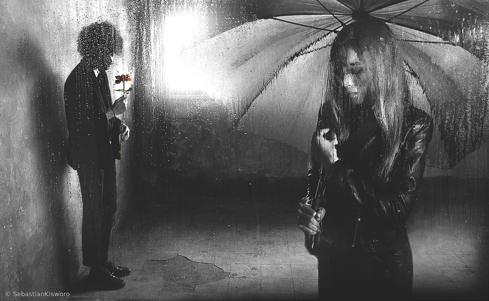
'Apology' by Sebastian Kisworo (Mood)
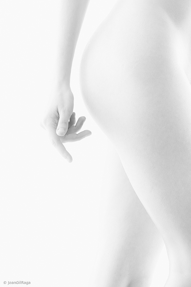
'Nude soft' by Joan Gil Raga (Fine Art Nude)
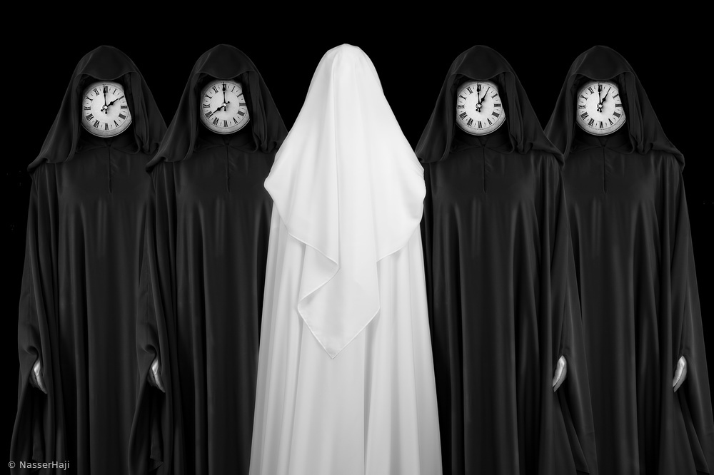
'Clocks' by Nasser Haji (Conceptual)
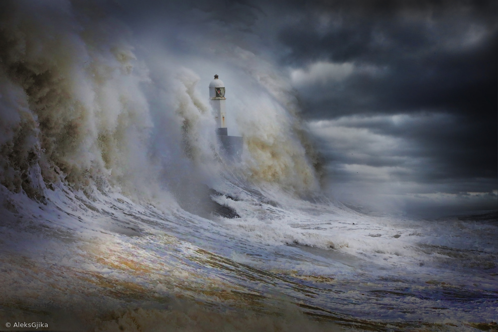
'Storm Force' by Aleks Gjika (Landscape)
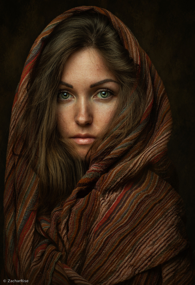
'Oksana' by Zachar Rise (Portrait)
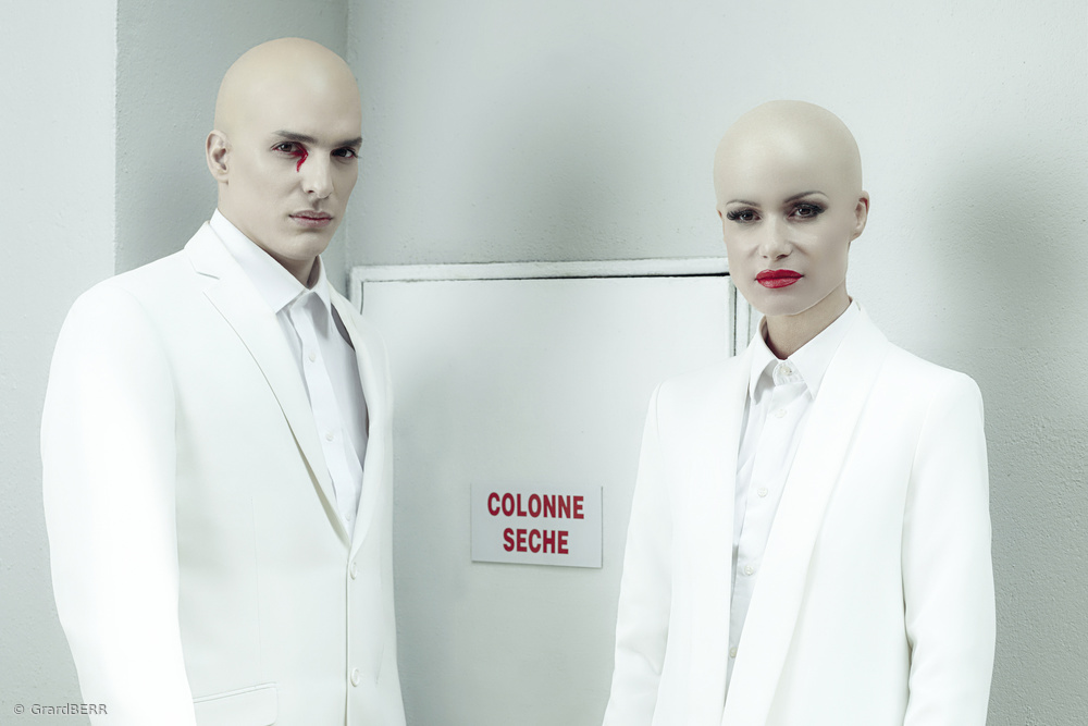
'Colonne sèche' by Gérard BERR (Conceptual)
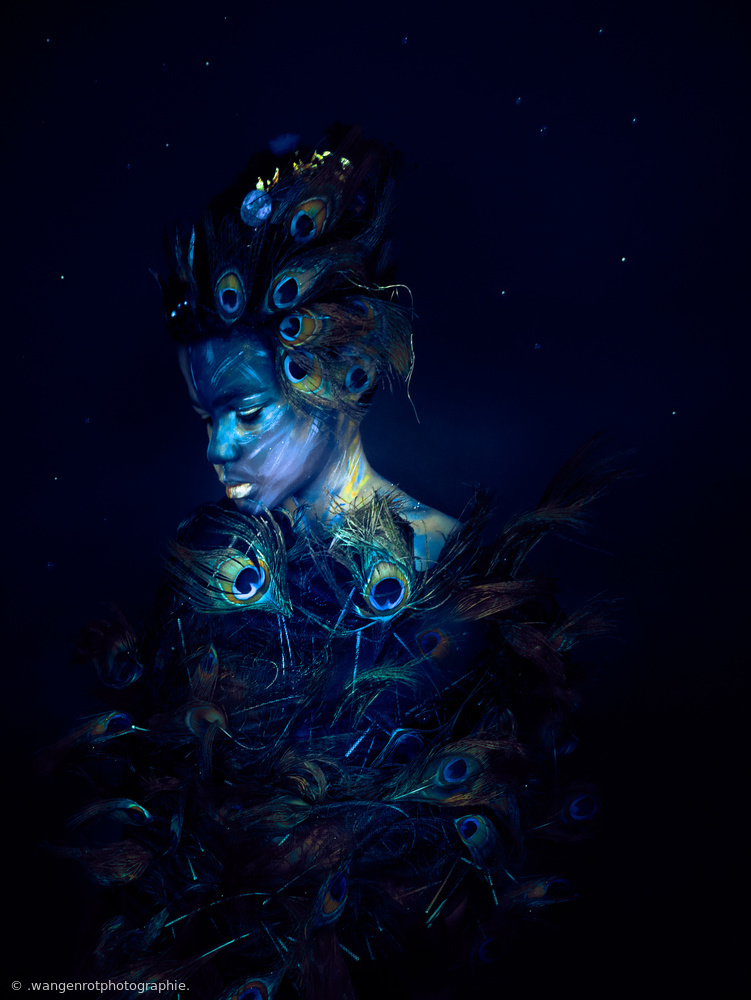
'the little peacock' by . Anja Diabaté . (Portrait)
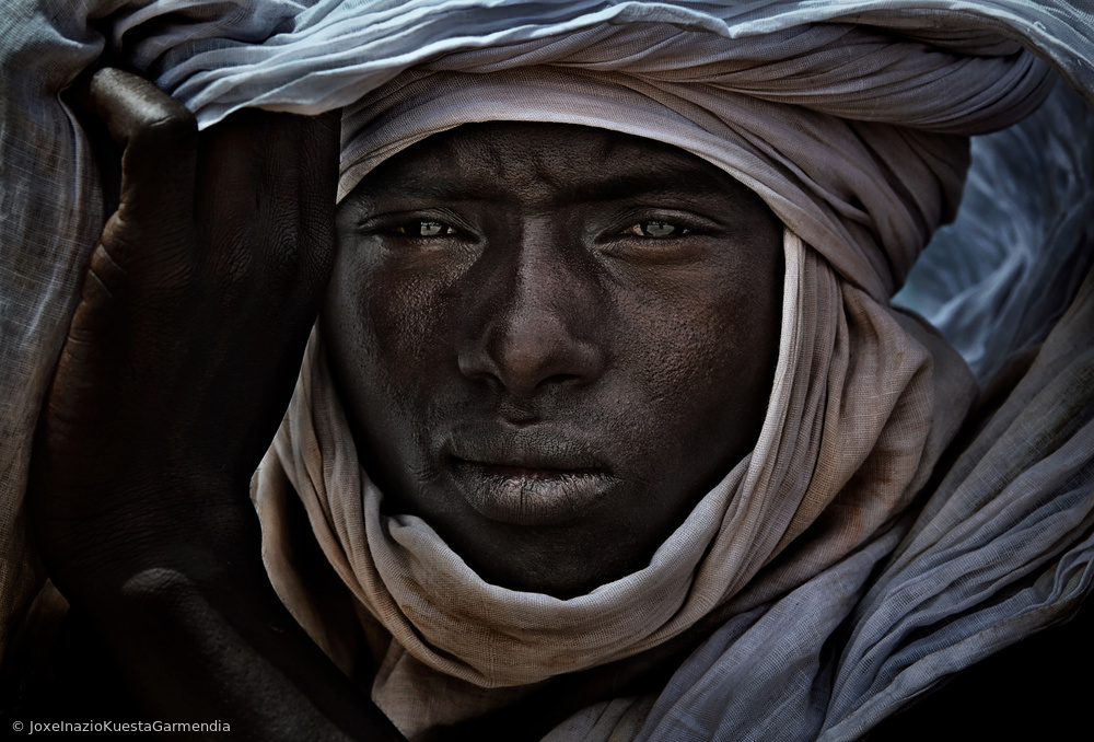
'Peul man watching the gerewol festival Niger' by Joxe Inazio Kuesta Garmendia (Documentary)
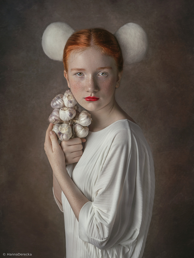
'Zuzanna' by Hanna Derecka (Portrait)
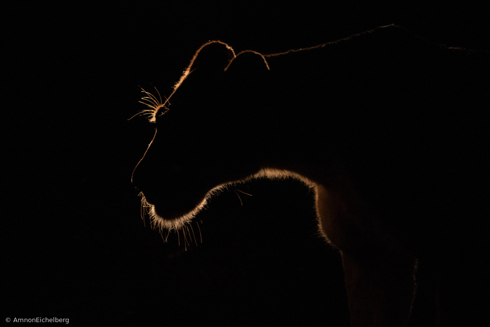
n/t by Amnon Eichelberg (Wildlife)
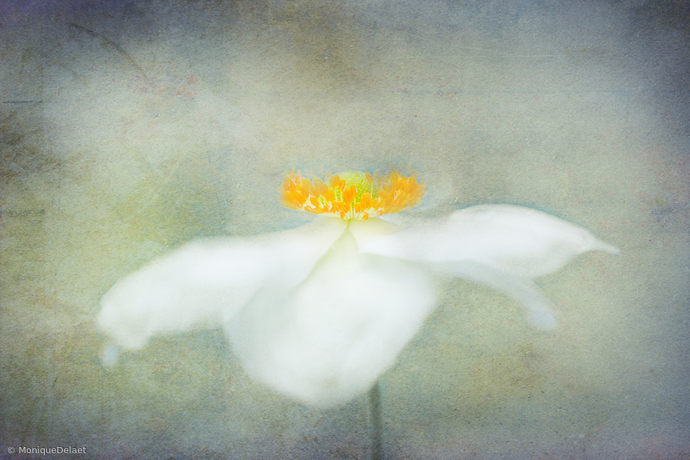
'autumn flower' by Monique Delaet (Creative edit)
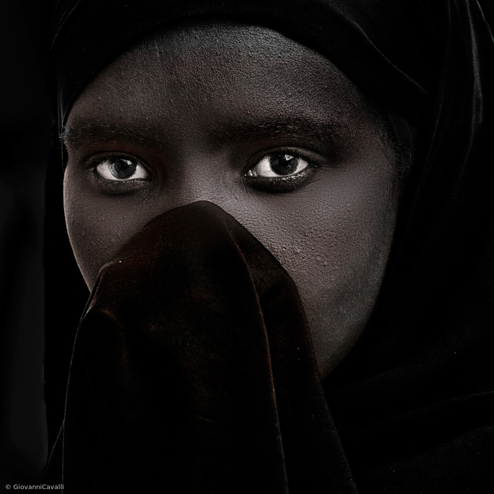
'Series of women street portraits: Ethiopa' by Giovanni Cavalli (Portrait)
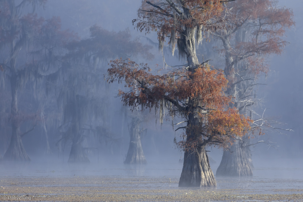
'Texas foliage' by Libby Zhang (Landscape)
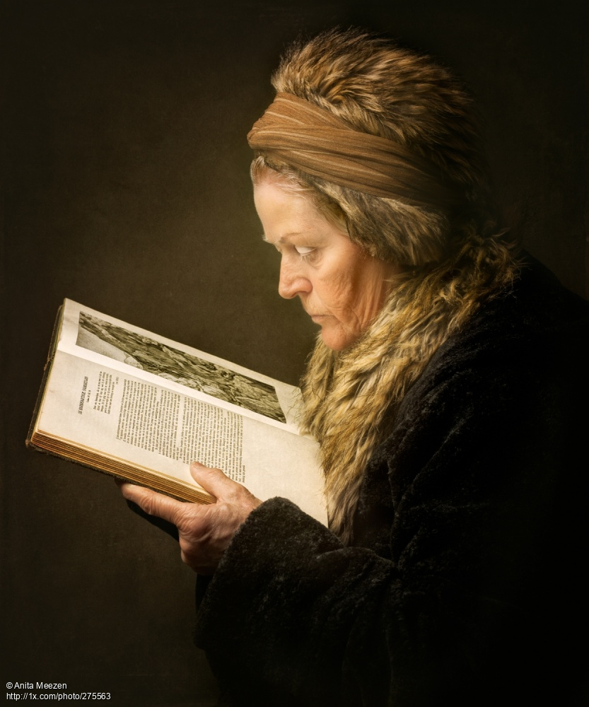
'The Woman Reading' by Anita Meezen (Portrait)

'Burj Khalifa' by Carmine Chiriacó

'Once Upon a Time' by Marek Boguszak (Landscape)
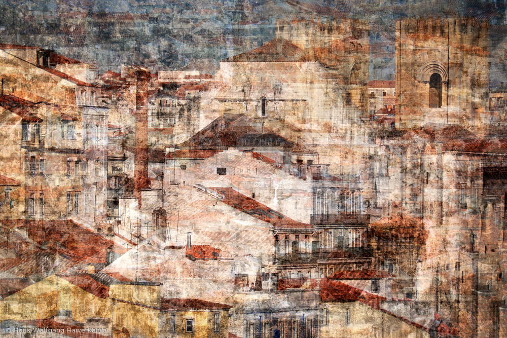
'Lisboa' by Hans-Wolfgang Hawerkamp (Creative edit)
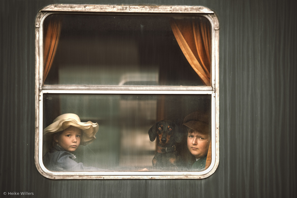
'GOODBYE..' by Heike Willers (Portrait)
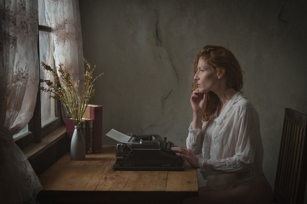
'the author' by Ruth Franke (Portrait)
Do you ever scan through your favorites?
Challenge is a gift, as is good light – your thoughts and feedback are too!
Wicher
 | Write |
 | Dennis Bater I was both surprised and honored to have one of my images included. Thank you so much! |
 | Hanna Derecka O wow, thank You so much! Im honored :) |
 | Marek Boguszak PRO I am honored to be included in this great article, thank you! |
 | Marek Boguszak PRO I am honored to be includd in this great article, thank you! |
 | Fang Tong CREW Great work and article! |
 | Wicher Bos CREW Thx 😀 |
 | . Anja Diabaté . PRO Such honest, deep and enriching thoughts and words. I feel honored to be able to be a part of it.
Heartfelt thanks, dear Wicher!
. Anja . |
 | Wicher Bos CREW Thank you! Anja… 😀 |
 | Charlaine Gerber PRO Beautiful photos! Excellent! |
 | Wicher Bos CREW Thank you Charlaine! |
 | Sayyed Nayyer Reza Spectacular. |
 | Wicher Bos CREW 😀🤩 |
 | Streiff Marcel PRO A wonderful selection, each one a great work ! |
 | Wicher Bos CREW Yes 1x has some true masterpieces in its gallery! |
 | Jacob Jovelou FOUNDER Great article! |
 | Wicher Bos CREW Thank you Jacob! |
 | Serge Melesan PRO Interesting article 👏👏👏 |
 | Wicher Bos CREW Thank you Serge! |
 | Jorge Ribeiro Lume PRO Pedagogia brilhante! Belas imagens! |
 | Wicher Bos CREW Thanks Jorge! |
 | Anna Niemiec PRO Very clever article. For me, the most important thing is to be in harmony with myself. It is not always easy. And the biggest reward when my work is noticed and liked by someone. Thank you for this award. |
 | Elisabeth van Helden PRO I fully agree :D |
 | Wicher Bos CREW 😀 |
 | Hemanta Swain PRO Beautiful and inspiring. |
 | Wicher Bos CREW Thank you 🙏 |
 | Dennis/Picart Liu
Most of points are great.Art shouldn't be constrained in any certain styles and taste in either a forum or a professional website like 1x. Thank you for your sharing. |
 | Wicher Bos CREW 🙏 |
 | Joan Gil Raga PRO Thanks a lot! |
 | Wicher Bos CREW 🙏 |
 | Gerda J. Hoogerwerf PRO Some things make sense and some don’t. This article sure does, thank you for sharing!
I fully concur with Elisabeth’s words. |
 | Wicher Bos CREW 🙏 |
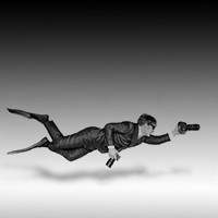
 | Bogdan Bouşcă PRO All featured images are so beautiful and my sincere congratulations for this selection! the "front" image as a promoter is so weak and with extremely lack of impact! awful attempt of power by so in-significant image of HRD man who pretends that can give advises and put the rest on the corner with his authoritarian hdr attitude and fake rule in charge. pathetic old beard man who show us the finger .... as he knows what's going on and we are the humbled stupid students... he's the Master of human secrets and we have to kneel. low level inspiration of the photographer and poor pathetic man model who accepted this fake attitude. the XXI century man. shame ... the direction of symbols and visual are day by day so very low and soon enough we'll lost the essence and meaning of what an image are! apologies for this intervention. The front Cover of this Article is not at all an "Artistic taste and style". not at all.... |
 | Wicher Bos CREW Life is complicated Bogdan…🙏 |
 | Biao Huang PRO 非常精彩的图片和文章,感谢! |
 | Wicher Bos CREW 谢谢! Thx (I used google translate hope it did a good job ;) |
 | Elisabeth van Helden PRO Thank you Wicher for this article. It is indeed sometimes a struggle to find balance between 'being liked' and pushing myself to go explore 'other' possibilities: creatively, technically, emotionally to find my own creative path (and not always get the recognition :D). And it helps to know that I am not the only one. I admire some artist that seem to have reached that (artists that post after post have a consisting style, technique and you can recognise their work), but I am sure it took a lot of hard work to get there. |
 | Wicher Bos CREW Thanks, I am truly grateful to be of help. |
 | Yuri Shepelev PRO Thanks ! |
 | Wicher Bos CREW :) |
 | Franz Engels PRO Powerful inputs, thank you very much, Wicher, for sharing your experience and your favorites! |
 | Wicher Bos CREW Thank you Franz! |
 | Hans-Wolfgang Hawerkamp PRO
a very valuable article on the current situation in 1x.com. In addition, a very successful selection of high-quality artistic images. I am pleased that one of my works is included. But it also shows how seldom some of the photographers published here show their work here at the moment. I wish nothing more than that, as in the past, top-quality artistic photography will be shown on the 1x.com homepage. I would like to thank the editor Wicher and Yvette for the article. Hans-Wolfgang |
 | Wicher Bos CREW Thanks Mike for this complement! I am truly grateful to be of help. |
 | Wicher Bos CREW Hans_Wolfgang my apologies for the copy error... |
 | Yvette Depaepe CREW Thanks a lot for your faithful magazine reading, dear Hans-Wolfgang !!! Yes this is a TOP article ... Wicher is a great editor ! |
 | Yvette Depaepe CREW Excellent writing, Wicher !!! Thank you so much, dear friend... |
 | Wicher Bos CREW Thx Yvette, :) |
 | Mike Kreiten CREW Wicher, this is a brilliant article, thanks for taking te time to create it.
When we (so the tam and I) write critiques, alot of it applies. Fisrt of all we can only share our own vision and very often express it's only that. Senior critics used to have a look at the portfolio of members posting for critique, to get a sense of their skills and preferences. We try to get an idea what memebrs can do from a skill perspective and why their work looks like it does, taste and style. With new 1x, this is often quite impossible, since we can only see the published photos. In case of new memebrs or beginners this is only a subset of waht they do, or even blank. So I think only classic 1x allows us to do so, and I hope it will be maintained for long.
Thanks again and best regards,
Mike |
 | Wicher Bos CREW Thanks Mike for this complement! I am truly grateful to be of help. |