


|
|
|
|
by Editor Wicher Bos
Published the 16th of July 2021
This time a bit of history again.
Breadth of an image, no not width, breadth… have you ever heard it?
When you (as I do) like to understand how composition evolved over time and read historical books in my quest for answers, you will occasionally read about Breadth. Let’s dive in and see if we lost a valuable composition feature over time…

'Amphitrite' by Gabriela Slegrova
WHAT IS IT?
Henry Peach Robinson, wrote: (in 1881 - Pictorial Effect in Photography - being hints on composition and chiaro-oscuro for photographers)
In short, the grand fundamental laws of composition may be summed up very briefly. They are unity, balance, and the adaptability of the whole to breadth of light and shade, by which the principal object in a picture … is brought forward most prominently, yet united with the other parts so that the eye may first see the point of chief interest, and be gradually and agreeably led over the picture.
AND
Some of the finest, effects are those which consist of broad masses of light and shadow. Breadth of effect is one of the most pleasing qualities in art; it harmonizes everything, and will give beauty to the ugliest objects.
Who doesn’t want that?
His contemporary, Alfred Henry Wall dedicated a full chapter to Breadth in his book published in 1861 (A manual of Artistic Colouring) although to be honest, it is at times a bit confusing…
Is breadth just about light and shade? Or more?
Pictorial effect is dependent principally upon a quality termed "breadth," by which is meant a simple grandeur and beauty of appearance, obtained by grouping together in separate masses the light and dark portions … without sacrificing the necessary relief of important parts, avoiding everything like spottiness or obscureness of effect.
This characteristic must have been something very familiar and obvious to readers at the time, because it often is without further explanation. If breadth means anything it certainly means the harmonious relationship of every part with the whole, a concentration of every available power to strengthen a given purpose. Wall again:
…[The] inartistic photographer never recognises the value of subordination or breadth, his chief aim being that of rendering every object and all their details equally conspicuous, or as he says “sharp."
Linda Cranck in her blog (2015) summarizes "breadth of treatment" as: It is a quality that allows the viewer's eye to flow easily across a picture and is quite deliberately striven after by those artists who value it.
Not a new idea, listen to an old composition testing advice by Alfred Horsley Hinton in 1902 – Practical Pictorial Photography Part II:
Hence a good plan when deciding the merits of one's own work is to hang it at some little distance, in a good light, and at a sufficient distance for us to lose sight of the exact objects, and then, closing the eyes, open them suddenly on the particular picture, and so determine whether the first impression is of a self-contained, well-balanced arrangement of light and shadow.
This resolving of the picture into a black and white design or plan seems to present a difficulty to some, and yet there is no course of self-instruction more useful than endeavouring to translate any subject into its light and shade masses.
If we look at a view with half-closed eyes we see the scene through the eyelashes, and details being lost sight of, the whole view resolves itself into masses, and it is this which I should recommend the student to set down on paper like a very broad, rough sketch.
CAN WE STILL USE IT?
If Breadth is about variation in values in the image - a kind of tonal abstraction of values in the image - we could analyse tonal values, and tweak them where needed. I suppose it didn’t survive as a concept because its definition was too vague, and its application to images too cumbersome. That last issue is solved by use of editing tools like Photoshop. Another reason for its obsolescence could be that today we are used to images with more visual intensity than before.
Note that “Breadth does not signify neglect of detail; it means simplification where unity had been threatened”. It is seeing the big side of small things, if the small things cannot be ignored.
Image analyses in Photoshop – make it monochrome and blur it… (I found a radius of 100-160 usually works well). If desired, adjust your light and contrasts to get a smooth spread. Our brain somehow distinguishes these subtle differences immediately.
The historical editing guideline I've found is:
· Avoid spottiness, smoothen lights and darks; Breadth is obtained by graded light.
· Make sure the eye passes the middle when scanning from contrast to contrast
· Consider the (as we call it today) natural visual weight in the image
Let me show two examples to illustrate the outcome of an analyses, I will not give you the originals, only these Breadth-images.
A published and awarded image

A not-accepted image

The above examples are, of course just meant to illustrate this feature, you may not agree with it and you may absolutely find situations where this analysis will not work. Consider it just a nice to know historical concept, or perhaps even a potential analysis tool in your toolbox.
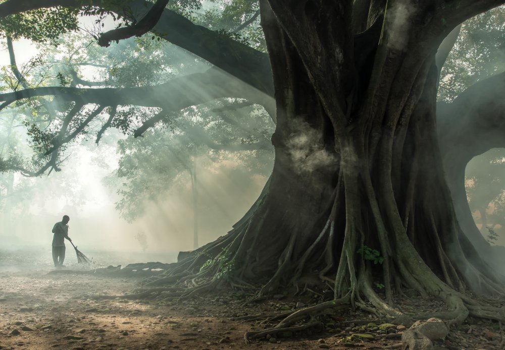
Next, just some fine images from the 1x.com wealth, which I feel might meet the ideas of the Breadth feature. So, just enjoy these beauties…

'Persian girl' by Moein Hasheminasab
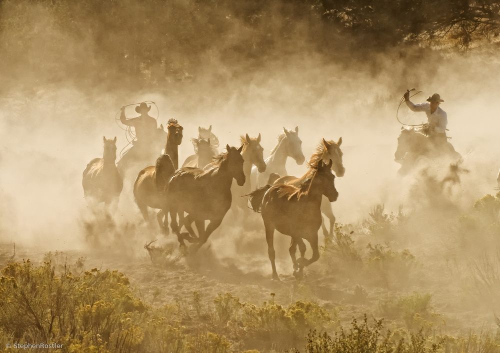
'Tending the Herd' by Stephen Rostler

'Whisper' by Jacky Parker
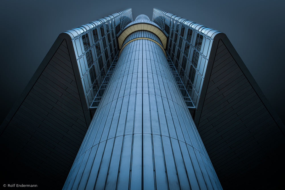
'the tower' by Rolf Endermann
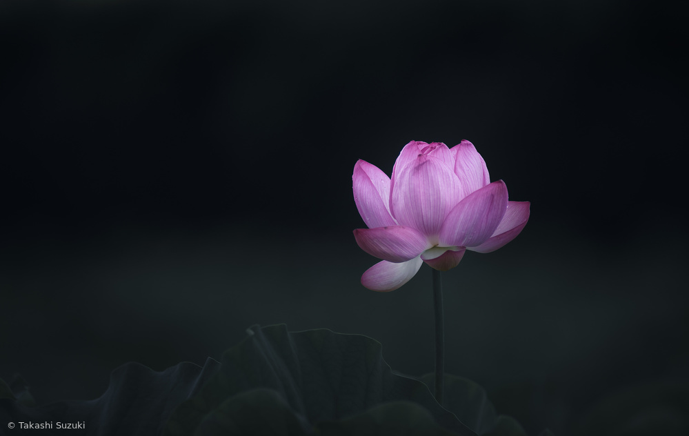 'Pink gem' by Takashi Suzuki

'dream catcher' by Desislava Ignatova
'Puri' by Andika Oky Arisandi
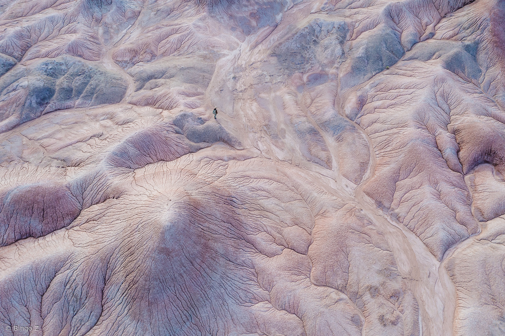
'Colorful land' by Bingo Z

'Purple Anemone' by Lydia Jacobs
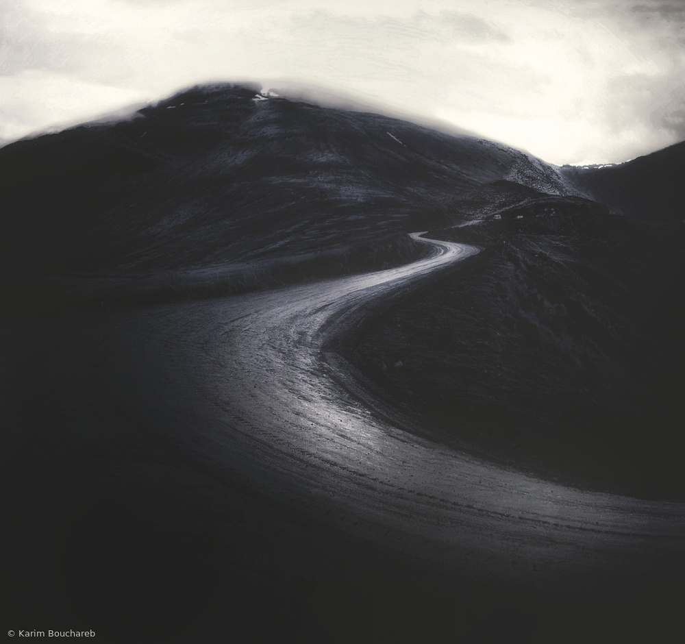
'Zigzag' by Karim Bouchareb

[ ... power of nature ] by Raymond Hoffmann
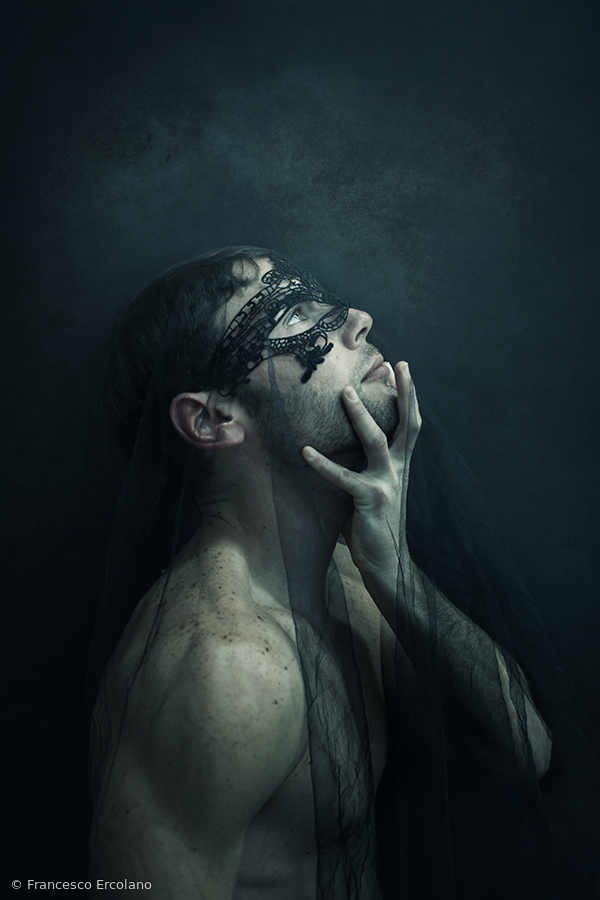
'Lorenzo' by Francesco Ercolano
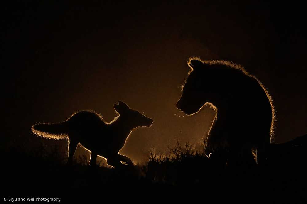
'Encounter at night' by Siyu and Wei Photography
So, now you know what is meant by Breadth.
Let me know if you ever used a similar method to analyse your composition to improve its light balance…
Do you think it is still useful today?
References:
The books you can find on https://www.archive.org
Linda Cranck: http://lacrank.blogspot.com/2015/07/
Andrew Molitor: https://luminous-landscape.com/breadth/
 | Write |
 | Steven T CREW Wicher, Thank you for the article, and the great tip . . . monochrome and blur. I'll add it to my bag of tricks for judging composition. One we often suggest in Critique is to turn the canvas upside down - that's a technique painters sometimes use. Also flipping left-to-right. They're just ways to distract our brains from the details long enough to become aware of the weight and balance of the shapes and tones. 'Breadth' feels like an old word - but a good concept to consider about when making a photograph. Thanks again.
|
 | Wicher Bos CREW Thanks Stephen! Tone abstraction is essential for an image check… indeed various ways to to do it… |