


|
|
|
|
Published by Yvette Depaepe in collaboration with Mike Kreiten, Head of the Senior Critics
Published the 8th of July 2021
1x has a unique feature the founders are very proud of: the photo critique .
Members can submit pictures to a team of knowledgeable senior critics. Their feedback and different suggestions are useful, interesting and enriching even for the best of us.
_____________________________________________________________________________________
Critique on '1945' by Elisabeth van Helden
Hello There ... Since I have great experience with classic curation, I use it until we loose it :D
This time I wish to have feedback before posting it into curation. I'd like to know what you think. I know this one is less popular than my previous photo (Comes a time) and I know that this composition is a bit odd, but I thought it would work (the original frame had a lot of same space on the right side, no room on the left side). Can it work this way or shouldn't I try it, is it too much out of balance? Or would it work in another crop?
settings: F9 / ISO 100 / 1/200 sec / 70MM
sony A7II + 24-70 4.0 lens
photoshop post processing
Thank you!
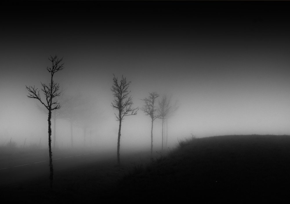
'1945'
_________________________________________________________________________________________
Senior Critic Mike Schaffner
Hi Elisabeth, Thanks for sharing this and thanks for providing the exposure information.
This is a very moody image and the section with the trees is very appealing.
The part I struggle with is the right side as it adds nothing to the composition. Based on your questions I think you also struggle with it.
Not only does it not add to the composition it is a distraction as we try to see if we are missing something and concentrate on what we can't see rather than on what we can see.
I would simply crop the right side just after the tuft of grass sticking up and just before the slope begins to flatten out. The will concentrate the attention to the subject.
I hope this help. This is just my personal opinion. As the photographer, your opinion is the one that matters.
Mike S. - Senior Critic
Elisabeth van Helden
Hi Mike, Thank you for taking time to look at my image and give some suggestions. I think you are right and before posting I tried that same crop, but it did not please me. So I do not think I will post this one to curation, the composition doesn’t work. Thanks again! Elisabeth
_____________________________________________________________________________________
Senior Critic Daniel Springgay
Hi Elisabeth welcome to critique and thank you for sharing your fine image. " 1945 "
I have had a look at your other image " Comes a time " Wow that is some composition and has that special power to please the viewer amazing image well worth publication twice over.
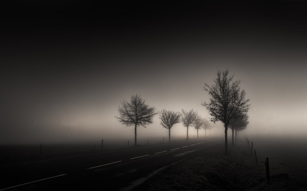
'Comes a time'
So that said I have to compare it with this one. I'm in the same ball park as Mike - he's 100% right about that right side of your image, the whole balance is lop sided.
Even with a good crop I don't think it would pass selection. Please Elisabeth please put both images up on your computer and judge for yourself - if " Come a time " is a 100 then this is a 50...
Daniel Springgay - Senior critic
_____________________________________________________________________________________
Member Franky De Meyer
Hi Elisabeth, I see your image "Comes a time" has been published ant that is so well deserved. I love it. Wonderful yellow tone and perfect crop. Also like the title very much!
Here again a few comments from me, as fellow photographer, gallery visitor, so please take it for what it's worth...
Viewing the image, this was my experience: my eyes were immediately drawn to the prominent right half of the frame and my brain kicked in and started wondering: "what is this?". I then looked at the title "1945" so the theme "war" came to mind. And indeed, I experienced this odd recollection of driving through the countryside of France, being unexpectedly exposed to the many relics of war, the graveyards, the abandoned battlefields.
That's what this image means to me, it's almost a sequel to "Comes a time", with the same or similar road, but now we've travelled further, almost as a story unfolding. As if "Comes a time" starts to reveal itself, with this ominous plateau we're now passing, revealing a hint to what that "coming time" might actually be, something not as innocent as first thought.
Now I think of it, if this is the second part of a triptych you're planning ... you have me looking forward to number three ;)
OK, I'll stop it right here. I must admit I now get this uncomfortable feeling, like I get when reading some poetry or look at a physical abstract work of art: "What I'm making of it, may not at all be what the artist had in mind, and this is just my silly imagination again". I guess that's fine too, isn't it? ;)
In conclusion, I personally think the crop works, and I wouldn't try to "handicap" it or making it into a clone of "Comes a time", which is very strong indeed. It's a bold crop and evokes a story to me.
Having said this, remember I'm not a critic, not even a professional photographer. See it as just the view of a random gallery visitor. I also understand and respect what Mike and Daniel are saying so please listen to them ;)
Elisabeth van Helden
Hi Franky, Thank you for your thoughts. It is interesting to read how this photo reveals a chain of associative thoughts. I like the way you describe your questions and also to know what a photo can evoke to others than myself. To be honest, I did not have a clear message, but I chose my photos mostly because they choose me, they evoke an emotion. Then I try to enhance that emotion so others can feel also something. What that may be, is totally personal and fine. I chose this title, because I found the skinny trees in this atmosphere a bit disturbing, like the composition. So is was like if they came back from war, in a hesitating, solitary way, without knowing if the light was really the light, or better. So ... But there is no third one I believe (it was the same road though) Thank you for your time and serious thoughts!
_____________________________________________________________________________________
Senior Critic Steve T
Elisabeth, From your gallery and the other photos you've posted to Critique, I assumed that this unusual composition was deliberate.
From the title, '1945', and what you wrote in the description area . . . . "A hesitating walk to a brighter world", I immediately thought of war, just as Franky did. It was very real in your country. The dark, shadowy mound is so heavy. The light/heavy balance between fog and blackness generates tension. The road leading toward the light is optimism, but the weight of the mound of earth is reality. In my opinion. (must always must remember to remember that)
Here is where the artist has to be brave. If this is the composition that feels right, then it's right. I often think of a story I read a very long time ago about Bill Brandt. He sent prints to Edward Steichen for the 'Family of Man' exhibit, and they were rejected for being too dark. Steichen thought Brandt had made poor quality prints. Turned out that it was Bill Brandt's style for his photographs of the coal mining towns and people of northern England. Lots of pure black. Heavy. There are many similar stories, and some may be apocryphal. The Jazz musician, Thelonious Monk who couldn't get gigs because he played chords no one had ever heard before and most people found them strange and disturbing. Turns out that it was his style, and when the world caught up they began to call him 'genius'.
I have nothing to critique here - except that there is a fine white line at the top of the frame. I'm not sure if that's an artefact generated by the 1X re-sizing machine, but you might want to check it out with the photo on your screen with a dark background. I'm sure you know this, but in Photoshop you can toggle three different screen colours quickly with the 'F' key. And you can choose those colours by right-clicking on an empty part of the screen.
I was neutral on 'Le Calabert'
I loved 'Comes a Time'
and I'm not sure how I feel about '1945'
But I really do appreciate photos that make me think, though, and this is one.
Thank you for sharing it with us, and for supporting the Critique section.
_____________________________________________________________________________________
Critique is also open to all members, and we learn together here. If you see an image you'd like to comment on, your words would be welcome.
 | Write |
 | Elisabeth van Helden PRO Thanks to the 1x team for their support. And classic critique is a great tool to learn either in technique, style or just to get the support in taking chances. Just try 😊 |