


|
|
|
|


Published by Yvette Depaepe in collaboration with Mike Kreiten, Head of the Senior Critics
Published the 5th of May 2021
1x has a unique feature the founders are very proud of: the photo critique. Members can submit pictures to a team of knowledgeable senior critics. Their feedback and different suggestions are useful, interesting and enriching even for the best of us.
Critique on 'A Kayak at Sunset' by Guy Sapir
Hi dear senior critics,
I took this at the end of a wonderful day trip in Israel. As the day ended I wanted to finish it with a nice sunset photo. It turned out to be the road to the beach I was aiming to was blocked and by the time I reached this beach the sun was already below the horizon. Nevertheless, the light was still beautiful and a very impressive cloud just split the skies into two.
I really like the way the cloud blocks the light from the left side of the frame while lets the beautiful colours of the sunset show on the right side of the frame. I intentionally waited for the kayak to get to the point when a golden line of colour is lit.
How would you improve this photo?
Metadata:
Camera - Nikon Z6
Lens - NIKKOR Z 24-70mm f/4 S
Speed - 1/160
ISO - 100
Aperture - F/6.3
ORIGINAL IMAGE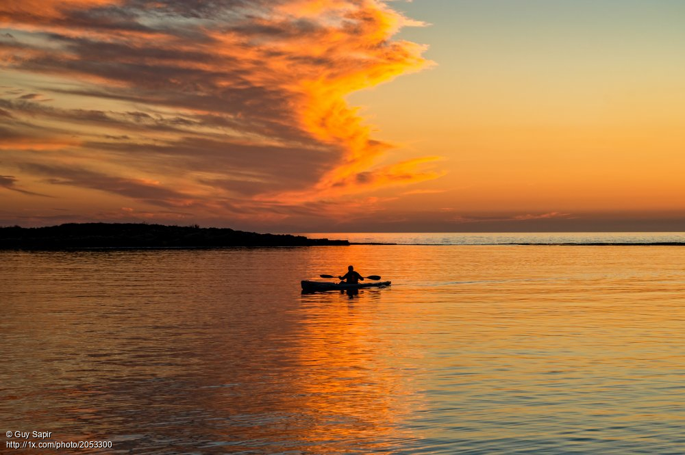 'A Kayak at Sunset' by Guy Sapir
RE-PROCESSED IMAGE AFTER SUBMISSION TO THE CRITICS
Senior Critic Daniel Springgay
Thank you for sharing this fine image 'A Kayak at Sunset', Guy.
I have to admit I'm struggling with you image. It's about the two half's composition. I love your sunset sky on the left but not the sky on the right. I also love the kayak complete with paddles.
I see plenty of quality and a good processing.
I might have moved my camera to the left and go for full overall colour, if that has been possible. That said a good title may weld the idea together for the viewer to enjoy.
Maybe 'A Journey's End' or 'Into the Fire'.
Guy Sapir
Thank you Daniel for your kind words and special thanks for drawing my attention to the importance of a good title. I never took it into consideration.
_____________________________________________________________________________________
Senior Critic Mike Schaffner
Thanks for sharing this beautiful image. Thanks also for providing the exposure information which is useful in evaluating the image. It also serves as a learning tool for others.
My major comment is in regard to the composition. You've broken two so-called "rules" or composition by centering the subject left to right and centering the horizon.
This is not necessarily a bad thing though. We should always question those types of rules and it okay to break them when it helps the composition. It could work in this composition were it not for the fact that it leaves the right side empty with not a lot of particular interest.
To minimize that emptiness I would suggest cropping up from the bottom right corner taking out about 7% from both the bottom and right edge.
I believe this draws more focus to the subject and still shows lets the beautiful colours of the sunset show on the right side of the frame.
One minor item is the hill in the background. There appears to be some haloing along the top edge. This can be quickly and easily fixed in Photoshop using the Healing Brush Tool set to Darken.
I hope this helps. Keep in mind this is all just my personal opinion. Your opinion, as the photographer, is the one that matters.
Best wishes, Mike S. - Senior Critic
Guy Sapir
Thank you Mike for your kind words. With regards to your composition suggestion, I will play with it and see if I love it. My reasoning for "breaking the rules" are: 1. The background is partly unusual because of the major differences between the right and left side of the photo as well as the above and below the rocks formation. I wanted these dramatic changes to be part of the story of the picture. 2. I truly love the colour of the water on the right end side. That being said, I do understand how it can be considered "wrong" or unpleasing to the eye.
_____________________________________________________________________________________
Senior Steven T
Thanks for sharing 'A Kayak at Sunset' with us in Critique. I like the photo for it's simplicity, drama, and lush colours. The 'stillness' is a nice feeling too. You timed it well to get both sides of the paddle showing. That's a small detail, but it adds to the balance of the composition.
The composition: Daniel and Mike both commented on the 'half and half' style. Perhaps that's the strong point of the design. When I first saw it I thought of 'halfway there', as if the subject were on a journey and just past the halfway mark between the light and the darkness.
What I wanted, though - what I thought would be a more optimistic theme - would have the boat moving the other way - out of the darkness towards the light.
A Master Photoshopper could probably flip the boat and have it go left to right cleanly, but I'm not sure how.
A simple eyedropper selection with 'Select>Conor Range' and then 'Edit>Transform>Flip Horizontal' would do it, but there would be a lot of work with the Clone brush to neaten it up. Maybe another member can offer an idea here?
I don't want you to accept this idea as something that must be done . . . . it's just an idea . . . something I might try if it were my photo to play with. Isn't it interesting, though, that dark to light or light to dark are two different themes? For viewers compelled to find meaning in everything it could be the story of 'Life's Journey'. Then the position of the subject becomes even more important - are the close to the end, or is there still space?
Thanks again for posting, Guy. I enjoyed viewing and pondering.
Steven, senior critic
Guy Sapir
Thank you so much for your response Steven I'm happy that correctly understood my composition decision. (See also my reply to Mike below) I really enjoyed following your thinking path. Thank you so much for viewing and pondering.
_____________________________________________________________________________________
Critique is also open to all members, and we learn together here. If you see an image you'd like to comment on, your words would be welcome.
 | Write |
 | Lindsay Thomson Marmen Hi, I love taking photos of sunsets as they keep changing as the sun goes down. Thank- you for sharing this. I dont often post on here but something compelled me to comment. For me I would crop the top of your photo to lessen the sky that still has a lot of blue . Down to the second or third little cloud point before it does its big curve to the left. That way you still have a little bit of bluish sky but it doesn’t dominate that brighter side of the photo. I know you do like the contrast between the two sides and cutting out some of the blue at the top totally changes the photo. I find my eye goes to the kayaker more than the contrasting sky if cropped but if not cropped it definitely goes to the sky which becomes the main focus for me. I guess it depends on whether you want the sky to be the focal point or the kayak. |
 | Yvette Depaepe CREW Thanks for giving your own advice/critique, Lindsay ! |