


|
|
|
|
Published by Yvette Depaepe in collaboration with Mike Kreiten, Head of the Senior Critics
Published the 15th of April 2021
1x has a unique feature the founders are very proud of: the photo critique. Members can submit pictures to a team of knowledgeable senior critics. Their feedback and different suggestions are useful, interesting and enriching even for the best of us.
_____________________________________________________________________________________
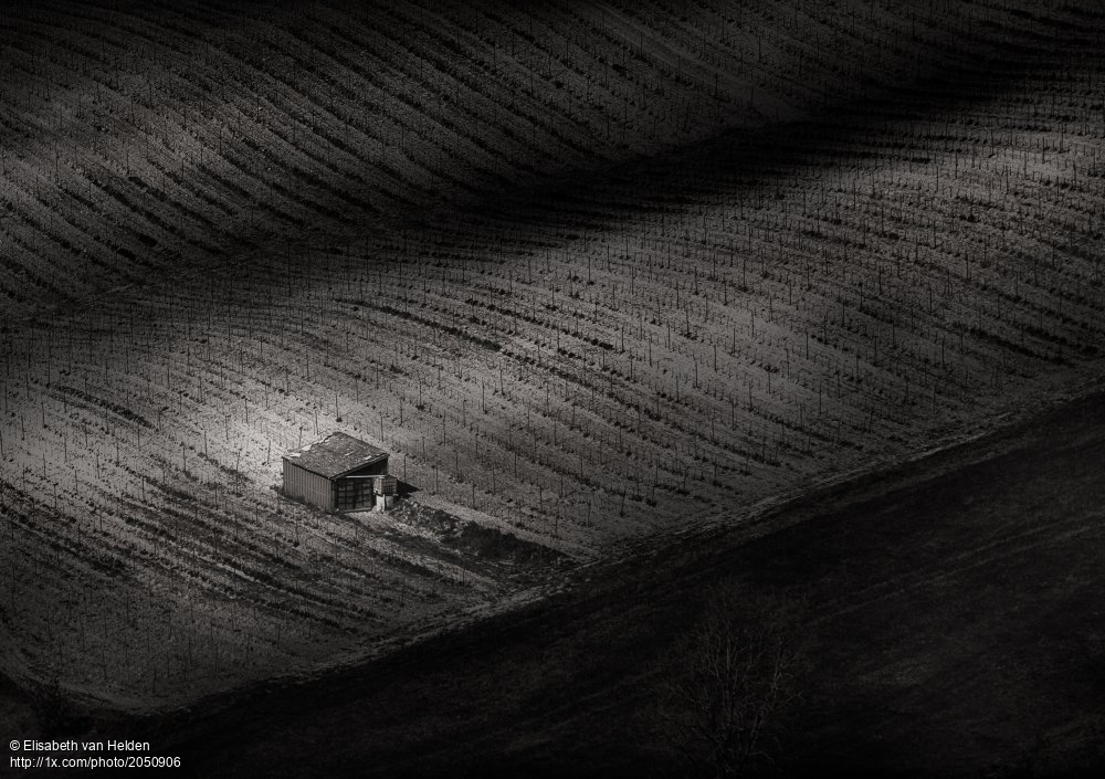
Critique on 'Le Calabert' by Elisabeth van Helden
First of all, thank you for taking time to watch and give your opinion.
The settings: Sony A7II . Tamron 70-180 2.8 . 180 mm . 1/400s . ISO100 . f/9
Then the cry for help: each time I upload a photo on this site, I try to show a picture that is different, push my boundaries that demands different skills, has different subjects etc. I do not always choose the photos that gets the most 'likes' on other websites and tend to be a bit more 'artistic' is I might say. I did not go to art school and started to photograph about a year ago. I also am discovering Photoshop, but I am keen to learn and to get better.
About this photo: I mostly shoot in RAW. Here I noticed the lovely waves, the shed and textures on the mountain below. It had lovely colours (green and ochre), but I thought it had more impact in black and white. I wanted to create a moody dark image, where the main subject, the shed and textured waved land, catches the eye.
After a crop selection and some minor adjustments in Lightroom, I took it into Photoshop, where I transformed the image into black and white with NIK silver efex pro and added a clarity/contrast layer mask (clarity on 70, contrast on 29) and applied it on sections of the photo (the shed, the boundaries of the field and some clearer parts of the field. Finally, I added a curve layer to darken/clear some parts of the photo.
What are your suggestions in order to make it better ?

'Le Calabert' by Elisabeth van Helden
______________________________________________________________________________________________________
Senior Critic Mike Schaffner
Elisabeth, Thanks for sharing this image. Thanks also for providing the exposure information which is useful in evaluating the image.
I took a quick look at your portfolio. You've done exceedingly well (including 1 photo published) for only doing photography for a year. You are a quick learn and clearly have a natural talent and a good eye.
I like this image as I'm partial to dark moody images. It is well composed and you have done very well in the processing.
I have two suggestions for you to consider.
First the dark triangle in the lower right hand corner is way too dark. It appear essentially of solid black lacking any detail. I took a screenshot into Adobe Lightroom and by using the shadow slider at 100% I could bring out just enough detail to show that there is something there but not so much as to compete with the rest of the image.
Second, you haven't used all of the dynamic range. I would suggest using a radial filter configured as an ellipse with feathering to cover the building the the ridge line it is on. By increasing the exposure you are "throwing light" on the subject to highlight it and emphasize it as the subject.
I hope this help. Of course this is all just my personal opinion. As the photographer, it is your opinion that matters. Best wishes, Mike S. - Senior Critic
Elisabeth van Helden
Hi Mike, Thank you very much for taking the time to look at my image. I did a second upload of the photo with the right lower triangle brightened and the contrast lowered. I feel it is maybe too flat right now. Could you take a look again and tell me if I am in the right direction? It is sometimes not easy to find a balance in detail and mood.
_____________________________________________________________________________________
Senior Critic Mike Kreiten
Dear Elisabeth, I recognize this photo because you posted it in Fine Eye Magazine a few days ago. Actually I'm the one who rejected it, I do most of the selections on that site for the magazine. I don't want to hide behind the anonymity of administration
I'm with Mike regarding the tonal range, it's hard contrasts paired with a limited range of tones in this. I would simply add a curve correction layer, pull up the very left a bit to soften your blacks and pull up significantly left from the middle. Your highlight on the barn remains, it's just a bit softer. You have soft, smooth waves in this, I fully understand what fascinated you taking this photo. Curves and squares, diagonals and straight lines, I just find it a very hard take on a pleasant scene.
I cropped it as a 4:3, starting at 11% from the left, full height as now. This puts the barn on a photographic hot spot while there is less space around it. It's a more focused layout for that reason, while your waves are still present. First and second subject, because our eyes now go the barn first and then explore the rest. In your original layout it's exactly on the golden ratio, but since there is so much space around it my eyes wander to the top right without finding "something new" in your photo.
I hope you don't mind I see the potential but just would like to see it a bit differently. For sure it has to do with preferences and ours not necessarily match. But I promise to take it in Fine Eye if you brighten it up a bit at least. Best regards, Mike - senior critic
Elisabeth van Helden
Mike, Thank you for taking time to look at this photo and explain why you rejected it in Fine Eye. I did what you suggested, but It was not easy to find the balance between the moody dark image I wanted to have and your suggestion to brighten it up by decreasing the blacks with the curves. I did the crop you suggested. Indeed, I think it makes the eye flow easier to the barn. I kept in mind that the contrast could be softened and the black part bit less dark, without loosing the light on the barn. I uploaded another version: Is this something you'd in mind or is it too bright now (after looking and trying, the eye gets used or confused).
Thank you again!
Senior Critic Mike Kreiten
It's coming very close to what I meant, but the most important is of course you like it.
The light spot on the barn got lost in your second version, and I think that's important. You can easily dodge the highlights with a brush 4x the size of your barn to get that again.
It seems to me you brightened it up, but kept the deep blacks. That's not what I suggested to do in a curve correction.
If you have a look of your version 1 and two, both have histograms sticking to the left edge, representing elements in pitch black. I suggested to lose up that hard blacks by lifting the left anchor point in a tonal curve correction. Which more or less keeps your contrasts as is, but gets rid of the deep black tones. It's smoother, less hard.
Best regards, Mike
Elisabeth van Helden
Thank you Mike! So I did your crop and I applied your adjustment with an extra curves layer and I am happy with the result that has more detail in de dark triangle without loosing the mood. I'll put this one in curation.
Senior Critic Mike Kreiten
You're very welcome, Elisabeth. I'm glad you're happy with the result and wish you good luck in curation (stage 3 :-) )! Best regards, Mike -SC
____________________________________________________________________________________
Critique is also open to all members, and we learn together here. If you see an image you'd like to comment on, your words would be welcome.
 | Write |
 | Elisabeth van Helden PRO Thank you Yvette and Mike! |
 | Yvette Depaepe CREW My pleasure, Elisabeth ! |