


|
|
|
|
by Yvette Depaepe in collaboration with Mike Kreiten, Head of the Senior Critics.
Published the 4th of March 2021
1x has a unique feature the founders are very proud of: the photo critique. Members can submit pictures to a team of knowledgeable senior critics. Their feedback and different suggestions are useful, interesting and enriching even for the best of us.
Today, I like to present you three critiques on different versions from the image
'The special bio-tech watch' by F4 passion.
_____________________________________________________________________________________
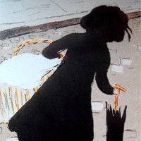
FIRST VERSION OF 'The special bi-tech watch'.
This "special bio-tech watch" is a new challenge for me to combine both of the similarity and the contrast of soft flower and hard gear in one composition.
Any comment and suggestion on improving the subject matter, composition, mood, technical quality and originality is very much appreciated.
It would be very helpful if the Critique team could advise me on how to improve this work.
Thanks in advance! Fukunaga.
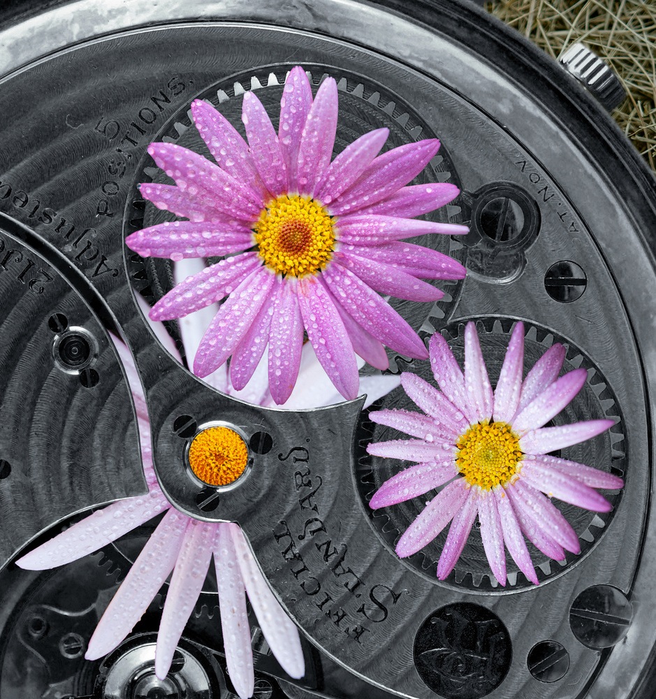
'The special bio-tech watch I' by F4 passion
Senior Critic Darlene Hewson
Hi Fukunaga, I quite like the concept. I do like the pinks and greys together - so the colour palette is quite pleasing. I do wish there wasn't grass or straw (whatever that is in the top right corner). Perhaps a piece of grey paper or fabric would work better as this would ensure you were sticking to a constant grey and pink format.
I think the biggest issue with this for me personally, is although I do like the water droplets on the flowers, my brain instantly realizes that there should also be water droplets on the watch. Not sure if you agree or not and this is just my opinion.
This is creative and as I said earlier - the colours are quite pleasing together.
F4 passion
Thanks for your advice, Darlene! Exactly what I am looking for. Colour coordination is a great point. Water drops on the watch panel will help to enhance reality I believe. I will try a new version following your suggestions. Fukunaga.
Senior Critic Calin Hanchevici
Dear Fukunaga, thank you for sharing the image with us and including exposure details. It is a clever image, creative, and well executed. The contrast of colours and textures works very well for me.
Besides the observations Darlene made, I have few of my own, and please keep in mind they are simply personal opinions.
First thing I notice is that the focus is not uniform throughout the image. The petals of the flower underneath the mechanism are out of focus (mainly on top), and the focus on the right flower is a bit soft, mainly at its top and right part.
The hay/dry grass is a bit too small for me, and it becomes a distraction. Ideally it should match the flowers in a way, maybe fresh blades of grass, or simply nothing.
Framing-wise, I feel this image would work much better in a square format, with a bit more space around the watch (not cropping top and right part). You would have beautiful curves in the image and the flowers be stronger.
It is a very creative image, well executed, and the above are simply things that I noticed. I hope you will find some useful between them.
F4 passion
Thank you so much Calin! Your suggestions together with the ones from Darlene, are the best gifts I got this morning! Yes, you are right. The flowers are taken separately and I failed to keep a natural focus balance among them. I've prepared a set of new shots and hope I can find a good balance. The back ground grass, have no idea yet but definitely will try to make it more "matching" the subjects. And finally, the composition... sure, I will try a square crop! Fukunaga.
____________________________________________________________________________________
SECOND VERSION OF 'The special bio-tech watch'
This is the second edition of my "Special bio-watch"
The great advice I got from the Critique team on previous version gave me a lot of inspiration to improve this image.
I hope that the new processing of this photo reflects the suggestions about the composition, colour combination, technical details (water drops, focus) after trying several versions. I would be very happy to have the opinion of the Senior Critics on this one too. Fukunaga.
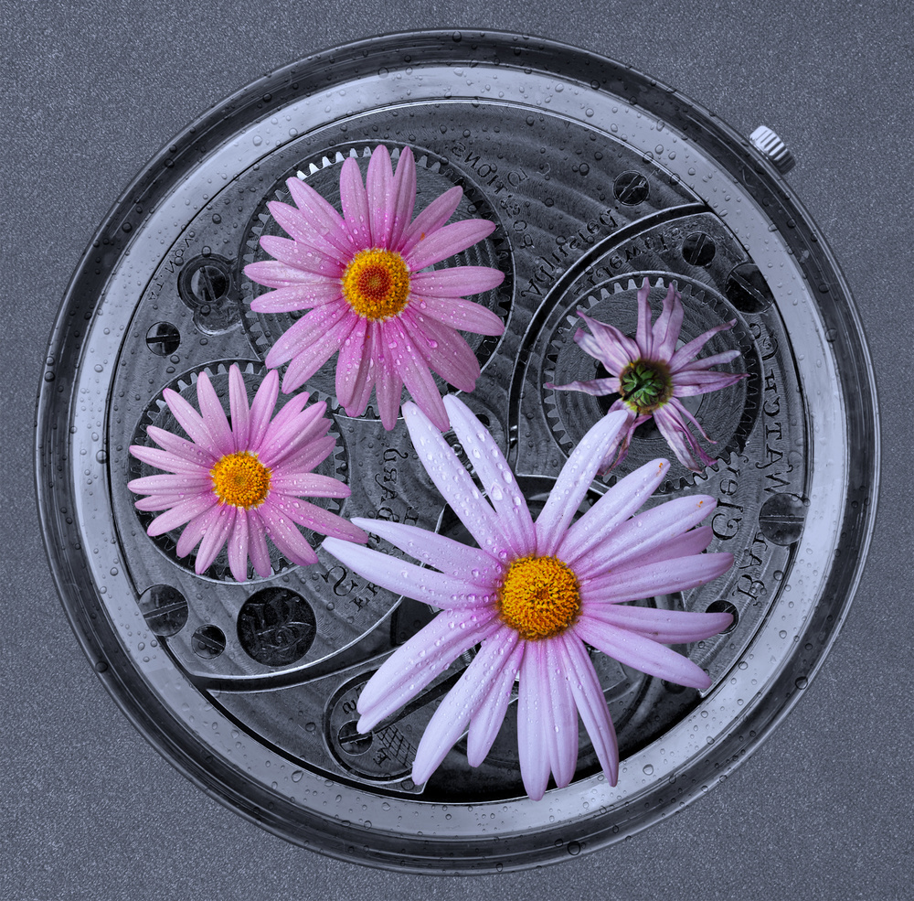
'The special bio-watch II' by F4 passion
Member Giuseppe Satriani
I am not part of the Senior Critics team but I followed the history of this image.
My point of view is that, if you want to show the combination between natural and gear objects, this composition is without any doubt much better than previous one. Here the viewer can fully see both the gear and the flowers.
Just by curiosity I would like to know how you improved the focus according to Calin's suggestion?
Did you replace the flowers by new ones in this second version?
Anyway it has been a pleasure to meet you here and I hope we can stay in touch. Ciao Giuseppe.
F4 passion
Thank you very much, for your compliments Giuseppe! Concerning the 'focus', I took another set of pictures, each with the three flowers on the same place to get a good focus balance and chose the best out to replace the old ones. Yes, lets keep in touch ! Ciao Fukunaga
Senior Critic Calin Hanchevici
Thank you for sharing this second version with us too, and especially for keeping the old one so other people can compare and learn from it. This version is much better in my opinion, the focus is very good throughout the image, the light seems uniform (and you have rotated the flowers a such that the light seems to come from the left). Spraying water on the watch makes the image more realistic, overall and excellent image!
The only thing I would maybe change is to rotate the dry flower a bit so that its petal is not under the big flower petal, but in between the gap (like you cleverly have done it with the rest). This is just nit-picking.
F4 passion
Thank you for your continuous follow-up, Calin! And really happy for that you like this version better. This time, I tried a f9 aperture instead of f2.8 and put all the flowers together to make it easier to get a better focus balance. Yes, I tried to align all the elements (the gears, the flowers,, the crown and the drops) with a virtual light source from the top-left. A new challenge this time is tried to show a battle among the flowers (LOL) and the "try" one is the victim (upset down, under the "foot" of the big one). But, but,... it seems that the story is not well presented. From the point of view of our human being, it is a bio-watch; From the point of view of the flowers, the smaller ones fight for their own home base against the biggest one... However, it is obviously that the battle story is not obviously depicted.
Senior Critic Darlene Hewson
This one is beautiful, Fukunaga! Great background...water drops on the watch itself - all makes it look more believable. I think the pinks are so beautiful against the grey tones. I actually could see this framed, hanging on a wall!!
F4 passion
Thanks, Darlene. Your words are really encouraging! I am so happy that your suggestions took me in the right direction to improve this photo. Best regards, Fukunaga.
_____________________________________________________________________________________
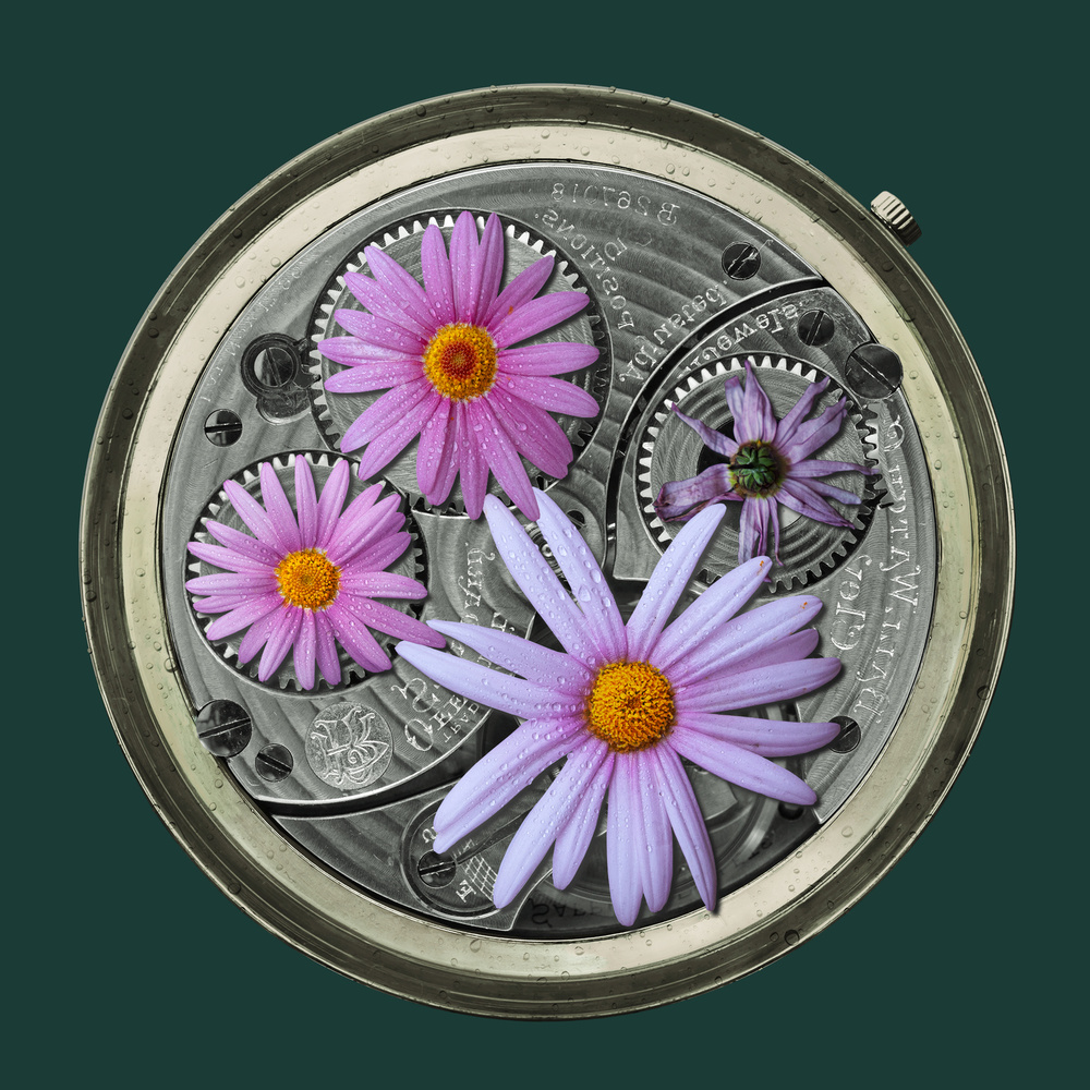
THIRD VERSION OF 'The special bio-tech watch'
This is the 3rd version of my work "The special bio-watch".
This time, I tried a full colour background for the purpose of comparison.
In the 2nd version, I tried a gray watch panel and gray wall paper.
I love the combination of pink flower and gray background very much.
A final try came to my mind by doing a full research of colour combination. The pink-golden-green colour set looks like a good choice from quit a lot of combinations.
Of course any advice is welcome for this version too ;-)
Big thanks on the forehand. Fukunaga.
'The special bio-watch III' by F4 passion.
Senior Critic Theo Luycx
I did not give any comment yet but Calin and Darlene gave you very good suggestions. So please listen to Calin and Darlene. But I like your idea very much so what I will do is now is giving you my personal vision …
The earlier grey tone was the best for my taste. It is restful and gives more attention to the middle of the image. If you want you can play also a little with various grey tones.
According to the centre of the image, I also have a remark.
You placed the flowers on the diameter of the gears and that is good to create a nice rhythm. But I think that the flower below takes a way too much of the attention. The eye is immediately led to that flower. I would make it smaller and not overlapping the other flowers. Try to find a good balance.
____________________________________________________________________________________
Critique is also open to all members, and we learn together here. If you see an image you'd like to comment on, your words would be welcome.
 | Write |
 | F4 Passion Hello Joe,
Thank you very much for your great comments/suggestions below. Yes, I'm working on a new grey version and will try my best to make the feeling more realistic (the soft delicate petals vs the rough steel teeth!). Best wishes, F4 passion (Fukunaga) |
| F4 Passion Thank Joe! So far, I was focused on issues, like composition, color coordination, light and it is time for me to handle the details that help depicts the initial theme: flower vs gear (a reflection of nature vs human being--- a theme too big to address (LOL)) Have a wonderful weekend! Fukunaga |
| | F4 Passion Hello Yvette,
Thank you so much for notify me this big news! I just still cannot believe that my trial works can go published on 1x magazine and other great 1x locations. What a great honor!
Would like to say thanks to senior Critic Calin, Darlene, Theo, who have repeatedly granted me wonderful advices that encouraged and inspired me to challenge my own limitations.
Just like I told Mike, the head of the Critique team, I believe the Critique function is the core stone that connects 1x photographers, like me, to the professionals behind 1x website. This great function makes 1x different and attractive.
Thanks also go to Gluseppe, a 1x friend who followed my every new trials and, each time, his warm words made me became more and more confident. So thank you very much Gluseppe!
Best wishes,
F4 passion (Fukunaga) |
 | Yvette Depaepe CREW It is true that the critique forum is a unique feature of 1x, Fukunaga. My pleasure to put it in the spotlights through the magazine! |
| F4 Passion Thank you Yvette!
Hope it can boost Critique activities a bit!
Best regards, Fukunaga |
 | Theo Luycx CREW Yvette,
Thank you for this very nice presented project. And F4 had earlier a published photo "the Adventurer" after three Critique session. And also F4 thank you it is nice to work with you.
|
| F4 Passion Thank you very much Theo for you great advices!
I'm working on a new grey version follows yours idea. It will be a lighter grey version and hope it can be better in terms of showing up more contrast between the soft flower and the hard gears! Again, thank you! Best wishes, F4 passion( Fukunaga) |
| Yvette Depaepe CREW Thanks dear Theo !!! My pleasure to promote the critique forum ;-) |
 | Irena Jasionek A great guide to study. Thank you Yvette. |
| Yvette Depaepe CREW And thanks to the Senior Critics too, of course !!! Cheers, dear Irena ... |
 | Daniel Springgay CREW Love your Final image F4 Passion.. |
| F4 Passion Thank you so much Daniel! Best wishes, Fukunaga |
| | Daniel Springgay CREW Wonderful article Yvette so well put together thank you. So many good points of 1x.com coming together in one place. |
| Yvette Depaepe CREW Thanks for your appreciation, dear Daniel ! |
| | Yvette Depaepe CREW Dear Fukunaga, thanks for submitting your work to the critique forum and thanks to the Senior Critics for the great suggestions they made to improve this image. Cheers, Yvette |
| F4 Passion Dear Yvette, thank you so much for giving me this BIG surprise! My great honor!
I hope the conversions between the Senior Critic team, Calin, Darlene, Theo and me could give some hints to other 1x photographers.
(Sorry, I wrote a reply to you the other way because I missed the "reply" check here)
Best wishes,
Fukunaga |