


|
|
|
|
by Editor Rob Darby
Published the 5th of March 2021
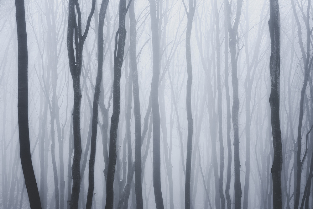
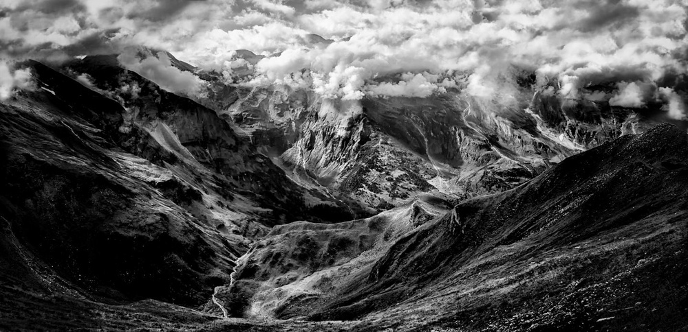
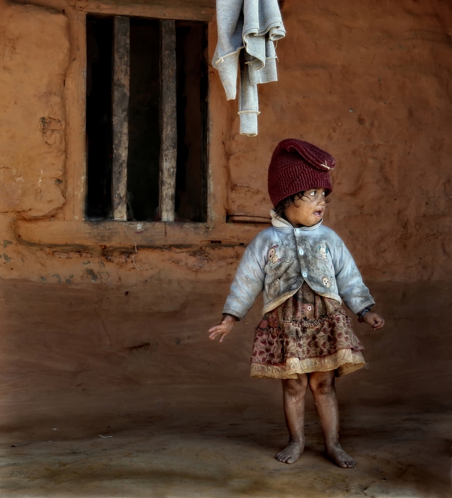 'Children of Nepal' by Yvette Depaepe
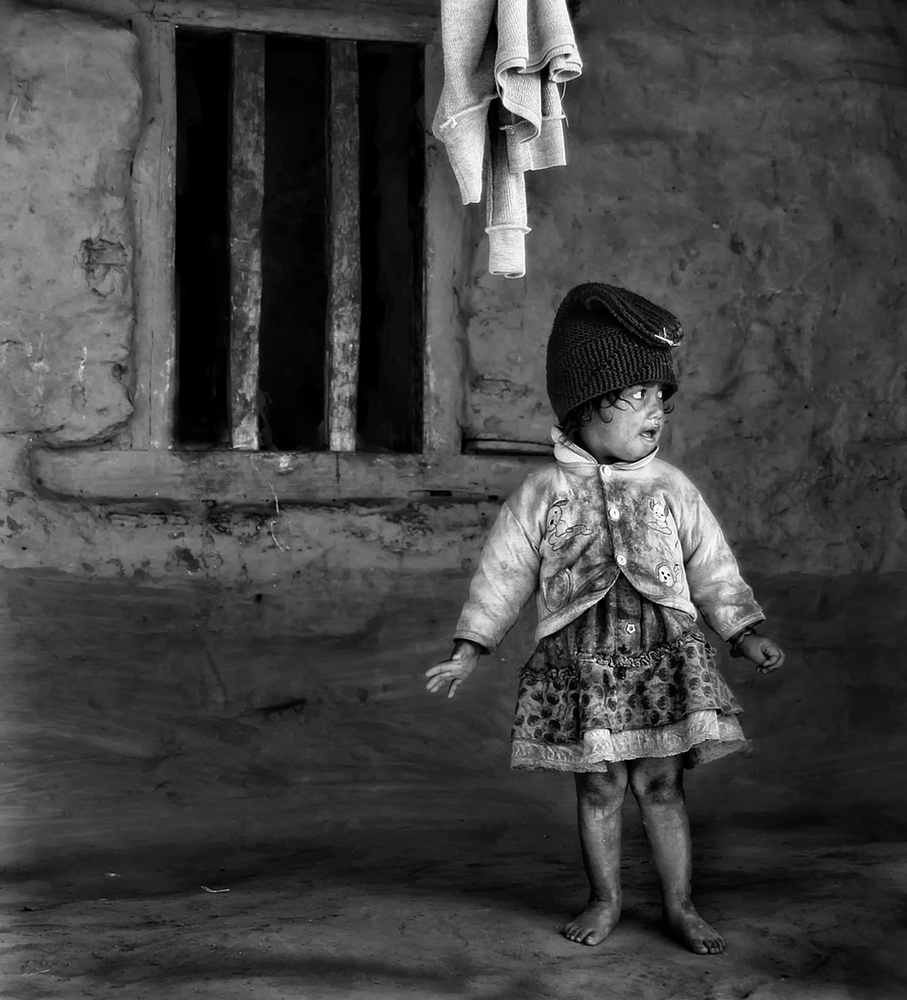
'Children of Nepal – monochrome version' by Yvette Depaepe
____________________________________________________________________________________

n/t by Ibrahim Nabeel
n/t by Ibrahim Nabeel
____________________________________________________________________________________
For many of us, our first steps into photography didn’t start in the realm of black and white. For others, however, black and white film photography may have been where their journey began. It is likely true that where one begins informs their artistic path, at least initially. For others, monochrome photography may be a new avenue of expression.
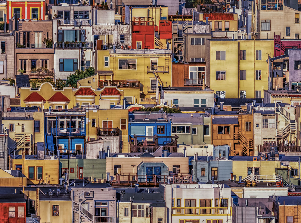
'A Quarantine View' by Rob Darby
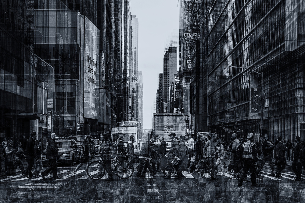
'City Living' by Rob Darby
I wrote this article as an exploration into how an image in colour or monochrome may evoke different emotions from the viewer, or may focus the viewer on elements that the author wants to emphasize. I have often received comments from the 1X community, as well as in other forums, where a photographer critiquing one of my images will say “this image would be better in Black and White” and just as often people may comment that they would prefer to see the image in colour.
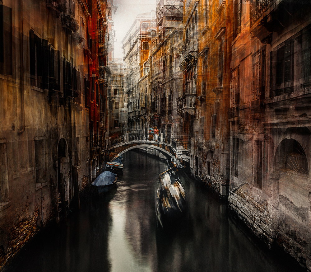
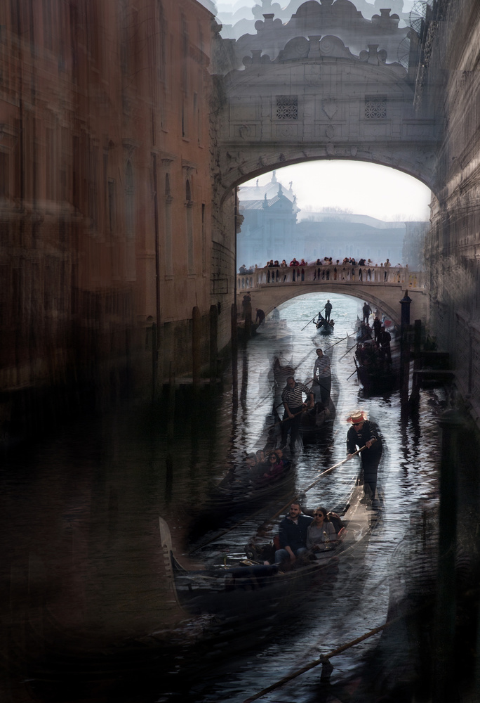
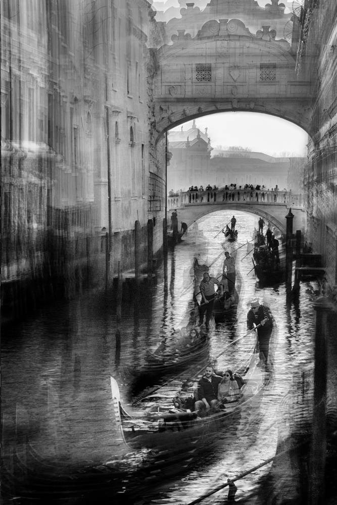
'The Gondolier 2' by Carmine Chiriacò
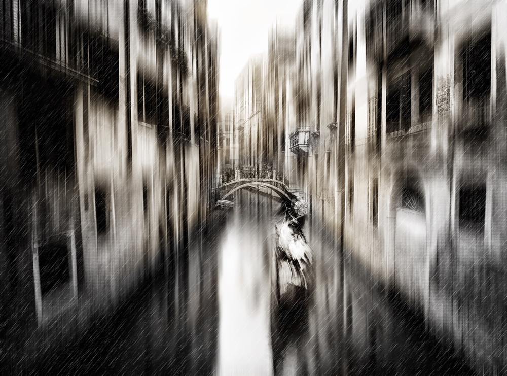
'on the canal' by Carmine Chiriacò
For this article, I have selected a number of images which were published or submitted in both colour and monochrome by photographers here on 1X.
In some cases, both were accepted by curators, in some cases not.
But the side-by-side comparison of the same (or similar) image rendered in colour and black and white, may reveal the different impact that one or the other approach has on the work’s visual appeal and the emotion that the author intended to invoke.
'Goldeneye' by Jure Kravanja
'Barrel Sky' by Jure Kravanja
____________________________________________________________________________________
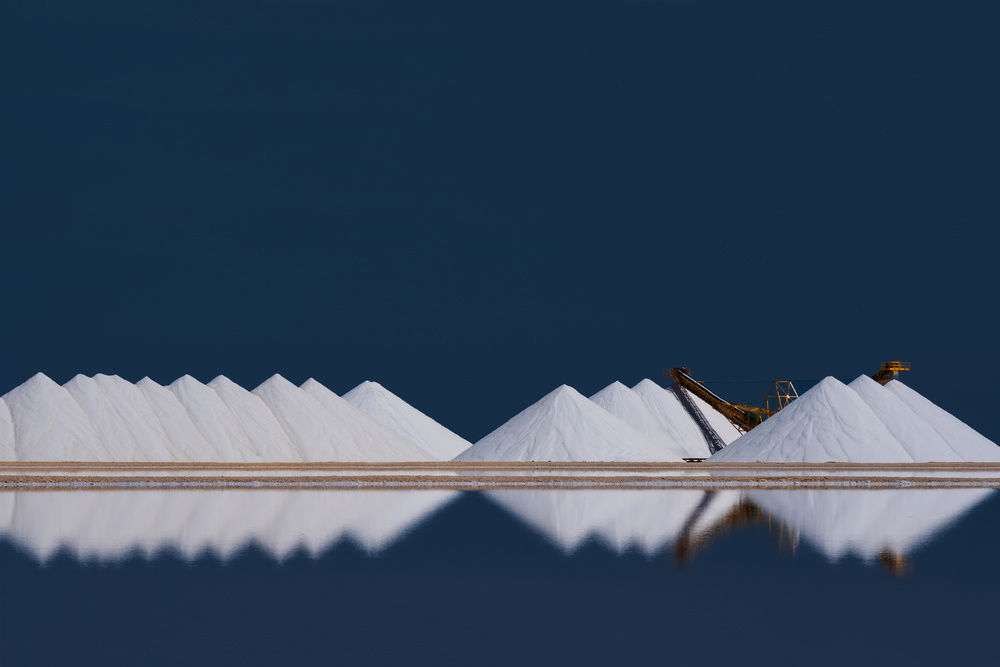
'salt production' by Rolf Endermann
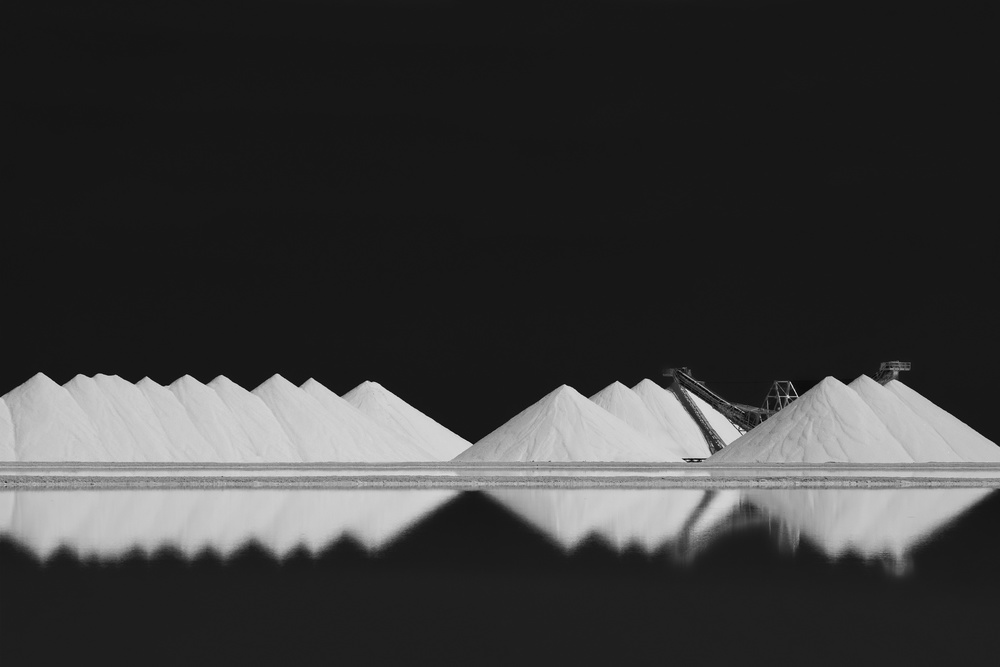
'salt production BW' by Rolf Endermann
So, which is preferable? Well, I would argue that this question is often a matter of aesthetics and personal preference, although without question some images are clearly stronger in colour and others, in monochrome. In some cases, both images are compelling, but for different reasons. The better question might be: how does the mood or subject change with a monochrome conversion? Sometimes, actually quite often, many of us will process an image in greyscale and sRBG to see which captures the mood or the essence of the moment that we want to emphasize.
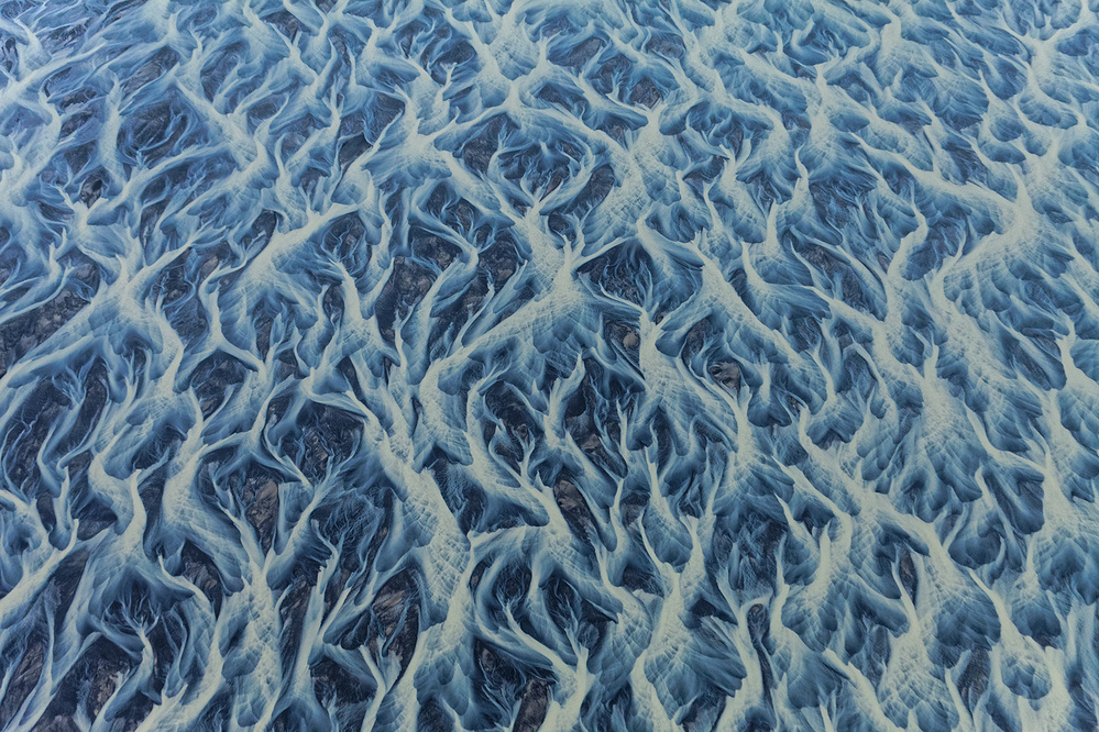
#1 Veins of the Earth' by Peter Svoboda, MQEP
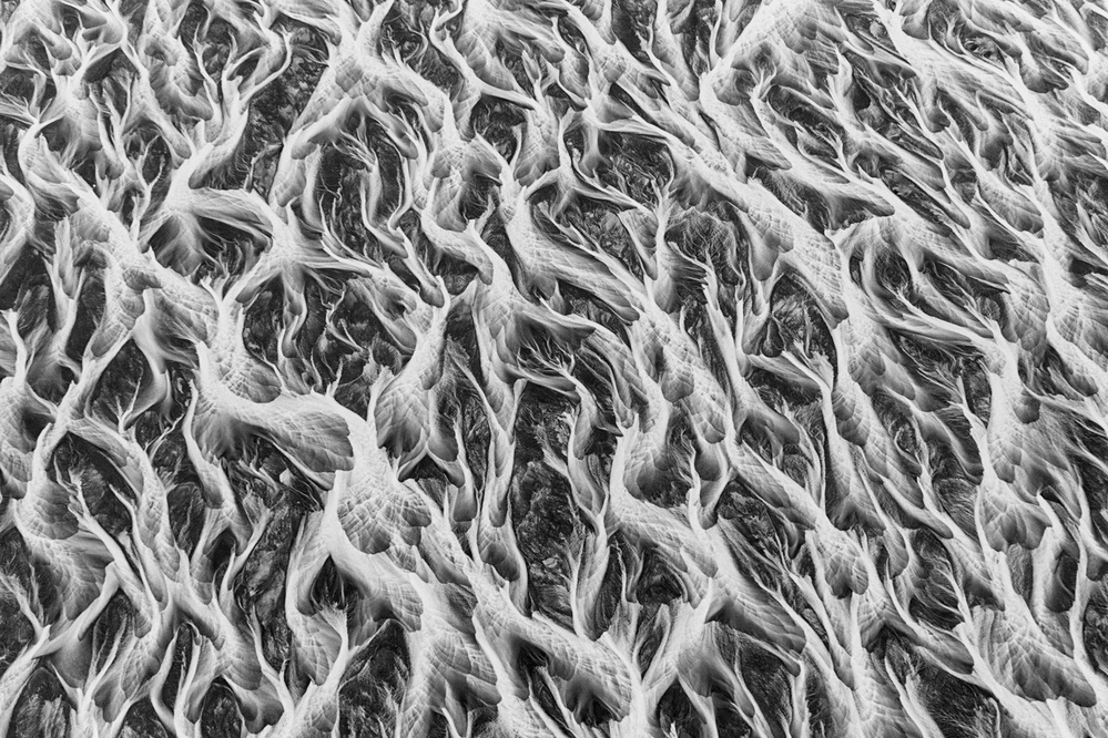
'Wide River Shapes' by Peter Svoboda, MQEP
Over time, I began to ask myself the question: what specifically is it that makes one version “preferable” over another? Do monochrome images evoke different emotions or turn the viewer’s focus onto an aspect of the image that gets lost in the cacophony of colour? Is colour an essential element of the image and does it positively contribute to the mood or the story the author is telling?
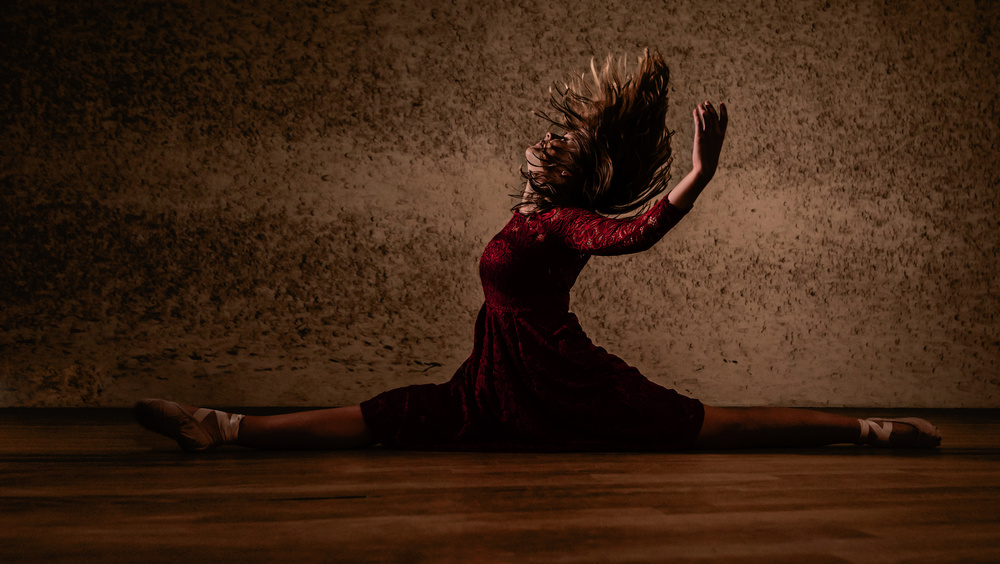
'Passion' by mike kreiten
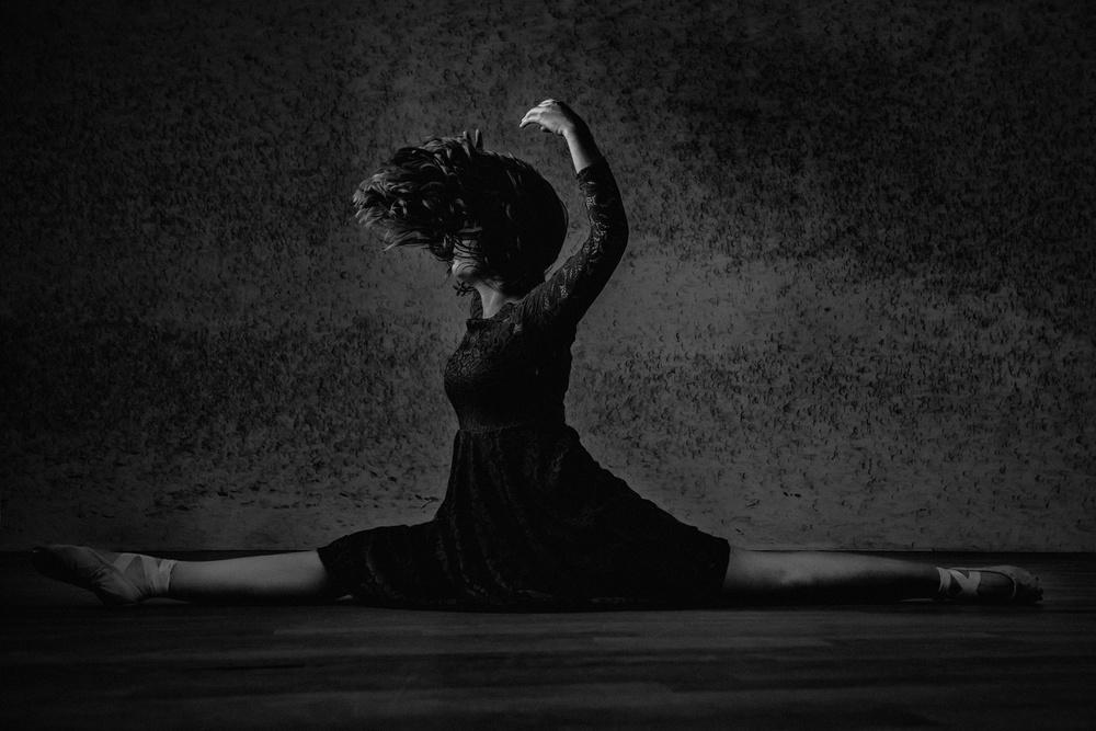
'Tensionette' by mike kreiten
Not long ago, just before my father passed away, he told me something that I never knew about my grandfather. He was a landscape black and white film photographer back in the mid part of the last century. Since learning this, when I see a monochrome image waves of nostalgia take me back to an earlier time.
'Venecian simbols' by milan malovrh
'Bridge of Venice 1' by milan malovrh
For me, monochrome images evoke remembrances of the first images I saw when I was young. The moody and stunning landscapes of Ansel Adams. The amazing portraitures of Annie Lebowitz. The street photography of Bresson. These artists were able to capture the beauty and mood of a place or a person with whites, greys, and blacks, using contrast, shadow, texture, and shades of tonality to create drama and mood. The face of an elderly man or the granite face of Half Dome in Yosemite may evoke different emotions in monochrome than they do in colour. Not better or worse, necessarily, but certainly different.
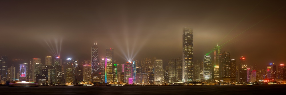
'Hong Kong Island' by Daniel Murphy
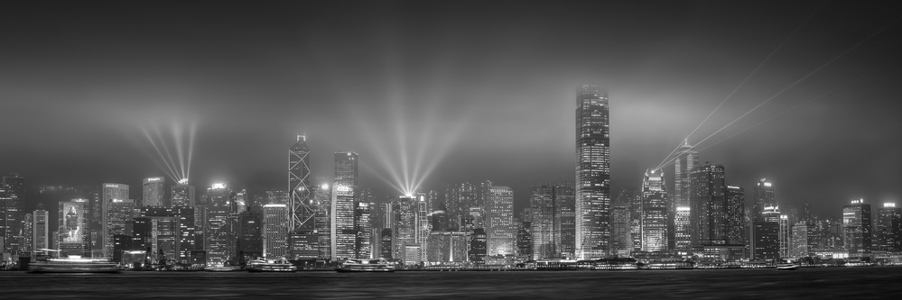
'Hong Kong Monochrome' by Daniel Murphy
I guess it is safe to say, that a reader’s response to an image is likely reflective of their own particular way of seeing. Some “see” better in black and white. Monochrome images offer no distraction from disparate colours that might, for some people, detract from the core subject of the image or the story they want to convey. The textures, gradations of tonality, shadows, and shapes focus the viewer differently. There is often a rawness to monochrome images. Subjects reveal their organic essence and are stripped bare of the safety of colour.
'Waves' by Arnon Orbach
'Up up and away – Rishon LeZion' by Arnon Orbach
In other images, colour is integral to the success of an image. For example, if one is trying to capture the subtle beauty of a winter sunrise, the soft yellows and blues of an icy scene might add an element of intrigue: the icy cold and the pale sunlight might be more striking in colour to bring out the contrast between the warmth of the sun and cold of the ice.
'Two Trees' by Uschi Hermann
'Winterland' by Uschi Hermann
____________________________________________________________________________________________________
 'Merging of Minds.. (pano version)' by Radu Andrei Alexandru
 'Unjustified Sadness..' by Radu Andrei Alexandru
The same image in monochrome focuses the viewer on the textures of the sky, or wind-blown striations in the snow, the contrast between the light of the sun and the dark shadows in the trees. Or perhaps a monochrome image of this winter scene may accentuate the sense of clarity and cold in the landscape, with gradations of tonality providing the separation of elements instead of colour.
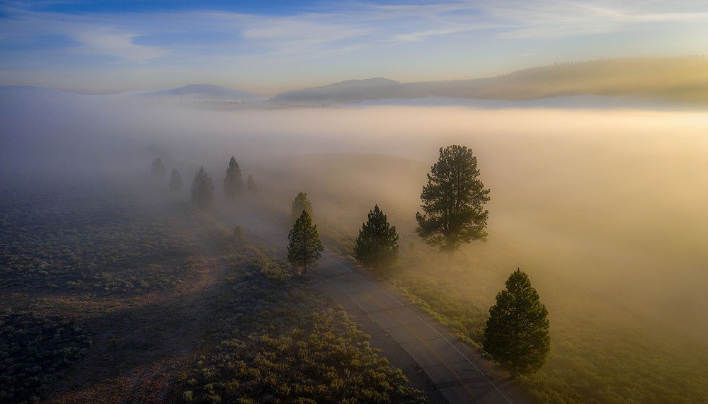
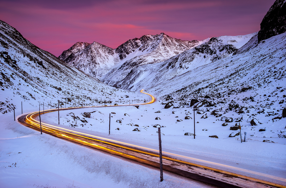
'Mountain Sunrise' by Rob Darby
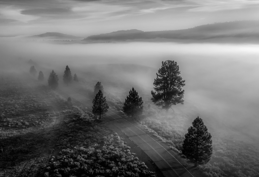
n/t by Rob Darby
All art is subjective, as we all know too well in the curation process on 1X or the selection of an artist for a particular exhibition.
Whether your preferred genre is monochrome or colour, or both, the most important question that we demand of ourselves to answer is whether a particular image is rendered in a way that maximizes its emotional and visual impact on the viewer.
n/t by NIKA
n/t by NIKA
_____________________________________________________________________________________
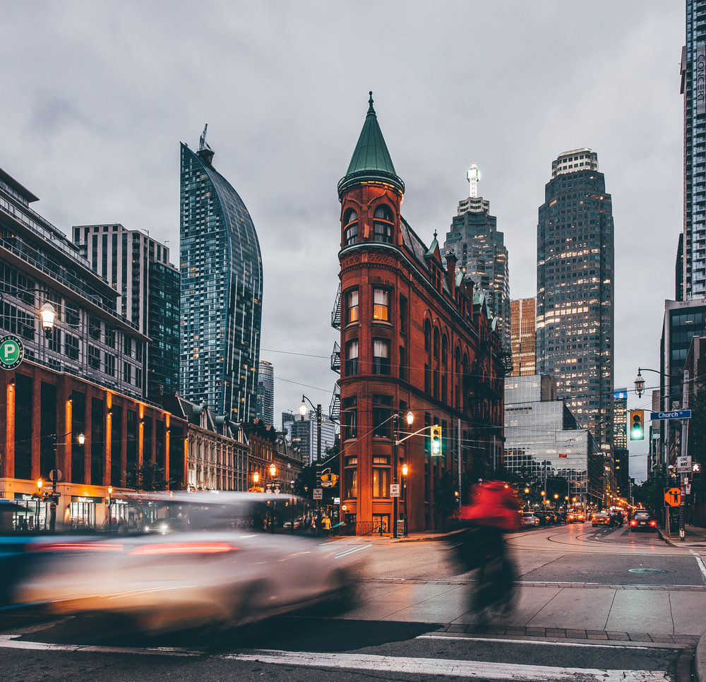
'Gooderham Building' by Carmine Chiriacó
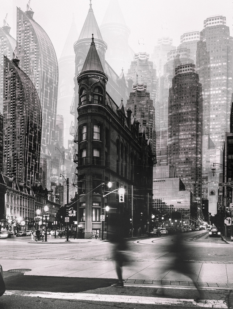
'The Walk' by Carmine Chiriacó
_____________________________________________________________________________________
'Drive Through' by Andreas Agazzi
'Over the Top' by Andreas Agazzi
 | Write |
 | Tony Key As a street photographer my 1st instinct is to go with colour, it's a personal preference and as they say the world is not in b&w. However in practice I make an image by image assessment of what I feel works best for any given shot and then use colour or b&w accordingly...any other approach seems irrational to me. |
 | Federico Righi PRO Thank you very much both of you for this extraordinary article. I've always had this doubt in all times that I should have decided between BW or colour. Best Regards |
 | Wicher Bos CREW Thanks Rob for this inspiring article!
|
 | Rob Darby PRO My sincere pleasure. |
 | NIKA PRO Thank you very much Yvette Depaepe and Rob Darby! Have a nice weekend for members 1x! |
 | Yvette Depaepe CREW Thanks, dear Nika !!! |
| Rob Darby PRO Thank you Nika! Have a great weekend. |
 | Ibrahim Nabeel Thank you very much, Rob Darby, for choosing two works, which I really appreciate
Thanks also to Yvette Depaepe for this article
Very important and useful article
Wonderful and inspiring works |
| Yvette Depaepe CREW Thanks a lot, Ibrahim! |
| Rob Darby PRO My pleasure Ibrahim. Your work is amazing and I was happy to find 2 similar images to help illustrate the points I wanted to make in the article. |
 | Izabella Végh PRO It is a really very interesting and useful article. Thanks a lot for the authors. |
| Rob Darby PRO Thank you Izabella! |
 | Arnon Orbach CREW Thanks, dear Rob, for sharing your thoughts on the issue. It is an issue most photographers face on a regular basis; each form can be chosen pending on which form can serve best the emotion one wants to evoke. Personally, I prefer color photography which, in my humble opinion, can evoke more varied emotions than B&W. Thanks for including my photos in the article, much appreciated. Finally, my compliments to Yvette for her contribution as always. Have a great weekend. |
| Yvette Depaepe CREW Thank you, dear Arnon ! |
| Rob Darby PRO Thank you Arnon. I hope all is well. |
 | Rolf Endermann PRO Many thanks to Yvette and Rob who took the trouble to compile the corresponding images for this article impressively.I converge many of my images in BW and then decide according to feeling or form of the day which variant I upload. I find most of the pictures shown here appealing in colour as well as in BW, I think it is a matter of personal taste which variant one favours.
Thank you for this interesting report.
Many greetings
ROLF
Translated with www.DeepL.com/Translator (free version) |
| Yvette Depaepe CREW Thanks for your appreciation, dear Rolf! |
| Rob Darby PRO Thank you Rolf. I was particularly happy to find your images in both color and monochrome. They are both amazing, but they have different feelings.
Have a great weekend.
|
| | Yvette Depaepe CREW Thanks Rob, for this fine article about the visual impact of BW images versus colour images.
Congratulations to the authors ... Cheers, Yvette |
| Rob Darby PRO Thank you, Dear Yvette for the opportunities and the thoughtful oversight of the articles and the magazine. |
 | Marc Apers CREW Beautiful article, thanks Rob and Yvette ! Some will surely find the black and white version of a certain photo more beautiful than the color version or vice versa but I wonder what the motive is of some photographers ? Is it not just a search for reaffirmation, a desire for eternal fame and one more shown on the front page because of the lack of other suitable material at a certain time ? And not so much to claim that the black and white version is as good as the color version. Are we not all looking for recognition to put ourselves as much as possible in the center of attention ? Just my thought ...
|
| Yvette Depaepe CREW Thanks for your deep insight and thoughts, Marc! Have a great weekend ahead! |
| Rob Darby PRO Marc - your comment has been in my head since I read it yesterday. You raise a very valid perspective and one that, if I look at myself in the mirror critically, I think applies too often to my own work. Sometimes, the desire to be “published” is intoxicating and reminds me that we all are in search of affirmation. Perhaps, that affirmation should come from inside ourselves consistently while remaining open to the opportunities that criticism and rejection offer in helping to develop skill - speaking for myself only.
Thank you for the comment and I must say that I greatly admire your work.
Have a good weekend. |
| Marc Apers CREW I strongly appreciate your honest opinion Rob, thanks a lot ! |