


|
|
|
|


Published by Yvette Depaepe in collaboration with Mike Kreiten, Head of the Senior Critics.
Published the 17th of September 2020
1x has a unique feature the founders are very proud of: the photo critique.
Members can submit pictures to a team of knowledgeable senior critics. Their feedback and different suggestions are useful, interesting and enriching even for the best of us.
Critique on 'The jewel' by José Ignacio Gil Blanco
I was in Bled for a few days (I have to thank him for having learned to take photographs in the rain ... and it is not irony). Without a doubt the best thing was the treatment of the owner of the house whose upper floor we rented ... She was like a mother and although years have passed I still remember her fondly. I know that it is a "little original" place. This was a special moment where the blue hour mixed with the warm lighting. Image not published. What could improve?
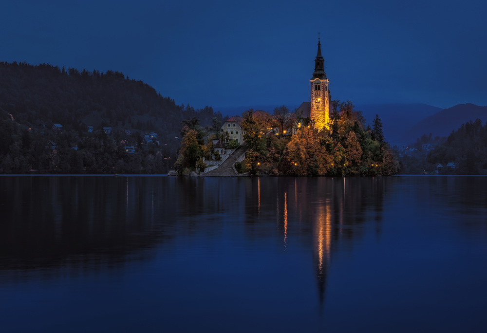
Nikon D750 . Nikon 24-120 f/4 . 46mm . f/11 . 4.00sec . ISO100
______________________________________________________________________________________________________
Senior Critic Andreas Agazzi
Hello José Ignacio, thank you very much for your upload here on the Photo Critique.
A question that is often being asked - why was the photo not published? Well, there are probably several reasons. The truth is, however, we from the critic team do not know what the criteria were that the curators brought up to this decision.
But we can guess and my personal feelings are as follows:
a) as you have identified and stated as well already, this is a very popular place, especially for landscape photographers and hence it is also seen quite often. It will become more and more difficult to create a photograph from this specific place that stands out from the many others that have already been published.
b) the main subject is very nicely photographed. Great light and colours. Blue hour works always well anyway and the bed weather did actually help in my opinion to create this beautiful calm mood. So this is nicely done.
What does less work here is the composition or actually the framing and maybe the exposure.
You have placed the horizon or the lakes' border level to the middle of the frame. As the reflection on the water is not strong enough, it makes in my opinion no sense for such a composition. If it was my photo, I would crop the frame substantially.
I would actually prefer to see more from the sky. But as this is not possible here, I recommend to crop at least 25% from the bottom and about the same amount or even a bit more from the left side. You now have a new panorama where the main subject gets much more presence. This is not necessary but as the parts that you have just cropped do not really add in a positive way to the overall look, the new composition makes more sense I think.
Then I would brighten up everything a bit. Everything seems to be a the dark side and you can correct this without loosing details in the brightest areas. Pay attention to the sky, it has some issues within the colour tones. It is not a banding I think but it is not clear whether this comes from different cloud layers and movements or if it is a destruction that comes from the post processing. If you are comfortable with applying a soft vignetting, feel free to do so; this creates a bit more depth and strengthens the island visually even more.
More than that needs not to be done in my opinion. Hopefully that was of any help José Ignacio.
José Ignacio Gil Blanco
Hello Andy. Thank you very much for your comments. I have just tried the proposed crop, clarifying (without affecting the illuminated parts) and vignetting gently and I compare and I am not convinced with that re-framing (surely you are right and possibly the framing had to have been varied in place). I will see them again in a couple of days which is the best when I have doubts ... As for the band in the sky I have gone to raw and they correspond to the clouds but I have forced some curves to check and if I notice something strange that could have occurred in the processing (will be corrected). Thank you very much again for your comments that are certainly helpful.
Senior Critic Andreas Agazzi
Thanks a lot for your honest answer. I agree with you that the proposed crop would probably not look better in the end. I am too much convinced that there should be more room above the dome and that's why I probably was motivated enough to reframe it within the given boundary, somehow to compensate. But I also think now that it won't work. Cheers, Andy
José Ignacio Gil Blanco
Thanks for your answer that has suggested something to me ... insisting that more space was necessary on the tower, I remembered how well "fill according to content in photoshop" works and I have made the test of enlarging the canvas by 10% by on top and apply the tool .... and the image certainly improves. Thank you very much. Best regards, Jose Ignacio
_____________________________________________________________________________________
Senior Critic Mike Kreiten
Dear José, You're probably not going to like what I say.
The first thing that came to my mind was "Oh, Bled, but not the best take on it".
I looked at the same things as Andy, the reflection, light distribution, background, colours. Nothing is wrong with your photo, and maybe it's the best you could make of the given rainy situation. So I started thinking why I think this is not the best take I've seen before.
I remembered a shot I last found, also not published, which left me speechless. It was moody, sunrise, put emphasis on the wideness of the lake surrounding, the mountains in the back, all in softer colours, more focused on the entire scene than just the island.
Since searches on 1x only deliver published photos, have a look at Sandeep Mathur's work if you like. He has two takes on this place, you will know which I mean.
https://1x.com/photo/1923864/all:user:704601
https://1x.com/photo/1828337/all:user:704601
You could play with red tones in the sky and its reflection, using luminosity masks, could de-focus the church tower a bit and emphasize the island as a whole element by dodging and burning. These are the things I'd try if this was mine.
Best regards, Mike.
José Ignacio Gil Blanco
Dear Mike. I don't dislike what you say at all ... I've seen quite a few more spectacular versions than the one I've presented. I have carefully seen the interesting website of Sandeep Mathur (sandeepmathurphotos) and I have checked the two versions that you indicate and I have understood what you mean. As for the processing that you would give it, it is daring and I would never have considered it but without a doubt I will try, to minimize the tower and emphasize more the island as a whole playing with the dodge and burn I will try it easily) that of playing with Red tones seem more complicated to me because of how cloudy and leaden the sky was but, lowering the blues a little, I will play with the luminosity masks and red tones .... I will definitely try. Thank you very much for your very interesting indications. Best regards, Jose Ignacio
_____________________________________________________________________________________
Critique is also open to all members, and we learn together here. If you see an image you'd like to comment on, your words would be welcome.
 | Write |
 | Leicher Oliver PRO I've also got 2 photos about this place and of course both rejected by the curator teams on who knows what grounds.
https://1x.com/photo/1765777/all:user:32616
https://1x.com/photo/1807300/all:user:32616 |
 | Yvette Depaepe CREW Dear Oliver ... you should try out the photo critique section ;-) |
 | Leicher Oliver PRO Thank you Yvette. That is unnecessary. Very little feedback from there probably because there is not much to write .
The screening process is very subjective in my opinion. Much more humble photos get accepted on front page.
|
 | José Ignacio Gil Blanco Thank you Ivette for using my image to promote "Critique". One of my favorite 1x sections, in addition to getting directions on your own image, I frequently stop to look at the rest and read their "reviews" carefully. It is a good way to learn. |
 | José Ignacio Gil Blanco Yvette no Ivettte (sorry) |
 | José Ignacio Gil Blanco Yvette no Ivettte (sorry) |
 | José Ignacio Gil Blanco Thank you Ivette for using my image to promote "Critique". One of my favorite 1x sections, in addition to getting directions on your own image, I frequently stop to look at the rest and read their "reviews" carefully. It is a good way to learn. |
 | Yvette Depaepe CREW So good to hear that, dear José! Thanks for your appreciation towards the magazine and of course towards our unique photo critique feature! |
 | Rolf Endermann PRO A lower location and more sky in the ratio 1/3 - 2/3 would make the subject more exciting for the viewer, perhaps a starting point for the next picture |
 | Rolf Endermann PRO A lower location and more sky in the ratio 1/3 - 2/3 would make the subject more exciting for the viewer, perhaps a starting point for the next picture |