


|
|
|
|
Published by Yvette Depaepe in collaboration with Mike Kreiten, Head of the Senior Critics.
1x has a unique feature the founders are very proud of: the photo critique. Members can submit pictures to a team of knowledgeable senior critics. Their feedback and different suggestions are useful, interesting and enriching even for the best of us.
Critique on 'Gerbera' by Jackie Matthews
I took this photo for an internet challenge which was to show an item and it's reflection on a black background. I wanted to show all the details the flower had, both in the actual flower and also it's reflection. To do this, I used a focus stacking technique and this are 30 images taken in camera and processed in photoshop. I chose to process in black and white as I thought the colour would distract from the details. Taken with a Canon mirrorless camera, EOS RP, 100 mm f2.8L IS USM macro lens using a tripod for stability.
I am here to learn so any critique is welcome!
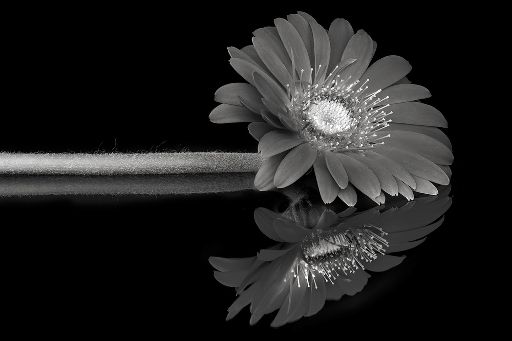
Canon EOS RP . EF100mm f2.8L IS USM . 100mm . 1/4sec . ISO100
Senior Critic Theo Lucyx
Hi Jackie … You want to learn, but we can learn from you, for me a great image. I have only suggestions for the composition and the details of the flower. The image looks great . The only thing I don't really agree is the framing. The flower is a bit too close to the frame sides. It needs some more space.
Let me make a suggestion for a better composition.
Create a black background colour which is exactly the same as the background in the image.
Make a rectangular selection from the whole photo and than go to EDIT>TRANSFORM>SCALE.
Starting from the upper right corner, make the rectangle smaller till the flower has about 5 times more black background. The heart of the flower should end horizontally on 1/3 of the length.
By doing this, the flower will have more space on the right and above and will look better.
Last but not least you might darken the heart a fraction to make the details pop out.
Try and see if you like it ;-)
Anyway, my compliments for the nice job you did. And at last you may darken the heart a fraction for the most detail. See if you like it and my compliments for this nice work.
Jackie Matthews
Thanks Theo. I agree with the space issue but the constraints under which the challenge was set needed the image to be captured within 3". I did as you suggested and I agree that it lets the image breathe. I darkened the centre too which brought back some detail.
Senior Critic Calin Hanchevici
Dear Jackie, thank you for sharing the image with us. You have done a great job in creating the stack, details are very well rendered, and the tones are excellent. I assume you have used a dark glass for this.
I like the image, my only comment is about the composition. I find it a bit static, and maybe a different placement of the flower could add more dynamic lines. Since it takes a lot of effort to create a new image, my only suggestion is for your next images.
Have a couple of shots to see how the composition would work better, then create the stack.
Theo suggested to increase the space, and I think is a great advice.
Nevertheless, it is an excellent image. Congratulations!
I hope this short comment will be of some use to you.
Jackie Matthews
Hi Calin, yes this image was shot on a black reflective wall tile. As I said, the restriction was to create an image in 3" but I agree that it looks much better with more space. Thank you for your suggestions.
Member Marketa Zvelebil
Hello Jackie, this is a beautiful photo with simplicity paramount. I love the reflection of the flower and I think you hit the lighting spot on. It's a very good example of photo stacking. I, as other have suggested, would also like to see a bit more space around the flower head. But I do like the composition.
Jackie Matthews
Thank you Marketa, I too agree that it needs more space having seen how it looks in a bigger frame. Thank you for advice.
Member Daniel Springgay
Hi Jackie, great well put together image. I can see you put a lot of work into it, I can see plenty of quality on show and wonderful camera skills. I love the idea of a flower and its reflection as a subject many photographers have tried over the years.
To make flowers look that bit special you have to come up with cutting edge ideas, try and think outside the box. May I be blunt "why monochrome" ? Flowers in there nature are full on colour for one reason: to attract insects and people. They just don't look right in black and white to me.
You don't really need the stem. I would have removed it, just keeping the flower head and the reflection to photograph. A few droplets of water on the flower and the glass mirror might have giving this wonderful flower a lift.
With flowers it's all about impact and power to please the viewer. There is nothing wrong with your camera skills. You're top notch! Just get thinking how to make the image published image and go for that special idea. Best of luck... we all need it!
Jackie Matthews
Thanks for the critique, Daniel. I've seen some beautiful black and white images of flowers here and I wanted to try one for myself. You are of course correct, colour is what is attractive about flowers. Composition is my weakness. I'm just working on some other images now without a stem and they look good, the pose for this one was awkward, I could see that but didn't know how to correct it. Water droplets are a good idea although not always because I've seen it done so many times and finally appears 'cheesy' but I will try that on some other images. Thanks for your feedback.
Critique is also open to all members, and we learn together here. If you see an image you'd like to comment on, your words would be welcome.
 | Write |
 | Theo Luycx CREW Jackie,
Nice you brought this image in Critique and I am glad you tried our suggestions and Yvette thanks for your great work.
TheoSc |
 | Yvette Depaepe CREW Congratulations to Jackie and many thanks to you too, Theo! Cheers, Yvette |