



|
|
|
|


(Part 1)
by Editor Lourens Durand
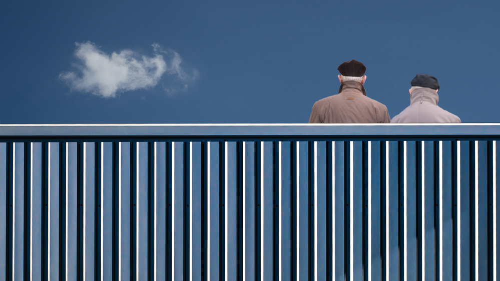
'The fence' by Luc Vangindertael
Today’s cameras and photo processing technology have brought the possibility of making excellent photographs within the reach of many more people than before. Nevertheless, we still need to be able to see the picture in the first place before activating the shutter. Even then, without any knowledge or feel for design and composition, “that” photograph would continue to escape us.

'Still life with lemons' by Svetlana L
The old masters of painting understood the elements of art and the principles of design. We can cleverly use the tools that they taught us to help us in our photography.
There are as many principles of design as there are art teachers, but here are some that I find are the more useful:
- Balance: the photo feels right and not lopsided or awkward
- Unity: all the parts feel as though they should be there
- Movement: suggested by the position of elements, leading lines, or actual movement
- Rhythm and Pattern: an underlying beat of repeated elements and shapes or colours
- Focus: the composer wants the viewer’s eye to rest on something, rather than wandering around
- Contrast: high or low, depending on colour, light and shade, rough and smooth textures, round and angular shapes
Elements of art may be distilled down to:
- Colour
- Line
- Shape
- Value or Tone
- Texture
- Volume or form
To start with, let’s have a close look at
BALANCE, UNITY, FOCUS
The John Paul Getty Museum Education principles of design describes balance as the distribution of the visual weight of objects, colours, textures, and space.
If the design was a scale, these elements should be balanced to make a design feel stable.
In symmetrical balance, the elements used on one side of the design are like those on the other side; in asymmetrical balance, the sides are different but still look balanced.
In radial balance, the elements are arranged around a central point and may be similar.
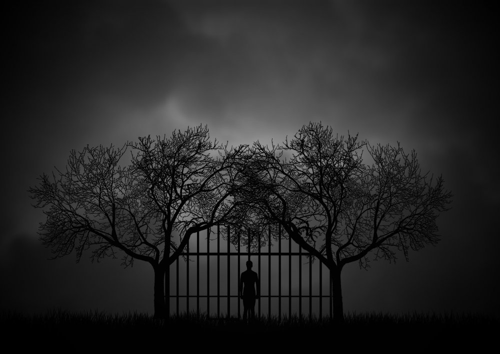
'Limitation I' by Aryana Golchin

'Trapped' by Jacqueline Hammer
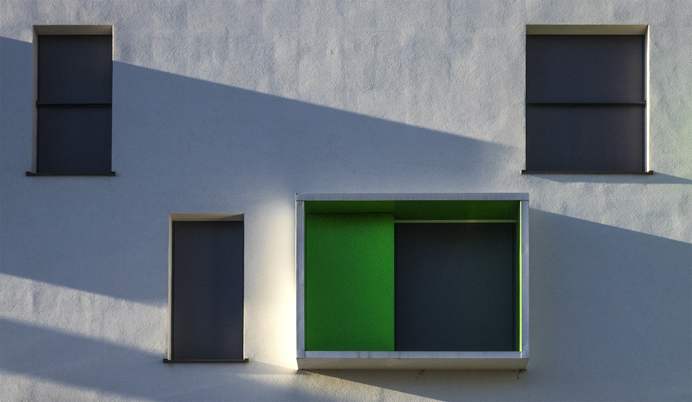
'Glowing green' by Jef Van den Houte

'still life with asparagus' by Iwona Czubek
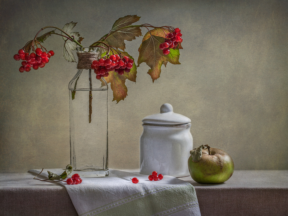
'Still Life with Small White Jar' by Inna Karpova
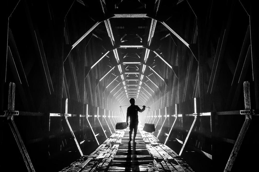
'Light of Hope' by Gunarto Song

'Fisherman on Inle Lake' by Mark Prior
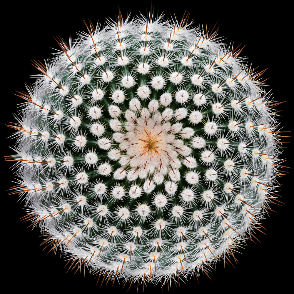
'Notocactus scopa' by Victor Mozqueda
The so-called Rule (or guideline, because there are no rules) of Thirds was first proposed in 1797 by an English painter and engraver John Thomas Smith, and it is now commonly accepted that the human eyes settle easily onto subjects falling at or along the intersection of the lines dividing a picture into thirds horizontally and vertically.
It is commonly accepted that a horizon line in a landscape is best placed on a line of thirds, either the upper or lower line (and that the horizon should be straight), but we will discuss this later.
There are other placements, but the thirds is the most common.
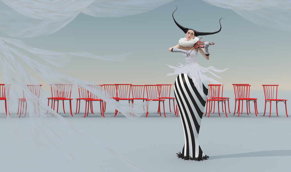
'Masterpiece' by Esther Margraff
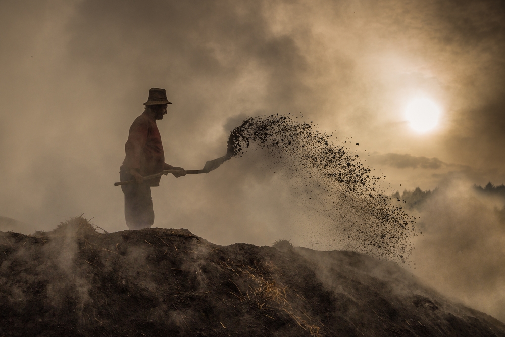
'New world creation' by Adrian Popan
Photographs of elements in threes or fives, rather than twos or fours, appeal better to the eye, because the eye and the brain tend to wander towards the centre of a group and, if it cannot find it, the photo appears to be out of balance.
Instead of photographing twos, either add an extra element like a posy of flowers, or make one element large and the other small, so that they don’t compete.

'FOXES. Juveniles' by Schlomo Waldmann
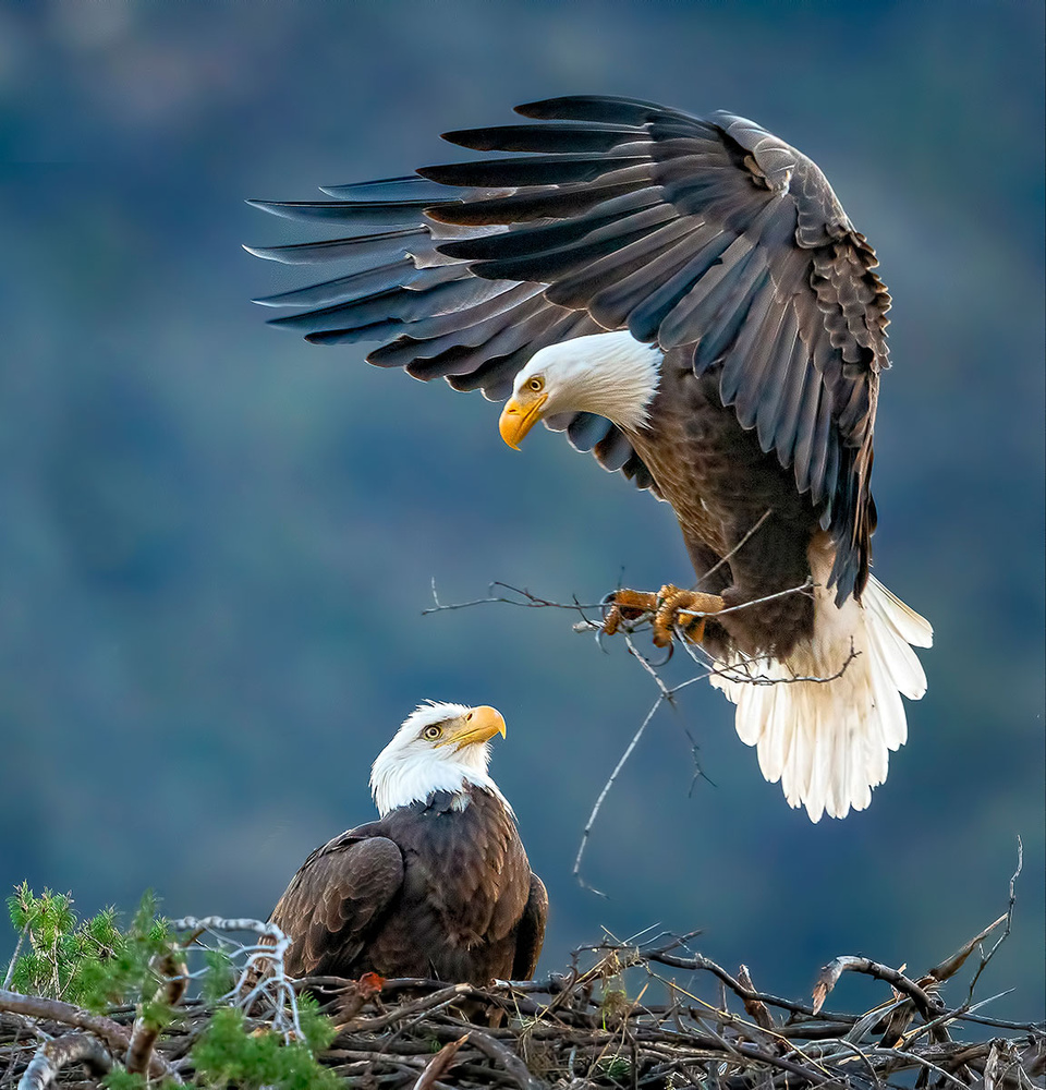 'Two Hearts – One Hut!' by Andrew J. Lee
Sometimes, depending on the subject matter, centring is preferred, but in most cases off-centre works better, making the picture more dynamic and interesting.
The human eye is drawn into visual art along lines, and so we need to provide these leading lines in the shape of roads, paths, colours, light or shade, normally from left to right. These lines can also be used to create the illusion of depth.
- In one special kind of leading line, the S curve (and even the C curve, which is half an S), the lines are meandering rather than straight, which help to create a soothing, unhurried mood.
- An L-shaped composition, especially along the line of thirds is particularly attractive, combining the dignity, height and strength of the vertical line with the calmness and tranquillity of the horizontal line. It is often used in landscapes to depict peace and serenity.
- The V shape is commonly used in landscapes to create depth, with a background of distant mountains held within the V.
- One of the strongest compositional elements is the triangle, representing strength and stability, and can be repeated throughout the picture.
As mentioned earlier, the horizon line should be straight and generally along one of the lines of thirds.
Exceptions are:
Where there is a strong reflection of a landscape in the foreground water. It may be better to provide a symmetrical image with the horizon along the centre line, or even without a horizon line
Where a more dramatic effect is desired, the horizon line can be situated very low down.
When a horizon line is shared with the top of a foreground subject, such as a beach chair with its top edge aligned level with the horizon, the sense of depth is lost. Conversely a horizon line above or below the top of a foreground subject accentuates depth and perspective.
Diagonals are useful in capturing drama, as displayed in Joe Rosenthal’s iconic photograph of US troops raising the flag in Iwo Jima during WW2, as well as in more modern photographs.
On the other hand, if diagonal lines are made to converge, they create a sense of depth.
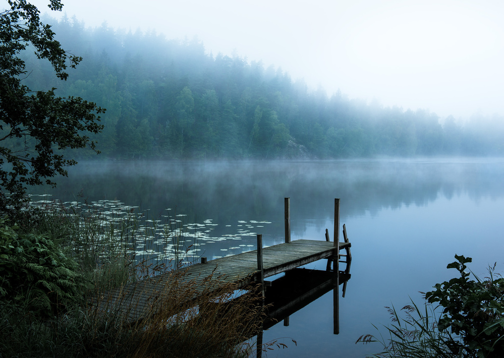
'Moody morning' by Chistian Lindsten
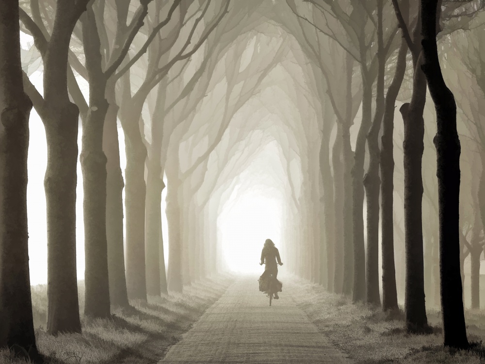
'Gone in a Few Sec' by Lars van de Goor
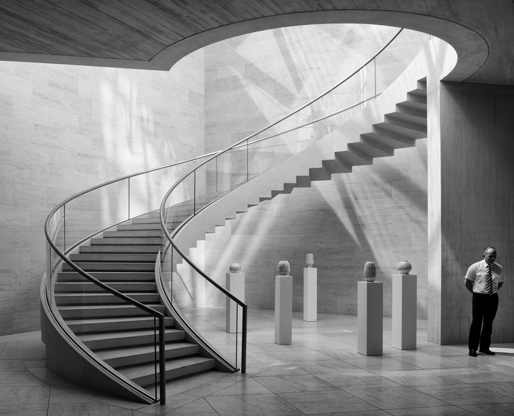
'Guarding the jars' by Jeroen van de Wiel
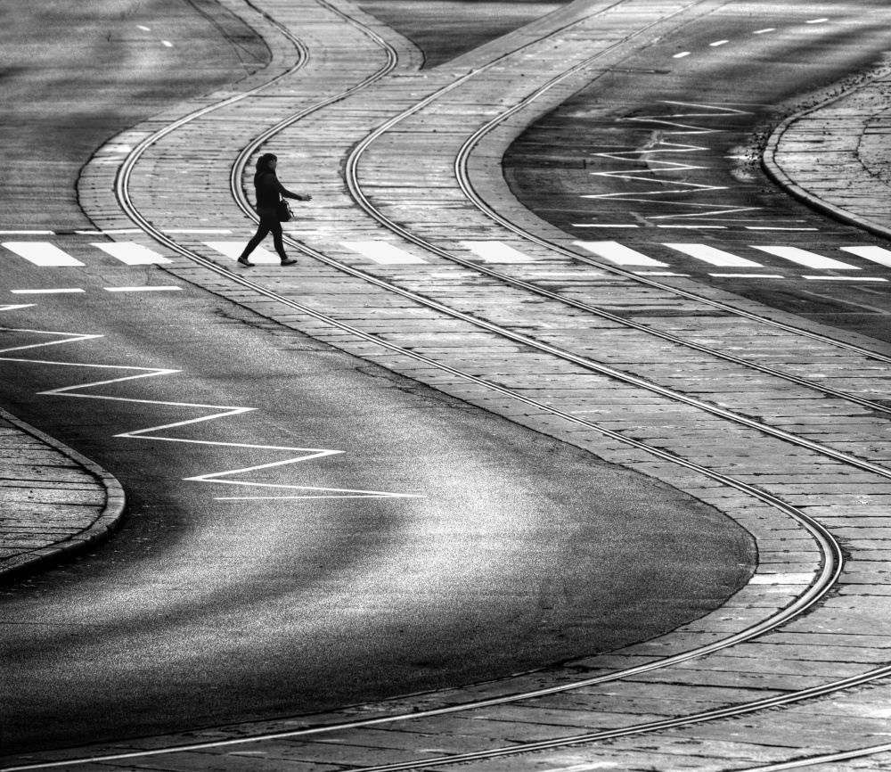
'Onto the other side road.' by Anna Niemiec

'electric coloured sky' by Riekus Reinders
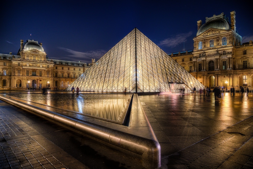
'Triangles' by Jean-Charles Mudet

'Triangulation' by Martin Gremm
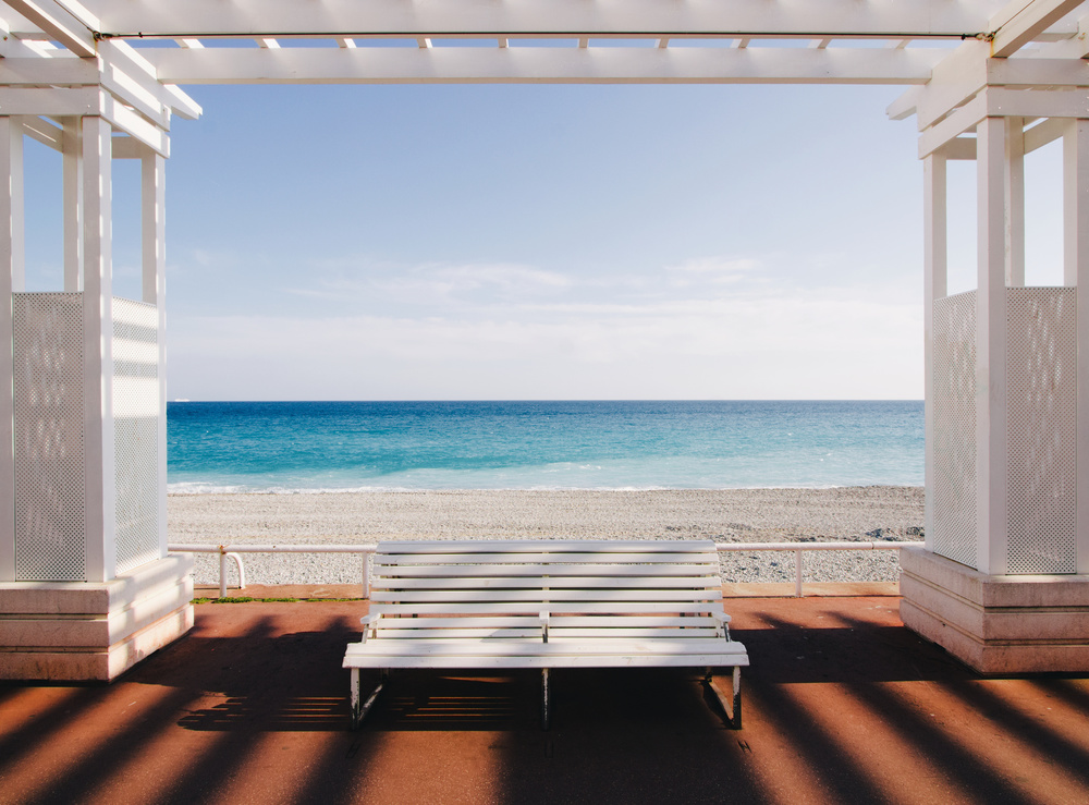
'Window to the Sea' by Paco Palazon
I hope that this selection of images helps to portray the essence of balance and unity in a photograph.
In part two of this article I will look at some of the other elements of art and principles of design that may be useful in photography.
Best regards and happy shooting
Lourens Durand
 | Write |
 | Thierry Lagandré (Transgressed Light) PRO Very interesting article, thanks to the authors and Yvette. |
 | Yvette Depaepe CREW Thanks for your interest, dear Thierry ;-) |
 | Aryana Golchin Tank you,Yvette,tank you Lourens Durand. |
 | Yvette Depaepe CREW Our pleasure, dear Aryana! |
 | Steven T CREW Thank you, Lourens, for an excellent article - informative, well-organized, and well-written. Good choice of photos too. I learn every day here at 1X. |
 | Leah Guo PRO Excellent article and examples,looking forward to read the 2nd part. Thank you Durand and Yvette! |
 | Yvette Depaepe CREW Thank you so much for your appreciation, Leah! |
 | Lourens Durand CREW Thanks to all for your appreciation and good wishes, and it is my pleasure to be able to write for 1X. |
 | Iwona Czubek Thank you Yvette, thank you Lourens. I am looking forward to part two of article:) Best regards! |
 | Yvette Depaepe CREW Our plaisure, Iwona! Part two is on its way (probably next Wednesday).
Have a nice Sunday, dear friend! |
 | Andreas Agazzi PRO Excellent article, very comprehensive with awesome examples of different photographs. Thank you very much and congratulations! |
 | Adrian Popan PRO Great article, thanks a lot! |
 | Knut Sander Thank you very much, Lourens for that great article and as Yvette I am looking forward to part 2. Those articles combined with pictures from 1x (and the blog as a whole, big thank you also to Yvette.) are in my view a great benefit of 1x. Best wishes, Knut |
 | Yvette Depaepe CREW Many thanks for so much appreciation, dear Knut! I wish you a fine weekend, dear friend! |
 | Yvette Depaepe CREW Very interesting study about the Elements of Art and Principles of Design applied to Photography (Part 1), dear Lourens. Looking forward to Part 2.
Big thanks for it!
Congratulations to all the authors of the selected images.
Wish you all a fine weekend ahead...
Cheers, Yvette |