

|
|
|
|


by Editor Yan Zhang (Sydney, Australia)
Several years ago, a professional photographer once told me that he saw the world in square: he used his medium format DSLR camera to produce his square-framed photography works. Even if he used a 35mm full frame DSLR, he had to visually compose the scene into a square format with his mind.
As a beginner photographer at the time, I didn’t really understand why this professional photographer was so dedicated to the square aspect ratio in his photography practice.
But as time went on, I began undertaking extensive landscape photography activities in many different places in the world, and I started to realize that the square is a powerful composition ratio, which, when applied effectively, can produce some of the best photographic works.
In this article, based on my studies and personal experiences, I will briefly talk about the history of the square aspect ratio in photography development, explain why a square composition may be the best option in various scenarios, and how we can master the “shooting in square” technique, in both field and post-processing.
THE ORIGIN OF THE SQUARE FORMAT
Before the digital era, most medium format cameras were made to shoot in square in terms of the aspect ratio of the frame. In fact, the first square medium format camera, Rolleiflex, was introduced in 1929. Other well-known medium format camera manufacturers, such as Hasselblad, stuck to the square format in their film cameras for a very long time until they started to make digital medium format cameras in the early 2000s.
There was a technical reason why the film medium format cameras used the square aspect ratio: since the design of most of these cameras made it hard to turn the cameras onto their sides to take photos, the square format was the most practical aspect ratio for photographers to use. This can be observed from the following structures of Rolleiflex and Hasselblad cameras.
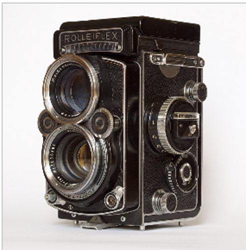 Rolleiflex 2.8 F
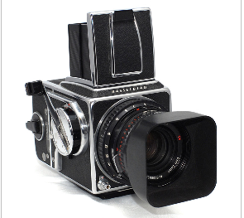 Hasseblad 500C/M with Zeiss lens
From a compositional viewpoint, a square format certainly has its advantages in practice. It presents a perfect balance on all sides of the frame, which is particularly good for shooting portraits and some specific landscapes such as seascapes. However, the square aspect ratio has never been used in 35mm SLR cameras. With the surge of digital technology now, most digital medium format camera makers, including Hasselblad, have also switched to rectangular 3:2 aspect ratio. Although some digital cameras have embedded different aspect ratios which photographers can choose when taking photos, such as the 9:4 and 1:1 aspect ratios, the camera sensors themselves are designed for the 3:2 aspect ratio frame.
FEATURES OF SQUARE COMPOSITION
(1) Lines, shapes and space
In landscape photography, there are many opportunities to use the square format in order to achieve the best outcomes. Through my photography practice, I have found that square compositions are particularly useful when lines, shapes and space play prominent roles in the photographers’ eyes.
I took the following image P1 during my alpine expedition in Tasman Glacier in Aoraki/Mount Cook National Park. Here lines perfectly divide two giant icy blocks into a symmetric formationwhen a square format is used. The original image was taken using a normal 2:3 aspect ratio in portrait format (see P2). As we can see, P2 does not present a good form of symmetric partitions, and is not as powerful as the cropped one.
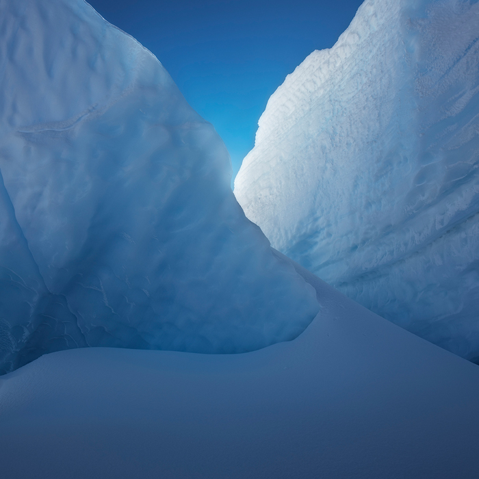 P1: Icy formation.
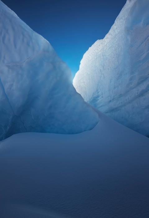 P2: Original image of P1
From an aesthetic viewpoint, sometimes the square format is also a better option in representing natural shapes compared to the traditional rectangular ratio. The following photo (P3) was taken of the famous Li River in China. The dawn light of the sky illustrated beautiful mountain silhouettes and their reflections into the river. I shot this image in a landscape format using my Canon Mark II camera. However, later on when I processed this photo, I found by cropping from the left side of the frame, the image became more balanced and appealing in the nearly square format. We note that photo P3 is in low light, there are not many details revealed from the image, but the mountain silhouettes and their reflections form dominant shapes of this place. The square composition provides an elegant frame for representing this unique scenery.
Another interesting feature of the square composition is its effective way of dealing with space. This is particularly true in seascape photography. Quite often, the sky is a critical component in seascape photography. Many photographers understand the importance of keeping a balanced portion of the sky when they take photos of the ocean. Sometimes, we only need a small part of the sky in the frame, e.g., 1/3 or less of the overall frame. Other times, we may need to have the sky dominate the whole scene. In both situations, we usually find that a square composition would have visual advantages over the traditional 2:3 aspect ratio in either landscape or portrait format, in terms of artistic representation and overall balance of the scenery. The following image P4 shows such an example.
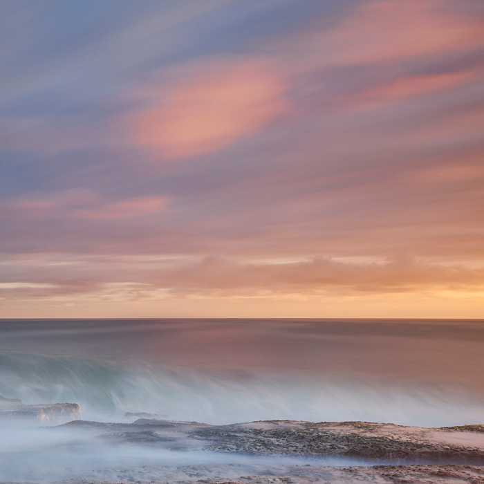
The square format works the best for this seascape image, which has 1/3 of the ocean and 2/3 of the sky, and produces a more artistic and balanced picture – not too wide, and not too narrow.
(2) Capturing grand landscapes
While the square is a powerful composition format when photographers deal with lines, shapes and space in natural scenes, it is also effective in representing grand landscapes like mountains, rivers and lands.
Instead of cropping a 2:3 aspect ratio image into a 1:1 ratio, by using a different approach, we can use the square format to capture grand and yet complicated natural scenes that are not possible to create via a single 2:3 aspect ratio frame.
Many times, we come to a place where there are a number of appealing natural elements we want to compose into the frame, but a single frame is not big enough to contain all of them. In this case, two shots with 2:3 aspect ratio (usually in landscape format) can be taken separately to cover different parts of the scene, and then they are seamlessly integrated into one square framed image through post processing. I call this approach the combined square composition.
There are at least two scenarios where this approach can be applied very effectively. The first case is when we do not want to compromise on the portions of both foreground and background using a 2:3 aspect ratio frame. For example, if the foreground and the far away mountain and sky are of a similar size that we want to capture, then the combined square composition may be an ideal option.
P5 shows one such circumstance. I took this photo on a stormy morning in Sydney’s east coast on Maroubra Beach. The tide was getting higher and just starting to wash over the big rock beds. At the same time, the sky was getting very dramatic; I wanted to have more sky in the image without reducing any part of the foreground which had the interesting, moving waves. So I used the combined square composition approach to capture this dramatic scenery.
P5: Waking up.
The second case where the combined square composition approach works best is simply when you need to take a larger picture. The following photo was taken in Cerro Torre of Patagonia mountain range. In this case, I was very close to the front three big rocks; it produced a good visual impact for the foreground effect. But this low shooting angle caused an undesired consequence: one single frame was not sufficient enough to include Cerro Torre peaks and the sky. So I took two separate shots to cover the foreground as well as the mountain and sky, respectively. As we can see, the final image represents the beautiful scenery with an impressive foreground impact as well as a significant perspective background of the mountains and sky. Note that here I did not change the focal length when taking these two shots.
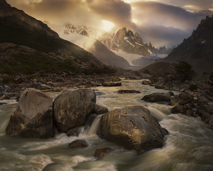 P6: Cerro Torre sunset
MASTER THE TECHNIQUE
Here, I mainly focus on the technique of the combined square composition approach, because the way of cropping a 2:3 aspect ratio photo into a square is rather straightforward. In the following, I run through a case study to demonstrate how we can master this technique.
(1) In the field
When we apply the combined square composition approach in the shooting field, two critical factors affecting our final outcome are composition and focusing.
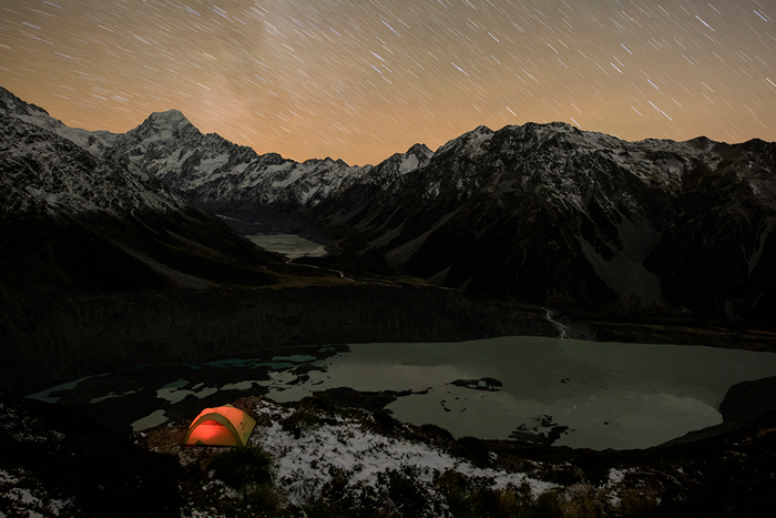
I took the following image in Aoraki/Mount Cook National Park, New Zealand. On 25 April 2017, I hiked to this location in the afternoon and set up my tent near the cliff ledge. I planned to take a night photo of this mountain scenery when the Milky Way would move to the right side of the Mount Cook peak and appear vertically in the sky.
P7: The sky is my companion.
Composition: During the planning stage, I wanted to create a grand photograph with the tent as the foreground, Mueller Lake and Hooker Lake as the middle ground, and the mountain peaks together with the Milky Way as the background. Obviously, one single frame would not be enough to capture all of the elements I was interested in for this landscape shoot. So, I used the combined square composition approach to shoot three separate frames – two captured the foreground and middle ground (with different exposure times), where only a small portion of the mountain and sky were included; and the third one captured the mountain peaks and sky, as illustrated in the following three pictures.
 P8: RAW file 1 for the foreground lake star reflections – 14mm, f/2.8, ISO 6400, 20 seconds.
 P9: RAW file 2 for the foreground and mid-ground details – 14mm, f/4.5, ISO 800, 365 seconds.
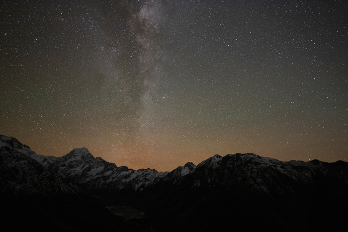
P10: RAW file 2 for the sky – 14mm f/2.8, ISO 6400, 20 seconds.
Tip 1: When we use the combined square composition approach, it is important to make the two individual shots as parallel as possible. To achieve this, after taking the first shot covering the foreground, one should shift the camera up horizontally to cover the background. Also remember that the second frame should have at least 40% overlap with the first one.
Focusing: Since the tent light was bright enough in the dark, I did a manual focus on the tent using the live view of D810. After taking a few test shots, I made sure that the tent was correctly focused. Then, in the following shoot, I kept the same focal point. Generally, when we use the combined square composition approach, we may need to focus on different objects in two separate shots in order to achieve a maximal sharpness of the final combined image, as I did for image 6 above.
But in this case, I only focused on the tent for both shots. This was because it was impossible to precisely focus on the far away mountain peaks in the dark. On the other hand, focusing to infinity was not an option either – while it might be feasible to make the starry sky appear sharply focused, it would leave the mountain peaks out of focus. Hence, by using aperture f/2.8 and focusing on the tent, it would produce the best focusing result from near to far in the dark across the entire scenery.
Tip 2: As a rule of thumb, when light is sufficient and the foreground is close to the camera, we should focus separately in two different frames: one focuses on the foreground object in the first frame and one focuses on the background objects in the second frame. However, if the foreground elements in the first frame are far from the camera, it is sufficient to do one focus in the first shot, and remain the same focus when taking the second shot.
Tip 3: When we take night photographs, such as the P7 example, it is important to have only one precise focus in the first foreground frame, and have that same focus in the second background frame, because it is usually impossible to do a precise focus in the dark for any far away background elements such as mountains.
(2) Post processing
Once we correctly complete the shooting process described above, combining the two frames into a single square image is relatively simple. Most of the time the “Photomerge” function in Photoshop CC usually does a good job for stitching two images together seamlessly. Some horizontal distortion may occur during this merge, but it can be easily adjusted through one or multiple “Transform” operations in Photoshop CC.
In this case, I used the Raw File 2 (P9) as a base, and the sky from Raw File 1 (P8) to replace the sky of Raw File 2 (which was full of star trails), and also the star reflections in Mueller Lake from P8 to replace the star trail reflections from Mueller Lake shown in P9.
After this replacement, I manually merged the resulting image with the Milky Way image (P10), which generated image P11 as follows. Since image P10 mainly contains the sky, two images can be simply merged manually, without causing any horizontal distortion.
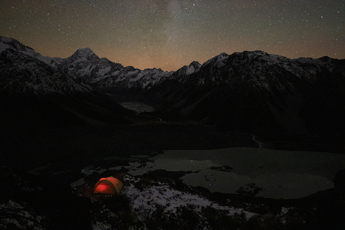
P11: After manually combining P9 and P10, while P8 is used to recover star
reflections in Mueller Lake. The final image after Photoshop processing is P7.
 | Write |
 | Janice W. Chen PRO Very interesting article. Thanks Yan and Yvette! It looks like P3 missing the square composition photo? |
 | Piet Haaksma PRO Thanks for the inspiring explanation. Gr. Piet Haaksma |
 | Yvette Depaepe CREW Dear Yan, thanks a lot for writing this most interesting article about shooting in square format.
Very well explained and supported by great examples. Cheers, Yvette |