


|
|
|
|
Published by Yvette Depaepe in collaboration with Mike Kreiten, Head of the Senior Critics
1x has a unique feature the founders are very proud of: the photo critique. Members can submit pictures to a team of knowledgeable senior critics. Their feedback and different suggestions are useful, interesting and enriching even for the best of us.
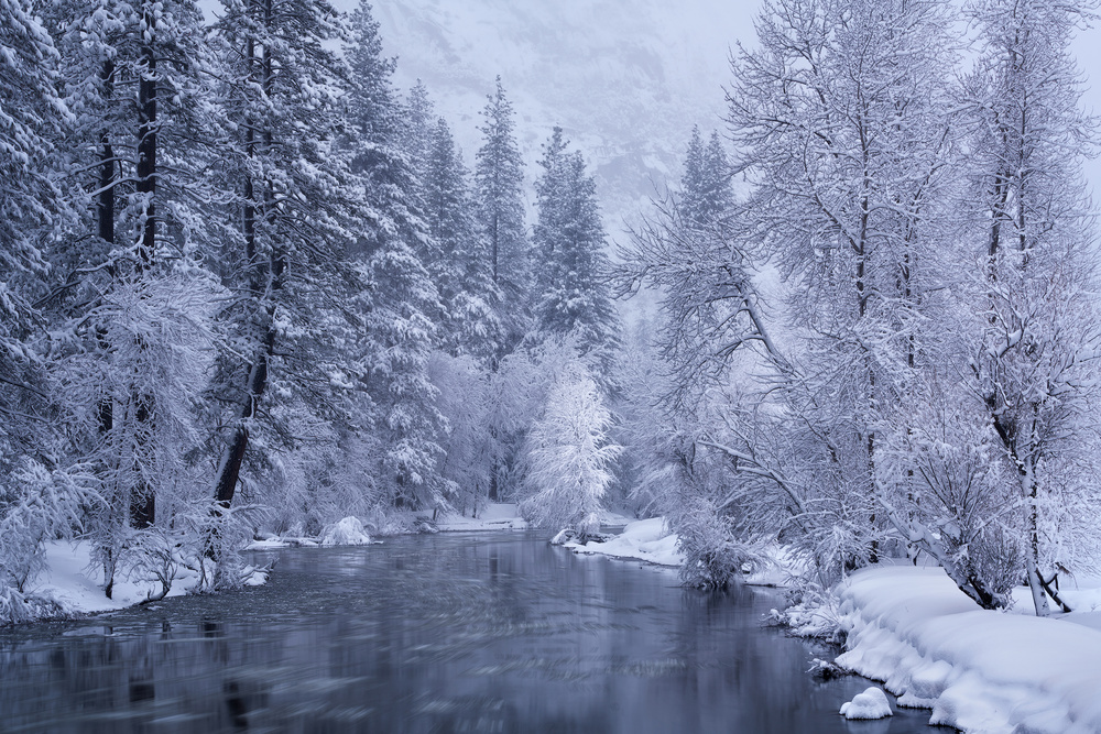
Critique on the photo ”Frozen motion” by Qiang Huang
Settings: Focal: 70mm, f/11, shutter speed: 2.5 sec, ISO 50. I used a longer
Processing: I used “dodge & burn” on the white tree and on the floating ice to create a leading line. Also highlighted the ice on the trees on both sides of the river and darkened slightly the background to obtain better contrasts.
Finally I applied a cold tone on the image.
__________________________________________________________________________________
Senior Critics Ivaylo and Teodora
Hi, Qiang. Thanks for sharing this frozen winter image in critique. First of all, I want to tell you I really like the picture and there is not a lot I would consider changing or re-editing.
In fact, there is one (completely subjective) feature I would change - the toning. It feels cold, it seems cold, the cyan light blue toning is just one step too much in emphasizing the cold and the freeze.
I had some thoughts about the depth and the way the volume of the scene should be created. May be some more shadows which could bring your accents to the light.
After telling you this, I want to point out my two really favourite accents in this beautiful images.
Love the delicate shapes in the white triangle, the visible movement of the water and the small white tree in the middle - the one you dodged to accentuate.
OK, this makes three of them, Lovely image and it true makes me feel the cold.
Wish you luck and best regards. Ivo, SC
Qiang Huang
Hi Ivo, thanks for the detailed feedback. I also felt the blue toning could be adjusted a bit, let me play with this. Will also do more D&B as you suggested.
__________________________________________________________________________________
Senior Critic Steven T
Dear Qiang, this may be the shortest critique I've ever written. I like the photo. I like it a lot! I saw it in the 'member curation' section the other day and gave it one of my rare 'Publish' votes. It is a beautiful winter scene. The composition has rhythm. We're invited into the scene by the leading lines that begin at bottom left and right, and, moving into the frame, we're rewarded with the discovery of the delicate white tree where the river curves out of sight. The wealth of fine detail is visually satisfying. The sense that it's very cold comes through with the icy-blue tone. I don't think it gets much better than this.
But . . . . if I had to find something to change, I'd consider the contradiction between the theme of winter's stillness and the implied movement of the water created with the long exposure. We get a lot of winter in Canada, and the feeling one gets when out in the bush is one of absolute silence and absolute stillness. The world is frozen and nothing moves. Here, the water rushing seems out of place.
I know ND filters are in vogue now, but I think this photo might have been just as good without. That's just my opinion.
Thank you for sharing 'Frozen Motion' with us. I enjoyed spending some time with it.
Steven, senior critic
Qiang Huang
Hi Steve, thanks for your detailed feedback. I also took images on that place without the ND filter and I found them lesser attractive. When I was on the bridge, the floating ice blocks were moving slowly towards me, which added some liveness and dynamics to the scene. I was quite impressed and really wanted to capture it. I guess this is a matter of personal taste :)
Senior Critic Steven T
Qiang, I understand and respect your choices. Thanks for explaining. Here in Critique we nit-pick small details. When you present an image that's near perfection, it makes our job more difficult. : ) This is a beautiful photograph!
__________________________________________________________________________________
Senior Critic Norman Gabitzsch
Qiang … Like my colleagues, I also was falling in love with the photo when I saw it. I like how the river pulls me into the frame. I like the extra white tree at the end of the stream to make me stop and look at the whole forest. It is most appealing in its coldness.
Like Steven, I find the near field river to be "nervous" and improper for the rest of the stream. You might want to try blurring the river slightly (please note that the only ice I ever get to see comes out of my refrigerator's freezer) as an experiment.
My second wish is that I could see just a touch more structure in the mountains in the background. I think that this nearly structureless "V" at the top of the frame is begging for attention. Just my opinion.
Despite the two slight distractions I still really like this image and you should be proud of this work!
Norm, Senior Critic.
Qiang Huang
Hi Norman, thanks for your reaction. I tried the motion blur on the floating ice on the foreground and it does look a bit better :)
__________________________________________________________________________________
Senior Critic Darlene Hewson
Hi Qiang..... I just have to say I love this shot - the slight blue hue, the snow covered trees, the slight blur of the ice blocks and the open water.
I like the idea of you highlighting that small tree - it definitely draws my eye into it!
Great scene and great work creating this!
Darlene, Senior Critic
Qiang Huang
Thanks for your compliments, Darlene.
__________________________________________________________________________________
Senior Critic Mike Kreiten
Dear Qiang Huang, just like my companions, I like this shot very much. More than any other shot recently, it shows everybody has his preferences and if we had been on the same spot, the results would be very different, obviously.
For me the sensation in this frame is the moving ice, the flow in curves, and of course the fine structured trees. I would rather emphasize the flow in your river than the small tree by more structure and brightness. Even if some critics did not like it, I actually do. It's the dynamic within the static I like. And I guess that's also your preference, the way you used a ND to get too this result.
Joining Steven, I don't like the toning too much, it is a slight violet for me.
I would not mind going in the direction of a more friendly teal/cyan tone. That fits winter moods better, I think. If you apply a hue/saturation correction layer, shift the Hue to about -25, that's what I mean.
About Norm's critique – well I read them all - there is some truth in his comment about the mountains in the back. They kind of block the scene. I would not like to see them even more, I'd rather suggest to crop them from above. I tried a 16:9 format from the bottom, full width. Which cuts into one of your tree tops. Still I believe the panoramic format fits your theme better than a 3:2. But see yourself, we can only share opinions. And as said, I rarely saw that many different opinions on one photograph.
Thanks for posting here, I hope we could give you some useful insights.
Mike, senior critic
Senior Critic Steven T
Mike, A correction: It was Ivaylo & Teodora who commented on the blue tone. I like the colour as it is. I tried your -25 Hue suggestion, though, and it's good too. Maybe halfway between? : )
Qiang Huang
Thanks for the detailed comments. I agree with the colour cast, I will do some tweaking there. Concerning dodging the leading line with floating ice and small tree, I felt that without the small tree as a focal, the remote scene will not have dimensions and layers ... I will also play with the cropping options to see how it looks.
I am really enjoying reading these comments and different perspectives.
Critique is also open to all members, and we learn together here. If you see an image you'd like to comment on, your words would be welcome.

It's an interesting suggestion, thank you for taking the time and bring it up. I have to admit critique is my "heart" of 1x, so it's a pleasure heading it and think about changes, improvements. Smaller ones. To a certain extend, Critique is a service, a hobby for some, a source for ideas, some read it to learn. If all of that would happen behind curtains, it would be half as useful and honestly, less of fun to do.
Of course we sometimes wish to see the RAW file and show what else can be done. But that would take it too far, so far we could live with what we can see.
Additionally, we like to have a look at the rest of a portfolio, to get a sense for the authors prefernces, genres, style and if possible, skill level. It would be unfortunate to see every photo out of context.
Sorry to say, the intersting your suggestion is, I don't see it improves the forum as it is now. And btw. we see good critiques from members currently, wouldn't it be a shame to take away that possibility from members obviously sharing our passion to discuss photos?
Thank you again, Vladimir, and best regards,
Mike - SC