


|
|
|
|
Published by Yvette Depaepe in collaboration with Mike Kreiten, Head of the Senior Critics.
1x has a unique feature the founders are very proud of: the photo critique. Members can submit pictures to a team of knowledgeable senior critics. Their feedback and different suggestions are useful, interesting and enriching even for the best of us.
Critique on the photo ”A Mid-winter Night's Dream” by Alessandro Traverso
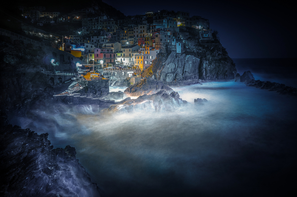
With this image I tried to accompany the observer on a journey suspended between the real Manarola and a Manarola of fantasy, through the editing of a unique photographic shot aimed at enhancing all the feelings that the moment suggested to me.
I consider this one of my best photos.
Obviously this picture has some problems that I can not see. I thank you in advance for your help in the analysis of the image.
F5.6 - 15 sec -- iso 100 - 16 mm (apsc)- pentax k2ii
Alessandro
__________________________________________________________________________________
Senior Critic Andreas Agazzi
Thanks for presenting one of your amazing photographs to the 1x Senior Critic team, Alessandro.Without any doubt, this photograph is also breathtaking!
You are referring to some problems with this work. I can only assume that the reason why you think so is a negative curation process. If so, there might be various reasons but not necessarily because of any flaws that would stop from a publication.
But you are here not for fishing compliments and so I try to dive down to the level of nitpicking. Please find my personal findings below:
Framing: my instant finding was that the scene is framed a bit tight., especially on the top. I would prefer to see more from the sky.
There is not enough air to breath. The eyes move within the composition upwards towards the top and are forced to stop immediately, no slow down at all before you hit the end. This is the emblematic approach trying to describe what I think could be a potential for improvement. At the right side I see the necessary negative space above the open sea; it also should be above the town. So, I am not sure whether you have more space left up there.
Processing: I like the way it is but I can imaging, this is not the same for some people. Clarity and colours are pretty strong.
Not sure whether you have used a detail extractor, the way your photograph looks like gives me that impression. There is nothing wrong with it but as I said, not for everyone's eye the best option.
Vignetting: the corners are a bit dark. I assume that this is not the result of your lens but added intentionally in post processing.
I would reduce it a bit, especially at the left side. The upper left corner lacks of details in the darkest areas, this is too much of a contradiction compared with the area where the central buildings are.
I understand that this is your favourite one.
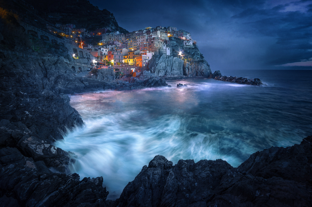
Your great work 'Between the Earth and the Sea' is my favourite and at the same quite similar to this one here. So, in case it was in curation and has been denied, I can imagine that this one here is too close to the other one, but that is just my subjective guess.
Alexandro Traverso
I turned to the precious help of the critical section because, together with the expertise and severity of the curators and the extraordinary variety and beauty of the photos published that I admire daily, are the best way to improve myself. The photo is close up because I have straightened very obvious hanging oblique lines of the houses of Nanomolar, but it did not bother me too much, perhaps because working a long time on an image one get used to it and one loses the critical spirit. As for the vignetting, it is a characteristic that I reproduce in several of my photos in order to better highlight the subjects of the same. In this case I have perhaps exaggerated a bit. As for clarity and saturation, white balance I understand that they may not please everyone, we would miss it, but I like it :) I'm a self-taught Light room and Gimp user, therefore I'm far from the technical aspects... I wondered if it is worth in situations like this to straighten the pending lines, I do not bother but I think many see them as imperfections to be avoided absolutely. Thanks a lot, Andreas.
__________________________________________________________________________________
Senior Critic Mike Kreiten
Usually we have a look at the portfolio of a member before writing, to get an idea for his or her preferences, skills, maybe habits. I enjoyed your portfolio very much, inspiring work.
Like Andreas, I noticed "Between Earth and Sea" and of course compared both. For me, and we can only share our personal opinion, that one is much stronger than this work. On 1x, very common subjects are not favoured in curation. 1x is a gallery, looking rather after renewing images.
Your shot of Manarola is far better than mine, and it was no surprise to me that it was published. But having two versions published may be a high expectation. Especially if the first one is stronger.
In this one, a very large portion of your frame is dedicated to the sea. But the sea in your other version has more details , appears wilder. This one is not calm, but still quite flat. Your houses are all straight. Manarola's houses are not all aligned, that's part of Italy's charm.
There is not a single window lit in a dark scene, just street lights. Again, better in "Between Earth and Sea". The strong vignette was covering some street lights, which now appears blown-out, toned down. The vignette became very obvious in this photo. The hard detail level on buildings looks pretty graphical to me, it's much more natural in your published image.
I read this one is your favourite, so I really have to hope you don't bother me naming all the weaknesses compared to the other version. This one is a great photograph, the other one is just more than great.
Alessandro Traverso
Thank you so much Mike, I'm so glad you like my wallet. I like this one better than "between the land and the sea" because I wanted to do something different, risking also some technical imperfection. I had already partially identified the weak points of the picture but, thanks to your expert analysis, now they are clearer. If a photo is not published, I think the fault is mine, certainly not the curators'. 1X gave me lots of unexpected satisfaction and also to have you among my followers.
Senior Critic Mike Kreiten
You're very welcome, Alessandro! Your portfolio is for sure interesting to watch. We usually don't comment much on curation because we don't know more than any other member about it, but let me say something nevertheless.
1x is an online gallery, curators choose works that fill the virtual wall called front page. If a work is not chosen (I prefer that over 'rejected'), it does not mean there is something wrong with it. Curation is not a quality check. It just means other works occupied the vacant spaces that day and yours was not amongst the chosen ones.
__________________________________________________________________________________
Senior Critic Martin Zalba
Thank you very much for sharing your work with us, Alessandro. This view is magnificent! I think it is a complicated photograph due to the high dynamic range between lights and shadows.
From my point of view, so much light in the central area, makes the scene natural, the difference of light and shadow is so extreme ...
The main problem I see in your work is the excessive vignetting, which eats the details around the photo.
In general it seems to me that there is too much processing (look at the haloes in the rocks below on the left) the excessive saturation of warm colours, the excess of light in the central area of the photograph and the burned-out lights of the lighting.
I would reconsider the processing. I like the framing and the atmosphere.
I hope that, looking at the details that I mention, you rethink the processing of your photograph. Always with respect and with the desire to help.
Alessandro Traverso
Thanks for your contribution to the analysis of the photo, Martin.
__________________________________________________________________________________
Critique is also open to all members, and we learn together here. If you see an image you'd like to comment on, your words would be welcome.
 | Write |
 | Vladimir Asriyan Special thanks to Allesandro! :-) |
 | Yvette Depaepe CREW Of course!!! |
| | Vladimir Asriyan Excellent professional work of critics.
It seems to me that the frequent demonstration of the discussion of the work of experienced photographers will be useful to many others.
Bravo critics! Thanks Ivette! |
| Yvette Depaepe CREW You're so right, dear Vlad. Thanks for your feedback! Cheers, Yvette |
 | Alessandro Traverso PRO The critical section of 1x is a unique opportunity for growth for those who want to improve the quality of their photos.
The competence, courtesy and availability of the crews must be praised, they perform a very difficult task in the best way.
I thank Andreas Agazzi, Mike Kreiten and Martin Zalba for critic, I thank Yvette Depaepe and Mike Kreiten for choosing one of my photographs for this article.
Photos that I care a lot despite having various weaknesses.
Thanks for the gift!
Sincerely.
Alessandro Traverso |
| Yvette Depaepe CREW Well expressed appreciation for the Senior Critcs, dear Alessandro. Picked out your image because you submitted it in spite of your skills and because the critiques are most interesting ;-) Thanks to you, a fine example for all the members to discover this unique 1x feature. Cheers, Yvette |
| | Yvette Depaepe CREW Thanks to the Senior Critic team for this enriching and interesting review. Thanks to Alessandro for submitting his beautiful image. Cheers, Yvette |