


|
|
|
|
Published by Editor Yvette Depaepe in collaboration with Greg Barsh , Head of the Senior Critics.
1x has a unique feature the founders are very proud of: the photo critique.
Members can submit pictures to a team of knowledgeable senior critics. Their feedback and different suggestions are useful, interesting and enriching even for the best of us.
Critique on the photo ”Magic sunrise” by Gabi Rusu
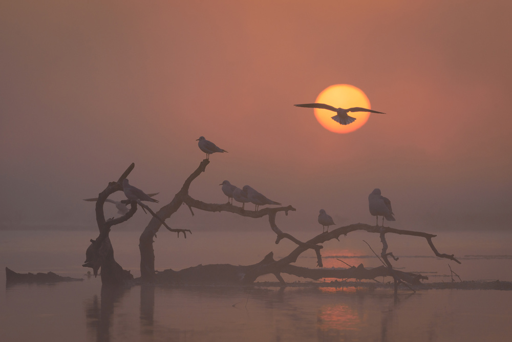
The image was taken in Danube's Delta, at sunrise. While the mist was scattering we were able to see a branch with some gulls resting on it. At some point another ones arrived at the place, flying, so I've waited for the moment when one of them was on the sun direction.
I'm interested in you opinion regarding the composition, subject, technical settings or whatever feedback you have. what could I've done better? what could I've done differently?
Technical details: 390mm; f/8; 1/640s; ISO 500; aperture priority; centre-weighted average metering.
I did some processing in Lightroom like: horizon correction, sharpness and very little colour boost. I don't like to alter nature images very much.
__________________________________________________________________________________
Senior Critic Javier Roldan
First of all, thank you for posting the shooting settings, as they allow for a better critique and for others to learn. You have done a fantastic job with this capture. Perfect settings for a perfect composition. It's so good that it seems a composite image.
From a critique perspective, these are my comments:
- My main observation is colours are completely washed away. Even though you prefer not altering too much, I'm sure the scene in reality had more contrast and, even if it didn't, the impression it left in you was stronger than the colours here, so I'd add more contrast and perhaps a little saturation.
- Maybe you can crop a tiny bit from the top to the bird lies perfectly in the strongest top-right point following the rule of thirds.
- There is noticeable "banding", stronger in the sun and less noticeable (but still there) in the sky below the sun. This may be because of processing. Make sure your handle correctly your colour profiles during editing and do everything on ProphotoRGB (I think it's called that way). You can google how to avoid banding to get tips on the topic.
I hope it helps and thank you for sharing
Gabi Rusu
Hello Javier, the scene was exactly like in the photo... the fog was pretty dense (I had to focus manually), but I will try to saturate the colours a bit more. Thanks you for your feedback!
__________________________________________________________________________________
Senior Critics Ivaylo and Teodora
Thank you for sharing this misty image in critique, Gabi. It awakens some old memories since I was there admiring the scenery the South side of the river. I can imagine the difficulty to capture and present this picture.
First I thought exactly the same as Javier but after I red your answer I considered a different approach.
You have all the ingredients for a very nice nature shot. But looking at this scene and how you captured it, I would edit it differently.
If you saturate lightly the colours and increase the contrasts, you will undeniably lose the feeling of hard thick mist. So I would go in the opposite way – de-saturating the colours and selectively decreasing the contrasts.
Usually, we imagine fog as “white”. Therefore it could be worth to try to make the scene paler while keeping the fire in the sky. This way, the viewer would catch the mood even if it is not corresponding exactly with the visual reality when you took it.
But I fully join Javier's critique concerning the banding in the sun which is too 'visible'. I would try to process it in another way if possible.
Beside this remarks, this is a very nice and relaxing image. I love it.
Gabi Rusu
Thank you, Ivo! I will try out your suggestions and take them into consideration to see if they can improve this image.
__________________________________________________________________________________
Senior Critic Norman Gabitzsch
Dear Gabi, I like this moody and very appealing image. I like the fog, I like the lines of the branches in the water, I like the placement of the sun and the small ripples in the water. Most of all I like the colour palette... warm and inviting. Very nice.
You have received suggestions to increase the saturation and/or decrease the saturation. Both are plausible answers, but I would like to suggest something else.
Personally, I find this image "flat"... 2 dimensional, even though I really like it.
What I would suggest is that you put in a radial gradient centered at the sun and increase the saturation gradient slightly as the gradient approaches sun. This will give the image dimensionality and pull the viewers eyes into the image, rather than leaving the viewer in the outside world.
I do have one question for you. Did you actually get the bird flying into the sun or have you added the bird in flight. The only reason I ask this is because if you added the bird, then this should technically be classified as a Creative Edit. Creative Edit does not diminish the work, but only sets the record straight.
Wonderful work! A small amount of dimensionality might make it even stronger.
Gabi Rusu
Thanks for your feedback, Norman! I did not add the bird in post-processing. It was really there. I saw it flying in the direction of the sun so I was shooting multiple times and was lucky enough to get one photo with the bird in this position.
__________________________________________________________________________________
Senior Critic Martin Zalba
Thank you very much for sharing this beautiful work with us. The reading of an image and in this case “yours” is always subjective, it does not escape to different opinions.
It could be more contrasted and deeper colours but for my personal taste, the soft tones contribute here to reinforce the atmosphere, mood and delightful softness.
I found it very good. I have tried to add a selective correction adjustment layer, choosing the black colour and adding just a little more of it. It resulted in a lesser flat image and everything was acquiring more depth.
Maybe you should try it to see if you like it, it's all I can give you.
Gabi Rusu
Thanks you so much for your feedback, Martin!
__________________________________________________________________________________
Critique is also open to all members, and we learn together here. If you see an image you'd like to comment on, your words would be welcome.
 | Write |
 | Catalin Alexandru Excellent article Miro and thanks for selecting my photo,much appreciated! |
 | Yvette Depaepe CREW Fine review on a beautiful image! Congrats to Gabi and thanks to the Senior Critic Team. Cheers, Yvette |
 | Gabi Rusu Many thanks for publishing this article, Yvette! |