

|
|
|
|


by Editor Peter Walmsley
If you look at the 1x collection, many pictures don’t have a title.
Does it matter?
What does a title add?
Let me start by proposing that titles are important and they often receive little thought.
All the creativity has gone into creating the picture and there’s nothing left for the title. Most competitions require a photograph to have a title and as a photographic judge, I’m normally presented with the title at the same time as the image is shown. In about 10 seconds, I have to assimilate title and image and in that situation, I’m looking for clues in the title which will help me to understand the image.
In the 1x gallery, I suspect that for most viewers, it is the opposite way around. An image catches the eye and only later may the viewer look at the title if they want to know more or can’t understand the image.
The number one job of the photographer is to convey a message. To understand why they wanted to take the picture in the first place and to work with camera controls, light, viewpoint, composition, timing and post processing to best convey that message. A photographer can make it easy or hard for the viewer but they shouldn’t abdicate responsibility for understanding the message to the viewer and should take care to avoid making assumptions about the knowledge of the viewer.
Sometimes an image is powerful enough not to need a title, though the photographer may choose to add one anyway.
Taking examples from recently popular 1x images.
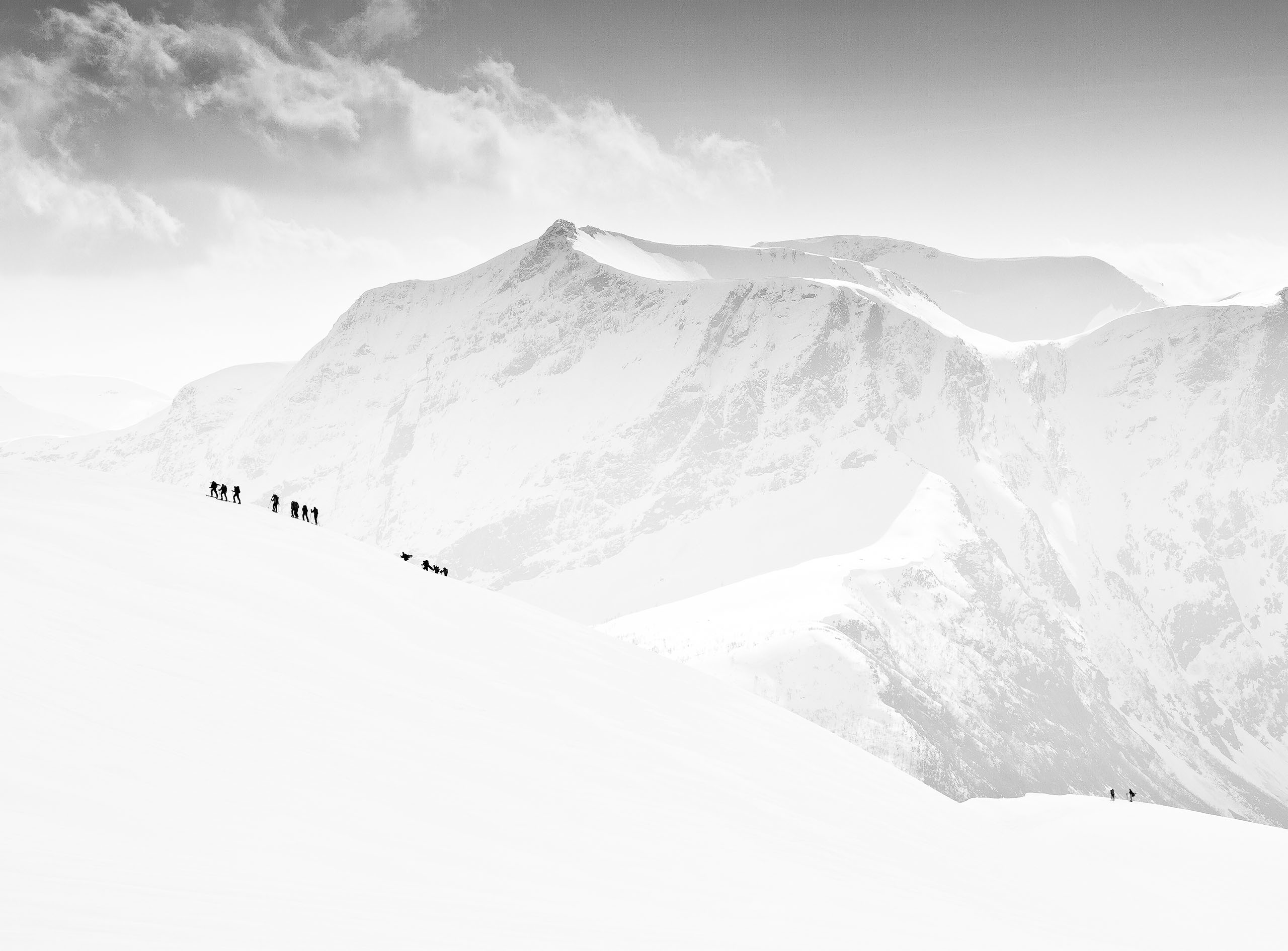
In this image, the message is clearly conveyed.
No titles or titles which state the obvious are probably the view of many of the early artists and sculptors who opted for simplistic names like ‘nude’ or ‘Portrait of a lady’.
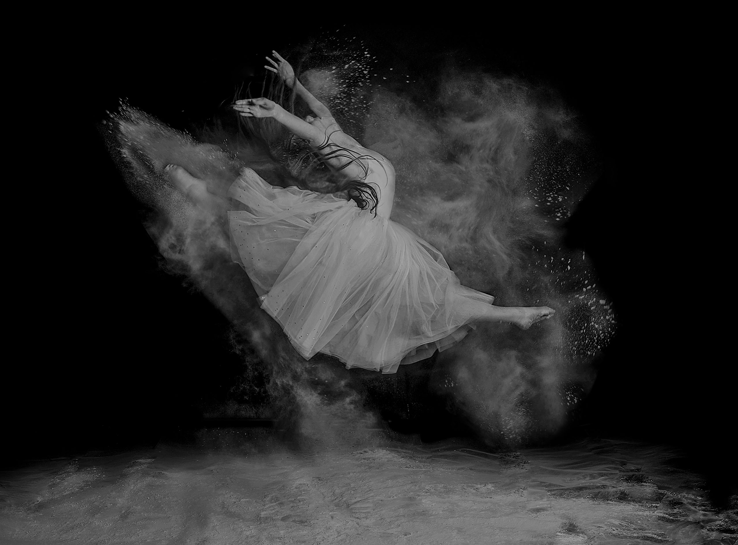
This beautiful image in the 1x gallery doesn’t have any title but I’m also not sure what to make of it and personally I’d be grateful for some help.
In my view, it is generally better to assume an intelligent viewer and avoid repeating the obvious. A large number of competition images follow this route as does this example:
A little more subtle is: ‘Eyes’ by Andrey Lobodin
Before I receive angry responses from the authors and other 1x viewers, this is not a comment on the quality of the photography: just examples of an approach to titling.
Photographers may choose to help viewers with their thought process.
This example is a woman posing as a statue titled ‘Antique’ by Stanislav Ivanitskiy
This made me think for a while before I concluded that the photographer intended to draw parallels with the pose of his subject being similar to those of classic artists despite the contrasting setting. I may be wrong in my interpretation but I’ve taken away an understanding I’m satisfied with and pleased that the photographer made me work to get it.
Landscape photographers often append place names as titles such as ‘Le Minou’ by Sus Bogaerts.
Where I find the location (and its photographic treatment) of interest, I’m usually quite pleased to know where it is.
Alternatively the photographer can tell me a little more about the story they were trying to capture such as: ‘Before the tempest’ by Franklin Neto
As photographers, we know that what attracted our eye at the time may be subconscious and may not actually become apparent until we’ve studied the image later and worked it out. Titles can imply an interpretation which the photographer may or may not have seen at the time and to work, the title has to credibly connect with the point of the photograph. See ‘Life in an imaginary World’ by Thierry Dufour
Many nature photographers use the Latin names of their subjects as titles such as ‘Trimereserus Gumprechti’ by Thor Hakonsen
Though such use assumes an interest in the viewer which may not exist. To me, the composition of the snake’s body curling into the picture from top right, and leading towards the bright yellow eye concentrating on its prey and the darting tongue are the story elements in this image.
Some titles leave me baffled: ‘ZM.01’ by Erik Rozman
But maybe this refers to something which I don’t normally encounter.
Some titles usefully add information: ‘Angry fish’ by Andi Halil
I really did want to know why the fish had such a dramatic red tail and now I do.
And some (and probably my personal favourite category of titling) tell me about the emotive content the photographer was trying to capture so they add to the story such as: ‘Silence’ by Andrey Lobodin
One last thought: you tend to know when a title is correct because it just feels right and you remember it for a long time. The intent of the image and the description connect.
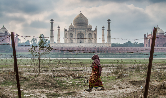
This last image is one of my own titled ‘Mind the gap’ by Peter Walmsley.
 'Mind the gap' by Peter Walmsley
It took a week to think of this title and it doesn’t work across all languages and cultures because it is a play on the phrase used by London Underground to warn of the gap between the train and the platform. But in this case it describes the poverty gap between the female subject and the Taj Mahal as observed by the viewer on the other side of the barbed wire fence.
Thank you for giving us your thoughts on this. You make a strong case for using titles. I hope the article will motivate some readers to consider the importance of that final step in the creative process.
I'm sure you know that there are two schools of thought on this. Many photographers insist that their photographs speak for themselves, and that leaving the discovery of meaning up to the viewer's imagination allows a wider variety of interpretations.
That may be true, but my belief is that most photos benefit from a carefully-crafted title. Photographers should have at least an approximate idea of the meaning or theme of their photograph. A good title will nudge the viewer gently towards the intended meaning, but not preach to them by spelling it out explicitly. Images are appreciated more when a viewer has to think a little, and then are rewarded with the 'Aha !!' moment when they grasp the harmony between the photograph, the title, and the photographer's vision.