


|
|
|
|
Published by Editor Yvette Depaepe in collaboration with Theo Luycx, Head of the Senior Critics.
1x has a unique feature the founders are very proud of: the photo critique.
Members can submit pictures to a team of knowledgeable senior critics. Their feedback and different suggestions are useful, interesting and enriching even for the best of us.
Every month, well-known 1x photographers will lend their “expert eyes” to members, providing new opinions, expertise across a diversity of genres, and photographic wisdom and insight.
Guest Critics for June is Veselin Atanasov.
Critique on the photo ”Hallstatt, Austria” submitted by Abbas Ali Amir.
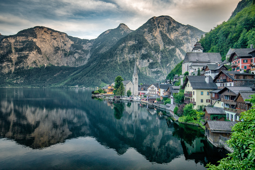
This photograph was taken in Hallstatt, Austria, a very picturesque town. I wanted to capture the essence of the place and the scenic surroundings.
Settings: 21mm, f/7, ISO 800, 1/80s
Editing: Lightroom and Nik ColorFX plug-in for basic retouching, tonal contrast etc.
Some selective editing on the city itself to increase the exposure and selective colouring by decreasing the luminosity on the sky and increasing the saturation of greens.
Please let me know if something is wrong and how to improve it.
Composition wise I was limited by the railing that I couldn't cross.
__________________________________________________________________________________
Senior Critic Greg Barsh
Picturesque is the right word to describe perfectly well this photo! A wonderful image that evokes for me a sense of the terrific scenery one can appreciate in a small European village on a lake.
I think the choice of perspective, focal length, and framing is perfect; even at 21 mm, the mountains loom large, the details in front of the church (I think it's a church) are interesting, and there's a nice leading line created from the lower right corner up to the end of the peninsula.
I have two comments about processing:
First, I think the lake edge may be tilted a degree or two clockwise; even if your sensor was perfectly parallel, these types of images can sometimes benefit from artificially rotating the image (in this case a degree or two CCW) so as to make the "horizon"-equivalent perfectly flat.
More important, though (for me), the image has a very two-dimensional illustrative feel to it--by that I mean that (a) there is very little transition from foreground to background in luminosity, contrast, or white balance; (b) I see very little evidence of directional lighting, i.e. shadows; and (c) there's a lot of mid-tone contrast but an absence of very dark or very bright areas.
If that's what you were going for, great, but if not, you might try some different settings in ColorEfex tonal contrast, or skipping it altogether. Everyone does things differently, but I find it helpful to use ColorEfex tonal contrast as an experiment rather than an actual processing tool, because it helps me to gauge the potential impact of the underlying manipulations (which I believe are to increase the mid-tone contrast, raise shadows and lower highlights, and increase saturation of mid-tones). If you're going to use ColorEfex tonal contrast, and at the risk of getting too detailed, I suggest sticking with the "standard" setting (avoid fine, neutral, etc), unless you're going for a Trey Ratcliff style image. In this case, I think the effect works well for the area around the church and the distant part of the village, but less well for the houses and foliage on the right (and proximal) part of the frame.
Hope this helps, and now you've got me thinking about a trip to Austria! Greg--SC
Abbas Ali Amir
Thanks a lot, Greg. Very interesting observations. I see your point on tilted horizon, i will fix that. Talking about the second point - I used standard settings on 'Tonal Contrast'. I didn't intend to create this style while processing, it just so happened that playing around with different plug-ins and settings led me up to this result that I was eventually happy with, but obviously if my definition of 'happy' would be THE benchmark, this image would do wonders among all viewers, which apparently isn't the case. So there is definitely something wrong / off with my processing. Like you pointed out the mid-tones and mid-tones contrast are prominent in the photo but not deep shadows or bright points. My dilemma at the time of processing was that if I didn't tone down the skies, clouds and the mountains, the buildings wouldn't have got due attention and in fact might have looked distraction as the main subject would become the mountains. On the other hand, if darken the mountains and the sky too much, it would look artificial as it was day time (apparent from the faded sky colour). So I'd love some inputs on which areas specifically I can target to darken or brighten to create that 3-D look in this image, which hopefully will add dynamism.
__________________________________________________________________________________
Member Claudio Beffa
This photograph jumped at my eyes and I like the scenery since it evokes to my mind a past experience in which I captured a mountain lake in northern Italy. I like the composition and the reach details in every part of the photo.
About the processing choices, I'd like to express my point of view that's not much dissimilar to Greg's: the image seems a bit too "tone-mapped".
This leads to some issues: - Toning down the sky has created a little halo along the line which separates the mountains and the sky; this is more visible if you zoom-out the image. - The foreground (bush and lower water) maybe is a tad too bright: this is unnecessary because there are not very important elements and it caused some noise. - The village and the forest above it feel too bright: I see that the natural sunlight comes from the right, painting a nice warm colour on the right side of the mountains; so the village should not be brighter than that.
The suggestion I feel to give you is to try selective/zonal adjustments: using different techniques like luminosity masking or blend-if, you can obtain an image rich in details but more precisely tuned, with a more three-dimensional sense of deepness. During the shooting phase, you can try using a soft gradual ND filters, which saves you a lot of post-processing time recovering the highlights in the sky.
I hope I've been of any help. Cheers and keep up the good work!
Abbas Ali Amir
Thanks a lot, I really appreciate your inputs.
I cannot thank 1x critique feature enough, it has and still is helping me tremendously in improving my skills.
__________________________________________________________________________________
Senior Critics Ivaylo and Teodora
Thanks for sharing here and thanks for dialogue you take part in so the whole critique story kind of makes sense :)
About the image - you got the PoV and the colour and surely you got the elements for a great landscape shot. Water, reflections, sky, rock, forest.. and some human presence to cooperate with the natural palette. Surely a great spot you got.
Of course, there is Greg speaking about the depth and volume and he has a good point. And as you say, you try to escape the artificial look of the landscape which could happen if you selectively darken or brighten areas for more dynamic and depth.
In fact this is how the successful Nature and Landscape photography works lately - spot light, accentuated bright areas surrounded in darkness... and it does look good but the most important thing as I see it to not overdo the editing. So you could anyway try this and see what happens.
There is a slight feeling of HDR image here which gives a mood to the houses but steals away from the possible nature strength and impressive power. The composition is really well chosen, from contents point of view I would consider leaving the red house out of the image, but this is just an option.
Overall a great view and well technically taken picture with a pretty flat day light which is the issue to solve here. If any improvement possible it would be the editing and creating accents and depth.
Hope you find something of use in my words. Best regards, Ivo, SC
Abbas Ali Amir
Thanks, very helpful again. I didn't even look at the red house the way you did, a third perspective brings this to the able. I will try and re-edit this image with all these points in mind.
__________________________________________________________________________________
Guest Senior Critic for June: Veselin Atanasov
Hello , Abbas! Thanks for the wonderful picture you showed us. I have never been there, but I have a great desire to visit the place. Thank you!
My opinion coincides with the opinion of Ivaylo and Teodora and I can add that it would be interesting for me to see the picture with reduced detail in the background, behind a building like a church with a tower.
I think the detail and the colour of the background blends with this important element of the frame. A post-process aimed at highlighting this building from the background would, in my view, add more depth and emphasis to the frame.
I hope my little addition to the wonderful recommendations given by everyone will be helpful. All the best! Veselin - guest critic
__________________________________________________________________________________
Critique is also open to all members, and we learn together here. If you see an image you'd like to comment on, your words would be welcome.
 | Write |