


|
|
|
|
Published by Yvette Depaepe in collaboration with Theo Luycx, Head of the Senior Critics
1x has a unique feature the founders are very proud of: the photo critique .
Members can submit pictures to a team of knowledgeable senior critics. Their feedback and different suggestions are useful, interesting and enriching even for the best of us.
Every month, two well-known 1x photographers will lend their “expert eyes” to members, providing new opinions, expertise across a diversity of genres, and photographic wisdom and insight.
Guest Critics for April are: Jose C. Lobato and Martin Zalba.
Critique on the photo ”Somewhere” submitted by AGNIRIBE
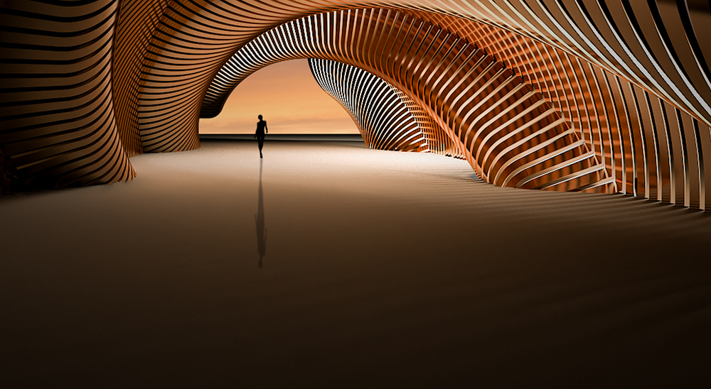
First I modeled the tunnel shape with 3ds max and then added the floor and the sky.
I also added the silhouette and its shadow. I tried to adjust the sky tones with the tunnel texture. I finally adjusted the global colours, light and tones with Photoshop. I wanted to give a surreal atmosphere and the feeling of emptiness where someone can feel lost.
Don't hesitate to give your point of view and your advice in order to get it better .
__________________________________________________________________________________
Senior Critic Norman Gabitzsch
This is another stunning image to add to your collection of 1x images. The lines and warm lovely tones of the created tunnel are fantastic. The silhouette is bold and sets a scale for the image ... an essential element. The shadows on the foreground are elegantly subtle. You have presented to us a spectacular image.
I like this image the way it is, but I am going to make a few small (very small) suggestions.
The silhouette stands out beautifully, but it loses some Figure-To-Ground against the black horizon.
I don't know if there is a better solution than what you have presented but you might try playing (brightening) the light on the black horizon slightly to get a little tonal contrast.
The second point is also small but something to be considered in some art markets. We often tell photographers of lesser experience than you is that in the Western culture we learn to read art from left to right (the same way we learn to read a Western language).
I would suggest that you try a mirror flip on this image to see if it doesn't read better for you flipped.
Finally, although I love the foreground, maybe there is a little to much of it.
You might consider sacrificing a small amount of the most negative near field.
__________________________________________________________________________________
Senior Critic Theo Luycx
My compliments for the very nice creative edit. Really great.
I red Norman's comment of Norman and I agree on most points.
But I don't agree with one point.
He is right that we read an image from the left to the right. Although I think you did it already in your composition.
By shaping the tunnel like you did – a bit longer on the right side and more details behind the turn, it seems OK to me. You created a background suggesting that the entrance to the tunnel is situated left below. If you do the mirror flip it will look strange and will suggest the entrance to the tunnel is situated right below. So I would say: don't change it. Of course this is my personal vision.
Another point is about the large foreground. I would also crop it to keep the attention on the upper part and to have a better balance in your composition.
For instance you could reduce the foreground to 2/3 of the highth of the sky.
__________________________________________________________________________________
Senior Critic Johanes Januar
This photo is very interesting to me. The shape of the tunnel and the colours are beautiful. Your creative editing is excellent.
But I like to make some remarks to improve the image.
First of all, my attention goes immediately to the silhouette and its rather long shadow.
I do not find the 'light source' that causes this shadow. Usually such a long shadow comes from a low light source or light facing the silhouette.
For instance, if we look at the right side of the tunnel, we can see subtle shadows on the floor due to the light coming from the right side.
The light sources here need to have special attention to create a plausible shadow of the silhouette.
About the composition, I agree that the bottom feels like a huge void. You might consider the opinion of Theo. Just a personal opinion. Its your decision and I will respect it.
__________________________________________________________________________________
Member Anna-Riitta Ovaska
This is a beautiful image and I like your choice of colours and tones. My concern is the shadow of your figure is out of sync with the other shadows in the image. The curves are lovely and I like the empty foreground.
__________________________________________________________________________________
Member Anastasia Kovacevic
Let me say I find this photo stunning. A very good idea and well realized. It is a pity the rippled floor is not so visible and there seems to have an empty space at the bottom-left zone of the picture which is too dark. Perhaps the tunnel would have been reflected too by the rippled floor? Maybe it would have added to the composition. Just an idea.
__________________________________________________________________________________
Guest critic Martin Zalba
Your work seems wonderful to me, a great creative edition full of imagination and visual art.
What puzzles me a little is the projection of the shadow (for my taste, too long) I do not know if the projection of the shadow can be oriented to the left and forward, taking into account that the main source of light in the tunnel, it's on the right. In any case, it would try to direct it towards us and to the right, something shorter.
Since you leave a large space in the foreground, I would highlight a little more the lights and shadows of the textures of the floor (those that are closer to us) to finish composing with light in that area.
They are just ideas that I tell you in case, maybe, you want to try them.
A great job.
__________________________________________________________________________________
Critique is also open to all members, and we learn together here. If you see an image you'd like to comment on, your words would be welcome.
 | Write |
 | Marc Pelissier PRO I really love reading this type of article that do show the value of critique and how rich it can (even fro already amazing image like here ;-) . Thanks Yvette for the article and to SCs |
 | Jovelino just 2 notes on my point of view : 1/ the long figure shadow looks me very pleasant but makes me feel something being wrong because the strong light over that area should make that shadow much shorter and to the left - 2/ I do not agree with the critics about "reduce the foreground" : the bottom large dark negative space balance very well the upper scene; ok, you may cut a bit but please not very much |
| | Jovelino fabulous !! |