


|
|
|
|
Published by Yvette Depaepe in collaboration with Alfred Forns, Head of the Senior Critics.
1x has a unique feature the founders are very proud of: the photo critique. Members can submit pictures to a team of knowledgeable senior critics. Their feedback is useful, interesting and enriching even for the best of us.
Critique on the photo ”The light of the soul” submitted by Rodrigo Núñez Buj
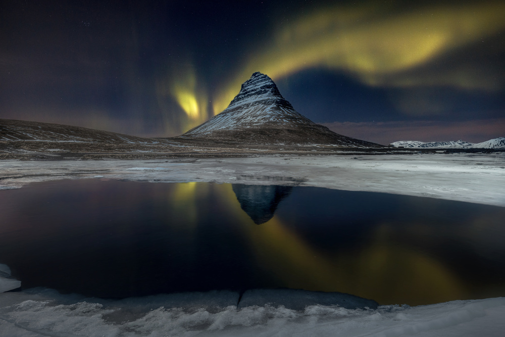
I would like to know the criteria from the curators to discard this image, in order to improve the processing technique. The main part is the aurora and church mountain, all others parts are using to complete the frame. Do you need more lights in the mountain? and less in right ice part?
I don't know.
__________________________________________________________________________________
Head Senior Critics Alfred Forns
Normally I don't try getting into the selecting, rejecting images during curation (discussion). It is a continuous ongoing topic of conversation with no end. Too many factors are involved.
The feedback/suggestions I can give on this image, I feel there is much more drama on the top part than the bottom. The mountain, ice around it, light sky etc. are amazing but the bottom brings the image down.
I know we are always excited showing reflections but they have to be strong and complementing. Try covering half of the image with a paper, looking, then seeing the entire image. Should hit you right away, at least it does to me. Though to say exactly the ending point at the bottom and would be just a personal choice of taste. Would like seeing more of what is happening to the right, both regarding the sky and landscape. You have made a fine image and one I would be proud to have.
__________________________________________________________________________________
Senior Critic Steven T
This is an excellent photo - thank you for sharing it here in Critique.
Thanks also for including the exposure data. It helps us to understand how the image was made - and we learn from it too. If I am fortunate enough to get a photo opportunity with the Aurora Borealis, I'll have a starting point for the correct exposure - 1600 ISO, 5 seconds, f/5.
We can't say why the Curators 'discarded' the photo. In reality, they may have loved it as a photo - but had to choose 'not publish' because it didn't fit their front page at this time. There are many photos made at this location, and the Curators may be suffering from 'Icelandic Overload'. I think more than a thousand photographs are submitted to the Curators every day, and they can only choose about 50 - 60 to publish. We here in Critique are not told how they make their decisions, but there have been articles published in the 1X magazine that shed some light on that mysterious process. Here are the links . . . . .
"Rejection of photographs by 1x curation: Reasons and Consequences"
"How to get published on the 1x Gallery"
Since this is the Critique section where we make nit-picking suggestions that we think might make an image better, I'll offer some ideas.
First, I think cropping about 10% - 12% from the left would make the composition more harmonious. That moves the mountain off centre a little and gives more emphasis to the Aurora. If you're a Photoshop user, you might try the 'Content Aware' option in the Crop tool to add some sky to the top of the frame.
As you suggested in the description, the snow at the middle right could be darkened. We tend to be drawn to the brightest parts of an image, and here it would be better if viewers' attention goes to the mountain without being distracted by that bright area of snow.
The colour of the Aurora is unusual. I've seen many shades of blue, green, and sometimes even red - but this gold tone is not common - at least in my memory of viewing the lights from northern Canada. I enjoyed the photograph!
__________________________________________________________________________________
Ansel Siegenthaler
Great atmosphere and sky activity. There is no set criteria exactly to dismiss an image. However, most of the action is situated in the middle of the frame here, i.e., the reflection is centred, the mountain is centred and the light activity overhead is also centred.
The lake in the foreground would make nice frame if entirely in the frame with maybe some rock or snow texture (not sure what is there on this location). The aurora lines could also maybe be spread out a bit wider in the frame to balance the mountain in the centre.
Lighting is good and balanced throughout and I like the colouring.
__________________________________________________________________________________
Robert D. Kusztos
As said above:
- move the mountain to the left, rule of thirds,
- cut the lower - approximate 20% of the shot,
- darken a little bit the snow field on the right,
- change the colours of the aurora.
These objective steps will further improve your excellent picture. More important than a subjective "published" or "rejected" IMHO.
 | Write |