


|
|
|
|
Published by Yvette Depaepe in collaboration with Alfred Forns, Head of the Senior Critics
1x has a unique feature the founders are very proud of: the photo critique.
Members can submit pictures to a team of knowledgeable senior critics. Their feedback is useful, interesting and enriching even for the best of us.
Critique on the photo ”epic nights” submitted by Swapnil.
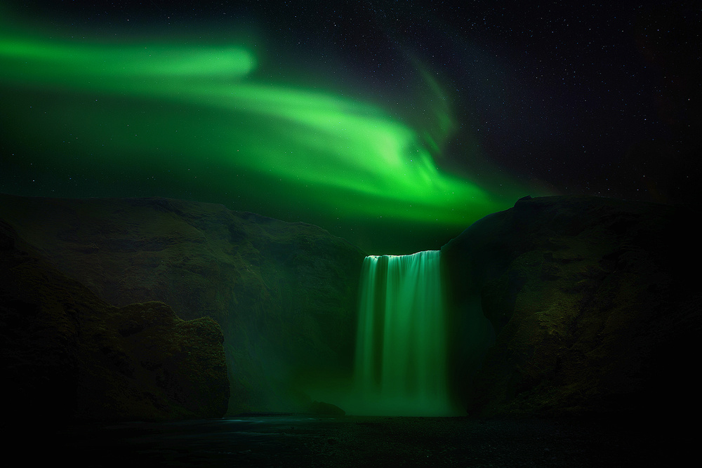
Aurora Borealis with Skogafoss. This is a re-edited version for curation .
I would like to know about the improvements.
Exposure time: 1 minut on the Foreground and 10 seconds on the Aurora. ISO800.
_________________________________________________________________________________
Senior Critic Hilde Ghesquiere
About this picture, it caught my eye right away. I love the colours and it reminds me of the moment I could see the aurora myself. I can tell, to me it was a great moment.
Nevertheless I would change some minor things in your picture.
At first I would turn it horizontally. In my opinion one can read the photo more easily.
I would also cut a little bit from the left (now the right) so the Skogafoss gets more to the left of the picture instead of a centered position.
At the end, I would also lighten up the left and the right bottom a tiny little bit.
_________________________________________________________________________________
Member Michael Castellano
A beautiful, awesome image. Like from another planet. The only suggestion I have is to try a closer crop but keeping the same proportions.
A larger image in pixel size can also be tried, one that fills the screen better. Just my own style, I suppose. One that will take up 3/4 of the screen. A ratio of 2 x 1 pixels, say for example 5400 x 2700 pixels. That will occupy a large part of the screen in 1x.
I just viewed this photo on another computer with a large, monster screen, and the photo looks 10x better on it when larger. The first time was on a much smaller lap top, which wasn't nearly as impressive.
On a smaller monitor image you lose the subtle details in the rocks as well as the stars. The same would happen if you printed it too small. Happens to me as well on some of my images.
_________________________________________________________________________________
Senior Critic Mike Kreiten
It's a pleasure to see work of a very successful 1x member here in "Critique". And what you present us is of course a deliberately processed shot. I assume we're all photographers here, so pictures like these are explored in very detail immediately, because hardly somebody believes you've found the situation and light exactly like that. I've been to Iceland myself and experienced very bright Auroras, still the very bright, almost white edge of your Skogafoss top does not make much sense.
The problem with night shots is that there isn't much of a shadow, so little structure. Which you dealt with very good for the front parts of your hills, but less intense on the sides of your waterfall.
Depending on the viewing program, on the left front, there is even a whole area of no structure, dark brown. It's better in Internet explorer than in Chrome, no idea why. What I often do when structure is there, but too little (assuming your 16-bit original has some more than the JPG), is copy the layer, set the blending mode to soft up to hard light and mask off where not needed. A quick&dirty method, but pretty convenient. Converting in b&w by Silver Efex and increasing structure gives more effect when using it as luminosity or soft light, you probably know all this.
My main concern though is that effectively it's not very clear where your light source was, especially because the section in the back is more flat and brighter than the front, which is only partly lit.
Basically, it's a wow-picture when opening it. Just nit-pickers like us will instantly find there are various thing not quite coherent regarding the light.
You have been honest and open this is an edit, so hopefully you still don't mind me picking on your light. I'm not even convinced I could do any better, just one thing...
There is a slight, bright halo close to your waterfall edge left and even more, on the right side. You can easily remove that by "burning" mid-tones, and later recover your aurealis in that area.
An impressive catch, Swapnil. Most people will love and envy it as it is. But you asked how to improve it and I hope I shared some hints where this could be done. And I learned Chrome is faster with 1x, but IE 11 is far more accurate from colour and shading. Your rather extreme deep tones made me discover it. We're all here to learn...
Swapnil.
Thank you so much for the indepth review Mike , it really helped a lot. You are right about the sides of waterfall but the long exposure of the falls wasn't enough to get some details there, probably standing more towards the right may have introduced more light but there was water on that part. Thank you for the solution you suggested here.
 | Write |
 | Thierry Lagandré (Transgressed Light) PRO Magnifique et fantastique, félicitations pour cette image. |
 | Jackson FLOYD MAYWEATHER JR. VS. CONOR MCGREGOR
https://www.mayweathervsmcgregor-livehd.com/
|
 | Nick van Dijk Great work team !! Thank you Yvette !!
Grtz, Nick |