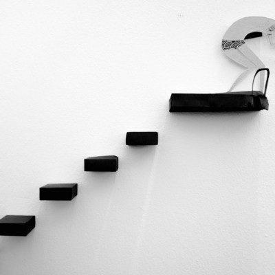
After viewing the work of two surrealist photographers, Chema Madoz from Spain and Gilbert Garcin from France, I tried to convey feelings through an illustration that depicts the sensations of freedom, pleasure, freshness and healthy lifestyle.
This idea suddenly came to me after studying the work of Madoz and Garcin. Their stylistic, aesthetic approaches to photography create relationships between figurative and actual events through projects they develop, designed to make us believe in the realism of their contents. I was inspired, so in my image “In the Swimming Pool,” I tried to convey feelings of freedom, pleasure and healthy living through an illustrative, graphical representation.
"The illustration of the swimmer was created by my daughter after I explained to her what I was trying to accomplish."
The photo shoot was planned and executed one afternoon. After establishing my initial concept, I envisioned a scene that would incorporate the feelings that I wanted to portray in the image. I constructed the set using sheets of cardboard for the steps and glued them to the wall. The illustration of the swimmer was created by my daughter after I explained to her what I was trying to accomplish. Once the scene was assembled, I set up my camera and tripod directly in front of the wall and at eye level. From that angle I was able to have sharpness throughout the scene, avoid distortion in the horizontal and vertical lines and give depth and dimension to the steps.
"The natural light in the room, and the fact that it also bounced off the other walls in the room, provided a smooth and uniform illumination, so there was no need to use a flash."
I shot the image with a Fujifilm FinePix X100 and a Fujinon Super EBC XF 23mm aspherical lens. I set the camera to Aperture Priority mode, the aperture to f/2 and the ISO to 100. I did not use a flash, but I handheld the camera and shot this image at 1/40 second shutter speed. The 23 mm focal length allowed good sharpness throughout the scene, even with the wide aperture and fairly slow shutter speed that I used. The natural light in the room, and the fact that it also bounced off the other walls in the room, provided a smooth and uniform illumination, so there was no need to use a flash. The exposure time of 1/40 second was not an issue because there was no motion in the scene.It's a humorous picture that simultaneously transmits peace and quiet, and that is exactly what I set out to achieve.I used Adobe Lightroom 5.3 to process the image.

Original image
1) Search for simplicity. Look around for areas that are more minimalistic and less chaotic.
2) Look for parts that represent the whole; the whole often leads to disappointment. Keep an eye open for patterns, shadows, repetitive shapes, color contrasts, and so on. When you are composing your images, pay special attention to the edges and corners of the frame.
3) Look for objects with potential — don't look for great photographs.
4) Maintain a positive attitude. Open your mind to see something new and creative.
5) Explore: Put your camera down and study the scene without it. Move yourself. Go low, go high, look around, look inside, change your viewpoint, look at the scene from every angle and bend your knees.
6) Stop: If you have explored the area for a while and have found nothing interesting to photograph, just stop. Go home and come back again another day to look at the scene with fresh eyes.
7) Deal with disappointment. This is a very, very personal issue, but you have to think about photography as you think about life: a little rain makes you appreciate the sunny days even more. Learn from your experiences.
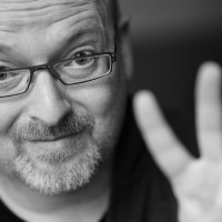
I'm Portuguese, and I live in the center of the country, close to Viseu. I work with the National Health Service as a family physician. I started my photography hobby with an analog camera, later crossing over to digital format. I learned about photography by reading books on the subject, observing works of major authors, consulting specialist journals and reviews, and joining sites on the internet, such as 1x.
I prefer to photograph architecture and architectural design, conceptual and street photography. I am always looking for contrasts, shapes, patterns, and the play between light and shadows, and I want to convey to others what I feel when I photograph.


