


|
|
|
|
Published by Yvette Depaepe in collaboration with Alfred Forns, Head of the Senior Critics
1x has a unique feature the founders are very proud of: the photo critique. Members can submit pictures to a team of knowledgeable senior critics. Their feedback is useful, interesting and enriching even for the best of us.
Critique on the photo ”Cloister lines” submitted by Mario Lechuga.
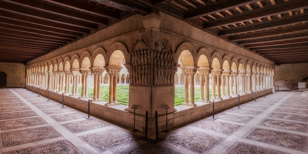
11 handheld shots to make this panoramic. I love interior architecture in chruches, cathedrals and so on. That is why I usually take panoramics when I visit different monuments as Santo Domingo de Silos Abbey is. All shots were developed in lightroom and stitched in Autopano Giga.
There were a lot of people but I waited until they were in the opposite corner.
_______________________________________________________________________
Thanks for posting your image here while sharing also the technical information of your camera settings.
Your intention of how you wanted to capture this scene is obvious, the architecture including the floor and ceiling is inviting for such a composition. In this case it is key that the symmetry is very carefully aligned within the frame by assuring it especially for each corner and here also along the vertical and horizontal center lines. Stating this I would recommend to do some adjustments, it will enhance the overall look.
Light management in this situation is quite challenging, the exterior area in full daylight does compete with inner ceiling.
In my opinion the outside and part of the arcade and floor are too bright, as a result the eyes are a bit distracted by that. With the main pillar in the foreground from where the arcades are leading to the opposite directions it is not clear which way the eyes should follow. As generally the aim is to lead the eyes to one focus point we have here a bi-directional view. Maybe as an idea you want to try to brighten up the center pillar and darken arcades towards the outer sides gradually?
One other option you might try is to leave the idea of a centered and symmetric view by re-framing the image and set it into the rule of thirds; thus cropping the left side of the image by one third. The main pillar now at the left side of the frame would then be the starting point for the eyes journey and the view would continue to the right side using the arcade, floor and ceiling as leading lines. The light setting is essential here but as an idea you might want to try it.
______________________________________________________________________
This is very much different from your light project, I'm surprised. Thank you for posting in critique and providing the shooting settings.
Cloisters are an attractive subject, I have my own experience capturing them. I always wanted a fish-eye for these occasions, but then I thought about how often would I use it and saved my money. But it looks cool...
You came across the issue by stitching and you did a good job in this. The major problem at stitching is the consistency of base material.
I don't know if you work with Adobe RAW, the JPGs just or Lightroom. But I assume you're a skilled editor. In Lightroom it's easy to transfer modifications of all kinds to another picture. In RAW, you need to use Adobe Bridge (free of charge) to open multiple RAWs at once. I'm of course referring to the very bright inner of your cloister, which I find distracting, as Andreas mentioned already. You avoided hard, asymmetrical shadows from the front bows by choosing the right side & time, but the downside was the dynamic range required to balance inside and outside light later on. The Canon 1000d is not known for an extraordinary dynamic range, as most Canons, so a later point in time would have helped. But probably the spot is not accessible much later. At least the bright parts on the wall between the bows in front structure could have been avoided by going deeper when capturing. From what I can see, you took it from the height of the knees of your front post sculptures, a 1,8m roughly.
This is a usual perspective for humans, and unusual perspectives bring more tension in a picture.
If you did it from 50cm for example, the bright walls between bows would not appear at all.
There is still some falling line left and right you could fix in this, more on the left side than on the right. The remaining people in the back of your square you could clone out easily, I would consider that. The two elements left and right at the end of your gangway don't contribute to your picture, so you could stretch the frame or crop them away a bit. Lens correction in LR/PS can also be used not to correct the picture, but doing the opposite. You could generate a fish-eye distortion by choosing the according lens and "correct" the wrong way.
I hope this gave you some valuable feedback and maybe inspiration to go for another few steps with your work. If not start from scratch and fight the light balancing first.
______________________________________________________________________
Great shot! I like the symmetry in this photo very much, but to come to flourish fully it has to be perfect.
I have a couple of comments. First, on the left hand side, the exit in the wall should be completely visible or not at all. the same holds for the plaque on the right hand side of the image. Both to left and right one extra shot should be added to fix this. Moreover, the motifs in the floor would also show an extra line that would strengthen to the feeling of symmetry. The corner is centred in the middle well, so that is good. I would also lighten up the ceilings on the left side of the photo to balance it with the right side of the ceilings. Try to clone out the people in the back ground (either with post-editing, long exposure or by just being patience for the right moment). Also, the outside is a bit over-exposed; you could try exposure blending to compensate this. Also the floor has some over-exposed spots. All in all, a location offering great composition opportunities, but it takes quite some work to make the best out of it.
______________________________________________________________________
Senior Critic Zane Paxton
The grand symmetry is THE dominant aspect of the expression here. The expressive challenge is that the symmetry has a lot of distracting attributes that all reduce the expressive power of the image.
I'll try to articulate the main ones.
There's more I could ramble on about but I will stop here. The point is that the things that reduce the expressive power dramatically outnumber the useful reasons to use symmetry.
Consider that incorporating opposites is more expressive. As examples, to express light we need to see dark, to better feel roughness we need to see smooth, to understand youth contrast it with age, etc. The opposite of a symmetrical object is asymmetry; in the practical sense that is an off-axis or asymmetrical point of view. Consider that reinforcing an aspect with more of the same is perhaps not that expressive and dilutes the expression by some amount. If you want to do a portrait of someone, would you place them in a crowd to reinforce that the subject is a person?
________________________________________________________________________
John Bull
I love cloisters and this one is particularly attractive with its double pillars. I rather like the three figures framed in three of the distant cloisters. Have you considered cloning out the notice boards, posts and rope placed along the edge of the “windows”?
 | Write |
 | gaofeng201309 |
 | Miro Susta CREW Excellent, very educative. Well done Yvette & Co..... |
 | Yvette Depaepe CREW ;-) Thank you, Miro! |
 | Nick van Dijk Well done guys; great work Yvette !! Grtz, Nick |
| Yvette Depaepe CREW Thanks to the Senior Critic Team and thanks for your appreciation, Nick! |