
|
|
|
|


Published by Yvette Depaepe in collaboration with Alfred Forns , Head of the Senior Critics.
1x has a unique feature the founders are very proud of: the photo critique . Members can submit pictures to a team of knowledgeable senior critics. Their feedback is useful, interesting and enriching even for the best of us.
Critique on the photo ”Confluence Museum – Details” submitted by François Le Rolland
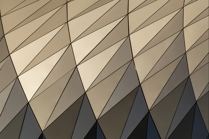
I really like the shapes of this very strange building. The Confluence Museum in Lyon is an example of modern architecture, and it's a paradise for photographer.
This one is a detail of small parts made of triangles. The photo has been taken during the sunset.
This is the first time I try architecture pictures.
________________________________________________________________________________
Senior Critic Dominic Schroeyers
If this is your first architectural picture, I can't wait to see the next ones. It is very promising.
The lines, shapes and colors almost look like a drawing.
There is one spot on the black lines which has a little glow. It catches my eye, I would try to remove it.
Another suggestion could be to squeeze and pull the picture so that a line starts in every corner. But that is not really a must. It looks also good as it is.
François Le Rolland
Thank you for your time and your feedback. I also have noticed the glow, but it's the only detail that distinguish a photograph from a drawing... I've hesitated to remove it, and finally left it..
_______________________________________________________________________________
Andreas Agazzi
What a pleasure to look at this masterfully composed frame, full of interesting geometric patterns, awesome color tones, added by a vivid play of light. You obviously have invested time to find the right size of frame and you achieved in post processing a result that proofs your skills in finding effectful settings to gain visual balance without loosing the viewers interest to wander in all directions within the photograph.
I have to admit that I share the idea with Dominic that this little lightspot has - although a minor - negative influence in quality. Everything else looks just perfect to me and I would not want to have a detail included that drags the eye exactly to that spot.
It is like looking at a beautiful car which has a minor damage somewhere, you want to get it repaired as soon as possible. Certainly, it is entrily up to you and it might also be a valid statement to leave a detail that differentiate it from a painting.
If there is anything else you want to try, you might check what effect the flipping of the image from left to right has?
Very often people see and read from left to right, from the bottom to the top, from dark to bright. Setting the brighter patterns to the upper right might result in an even better image - just as a thought. Solid work François!
François Le Rolland
Thanks for your very detailed critique. This kind of feedback is extremely motivating for me. I will try the flip to test if it brings anything or not.
_______________________________________________________________________________
Senior Critic Lyn Hungerford
My comments are similar to those made by Dominic and I can't wait to see some more too.
This architectural image has become an abstract and the way that the light is hitting the building is making very subtle tonal differences that really add to this image.
Given the very strong accent on pattern, what is missing for me is the line at the right finishing in the corner so that the pattern has space to complete itself.
The lovely triangles at the bottom which give a nice soliditiy to the image have been cut off in the bottom right hand corner... They start being tiny but gradually grow into large triangles, for me this would have given the image a completion.
With these kind of images it is difficult to know where to begin and end, but this is where I think I would have ended it... but this often depends on your lens and the space behind you as to where you can actually shoot from.
_______________________________________________________________________________
Senior Critic Mike Kreiten
I discovered your picture in my noon break, now I'm pretty late to the thread. However, I find it especially interesting when seeing the original building. The “mocca” tones probably are reflections to either the metal panels or even glass. Lovely!
I agree with Andreas and Dominic about the bright spot. I tried to flip the image horizontally and like it more. Andreas told you why. I even found the result better when rotating the image 180 degrees, dark side up, circles from the left. And maybe you will find the missing little segment in the upper left corner!
 | Write |