


|
|
|
|
Published by Yvette Depaepe in collaboration with Alfred Forns , Head of the Senior Critics
1x has a unique feature the founders are very proud of: the photo critique. Members can submit pictures to a team of knowledgeable senior critics. Their feedback is useful, interesting and enriching even for the best of us.
Critique on the portrait ”Rose” submitted by Antonella Renzulli.
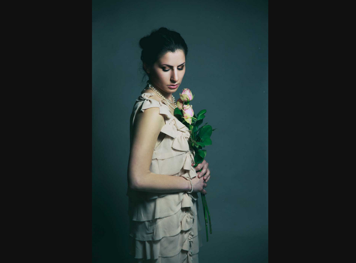
My intention behind this portrait was to shoot a classical portrait with an underlying romantic mood. I tried to pay attention to the lines in the frame and to the lighting. Editing was used mainly to adjust colour range and contrast. A very light texture was applied to enhance the romantic mood.
__________________________________________________________________________
Senior critic Nick van Dijk
It's always good to see a work from a successful artist in the critique section!
I had a look at your other recent work and I noticed this is the only image that is not as 'intimate' as your others. It shows a more distant look at the model. And I think this is what I miss a little bit in this portrait, the intimacy. The most interesting part, her downward glance and the lovely rose are a little bit small.
To improve this shot I have a few ideas / suggestions:
I am not sure if you use the Liquify tool in Photoshop, but maybe you can try it. I find her arm and 'bottom' a little bit large compared to her head. This is most likely caused by the (24-70 mm) lens. Pushing her arm and dress slightly and carefully inward will make her look a bit slimmer (and probably taller). Another thing I noticed is the colour difference between her head (reddish glow) and her arm (green/yellow glow). I would sample her face skin colour and (on a separate layer) paint her arm. The last thing I would do is get some detail / light in her hair.
Antonella Renzulli
Indeed, I can see the distortion of her body (partly due to the distortion of the lens and partly to the shooting point from above) as well as I realized the different tones of her skin mostly due to her face makeup. I also have to admit that her hair are very little detailed. This is the reason why I find the critique section very helpful because it helps to see the things the author cannot see because of his/her 'affection' to his/her shot. In fact all things you point out are absolutely true... And thanks for defining me a 'successful artist”! I am just a passionate hobbyist!
Senior critic Nick van Dijk
Antonella, you can without any doubt or hesitation call yourself a successful artist! I think 92 Frontpage Publications on 1x in just a few years is something 99% of all photographers would be very jealous off.
__________________________________________________________________________
Senior Critic Mike Kreiten
Nick discovered more than I would have seen, so I just want to add one thing.
You have a banding issue on your background, at least in the uploaded jpeg.
Maybe due to compression mode/settings, but if not, there are several tutorials around adding noise a bit to overcome this issue. I'm not a master in this, and I have a picture online with similar problems. It was hardly recognizable in PS, using 16 bit, but became stronger on 1x when posted as JPEG. But maybe you're better in treating the tones.
Antonella Renzulli
Yes, I often have this kind of issue with JPEGs and I think it depends on the fact that I use to post web compressed files. It disappears with the original file. To be honest, I don't know if there's a way to cope with it... and any suggestion about it is welcome!
When you "export" pictures for web appearance, colours are by default converted to sRGB, because JPEGs may contain color profiles disregarded by the website you post it for.
I don't know which colour range you use in Photoshop, but probably it is a 16 bit format like "ProPhoto color space". Bigger areas with just slightly varying tones then get reduced to 10-20 colours and you see the (blocky) edges between those. When exporting, you can choose a quality level from low to maximum, and whether you convert to sRGB or include a colour profile (if different from sRGB). Stupid enough banding is not recoverable, if people buy your prints, they will probably see it too.
Adding noise (on a 50% grey, additional layer, and setting the blending mode to "overlay") helps a bit, but does not remove the banding entirely. A patterned background would avoid the problem.
 | Write |
 | Jose Hernan Cibils Thanks, Yvette, for this new publishing! It is very useful for photographers and users of 1x!
Best regards. |
 | Yvette Depaepe CREW Yes, it is important for all 1x members. That's why I like this publications and help promoting the photo critique feature, dear José! Cheers, Yvette |
 | Ivaylo and Teodora Good work and good words here :) Gritz, all :) |
| Yvette Depaepe CREW Thank you for your appreciation, Ivaylo! |
 | Nick van Dijk Good morning,
Thank you Yvette !!
Grtz, Nick |
| Yvette Depaepe CREW My pleasure, Nick ;-) |