


|
|
|
|
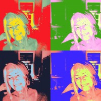

Hi, all of your suggestions gave me a lot to think about. Mike's authentic version and Elizabeth's B&W were valid but I sort
of wanted to keep it in the "pop art" genre. Steven, I loved your different orientation suggestion and tried several of them
but I have lived with this for so long I couldn't quite get there. I also loved how the collage looked. That gave me ideas.
Cicek's suggestion that I needed something as a vocal point seemed worth trying and I did stick a pigeon in although it takes it
out of the pop art, still life, feeling that I originally liked. Basically I did a combination of Theo, Steven and Arnon's edits or as
far as my PS skills allow.
Would love to know if you think I can live without the bird and if the new and improved version works.
Thanks again for your advise. I really appreciate it. Jane


Jane,
Thanks for sharing this new edit with us. The pigeon fills in the space and gives the compositon more harmony in my opinion. There's still a sense of 'chaos' from all the broken panes, the hieroglyphic-like grafitti, and the white arrow. I think that's the charm of the image - the juxtapositon and contrast of order and chaos. The gridwork of the window, and the logical perspective of straight verticals and horizontals provides the order.
I note that you added black edge details to the top and right, and the bottom window ledge has been simplified with less detail and texture. I think those changes help the image.
One suggestion . . . . if the pigeon were just a bit taller its beak would be separated from the window frame. Photoshop's 'Edit>Transform>Scale' could stretch the bird larger overall, or just taller. If you hold down the Shift key as you pull the 'handles', that tool will stretch or compress in one dimension - just the width or height.
The Critique Forum is often quiet on weekends, so you may have to be patient for more feedback.
. . . . . Steven

Hello, Jane
Welcome back. The pigeon was a well thought of addition to your image. I agree with my friend's remarks. Please do not forget to post it with creative edit. As the pigeon was added afterwards that should be tha category. I wish you good light and all the best. Cicek...
