|
|
|
|


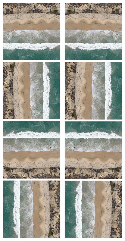
24mm, f/2.8, 1/160sec, ISO 100.
Minimally processed in Lightroom.
Stephen welcome to " The Real Critique " and thank you for sharing this fine image.. Reading your works your are asking all the right questions of your self - Will it look better the other way round will the colour look better on a sunny day. - The answer is got to bw yes.
Can I tell you what I would do - I would take a red brolly and a couple of towels to give a great focal point or something along those lines.
As this image stands composition it fine I like the square format - Love the waves and the walkways along the beach... - But I feel it's lacks in the power to please in that department. - A sunny day and good focal ponit and just maybe a published image....

Hello Stephan,
Welcome to the forum and thank you for sharing this wonderful image with us. Daniel has already given you excellent advice. I like the range of textures and tones but, as you say, on a sunny day the image could really shine. I appreciate the square format although I think it could work very well as a longer vertical image too. The content is sufficient for me except that a lone figure would give a sense of scale. Wishing you all the best for your return visit, and I look forward to seeing the results.
Elizabeth Allen

Stephan,
Daniel and Elizabeth gave you the best advices. To add something or a longer vertical looks stronger I think. But if I have to answer your basic question turn or not for this one, is my personal vision turn counterclockwise and darken blow a fraction ( more impressive and normal because you are flying to the coast). But this is only an answer on your question. think about the two other advices if you work with a drone. Theo-senior critic.

Hello, Stephan Morais
Welcome to 1x and to our forum. It is great to have fresh blood amongst our members. We are a friendly group of photography enthusiasts who like to share their ideas upon posted images. I liked your image the moment I set eyes on it. I especially liked the different textures being presented together. The layers work so well together. If this were my image I would have flipped it 90 degrees clockwise. Why? Because I am used to see waves coming towards me. My friends have othr ideas which I also like. In addition to my rotation advice I also enhanced the blue of the sea somewhat and incread the overal contrast. I did try to supress the yellows and the oranges though. Here is the image. It is your choice to take it or leave it 😉. Have great light....
Cicek Kiral SC

Thank you all for the thoughtful and great advice. This is exactly the kind of thing I was hoping to get out of the site. I agree the orientation works better horizontally. That's an easy enough fix, as is boosting the contrast and color a bit. When I'm back in the area in a few weeks I'll definitely try again on a sunny day.
As far as a focal point to give it a better sense of scale, there is a tiny one there! If you look closely near the middle of the sandy area, you'll see a small red dot with a black dot next to it. The red dot is my 7yo son, and the black dot is me! I could certainly bring a colorful beach umbrella next time, but I may need to take the shot from a lower altitude, and scarrifice some of the sea and/or shrub in the composition. But I'll try it out.

I can easily see why many viewers would prefer the horizontal. For me I really like the vertical beause it is so unique. I can easily imagine it framed and hanging in an office and people walking by, then stoping and backing up, "Wow. What is that?"
Either way, it is a very nice capture.
Leigh

Stephan,
I'll add my opinion to the others. I like the horizontal with the water on the bottom - your original rotated 90° counter-clockwise.
Here in Critique we often suggest flipping images left-to-right and upside-down. That's a trick we learned from painters who will turn their canvas upside down and/or look at it imaged in a mirror. They do this to judge the weight and balance of the shapes and colours. Because we have digital images, we can go a step further and try all 8 orientations. If you use Photoshop you can make an 'Action' that will create them all with one click. Sometimes one will stand out and be more appealing. We often come back to the original - perhaps because it feels familar - but it's still a lesson in composition to observe how the balance and flow change when up becomes down and right becomes left.
. . . . Steven T.
PS: I enlarged the 'full.jpg' version of the file and saw the red and black dots you mentioned - father and son. It's amazing how sharp that image is. I'd love to know more - did you re-size or use extra sharpening? I think the drone has a relatively small sensor compared with full frame cameras, but you'd never know it from an image this sharp. I don't own a drone, but it's on my list. :-)


It's wonderful to see this image generate so much creativity, I love the end results of all of the suggestions. I think Johanes wins first prize from me at least, visual ambiguity in it's simpliest form, Steven took it to a whole other level.
BTW it took me a while to find the red dot, it was fun hunting for that too! Now I am longing for yet another piece of gear, a drone ;-)
Kim
Dear Stephan,
Thanks for submitting your photo to the critique forum. I share my dear friends view that it is a beautiful aerial nature scenery.
Personally, if it would be my photo, I would crop it tighter, I think that three strips, following the rule of thirds would work well in this case. I took your photo to PS and to Raw and worked on the colors to make it more vivid (I personally love vivid colors).
Good luck with it. It is a fine image.
Arnon Orbach Senior Critic.

Kimberly is certainly correct. This photo has generated a lot of creativity.
Leigh