


|
|
|
|

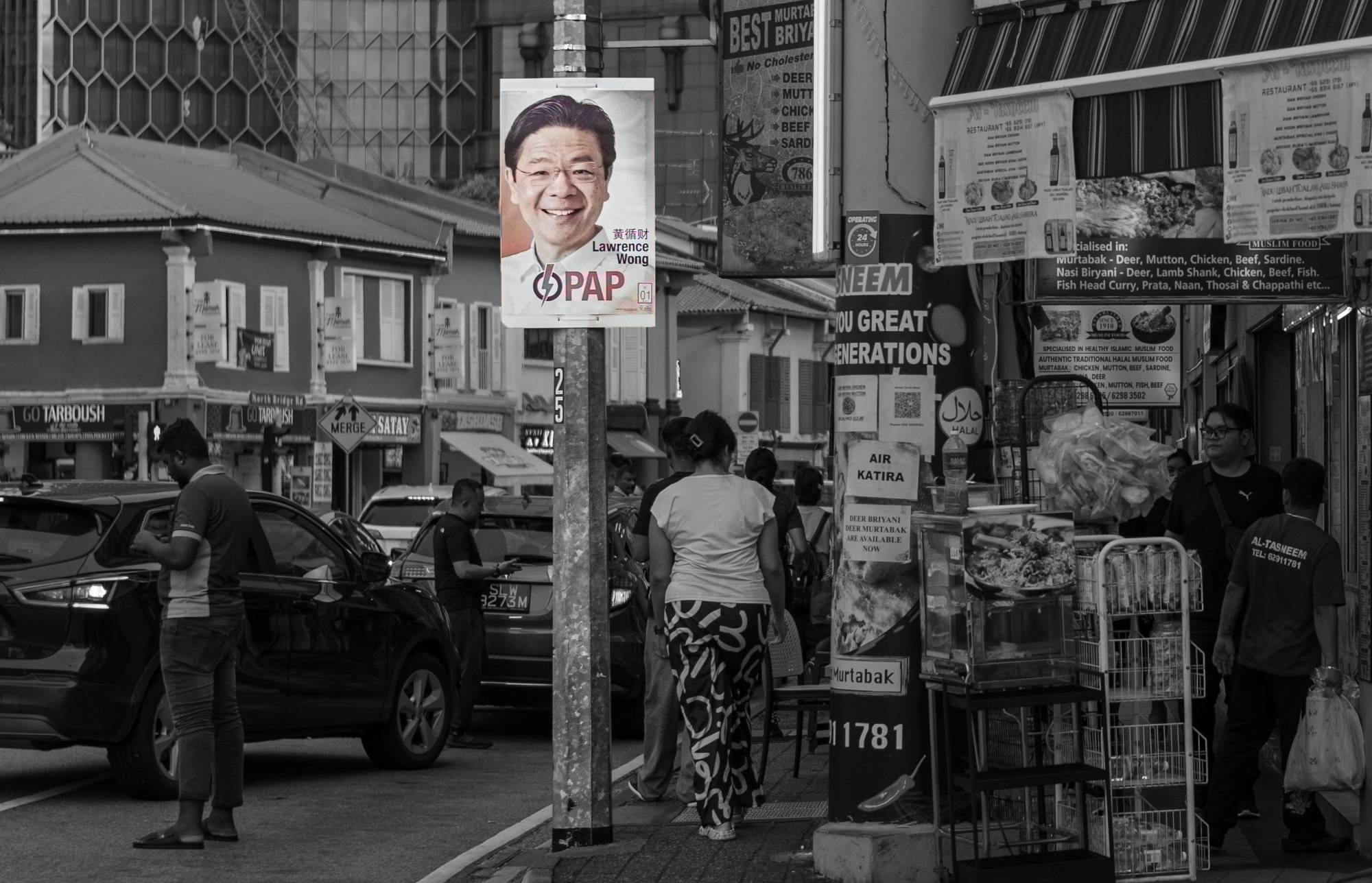
Leica M11 , 1.4/35mm ASPH lens,
1/640 sec, f /2.4, ISO 200

This photograph was taken on Election Day 2025 in Singapore, on the streets of the city. High up on an electric pole hangs a campaign poster featuring Singapore’s current Prime Minister Lawrence Wong and his party—the People’s Action Party. Below it, the streets are lined with shops, traffic, billboards, and, most importantly, ordinary Singaporeans of various skin colors and ethnic backgrounds, rushing by—working, living, passing under the poster.
Singapore, once a declining small city, has grown into a global metropolis and garden city through decades of governance and planning by Lee Kuan Yew and the People’s Action Party. Yet the country’s deeply diverse racial and cultural makeup has always posed a significant challenge for its leadership. At the same time, following a model of elitist governance, tensions and contradictions between the ruling elite and the broader population have become increasingly apparent. The People’s Action Party’s electoral campaigns no longer enjoy the absolute certainty and ease that characterized the era of Lee Kuan Yew.
I consider this one of the best street documentary photographs I’ve taken. The composition is somewhat chaotic, so I chose to render it in black and white. The people facing different directions—left, center, and right—create an intriguing visual structure despite the disorder. The presence of the campaign billboard above brings a sense of order amidst the visual clutter.
I don’t know why this photo wasn’t selected by the editors. It has made me question my understanding of street documentary photography. I sincerely hope to receive more detailed feedback to help me improve. Thank you.

Hello, Del. W
Welcome to our forum and thank you for sharing your documentary image with us. It is an image with really strong sides and lots of social and political information embedded in. I can understand where your frustration begins, yet did you think about the number of curators who could relate to the atmosphere in this image. If they know what the political and social status is they would choose differently. I personally think that visual adjustments would not change the outcome much. Maybe another image at the same spot with a local looking at the poster thoughtfully would direct the curators towards your goal. The image is not poorly structured but just too rich to find a specific topic or subject matter. I wish you good light. Cicek...

Hello Del
Thank you for sharing your Election Day photo with us; it's an interesting documentary image and I agree with the comments Cicek has made. However, the election poster attracts us but most of the other adverts and signs seem to be about food which causes some confusion. In the centre there is a rear view of a woman while on either side there are figures looking out of the frame or about to walk out of it. As Cicek suggested, a photo with a person looking at the election poster might clarify the message of your photo.
Good light, Elizabeth
Del.W
Thanks for submitting this photo.
Technically it is well done. It is a good street shot in that it documents a moment in everyday life. However, great street shots do more than just document; they tell a story and make us stop and think. I'm not seeing that in this shot. My eye wanders around the picture wondering what I'm supposed to be looking and it is not clear. I think the suggestion from Cicek Kiral is an excellent one.
Best regards,
Mike S. - Senior Critic.
Hello, Del. W
Welcome to our forum and thank you for sharing your documentary image with us. It is an image with really strong sides and lots of social and political information embedded in. I can understand where your frustration begins, yet did you think about the number of curators who could relate to the atmosphere in this image. If they know what the political and social status is they would choose differently. I personally think that visual adjustments would not change the outcome much. Maybe another image at the same spot with a local looking at the poster thoughtfully would direct the curators towards your goal. The image is not poorly structured but just too rich to find a specific topic or subject matter. I wish you good light. Cicek...
Hi Cicek,
Thank you for your thoughtful feedback and kind words. I truly appreciate you taking the time to reflect on the image and share your perspective.
Del
Hello Del
Thank you for sharing your Election Day photo with us; it's an interesting documentary image and I agree with the comments Cicek has made. However, the election poster attracts us but most of the other adverts and signs seem to be about food which causes some confusion. In the centre there is a rear view of a woman while on either side there are figures looking out of the frame or about to walk out of it. As Cicek suggested, a photo with a person looking at the election poster might clarify the message of your photo.
Good light, Elizabeth
Hi Elizabeth,
Thank you for your kind feedback and for taking the time to look at the image. I truly appreciate your thoughtful comments and insights.
I understand what you mean about the visual focus and will keep that in mind moving forward.
Del. W
Del.W
Thanks for submitting this photo.
Technically it is well done. It is a good street shot in that it documents a moment in everyday life. However, great street shots do more than just document; they tell a story and make us stop and think. I'm not seeing that in this shot. My eye wanders around the picture wondering what I'm supposed to be looking and it is not clear. I think the suggestion from Cicek Kiral is an excellent one.
Best regards,
Mike S. - Senior Critic.
Hi Mike,
Thank you for your feedback and for taking the time to review the photo. I appreciate your honest thoughts and will certainly take your points—and Cicek’s suggestion—into consideration as I continue to develop my further photos.
Del. W

Del.W,
Thank you for sharing the photo with us in Critique. I agree with the comments that the composition is busy. Sometimes chaos works (think Lee Friedlander), but usually a photo will be stronger when the subject is easily spotted by viewers. If you take a look at the 'Street' section of the 1X Gallery, you'll see that most of the compositions are simplified.
Mike S. mentioned 'Story', and that is important for street photography. The story here is that ordinary people are going about their everyday business and paying no mind to the politician. The title leads us to that story. Unfortunately many viewers don't read titles or descriptions, so the photograph has to speak in the visual language.
I edited a screen shot to suggest that the politician and his promises are something apart from the ordinary life of the people. It is unrealistic, I know, and more 'Conceptual' than 'Street' this way - but I offer it just as an idea. Many viewers don't like the 'selective colour' technique, but I thought it fit for this theme.
Selecting the poster with Photoshop's 'Quick Selection' tool allows you to edit it separately from the rest of the image, and by clicking 'Select>Inverse' it's possible to edit everything except the poster. For this edit, colour was added with 'Filter>Neural Filters>Colorize', and the background was darkened with 'Image>Adjustments>Brightness/Contrast' with a little extra done with the 'Burn' brush.
I think the title is a good one, and the idea of ordinary people going about their lives while ignoring the politician's smiling face high up on the pole is pure realism. Elections are important, of course, but sometimes it feels like nothing really changes after the votes are counted.
. . . . Steven, senior critic
Hi Steven,
Thank you very much for your generous and thoughtful critique. I truly appreciate the time you took not only to share your insights but also to create an edited example to illustrate your idea.
Your comments about clarity, visual storytelling, and viewer perception are very helpful, and I’ll definitely reflect on them as I continue to explore this theme and refine my approach. Thank you again for your guidance.
Del
Dear Del.W,
I think it became obvious from all comments so far the theme is not recognizable enough. It's quite common that the artist has memories, feelings or the history in mind when seeing own work, and it's quite impossible for others to see the same. Even for less complex takes that's the case, it also happens to me. That's what this forum also is here for, to experience what others see.
I'd like to comment on one photographic aspect, regarding your sentence: "The composition is somewhat chaotic, so I chose to render it in black and white"
I shoot more black&white than represented in my portfolio here. In fact I shoot 95% of my photos in black and white, because it helps me judging composition and layout better, no distraction from colors. Later I may recover colors from the RAW file, if they contribute, match the mood or emphasize the theme.
In black and white the guidance by colors is missing, therefore composition is more crucial. Usually black & white photos are more simplistic, either light & shadow sort the subjects, or we leave out elements that distract, bokeh can help leading to the main subject, leading lines, the position in the frrame, a lot of negative space, there are any ways to highlight what we want to show.
I don't see any of the methods applied in your shot, the only aspect leading to your campaign poster is the fact he's virtually facing the camera. Which works, since all others disregard your lens. But it's not a strong subject, so our eyes wander around in the frame and look for more to discover. That's the thing, our brain likes tasks, but hates disappointment. We can't find that "second thing", so it leaves us wondering if we missed a point. A good photo either hows us what the photographer want us to see, or it gives us the chance to discover it. The latter is only possible if it caught our attention and curiosity, other wise we would just pass the photograph. I'm afraid - my personal feeling of course - if it wasn't in critique and we have a closer look to help members, I'd just have passed it. A street scene, taken in times of an election. Before, after, at that day, I can't tell. I probably spend a second or two looking for a story - and the wonder why you took it.
Black and white needs a concept, meaningful or not, it should be bold. Leaving the colors out is already a level of abstraction. And abstraction is an essence of something, meant to make us guess or assume what we would see if it wasn't an abstract.
Best regards,
Mike
Dear Mike,
Thank you very much for taking the time to write such thoughtful and detailed feedback. I truly appreciate your insight, especially your reflections on the use of black and white and the importance of composition in the absence of color.
I got your point well. I can see now that the image lacks clear visual structure and focus, and that the decision to go black and white alone does not carry enough weight without intention behind it.
I’m grateful for your honest opinion—it’s given me a lot to reflect on as I continue to develop my eye and storytelling ability. I’ll definitely keep your advice in mind as I approach my next shots, especially regarding simplifying the frame and being more deliberate with compositional tools.
Thanks again for your time and generosity in sharing your perspective.
Best regards,
Del Wang
