|
|
|
|


Hello again everyone,
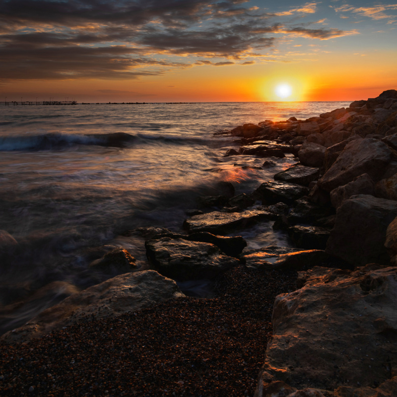
I like this shot very much but it wasn't selected and I really don't know why. Some comments from curation say it's too simple. Please let me know if it is a basic image or it has some potential and what can I improve to send it tu curation again

Hello again Vlad,
I'm glad that your next photo was posted on this Forum. I am all the more glad that this landscape is my favorite subject of photography.
Let's move on to the photo. It is a very interesting place, nice frame and a great time to take a landscape photo. Warm colors, sea, rocks great, but still not the edition this shot deserves.
After ripping to PSCC 2022, I performed the first actions on the masks, slightly lowering the intensity of the lights around the sun and also lifting - pulling the shadows in the area of the rocks. A good tool is the TK8, which makes it easy to work with layers in various areas. Unfortunately, I did not manage to eliminate the white glow around the horizon - the effect of sharpening too early during editing. Then, in Camera Raw, I picked up the hues and used the brush to add some contrast in the sky.
I went back to the PSCC and leveled the levels. I added a little contrast.
Of course, this is my suggestion for your photo.
Good light
Slawomir Kowalczyk - SC.

Vlad,
Thanks for submitting this to Critique. Also congrats, I see that you've had some recents success with the sunflower shot being published and the Horse/Iron image being awarded.
This is a beautiful sunrise shot and Slawomir Kowalczyk has given you some excellent suggestions.
While this is beautiful the harsh truth is that it is just that - another beautiful sunrise image. There is nothing to see beyond that (as beautiful as it is). Nothing to hold our interest very long and nothing to make it especially unique. Perhaps if there was a boat or some people in the composition that would add some interest.
My intent is not meant to be harsh, I'm just trying to give you an honest opinion. This is of course just my personal opinion. As the photographer it is your opinion that matters.
Best wishes,
Mike S. - Senior Critic

Hello, Vlad Ioan
Welcome to our forum. This is a nice image. Yet its being nice is most time not enough for it to get published. I personally likes the waves and the way they look really much. However, when looking at images that pass the curation process, I can say that they lack the shine, glimmer and light. I think they are the aspect that should be brought to the front. I also now that this is not plausible because of the position of the sun. Then what my friend Mike says about an interest point is what I think, too. Furthermore, Slawomir's touch increased the effetiveness of the image and it looks brighter but the gist is still missing. We have been and are presented with quite a lot of well mastered seascape images that I suppose the deceisive element of getting published and awarded is really high. Curators are looking for more. They want WOWs. They want to look longer at the images or get drowned in them. I do not want to sound discouraging but I want to to go out there and explore more and practise more. All I say is also true for each and every one of us. We try to exhibit images that move us and nowadays that is really not so easy anymore. Last but not least I want to repeat that I personally liked this image. I like the composition next to the effects on the waves. It has a diagonal line, there a lots of triangles in it and the partial presence of the clouds is impressive...Keep going. I think soon your progress will make your images stand out. Have good light...
Cicek Kiral SC

Vlad,
Thanks for sharing the photo with us here in Critique. It's a good seascape in my opinion - the rising sun and clouds are dramatic, the colours rich, and there are some wonderful details of the light on the foreground rocks and waves. Both parts of the image are interesting - but it might be better if one of them were to take the lead. My suggestion is to cut some of the sky, compress it so it becomes background and gives the water detail more attention.
I made a sample edit to show you. As well as compressing the sky with Photoshop's 'Edit>Transform>Scale', I darkened the sun (Slawomir did a better job on that), added some saturation and dodged some of the highlights of the water details.
. . . . Steven, senior crtitic