


|
|
|
|

Description
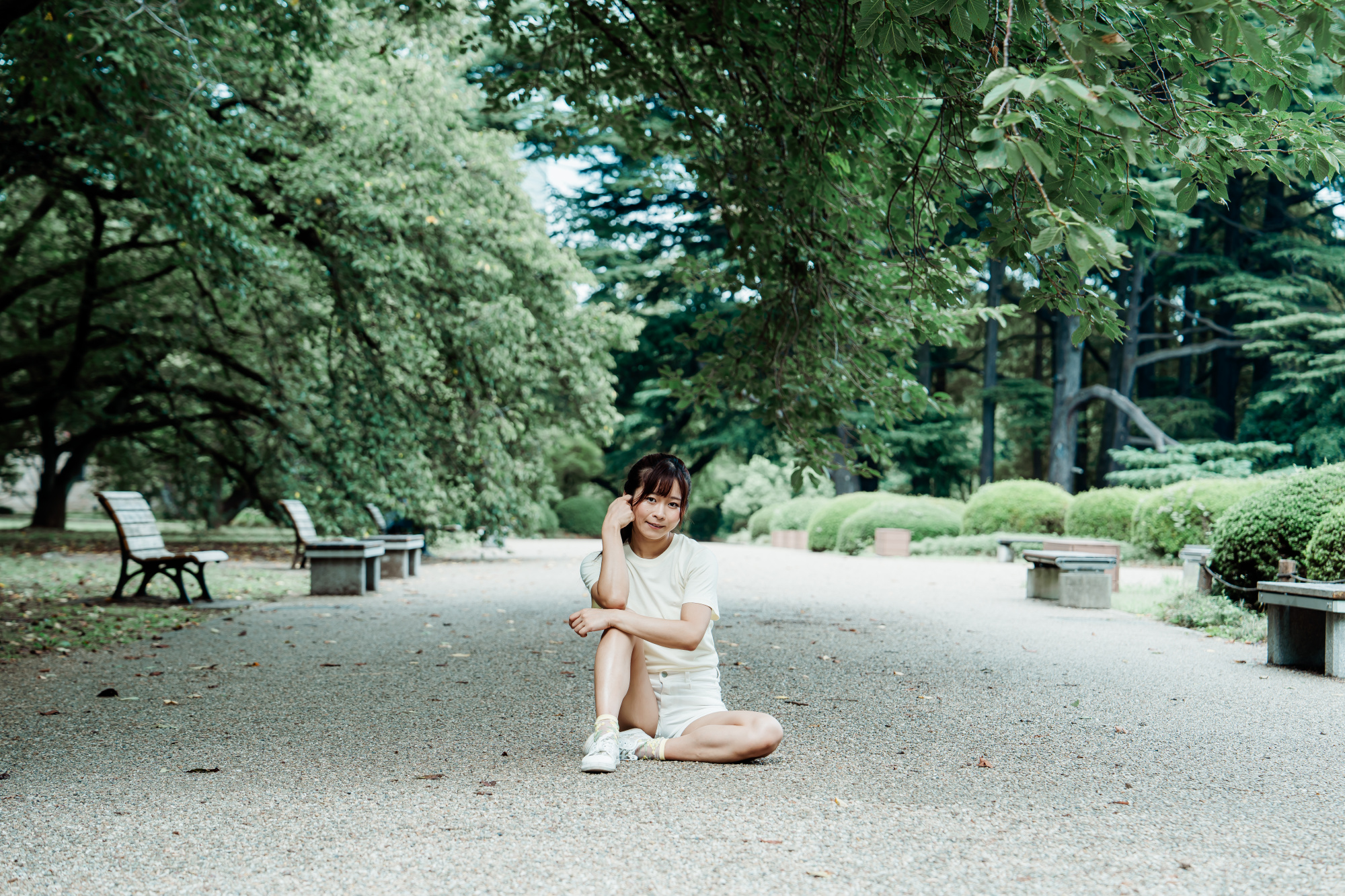
A calm portrait captured in a quiet city park, using only natural light to express solitude and gentle presence.
This photo was Not Selected in a previous gallery review, where the Areas of Improvement highlighted Technical Quality, Light, and Originality.
I re-edited the image to refine color and contrast based on that feedback.
Request for Feedback
I would appreciate detailed critique focused on Technical Quality, Light, and Originality.
In particular, any advice for improving the lighting balance—especially around the hair and background trees—and the overall technical polish would be very helpful.
Tenkuu,
Thanks for submitting this. I'm not that well versed with portrait photography so I'll defer to others in regard to areas of improvement that you specifically requested.
Despite this, I do have one suggestion. As a portrait I feel it needs to be significantly cropped. Your subject is lost within the frame. The scene is nice but distract from the subject.
This is just something for you to consider. As the artist, your opinion is the one that matters.
Best wishes,
Mike S. - Senior Critic
Given that so much of the park is out of focus, it is difficult to work out why you included so much of it. As for colour. I am quite sure it didn't look like this. You sau you re-edited it but you have made no attempt to make the colours look natural. Did you take multiple shots with different camera settings? When I see a portrait or what someone is calling a portrait, I really only want to see the subject. Including a prop is fine. Being in a location is fine too but make most of the photograph the subject.
Hi Tenkuu,
Thanks for sharing your image here for critique. I agree with Mike about the framing. When there’s this much open space, it usually works best as an environmental portrait where the background adds to the story or gives us some kind of context. In this case, the background isn’t really doing much, so the image ends up feeling a little empty. Unless that space is needed for something like copy in an ad layout, it’s hard to justify such a wide frame.
I also want to touch on posing. Her hand feels a little awkward here. Turning it to the side instead of showing the back would strengthen the gesture. The leg position also draws the eye straight between them. With women especially, we usually try to shape the body in a way that adds flow and grace. If her left leg had crossed over more, it would’ve helped create a more elegant line and shifted attention away from that area.
Sue Bryce is a master at posing women and has tons of courses available. I highly recommend checking into those.
All the best,
Tammy
Senior Critic
@Mike Schaffner
Thank you very much for taking the time to comment on my photo.
I really appreciate your suggestion about making a bold crop, and I would like to try that approach to see how it changes the image.
@David McCracken
Thank you very much for your thoughtful feedback.
I actually did not take multiple shots with different camera settings.
As Mike Schaffner also mentioned, I will work on making the subject larger in the frame and will re-edit the colors with more care.
@Tammy Swarek
Thank you so much for your detailed critique.
I truly appreciate your suggestions about adjusting the hand position and the leg placement to create a more graceful line.
I will definitely look into Sue Bryce’s courses to learn more about posing techniques and apply those ideas in future shoots.

Hello Uchujin
Thank you for sharing your photo with us. I agree with the comments that have already been made about cropping as the subject seems lost in the frame. I just want to add that the model would stand out more if she was wearing deepet or darker coloured clothes as she blends into the neutral foreground tones here.
Good light, Elizabeth
Hello @Elizabeth,
Thank you very much for your thoughtful feedback. I appreciate your agreement about the cropping, and your additional suggestion regarding the clothing color is very helpful. I now see how the neutral tones made the model blend into the background. Next time, I will pay more attention to stronger contrasts in clothing as well as framing.
Best regards,
Uchujin_N_
