


|
|
|
|


Hi all
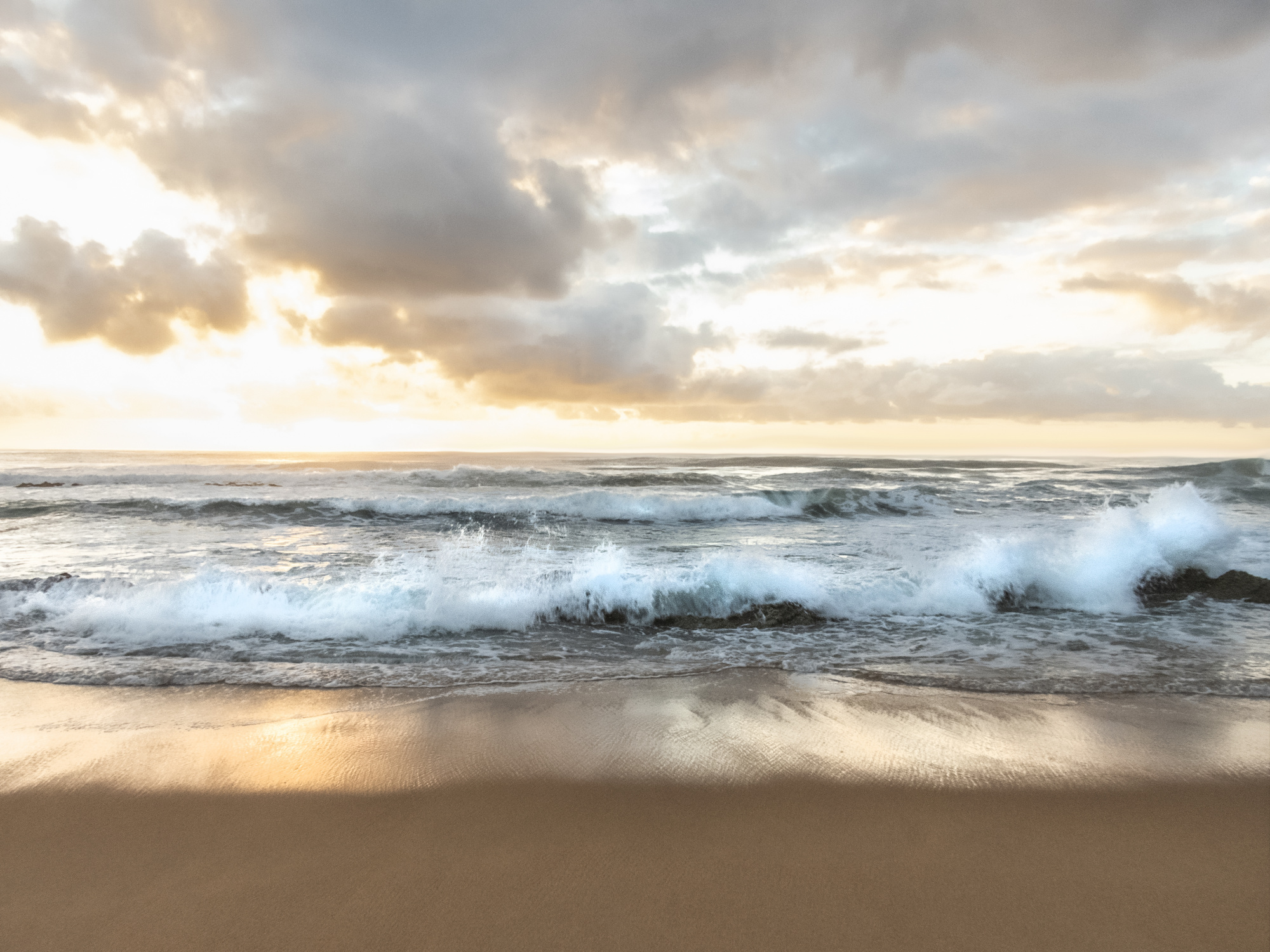
So I managed to get down to the coast 2 weeks ago and headed down to the beach in the early morning for some quiet time, just listening to the ocean and observing its rolling waves and splashes over the rocks, slowly watching the sun rise and the change of colour in the sky.
Specs are:
f/7.6, 1/40, ISO 200, exposure -1,7, focal length 4.3mm, time 5:43 AM
The first image is the original, the second is processed.
I played with the highlights and shadows in the camera raw filter and used the dodge and burn tools for the ocean and reflection. Not sure if it needs more colour and if the ocean is now to dark? Any suggestions on improvements re camera settings would be welcome, I am a novice when it comes to landscape photography.
Kind regards
Helga Williams

Helga,
You have a wonderful foreground but for me your sky looks not normal. So have a great change for improvement. I did the following actions.
First I did a crop I used a 15/10 format to come in a direction of 1/3 foreground and 2/3 sky. Than I brought him in Camera /raw as follows: Photoshop>filter>Camera Rawfilter. I used there both gradients: radial and linear for darkening and lighting. With the radial you become soft borders so you can choose several places. And after this the strange action. Photo shop has a very nice tool : REPLACEE AIR. The I could find for me a better sky. But if you don't like him you can easy go for another one Replace air goes as follows: Go in Photoshop to EDIT>REPLACE AIR. Below the result up to you if you like it. Theo-senior critic.
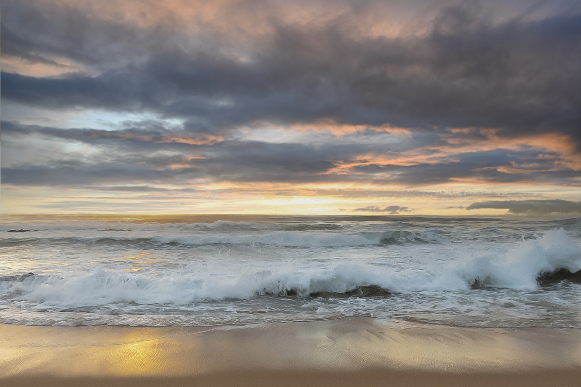
PS. This foreground needs a lttle bit more contrast , I think, but not so heavy as your second one.
A second version.
Perhaps not the right version but you can try to find a better sky.


Hello, Helga
I studied your image for quite some minutes. My first impression was an awe. It looked so clear, bright and romantic. Your edited image turned out to be quite nice in my point of view and I think you made good decisions with the touches in Photoshop. And I can also understand the advice Theo Luycx looks gave. The one part of your image that gives me a thought is the bright part at the left side of the image, the horizon line. I took a screenshot as well and tried my hand at it, but without changing the sky that part does not get fixed. There is too much loss of texture because of the brightness there. Honestly I think this could have been avoided while the image was taken. Inside the camera there is the highlight alert which can be very helpful in moments like this. It helps you to adjust your settings before you take the image. A tripod is quite handy at this point. You can check the progress in liveview. A slight shift to minus degrees in dehase in Photoshop Raw and minimal adjustments to texture and clarity could give the sky some dynamics. Yet it should be done delicalitely to avoid excessive darkening and noise. I also like the softness and the saturation of the image. Another point I thought about while studying your image was the absence of a living being. The impact of the image with a trace of somebody walking or have recently walked on the beach, or a bird, or somebody in a boat would have dramatically changed the impression of the image. Although I myself sometimes like landscapes without people better, I looked for an anchor point here. I hope I could be helpful with some insights...Have good light
Çiçek Kıral Senior Critic
Helga,
You have a wonderful foreground but for me your sky looks not normal. So have a great change for improvement. I did the following actions.
First I did a crop I used a 15/10 format to come in a direction of 1/3 foreground and 2/3 sky. Than I brought him in Camera /raw as follows: Photoshop>filter>Camera Rawfilter. I used there both gradients: radial and linear for darkening and lighting. With the radial you become soft borders so you can choose several places. And after this the strange action. Photo shop has a very nice tool : REPLACEE AIR. The I could find for me a better sky. But if you don't like him you can easy go for another one Replace air goes as follows: Go in Photoshop to EDIT>REPLACE AIR. Below the result up to you if you like it. Theo-senior critic.
PS. This foreground needs a lttle bit more contrast , I think, but not so heavy as your second one.
Hi Theo
thank you taking the time and energy to critique and work on my image.
It is the 'not normal' that fascinates me in any image, sort of the out side the box thinking. And that is the sky that was presented to me, replacing it with another that is not my work is not acceptable to me. I wanted to showcase a sky as I saw it with a bright, blinding light as it happend here just before the sun rises, the empty space that speaks volumes to me, moments before the sun rises. I did not see a dark sky. I do, however, accept the norm of photography rules and will adapt for this image.
I do like your radial and linear grading idea and will try to implement them and hopefully be successful.
I look forward to more of your mentoring ideas in the future.
Kind regards
Helga
Hello, Helga
I studied your image for quite some minutes. My first impression was an awe. It looked so clear, bright and romantic. Your edited image turned out to be quite nice in my point of view and I think you made good decisions with the touches in Photoshop. And I can also understand the advice Theo Luycx looks gave. The one part of your image that gives me a thought is the bright part at the left side of the image, the horizon line. I took a screenshot as well and tried my hand at it, but without changing the sky that part does not get fixed. There is too much loss of texture because of the brightness there. Honestly I think this could have been avoided while the image was taken. Inside the camera there is the highlight alert which can be very helpful in moments like this. It helps you to adjust your settings before you take the image. A tripod is quite handy at this point. You can check the progress in liveview. A slight shift to minus degrees in dehase in Photoshop Raw and minimal adjustments to texture and clarity could give the sky some dynamics. Yet it should be done delicalitely to avoid excessive darkening and noise. I also like the softness and the saturation of the image. Another point I thought about while studying your image was the absence of a living being. The impact of the image with a trace of somebody walking or have recently walked on the beach, or a bird, or somebody in a boat would have dramatically changed the impression of the image. Although I myself sometimes like landscapes without people better, I looked for an anchor point here. I hope I could be helpful with some insights...Have good light
Çiçek Kıral Senior Critic
Hi Cicek,
thank your for your thaughts and critique. I do confess that I am in two minds with what you say.
You say you were in awe as a first impression, clear, bright and romantic - that was intended on my part and you liked my photoshop skills, I thank you for that. To me that means you understood the image as is.
As I also explained to Theo (and I appreciate all advice given) that the bright part was intended to blow out, in my mind adding to the romanticism, if you will. I guess I just think differently and will adapt the image for curation purposes. I do know about the highlight alert, I just ignored it. I do take on board the dehaze and will work on the sky. Thank you for liking the softness and saturation of the image, again that was my intend. I purposely omitted a living being, I wanted the waves to speak for themselves.
I thank you for your valuable insight and will try to rework this image to hopefully make it more understood.
Kind regards
Helga
Helga,
You have a wonderful foreground but for me your sky looks not normal. So have a great change for improvement. I did the following actions.
First I did a crop I used a 15/10 format to come in a direction of 1/3 foreground and 2/3 sky. Than I brought him in Camera /raw as follows: Photoshop>filter>Camera Rawfilter. I used there both gradients: radial and linear for darkening and lighting. With the radial you become soft borders so you can choose several places. And after this the strange action. Photo shop has a very nice tool : REPLACEE AIR. The I could find for me a better sky. But if you don't like him you can easy go for another one Replace air goes as follows: Go in Photoshop to EDIT>REPLACE AIR. Below the result up to you if you like it. Theo-senior critic.
PS. This foreground needs a lttle bit more contrast , I think, but not so heavy as your second one.
Hi Theo
thank you taking the time and energy to critique and work on my image.
It is the 'not normal' that fascinates me in any image, sort of the out side the box thinking. And that is the sky that was presented to me, replacing it with another that is not my work is not acceptable to me. I wanted to showcase a sky as I saw it with a bright, blinding light as it happend here just before the sun rises, the empty space that speaks volumes to me, moments before the sun rises. I did not see a dark sky. I do, however, accept the norm of photography rules and will adapt for this image.
I do like your radial and linear grading idea and will try to implement them and hopefully be successful.
I look forward to more of your mentoring ideas in the future.
Kind regards
Helga
Helga,
I understand your vision. Below your original version in a new editing
Helga,
I used my edit of your foreground and for above I did following. Like Cicek also said on the left side the sky had no detail. I selected the whole sky with rectangle and gave a new filling layer dark yellow. Reduced the covering till 10-15% and after this I used BRIGHTNESS /CONTRAST to bring back the dark areas. I think you are right to go for the original, but your foreground was so nice therefore I did the change. Theo-senior critic
Hi Theo
I thank you for getting back to me and understanding my vision. I feel more comfortable with your latest version, but in the meantime have worked on my new version, trying to follow all advice. Kindly see the uploaded new version.

Helga,
I used my edit of your foreground and for above I did following. Like Cicek also said on the left side the sky had no detail. I selected the whole sky with rectangle and gave a new filling layer dark yellow. Reduced the covering till 10-15% and after this I used BRIGHTNESS /CONTRAST to bring back the dark areas. I think you are right to go for the original, but your foreground was so nice therefore I did the change. Theo-senior critic
Hello, Helga
I studied your image for quite some minutes. My first impression was an awe. It looked so clear, bright and romantic. Your edited image turned out to be quite nice in my point of view and I think you made good decisions with the touches in Photoshop. And I can also understand the advice Theo Luycx looks gave. The one part of your image that gives me a thought is the bright part at the left side of the image, the horizon line. I took a screenshot as well and tried my hand at it, but without changing the sky that part does not get fixed. There is too much loss of texture because of the brightness there. Honestly I think this could have been avoided while the image was taken. Inside the camera there is the highlight alert which can be very helpful in moments like this. It helps you to adjust your settings before you take the image. A tripod is quite handy at this point. You can check the progress in liveview. A slight shift to minus degrees in dehase in Photoshop Raw and minimal adjustments to texture and clarity could give the sky some dynamics. Yet it should be done delicalitely to avoid excessive darkening and noise. I also like the softness and the saturation of the image. Another point I thought about while studying your image was the absence of a living being. The impact of the image with a trace of somebody walking or have recently walked on the beach, or a bird, or somebody in a boat would have dramatically changed the impression of the image. Although I myself sometimes like landscapes without people better, I looked for an anchor point here. I hope I could be helpful with some insights...Have good light
Çiçek Kıral Senior Critic
Hi Cicek,
thank your for your thaughts and critique. I do confess that I am in two minds with what you say.
You say you were in awe as a first impression, clear, bright and romantic - that was intended on my part and you liked my photoshop skills, I thank you for that. To me that means you understood the image as is.
As I also explained to Theo (and I appreciate all advice given) that the bright part was intended to blow out, in my mind adding to the romanticism, if you will. I guess I just think differently and will adapt the image for curation purposes. I do know about the highlight alert, I just ignored it. I do take on board the dehaze and will work on the sky. Thank you for liking the softness and saturation of the image, again that was my intend. I purposely omitted a living being, I wanted the waves to speak for themselves.
I thank you for your valuable insight and will try to rework this image to hopefully make it more understood.
Kind regards
Helga
Hi again
I think it is very important that the photographer knows what they want to achieve...So, I hope everything works as you wish and we see this beautiful image published. All the best...Have good light...
Helga,
I used my edit of your foreground and for above I did following. Like Cicek also said on the left side the sky had no detail. I selected the whole sky with rectangle and gave a new filling layer dark yellow. Reduced the covering till 10-15% and after this I used BRIGHTNESS /CONTRAST to bring back the dark areas. I think you are right to go for the original, but your foreground was so nice therefore I did the change. Theo-senior critic
Hi Theo
I thank you for getting back to me and understanding my vision. I feel more comfortable with your latest version, but in the meantime have worked on my new version, trying to follow all advice. Kindly see the uploaded new version.
Helga,
I used my edit of your foreground and for above I did following. Like Cicek also said on the left side the sky had no detail. I selected the whole sky with rectangle and gave a new filling layer dark yellow. Reduced the covering till 10-15% and after this I used BRIGHTNESS /CONTRAST to bring back the dark areas. I think you are right to go for the original, but your foreground was so nice therefore I did the change. Theo-senior critic
Hello, Helga
I studied your image for quite some minutes. My first impression was an awe. It looked so clear, bright and romantic. Your edited image turned out to be quite nice in my point of view and I think you made good decisions with the touches in Photoshop. And I can also understand the advice Theo Luycx looks gave. The one part of your image that gives me a thought is the bright part at the left side of the image, the horizon line. I took a screenshot as well and tried my hand at it, but without changing the sky that part does not get fixed. There is too much loss of texture because of the brightness there. Honestly I think this could have been avoided while the image was taken. Inside the camera there is the highlight alert which can be very helpful in moments like this. It helps you to adjust your settings before you take the image. A tripod is quite handy at this point. You can check the progress in liveview. A slight shift to minus degrees in dehase in Photoshop Raw and minimal adjustments to texture and clarity could give the sky some dynamics. Yet it should be done delicalitely to avoid excessive darkening and noise. I also like the softness and the saturation of the image. Another point I thought about while studying your image was the absence of a living being. The impact of the image with a trace of somebody walking or have recently walked on the beach, or a bird, or somebody in a boat would have dramatically changed the impression of the image. Although I myself sometimes like landscapes without people better, I looked for an anchor point here. I hope I could be helpful with some insights...Have good light
Çiçek Kıral Senior Critic
Hi Cicek,
thank your for your thaughts and critique. I do confess that I am in two minds with what you say.
You say you were in awe as a first impression, clear, bright and romantic - that was intended on my part and you liked my photoshop skills, I thank you for that. To me that means you understood the image as is.
As I also explained to Theo (and I appreciate all advice given) that the bright part was intended to blow out, in my mind adding to the romanticism, if you will. I guess I just think differently and will adapt the image for curation purposes. I do know about the highlight alert, I just ignored it. I do take on board the dehaze and will work on the sky. Thank you for liking the softness and saturation of the image, again that was my intend. I purposely omitted a living being, I wanted the waves to speak for themselves.
I thank you for your valuable insight and will try to rework this image to hopefully make it more understood.
Kind regards
Helga
Helga,
I find that you did well. You have now a good looking composition.
Helga,
I used my edit of your foreground and for above I did following. Like Cicek also said on the left side the sky had no detail. I selected the whole sky with rectangle and gave a new filling layer dark yellow. Reduced the covering till 10-15% and after this I used BRIGHTNESS /CONTRAST to bring back the dark areas. I think you are right to go for the original, but your foreground was so nice therefore I did the change. Theo-senior critic
Hi Theo
I thank you for getting back to me and understanding my vision. I feel more comfortable with your latest version, but in the meantime have worked on my new version, trying to follow all advice. Kindly see the uploaded new version.
Helga,
I used my edit of your foreground and for above I did following. Like Cicek also said on the left side the sky had no detail. I selected the whole sky with rectangle and gave a new filling layer dark yellow. Reduced the covering till 10-15% and after this I used BRIGHTNESS /CONTRAST to bring back the dark areas. I think you are right to go for the original, but your foreground was so nice therefore I did the change. Theo-senior critic
Hello, Helga
I studied your image for quite some minutes. My first impression was an awe. It looked so clear, bright and romantic. Your edited image turned out to be quite nice in my point of view and I think you made good decisions with the touches in Photoshop. And I can also understand the advice Theo Luycx looks gave. The one part of your image that gives me a thought is the bright part at the left side of the image, the horizon line. I took a screenshot as well and tried my hand at it, but without changing the sky that part does not get fixed. There is too much loss of texture because of the brightness there. Honestly I think this could have been avoided while the image was taken. Inside the camera there is the highlight alert which can be very helpful in moments like this. It helps you to adjust your settings before you take the image. A tripod is quite handy at this point. You can check the progress in liveview. A slight shift to minus degrees in dehase in Photoshop Raw and minimal adjustments to texture and clarity could give the sky some dynamics. Yet it should be done delicalitely to avoid excessive darkening and noise. I also like the softness and the saturation of the image. Another point I thought about while studying your image was the absence of a living being. The impact of the image with a trace of somebody walking or have recently walked on the beach, or a bird, or somebody in a boat would have dramatically changed the impression of the image. Although I myself sometimes like landscapes without people better, I looked for an anchor point here. I hope I could be helpful with some insights...Have good light
Çiçek Kıral Senior Critic
Hi Cicek,
thank your for your thaughts and critique. I do confess that I am in two minds with what you say.
You say you were in awe as a first impression, clear, bright and romantic - that was intended on my part and you liked my photoshop skills, I thank you for that. To me that means you understood the image as is.
As I also explained to Theo (and I appreciate all advice given) that the bright part was intended to blow out, in my mind adding to the romanticism, if you will. I guess I just think differently and will adapt the image for curation purposes. I do know about the highlight alert, I just ignored it. I do take on board the dehaze and will work on the sky. Thank you for liking the softness and saturation of the image, again that was my intend. I purposely omitted a living being, I wanted the waves to speak for themselves.
I thank you for your valuable insight and will try to rework this image to hopefully make it more understood.
Kind regards
Helga
Helga,
I find that you did well. You have now a good looking composition.
Thank you Theo and Cicek for taking me on this journey, I have learned a lot, again! and that is what I am aiming for at the end of the day.
Hoping to hear from you on future projects.
Kindest regards
Helga
