


|
|
|
|

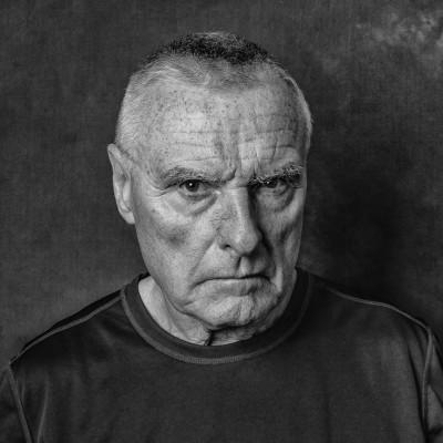
I took captured this photo of a woman alone in DTLA reading a book in the middle of a weekend day. It happened to be on a photowalk I was on and it so happened to be one of the few scenes where I was able to capture an individual subject alone in DTLA. Having said, I wasn't sure on what to put as a description for a photo from something like that; to me it would've had felt cheesy coming up with some meaningful description to justify my photo. So here's what I put "An image of a woman perfectly at peace being alone reading her book."
I may have lost some points on there. heh
I recieved some 3 stars on all my feedback categories and for areas of improvement I was told to look into subject matter; but for positive areas - subject matter was also listed.
I'm looking forward to getting some guidance on how to improve my undersntading of the curation process, not to tweek the system, but to be better at selecting and improving my photos.
Please critique this photo as a streetphotography image.

Thank you,
Braneo welcome. This is not my type of image but here goes just a few ideas to think about. First impressions it looked a little dull and underexposed. So I opened up the exposure +50 Did a crop off all sides and some dodge and burn tool work last Topaz AI sharten with noise reduction. Thank you for sharing..


Hello, Braneo
Welcome to our forum and thank you for sharing your image with us. I have also seen the space needle of yours. You received great advice from my colleague on both of them. I tried ti take a look at your portfolio and I saw that there are no published images yet. From both images I saw here I deduce that you are interested in photography and you have certain genres that evoke your instinct to take an image of the scene. To make better use of 1x and your 1x subscription I advise you to also follow tutorials to grow your background knowledge. For photography to be acknowledged on this platform you need mainly the good eye, technical and artistic skills. These are acquired by seeing lots of good photography samples, tutoring in technical and compositional skills and lots of practice. This is the way I have experienced since starting photography as a hobby. You can find everything you need here, on the net and all around you. Believe me no effort goes unaware. I think composition is what you should concentrate on fist. I wish you good light...Cicek
Cicek Kiral , thank you so much for the advice. May I trouble you with what you mean by "focusing on composition"? You have seen my other photo I have tried to publish and so I feel that you might understand my composition tendencies or personal taste. Is my composition bad ?

Hello Braneo. I am not going to even try to speak for another critic but Cicek's comment (as identified by you) certainly rang a bell with me. You see, I think this image is technically ok - rather under-exposed but Daniel's solution works fine for that. But it is the composition I have strong doubts about. T'other day, I commented on a photograph and said it was actually several photographs in one. I have a similar feeling here. I think your photograpoh covers many things which do the central subject / theme no favours at all. I have taken Daniel's edit and cropped it further (and flipped it). I would like to see more negative space ahead of this lady but that may not have been possible. Anyway, I think this part of your image says what you said you wished to say.
Just for my curiosity, what does "DTLA" mean, please? Cheers.

Woad Visage , Thank you for your critique. I should apologize I was asusming that alot of people have understood DT + initials of any city is Downtown + City. DTLA is simply downtown, LA.
Woad Visage , Thank you for your critique. I should apologize I was asusming that alot of people have understood DT + initials of any city is Downtown + City. DTLA is simply downtown, LA.
Hi Braneo. Thanks muchly. I did wonder if it was Los Angeles, USA - I assume LA is that! . Cheers. (I am not very far from London, UK, so I don't use "LA" as a phrase but I have heard of it).
Hello, again
Well, I did not mean that it was bad but it surely is not exactly what is probably a common understanding for some certain photographical settings. Let me give you an example of what I mean in other words. If you choose to watch a horror film you will most certainly expect sudden noises, night or dark scenes, bloody scenes or creepy creatures rather than clear skies and sunny days, laughter or heart warming scenes in the film. There are compositonal tendencies among photographers that affect the result of the curation. You might break those rules yet those instances are rare and seen in either very creative work or very outstanding ones. That is what I have seen in the past seven years on 1x. I personally think that one should be really well informed to step out of the rules intentionally. Do not take my words as a direct judgement on your work.I have only seen two images in critique and no published ones. So I just wanted to remind you about these. It is a teacher habit that sticks with me after teaching 30 years. It was just an insight... Until next time...
Cicek Kiral Thank you so much for the clarification! I definitely understand what you're underlining and will do my best to work on refining my compositional work so it can be a strong strength!
Braneo
Thanks for submitting this image. It has a lot of good elements.
Having said that, it is difficult to identify the woman as the subject of the photo. Our eye is first drawn to bright areas which in the case is the upper left corner while the woman is underexposed in the bottom of the photo. Daniel Springgay has given a great suggestion in regard to brightening the exposure and cropping out details at the top that don't add to the scene.
That leaves us with where the woman is positioned in the photo. She is near the left edge facing outwards. When you composed the image it would have had more impact if there was more space in front of her. To illustrate the potential impact I took a screenshot of Danny's edit and did a generative expand in photoshop to add some real estate in front of her. This is NOT a recommendation to use generative expand but simply a way to illustrate the impact of more space.
I hope this gives you some thing to consider. This is, of course, just my personal opinion. As the artist it is your opinion that matters,
Best wishes,
Mike S. - Senior Critic

Thank you so much for your comment. It is exactly in line with my understanding of everyone's comments so it is very assuring for me to know that I understand how to learn and be better at photogrpahy. I greatly appreciate the expert crtics here. Very much constructive while also being critical.
