


|
|
|
|
All critiques appriciated .
Kind regards
Stuart.

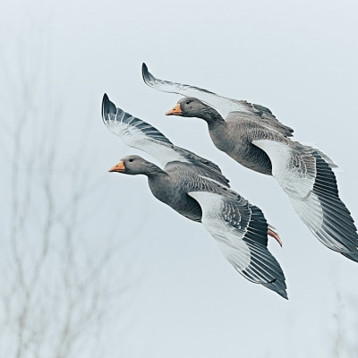
Stuart Hi and welcome - There is quite a lot of wildlife images on 1x.com at the moment so this may affect your input. - This is my take on your wonderful image as you can see I've gone for a cop on three sides. I've also used the burn tool to darken the edges. Nik tools Tonal contrast painted on the bird only. Last Topaz AI Sharpen with noise reduction just a litte for that Pro look thank you for sharing..


Hi Stuart,
my suggestion: remove the noise, slightly sharpen only the bird, blur the background outside the bird and the branches and then make a square cut so that the bird sits in the center of a so-called golden spiral.

Greetings
Udo

Hi, Stuart
welcome to our forum page. Well, I just looked at your portfolio, and I have to say that you deserved to have all these images published. Your nature images are beautiful. If I have to critique this special one, I would start saying that the composition is not as strong and technical quality is not as refined as most of your images that were previously published. I like rim light, but in this image, as you said, some of the details and texture in those details are lost because of the light. It would not look very nature to me too work on this blown highlights with some editing software. Had the aperture been A bit smaller, I think the image would have had a much bigger effect on the viewer. the composition is not bad, but it looks incomplete. I wish there were just the only branch the bird was on yet it's not always possible to find something so find in nature. Blurry background looks quite fine. However, my friends pointed out above. There are so many similar compositions on 1x to this one that want to see something new. And when some repeated compositions come across the way, the judgment, I suppose gets harsher. I wish you good light...cicek
Thank you all for your critiques. I agree with your points. I did like Daniels crop, plus the image does look better. Looking again at the image I just dont think it is good enough. It's still an image that I particulay like regarding mood & colours but the Stonechat is just not clear enough.
Thanks again. Always appriciate feedback good or bad.
