


|
|
|
|
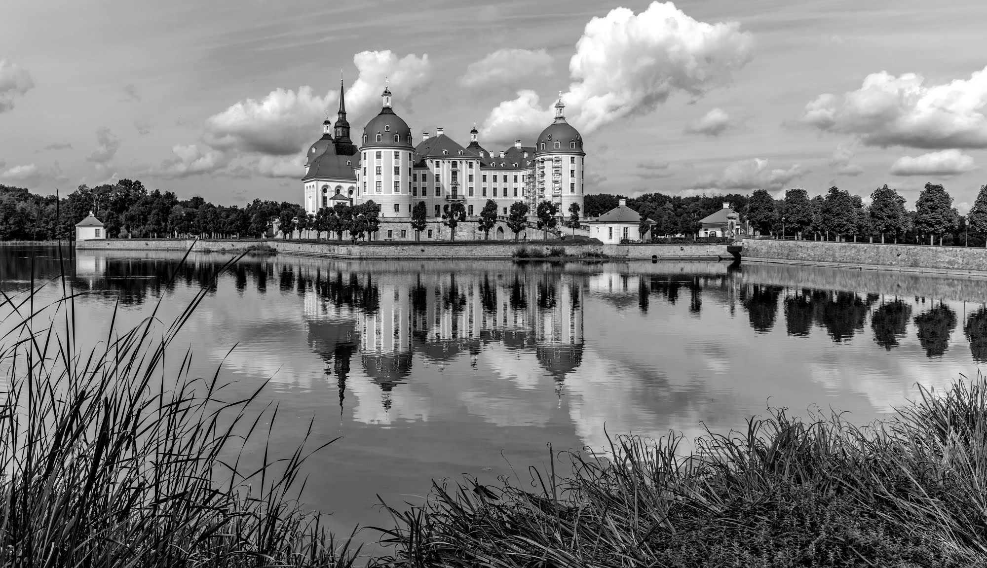
The castle "Moritzburg" is famous because it played an important role in a fairytale. A tighter cut version was published earlier, this one was not. Here I wanted to emphasise the surroundings of the castle a little more. It is also a little brighter than the first version, which some criticised as being too dark. The intention was to show the beautiful castle in the landscape. What could I do better?
The editing (alignment) was done with Photoshop.

Further details:
Camera: Canon 5D, lens 24-70 mm
focal length: 24 mm
aperture: f/8
shutter speed: 7.32s
ISO: 100
Urs thank you for given us a try, this is the home base of " The Real Critic " - Looking at you wonderful composition I think you did very well in terms of subject matter and balance. I see wonderful depth. - All I did was use Nik Tools Tonal Contrast to add punch - see attached...

Urs,
Thanks for submitting this.
I took a look at the version that was published. To be honest I prefer that version quite a bit more. It has a better composition in my opinion and does a better job of focusing attention on the subject by excluding much of the surrounding which I don't feel add much to the photo. I'll also add that personally I didn't find it too dark but that's a matter of taste.
In regard to the version above I have only minor version. At the top edge two little peak of the cloud are just touching the edge. This placement caught my eye and is a bit distracting I would suggest expanding the canvas just a wee bit and extending the sky to give them a bit more "breathing" room.
Hope this helps.
Mike S. - Senior Critic

Hello Urs
Welcome to the Critique forum and thank you for sharing your photo of Moritzburg castle with us. It's a well-composed image with beautiful reflections and details, and Daniel has already offered you an excellent edit. I'm just wondering how likely it is to be published as it's so similar to the photo that has already been published, so I thought you might like to consider a black-and-white version.
Wishing you all the best, Elizabeth
Dear Elizabeth, I chose a wider cropped, less dark image because the first version was criticised for being too dark.
Last week I uploaded this picture in black and white but it was rejected. The same has now happened with the coloured version.
This is not a tragedy, and photography is and always will be subjective. Best regards, Urs
You have a great attitude, dear Urs. Perhaps it's time to move on and try something different.
Best wishes, Elizabeth
Urs,
Thanks for submitting this.
I took a look at the version that was published. To be honest I prefer that version quite a bit more. It has a better composition in my opinion and does a better job of focusing attention on the subject by excluding much of the surrounding which I don't feel add much to the photo. I'll also add that personally I didn't find it too dark but that's a matter of taste.
In regard to the version above I have only minor version. At the top edge two little peak of the cloud are just touching the edge. This placement caught my eye and is a bit distracting I would suggest expanding the canvas just a wee bit and extending the sky to give them a bit more "breathing" room.
Hope this helps.
Mike S. - Senior Critic
Thank you very much for your critique, Mike. The cloud on the edge also bothered me a little, but it wasn't that significant for me.
Hello, Urs
Welcome to our forum. Thank you for giving us the chance to work on the improvement of your image. I think it is beautiful. I am not a landscape photographer but I am very into the fantastic world of photography. If this palace has anything to do with a fairy tale then I think it can be exaggarated in some ways. These might be contrast, saturation and definition. It is just another insight. Sometimes we need to boost up reality. I wish you good light. Cicek Kiral Senior Critic...

Dear Cicek
I am a little late with my reply because I overlooked it, but I would still like to thank you very much. There are always helpful tips in your forum. This castle was the setting for the famous fairy tale "Three nuts for Cinderella" :-).
Many greetings, Urs
Hello Urs,
Here's my suggestion:
Crop it from the right to get your subject off-centre. The middle is normally not a good position. Crop it in the way it adds some sky (context switched on), the clouds are substantial in this and too close to the edge. In mirrored motifs, having a water border in the middle id ofetn fortunate, especially if you have a foreground just present once.
Open it in RAW filter, raise blacks and darks to make it "lighter", in the sense of less heavy. Raise the exposure overall and tone down lights a bit to keep structure in your clouds. I applied a "look", a 3DLUT, to give it a bit more of an ancient color grading - only after setting it to a more neutral blue first. I also lowered brightness of the upper, left corner, tuning itin on the other blue sky to not stand out that much. Here you go:

Best regards,
Mike
Thank you very much for your suggestion. Unfortunately I saw the post a bit late because I didn't receive a notification, but your suggestion convinces me. That way you can always learn something new!
Many greetings
Urs

Urs,
I like the lighter version of Mike the most. But I should make below darker to bring the attention to above. Sorry Mike I used your nice version. Theo L.

My photo is getting better and better :-). Thank you very much, Theo.

Keep it in color and strong; the expression of primary colors is a highlight of the image (as Daniel Sprigngay composed).
Keep it in color and strong; the expression of primary colors is a highlight of the image (as Daniel Sprigngay composed).
Thank you very much, John.
