

|
|
|
|
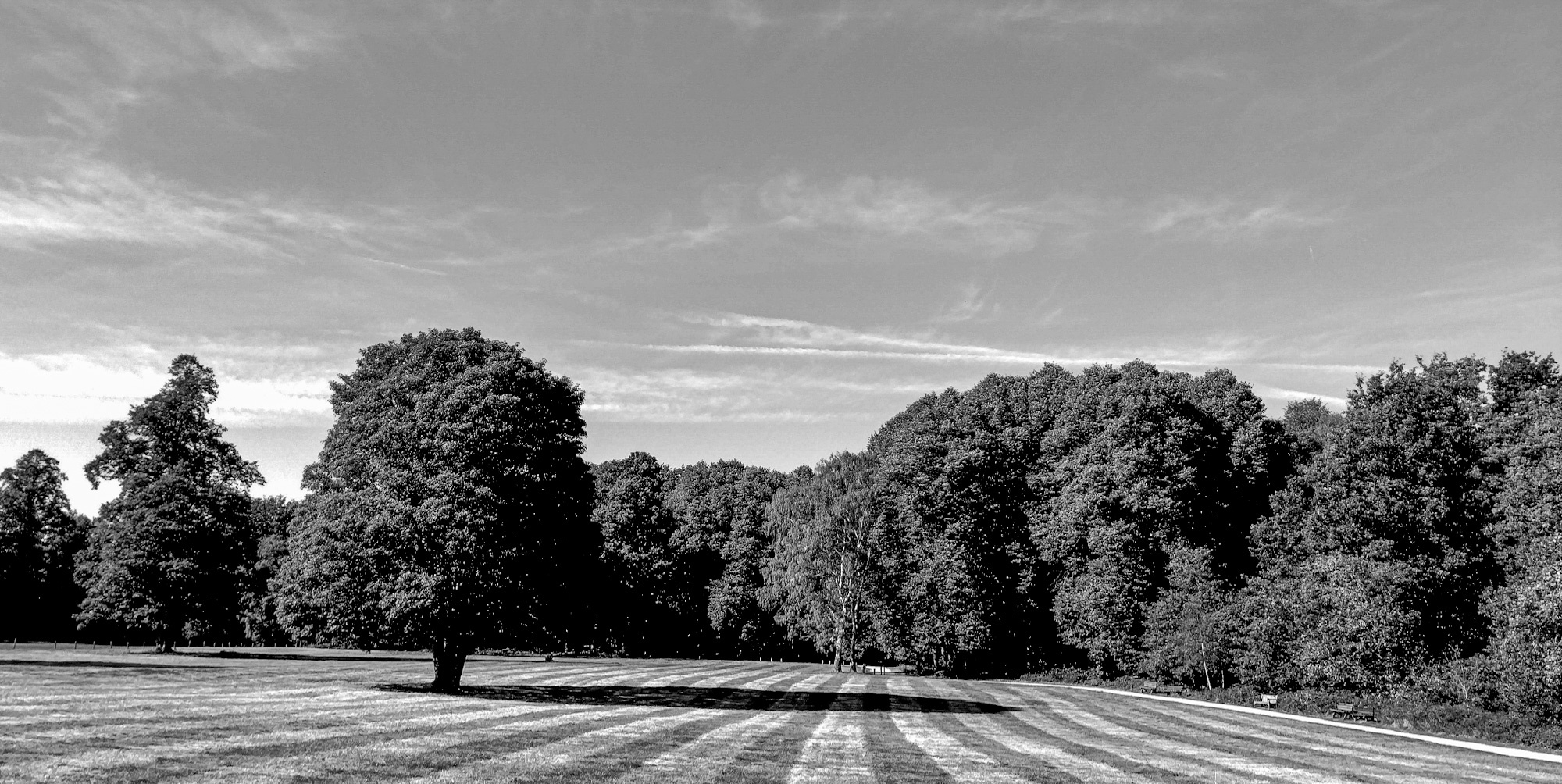
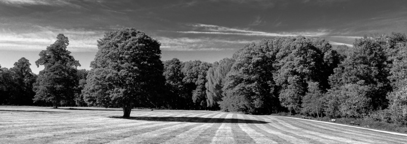
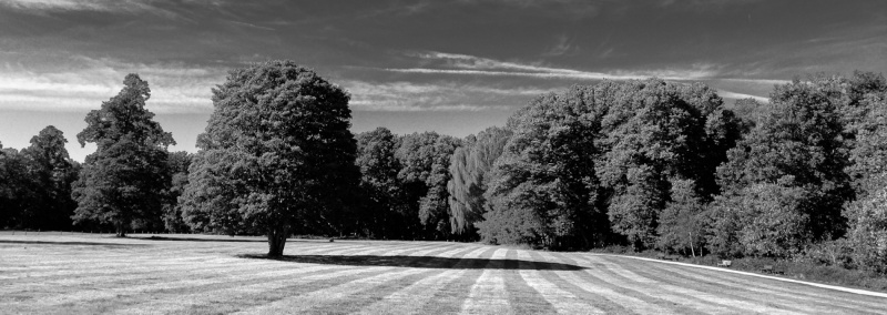
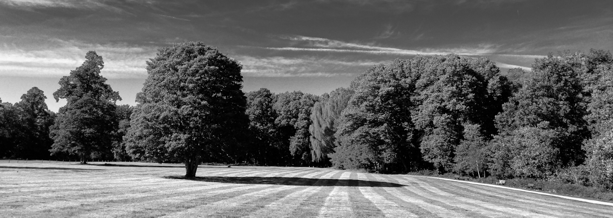
When I came across this open parkland vista, I was immediately drawn to the quiet dialogue between human order and natural form. The sweeping, freshly mowed stripes across the grass created natural leading lines, while the late afternoon sun cast a bold, elongated shadow from the solitary foreground tree directly across those patterns. My goal was to convey a calm, contemplative mood and highlight the subtle geometric rhythm found within a classic countryside landscape. Through a high-contrast monochrome conversion and a wide panoramic crop, I wanted the viewer to focus on the interplay of light, shadow, and clean lines rather than the distractions of color.
Before submitting this piece for official curation, I would greatly appreciate constructive feedback from the community on a few specific areas:
1. Composition & Crop: Does the panoramic format feel balanced, or does the open sky on the upper left feel slightly too empty?
2. Tonal Separation: Have I struck the right balance between the bright highlights on the grass stripes and the deep shadow details within the dense treeline?
3. Curation Readiness: Overall, does the visual s
tory and graphic simplicity of the scene hold strong enough interest for the 1x Landscape gallery?
Camera & EXIF Details:
• Focal Length: 26mm equivalent to 35mm focal length film
• Aperture: 1.8
• Shutter Speed: 1/485s
• ISO: 100

Hi Nikolai,
I tried editing your photo, but I'd prefer to work with the original file because some areas can't be restored this way (for example, black stays black). In any case, I'd rotate the photo 1.5 degrees to the left, because to my eye, the horizon looks crooked.
Reagrds
Udo
Dear Nikolai Garbutt,
Thanks for the occasion and posting. I'll go straight for the money because I had an exhausting day. Your photo appears tilted to the right. Could be the landscape was in fact, of course. But since viewers like me don't know, it looks like you did not hold the camera straight. You have memories attached to the frame, we don't.
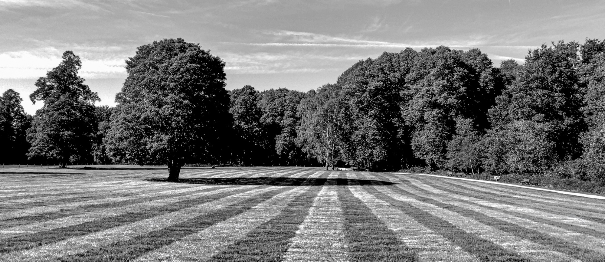
If the stripes, and your conversion brought them out pretty well, are a them, give them space. You dedicated more space for the sky not contributing than your subject. You should have gone far deeper and make this a front-to-back layout. I can't do that now afterwards, but a better composition in my view wouuld give 1/3rd, if not more, to your striped lawn. Quite like this:
Best regards,
Mike
Dear Nikolai Garbutt,
Thanks for the occasion and posting. I'll go straight for the money because I had an exhausting day. Your photo appears tilted to the right. Could be the landscape was in fact, of course. But since viewers like me don't know, it looks like you did not hold the camera straight. You have memories attached to the frame, we don't.
If the stripes, and your conversion brought them out pretty well, are a them, give them space. You dedicated more space for the sky not contributing than your subject. You should have gone far deeper and make this a front-to-back layout. I can't do that now afterwards, but a better composition in my view wouuld give 1/3rd, if not more, to your striped lawn. Quite like this:
Best regards,
Mike
Hello Mike,
I attached the wrong photo as I had noticed that it was slightly tilted,but I have lowered the top as you suggested. Please see the newer version with your suggestion.
Thank you
NIKOLAI

Hello Nikołaj,
Thank you for sharing your photo on this forum.
I won’t repeat what my colleague Mike has already written, but I would like to address a few points that I consider crucial.
First, regarding the framing itself: sometimes, a composition as orderly and aesthetic as the one in your photo doesn't quite hit the mark. Taking a shot from the eye level of a standing person isn't always the best choice in such situations. It’s often worth getting a bit lower or approaching the perspective differently. A full "frog’s-eye view" might be a bit too extreme here (though I’d still be tempted to try it), but a lower camera position would definitely be an improvement, in my opinion.
Second, the use of black and white doesn't quite work for me; the contrast is too low, which makes the image feel a bit off. I wonder what this photo looks like in color? Perhaps using an infrared (IR) filter would have created stronger contrast and given the image more character?
Third, I would suggest trying a different angle—perhaps at a 45-degree offset to the line of the grass—while also incorporating my first point. It’s always worth experimenting and breaking the rules.
Best of luck with your future work.
Slawomir Kowalczyk - SC