


|
|
|
|

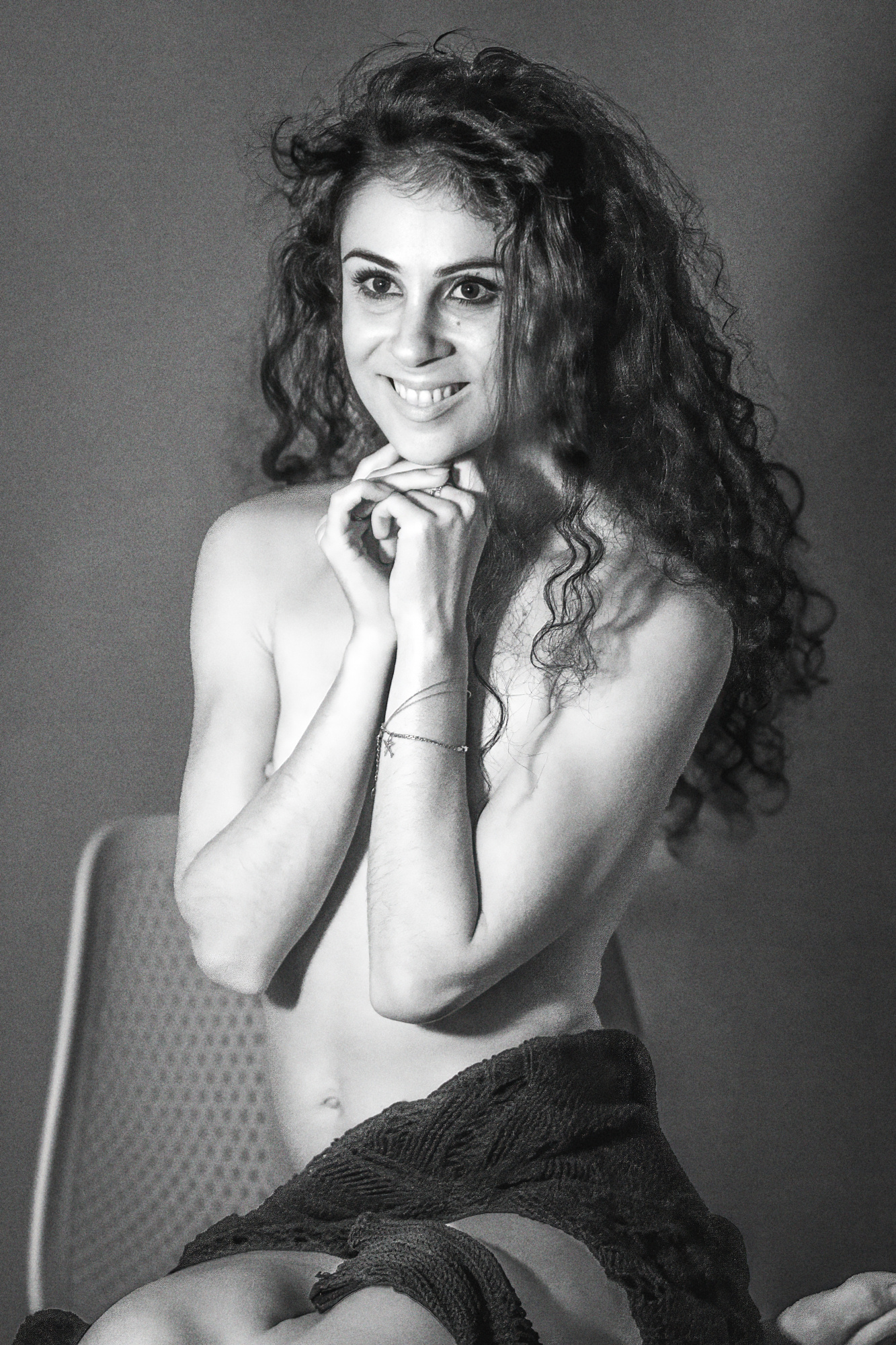
In this black-and-white image, a young girl sits casually on a chair, her body language relaxed but confident. The playful, mischievous smile on her face draws you in, creating an intriguing contrast with the raw and slightly gritty feel of the photograph. The subtle interplay of light and shadow highlights her expression, adding depth to the image while maintaining a sense of mystery and edge. The monochrome treatment enhances the texture and emotion, allowing the viewer to focus on the energy conveyed through her smile.
I would appreciate feedback on how well the image captures the contrast between her playful smile and the rougher visual style, as well as any suggestions for enhancing the lighting and composition.

Hello Yuri
Thank you for sharing this photo with us, although I would like to point out that as a general rule we ask photographers to pose one photo at a time as there is only room for a limited number of photos on the page.
This is not my genre, but I would recommend at least cropping the lower edge of the frame as the partial foot in the bottom right corner is a distraction in my opinion.
Good light, Elizabeth
Hi, thanks for commenting. I'm really new here and trying to fit in here among all the super talented photographers, and to be honest I didn't notice. Ugh, really unpleasant and apologize.Regarding your comment, absolutely right, just debating whether to cut or how to get out of it, but absolutely right about the bottom corner. I must be more alert to such inaccuracies
Hello, @ Yuri Siritsov
welcome to our form. Thank you for uploading your image and your request to get some suggestions to enhance it. I have been interested in the portrait genre and if you have time, you can check out my portraits to see the style I prefer shooting and the way I edit them. Some have been published and some have been awarded. Getting these achievements in this genre helped me to figure out how to process and create my images. I am also aware that I am way behind some really professional and skillful photographers as well that pursue this type of photography. Whatever you do nothing works better than making mistakes or getting unwanted results even though you work hard on your photography. When you understand what works and what does not you start to make progress. I myself, started off by analyzing work of successful photographers in the genres I pursue . I started off by comparing my work to theirs. And I also tried to teach myself with lots of online courses and workshops. There is still a long way ahead of me to get the results I want.
let's look at your image from my perspective first. I will share my ideas based. on my experience and that I have learned so far. Of course these are mainly subjective and you might or might not agree with me. First of all if possible try not to crop any joints of the model. In your image, I can see her knees are cropped in the middle horizontally and only a small a part of her foot is visible . In Portrait photography this is something to be definitely avoided. Then I have to say something about the words you gave us about this image and what you have shot. I don't think the girl is sitting in a casual pose. Her body may be, but the way she folded her arms and the way she smiles, eagerly ahead it's not a casual pose if you ask me. Her smile is mischievous and playful there we agree. The gritty feel of the photograph results mainly from the excessive bright light on her face. You might think that the bright light is not excessive, but I think it gives off cold light and does not look natural at all and I unfortunately do not agree with the sense of mystery and edge. Let's look at the shadows and light. Well the shadows are lighted, but they are not too contrastive to give and effect to capture the attention of the viewers at first glance. I might've preferred this image in color to be precise. It might have suited her aura much better. If you want to keep it in black-and-white, I would advise the lowering of the highlights and the whites while enhancing the blacks in the image. You might try a Gradual darkening starting from the outer edges. To get a better frame of the model, I would also advise to crop the image from the bottom just above where the foot is not seen. These are the main points I would like to comment on. None of my words were meant to criticize negatively. The ideas of photographers on your image would help to enhance your photography. I Would like to hear comments that would enhance my style of photography. I wish you Good light... CICEK
Thanks for the response!!First of all your photos are amazing, I went through everything and really outstanding photos.I agree with what you wrote and since I joined here I don't stop learning and thank you very much. Agree and learned a lot from your response.Thanks for the response!!First of all your photos are amazing, I went through everything and really outstanding photos.I agree with what you wrote and since I joined here I don't stop learning and thank you very much. Agree and learned a lot from your response.Thank you Yuri 😊


Hello Yuri,
This is an example of good portrait. I will have few edits and recommendations. I have cropped out the lower part of the photo to increase attention of the viewer to the models face and torso. I have also added some vignetting from the corners. Hope you like this version. I see the catchlight at the models eyes but it seems your light source is far from the model or you have used smaller light source. I recommend to use bigger light source at short distance to model for more attactive results.
