|
|
|
|

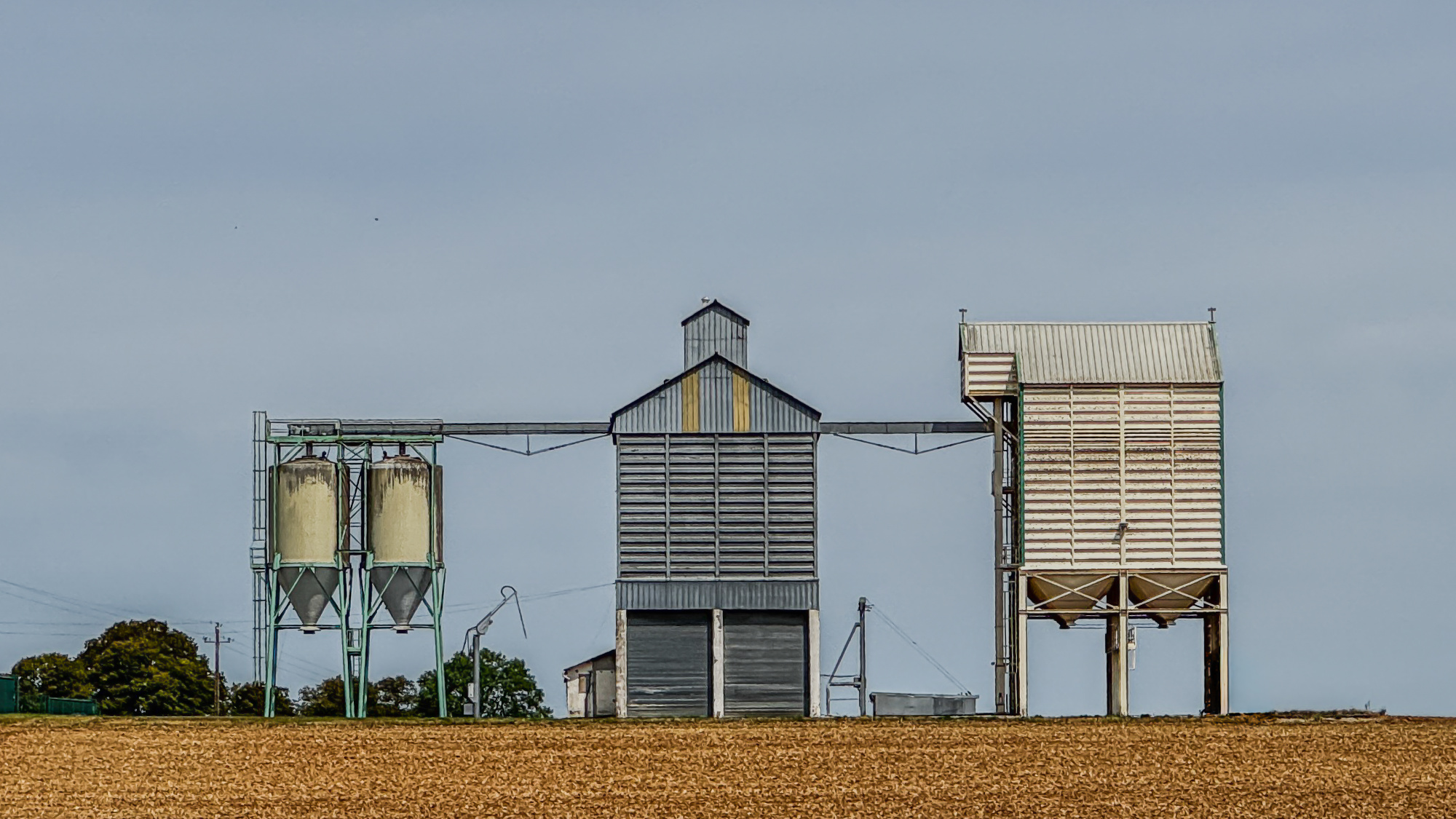
I love this photo,but some people called it "just a snapshot".
I was driving with my moto and I was happy surprised when this view came along.
I just took the picture with my smartphone.
1/2500sec
f/2.8
iso32
Kind regards.
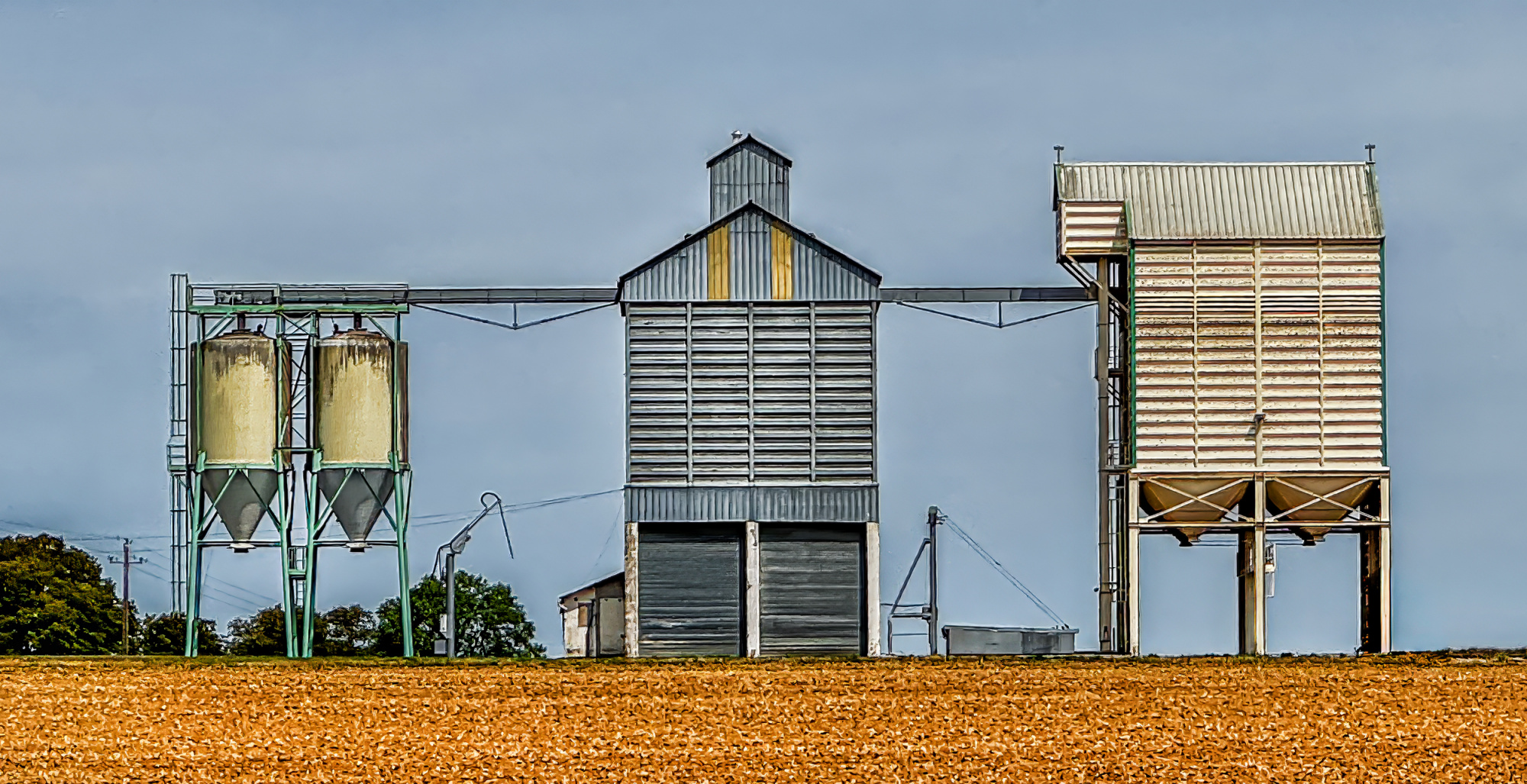
Hi and welcome - I feel it need more punch so I first went for a tighter crop added more saturation an used nik Tools Tonal Contrast - last some dodge tool work and then sharpened. Thank you for sharing.
johan,
Thanks for submitting this image. I really like the composition.
Normally with architecture related photos we want to show them at an angle so that we see both the front and a bit of the side. This helps create a sense of depth.
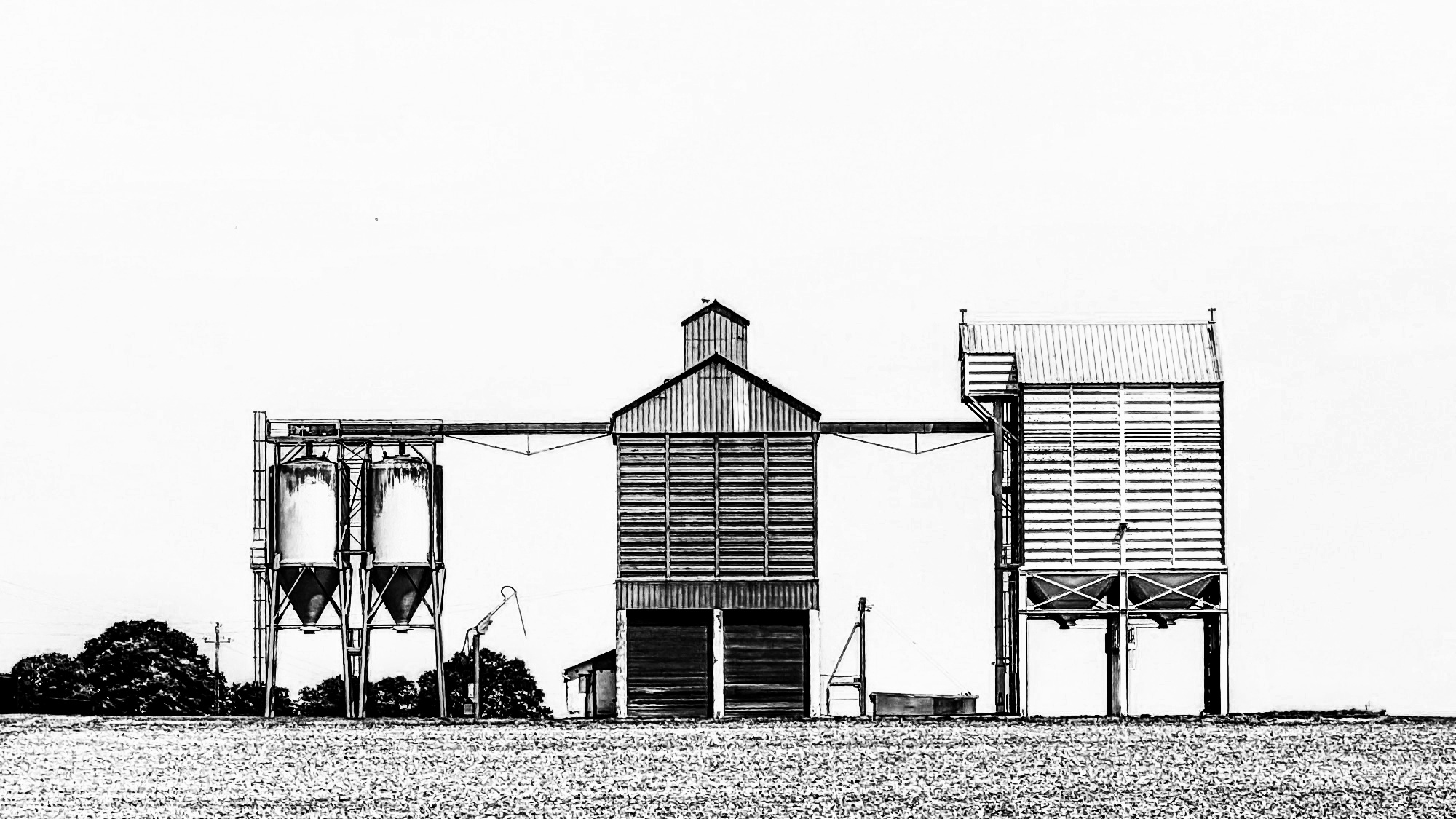
Your composition is straight on with out a sense of depth. It is very flat --- but it works!!! I love it. Sometime breaking the "rules" is a very good thing. This is one of those situations. In this case it takes it out the realm of documenting the overall architecture and forces us to focus on the various shapes that make up the structures. It captures and holds our attention.
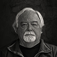
I did a color edit which ended up very similar to Daniel Springgay so I won't bother showing it. I also did a B&W version and pushed the contrast that makes is a very graphical composition that emphasizes the shapes.
In Photoshop I converted it to B&W and moved the yellow slider to 166 and the blue slider all the way to 300. I also did a curves adjustment layer with a fairly extreme S-curve shape to make it a very high-contrast graphical image.
I offer this up as something to consider as it may or may not go along with you vision. Your vision, not mine, is the one that matters.
Best wishes,
Mike S. - Senior Critic