


|
|
|
|

Description
the end of autumn
even after scattering
Autumn leaves are beautiful to us
gives a gift

Look at the falling leaves and see the image you envisioned
I took a picture and tried to express it.
(what you want to learn)
I would like to receive criticism mainly for retouching.
In addition, I would like to ask for advice on composition and so on.
Please tell me how to process and finish it to make it better
What I'm lacking, how other people feel when they see it
Any criticism would be appreciated.
(photo editing software)
I used photoshop. <br>
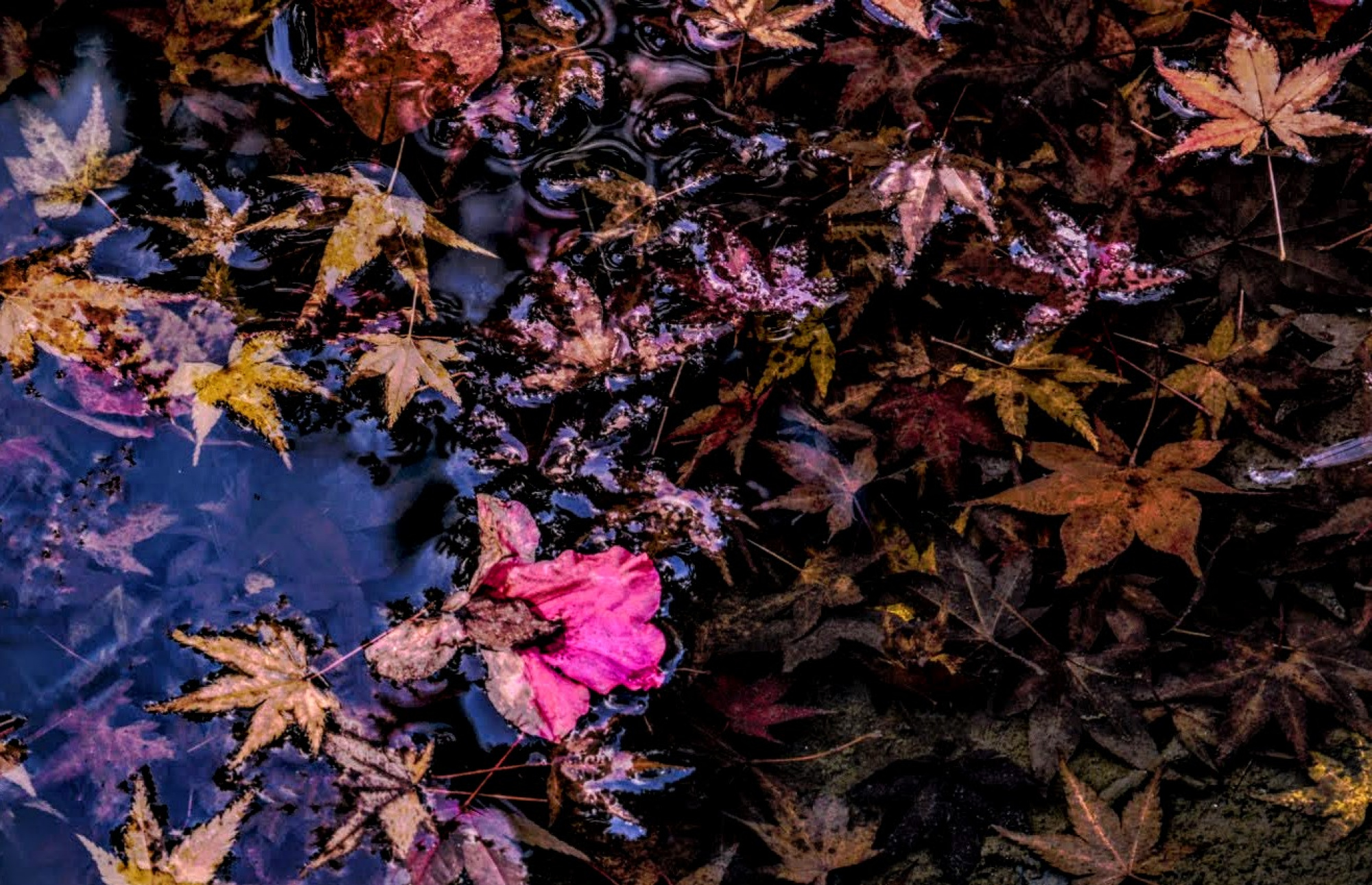
With autumn leaves floating on the surface of the water centered on the red of sasanqua
Autumn leaves reflecting light
autumn leaves under water
Adjust the color of these three types of autumn leaves and the degree of lightness and darkness.
I devised to give a sense of presence by darkening the surroundings.
Also fix the dirt on the extra stems and leaves
I tried to make it suitable for viewing.
Below is a photo before retouching.
https://drive.google.com/file/d/119RJY3k_La4zUApSA1D4ae6n_Q5bIi-H/view?usp=share_link
(Settei)
micro four thirds
Lens
tamron 18-270mm f3.5-6.3 di ii vc
Shutter Spee
1/15
Aperture
f8
ISO
100

Hello, Junji Yoshikawa
Welcome to our forum. This is a nice image of the autumn we have left ehind a short while ago. I opened the drive file to see the original image. I wanted to give my advice from there. I thought that the shadows were a bit too dark so in Camera raw I lighted the shadows after adding very little exposure to your overall image. I wanted to see the leaves on the right bottom side clearer . I think this also added dimension.

With a linear adjustment rush I reduced the highlights on the left so that the left side did not look very bright. Next I added some warmth to the image by dragging the yellow slider to the right. Autumn images have a warm appearance. I also lightened and saturates red, yellow, orange and pink tones to improve the color values of the leaves. Finally to give a better effect I slightly added black vignette to the corners of your image. What did I do different from you is to have a brighter and warmer image. Your edit has a slightly darker mood than what I suggest. It is up to you to accept my suggestions or not. I am always fond of autumn images. A slight change in tone and light changes our moods when we look at them. I wish you good light. Cicek Kiral SC...

Hi Junji welcome to Critique and thank you for given us a try - I will jump right in if you don't mind - When I see an image like this I want to see quality of sharpness and texture so this is my take on your fine image. - Composition wise I like the way it is so no change there. - back in Photoshop / Camera Raw - Clarity +10 - Vibrants +8 - Dehaze +30 - I then used Nik Tools Tonal Contrast to add colour and texture - Then sharpen all over - last I fished off with the dodge and burn tools to help some of the leaves stand out and darken parts of the water. Thank you for sharing good image -


Hello Junji,
Welcome to the forum, and thank you for sharing your photo of the fallen autumn leaves with us. I like the different colours and shapes of the leaves and the way you captured some on land and others on the surface of the water. You have already received excellent edits from both Cicek and Daniel with different colour tones. I thought that it would be interesting to try cropping your photo to remove some of the area lower right where there is a lot of soil but fewer leaves, so I have cropped the lower edge as well as each side. I have also sharpened, lowered the light a little and made the colours a little richer. It's up to you, as the artist, to decide whether to accept of reject any of our suggestions.
Good light, Elizabeth

Junji,
Thank you for sharing 'Gift From Fallen Leaves' with us here in Critique. I think you chose a good title to remind viewers that there is beauty even at the end of Nature's cycle. And often the beauty is right at our feet if we take the time to look and be still.
I've made similar photos myself, and I think the biggest challenge is to find some visual harmony in Nature's chaos. Your photo is good - but has a lot of detail. Perhaps there are just too many things to look at.
You wrote "I devised to give a sense of presence by darkening the surroundings". That is a technique we often suggest here in Critique. Viewers are drawn to the brightest areas of an image, and the places of higher contrast and brighter colour. With the Dodge and Burn tool we can direct viewers to the subject and show them the 'flow' and 'balance' of a composition.
Thank you for providing the link to the original. I can see you did quite a bit of work to get to the version you posted here. I started with the original as it seemed a bit sharper. There is some blur - likely a result of the slow shutter speed. At 1/15 second and 120mm, even with a lens with Vibration Control, there can be blur. I used Topaz Sharpen AI at its default settings, and then made two different crops. Each was brightened using 'Image>Adjustments>Levels' in Photoshop, then the 'History Brush' was used to brush back the areas that may distract viewers from the subject and flow. Some Dodging and Burning was done too. For the image without the red leaf, I added a bit of detail to the top of the cropped frame with Photoshop's 'Content Aware Fill' . . . . and then I flipped the image 180° so that the leaf was on the bottom rather than the top.
I hope we'll see more of your work here. We appreciate members who comment on the photos too - if you see one that you have an idea for, please share with us. We learn together by exchanging ideas and opinions.
. . . . Steven, senior critic


Cicek Kiral
Thank you for your advice on approaching with a bright color tone and a warm image.
Daniel Springgay
Thank you for your advice on approaching from the perspective of sharpness and texture quality.
Elizabeth Allen
T hank you for your advice on approaching by trimming the bottom edge and both sides
Steven T
Thank you for your reference to shutter speed and your advice on how to approach trimming.
Thank you for all of your criticisms from different perspectives based on the original photos.
I will use it as a source of future work.

Junji, I was looking at your photo and while I'm not an expert I didn't read in the other critique that if you use a polarizing filter on your lens you will cut out the sky reflection in the water and sometimes that leads to a cleaner shot. It also depends what is below the leaves... the "cleaner" shot sometimes reveals too much under the water so you need to experiment. The other thing for me is the diagonal line created from the reflection 1/3 - 2/3 that split the frame 1/3 - 2/3. Anyway, take my advice with a grain of salt as I am just an amateur learning.
